Affiliate links on Android Authority may earn us a commission. Learn more.
Android isn't perfect: 5 improvements we'd like to see from Google
Published onMarch 9, 2019

Android has evolved considerably over the years, introducing new UI redesign and gaining plenty of unique features and optimizations along the way. However, as refined as the modern Android experience is, a lot could still improve or change. With the anticipated release of Android Q this year we thought it’d be good to talk about a few things we’d like to see Google address in its next major OS release.
Better gesture navigations
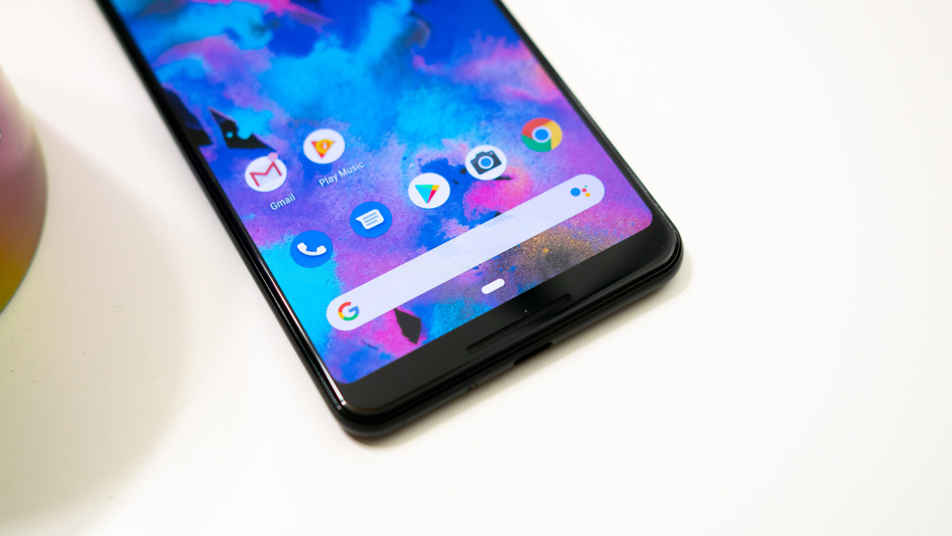
OEMs such as Apple, Motorola, and OnePlus have all implemented their own takes on gesture navigation and Google followed suit soon after them. The introduction of Android Pie brought gesture navigation natively to the Android OS. It sounded great at first, but if you’ve used Google’s gesture navigation you’ll know it’s pretty awful.

First and foremost, Pie’s gesture navigation doesn’t actually free up any screen real estate, defeating the purpose of gesture controls entirely.
There’s also still a navigation bar at the bottom, so it isn’t even all gestures. The home button is pill-shaped instead of a circle and there’s still a back button, but it only shows up when you’re in an app or essentially anything other than the launcher. The overview or recent apps button is the only button that’s truly gone. This was replaced with a short swipe up from the bottom to launch recent apps and swiping right on the navigation bar became the new way of swapping back and forth between your last two apps.
Android gesture navigation could use a lot of work -- a lot of the UI elements just don't make sense right now
Another reason why Android Pie’s gesture navigations are so bad is some of the gestures and UI elements don’t make sense. I like that I can swipe up to get to my recent apps but I don’t like that I have to perform a long swipe to get straight to my app drawer or swipe up a second time if I only did a short swipe. Despite using it all the time, I still haven’t gotten used to it. Putting the swipe up for recent apps on the right side of the navigation bar and swiping up from the middle to open up the app drawer would be an easy fix for this. This would negate the need for a long swipe to get to the app drawer entirely.
My final big issue is the placement of the “clear all” button on the recent apps screen. Many OEM Android skins give you a clear all button that is accessible no matter where you are within your recent apps. That isn’t the case with Google’s implementation. The clear all button for recent apps isn’t static, and the more apps you have open, the further it moves to the left of the list. It just doesn’t feel intuitive and can be cumbersome if you have a laundry list of recent apps.
Long screenshot and screen recording
Google’s done a great job improving and adding new features to Android over the years. Many features that you used to have to root, flash custom ROMs, or use an OEM skin for are now natively baked into Android. Back in the early days of Android, I would root my device just to get a flashlight toggle and a restart option in the power menu. Nowadays I no longer feel the need to do that, but some are essentials are still missing.
Google has yet to implement the ability to take long screenshots or create screen recordings into Android. OEMs like OnePlus, HUAWEI, and Samsung have one or both of these features baked in. If you’re on pure Android you’ll have to resort to third-party apps or rooting if you really want them. These are fine options, but having the features built directly into the OS is always a better experience.
Override OEM left-panels with Google feed

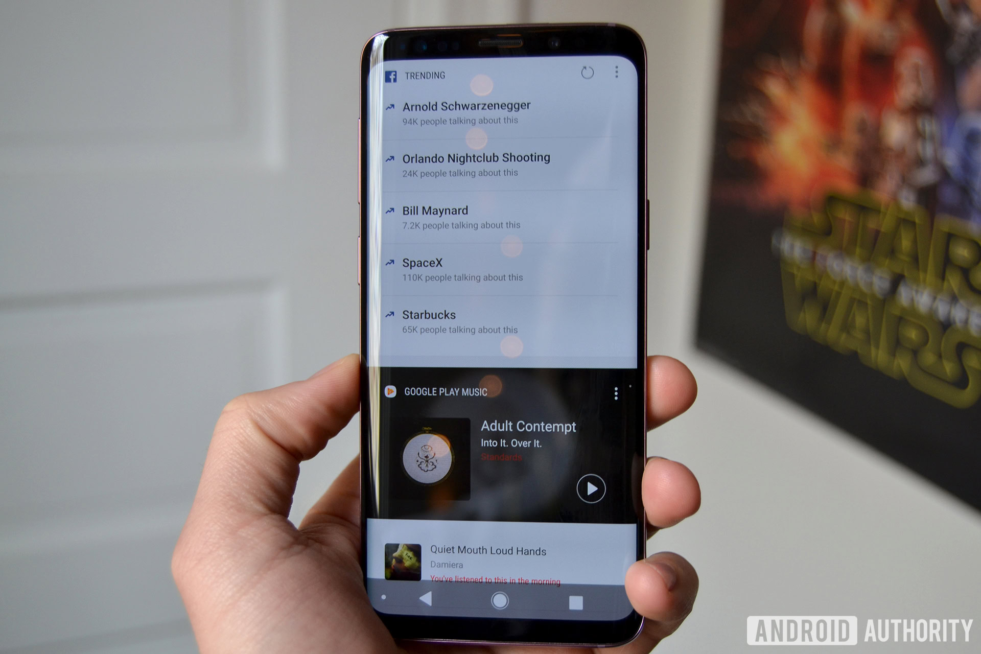
HTC’s Blinkfeed and Samsung’s Bixby Home are two well-known examples of left home panels set in place by OEMs. These panels are meant to provide quick information at a glance, but are often bloated and clunky. Most OEMs let you disable the feed if you don’t like it, but you can’t replace it with a different feed of your choice.
I personally enjoy Google’s own feed. It’s clean, provides the information I need, and doesn’t feel clunky or bloated like ones I mentioned. This is one of the main reasons why I prefer using Pixel devices, but it would be great if you could substitute an Android OEMs feed with Google’s.
Improved app permissions
Google’s done a great job of giving users more control over app permissions on Android over the years, but we’re still hoping for more. According to some early leaked builds, Android Q could give us god-like powers over app permissions.
Until the update is official we won’t really know for sure what improvements will be implemented, but one thing we would like to see Google change with app permissions is the ability to grant app permissions temporarily or only while the app is in use. This is great if you only want an app to know your location or use your camera temporarily and would put users with privacy concerns at ease. An app called Bouncer on the Google Play Store does exactly this, but having it built in natively to Android is always better.
Better sharing interface
If you’ve ever shared anything on Android, you know it’s quite a messy system. Many things about sharing on Android need improvement. I’ll try to keep this as brief as possible and touch on just a few points.
One of the most obvious problems you’ll notice with the sharing UI is that it’s very slow, especially if you have a lot of apps installed. The direct sharing items also don’t load in at the same time as the rest of your apps and the suggested direct share shortcuts seem completely random at times. The options you get for direct share varies from app to app. Sometimes simply reloading the sharing UI can change who or what you can share to.
Another major issue is the inconsistency of the sharing UI across apps. It doesn’t always look the same, because developers can make the UI look however they want. However, even across Google’s own apps the sharing UI isn’t the same. In the examples below you can see how YouTube and the Play Store have a vertical scrolling UI, which is the most common sharing UI you’ll see across Android, but apps like Google Photos and Maps have horizontal scrolling.
Google also needs to have a standard look and placement for the share button. Most of the time it’s that familiar three-dot triangle, but sometimes it can be an arrow, plain text, or a combination of text and a share icon. The share button can pop up at the top of the app, in the middle, on the bottom, or buried in a three-dot menu. You can see some examples down below. Having a standard placement and look for the share button across all apps would make the experience feel more intuitive, especially for users that aren’t as well versed in the Android ecosystem.
This certainly isn’t a be-all-end-all list of everything Google should improve with Android. These are some of the top things we’d like to see addressed. Hopefully with Android Q, Google will straighten some of these things out. The update isn’t too far away, so we’ll find out pretty soon what the company decides to change. Are there any other features or UI changes you desperately want to see come to Android in the future? Let us know about them in the comments.