Affiliate links on Android Authority may earn us a commission. Learn more.
Do we really even need an app drawer in Android?
Published onMarch 1, 2016
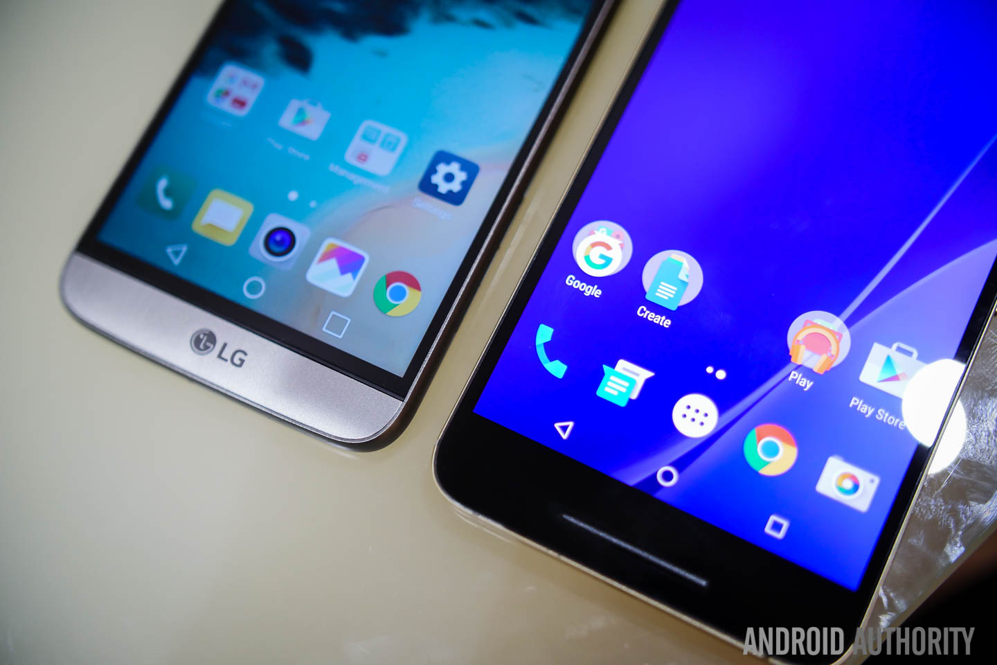
Recent leaks have shown a promising possibility that the Android N app drawer may not be dead and buried quite yet. Although the circumstantial evidence seems to point to OEMs knowing what’s coming, the team at Android Police have reportedly seen Android N with an app drawer. Regardless of whether it’s ultimately an Android N feature or not, it’s time to ask the question: do we really even need the app drawer?
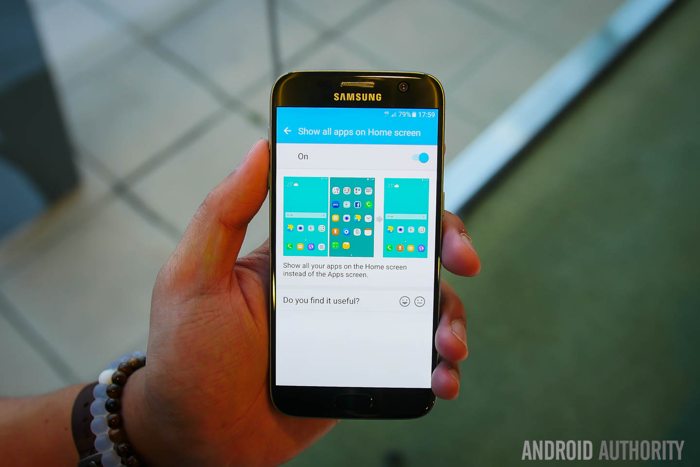
The information we received prior to MWC about Android N possibly removing the app drawer never said that the feature was definitively out. As we all know, Android features come and go and get tested and revised all the time. So we can’t say if the pre-release builds our sources told us about have now been revised to add the app drawer back in, whether it’ll be an optional setting like on the Galaxy S7 and in Sony’s Marshmallow concept, or if Google still hasn’t decided whether to keep it. But let’s look at the pros and cons of the situation.
Why we like the app drawer
On the pro-app drawer side, we know it as one of the defining features of Android. It helps keep your home screens tidy and affords a lot of the customization potential that Android is known for. By keeping an alphabetized list of apps out of sight, Android users can curate their home screens however they like, with their favorite apps, widgets, shortcuts and more. It’s a desktop model, where the full app list is only ever a click away and the home screen is a customizable playground.
By removing the app drawer, Android would not only look more like iOS, it would also add more steps to launching apps you don’t have on your main home screen. It seems reasonable that widgets, shortcuts and so on will still function as we know them to, but using them would actually add steps to the app launching experience rather than making everything simpler.
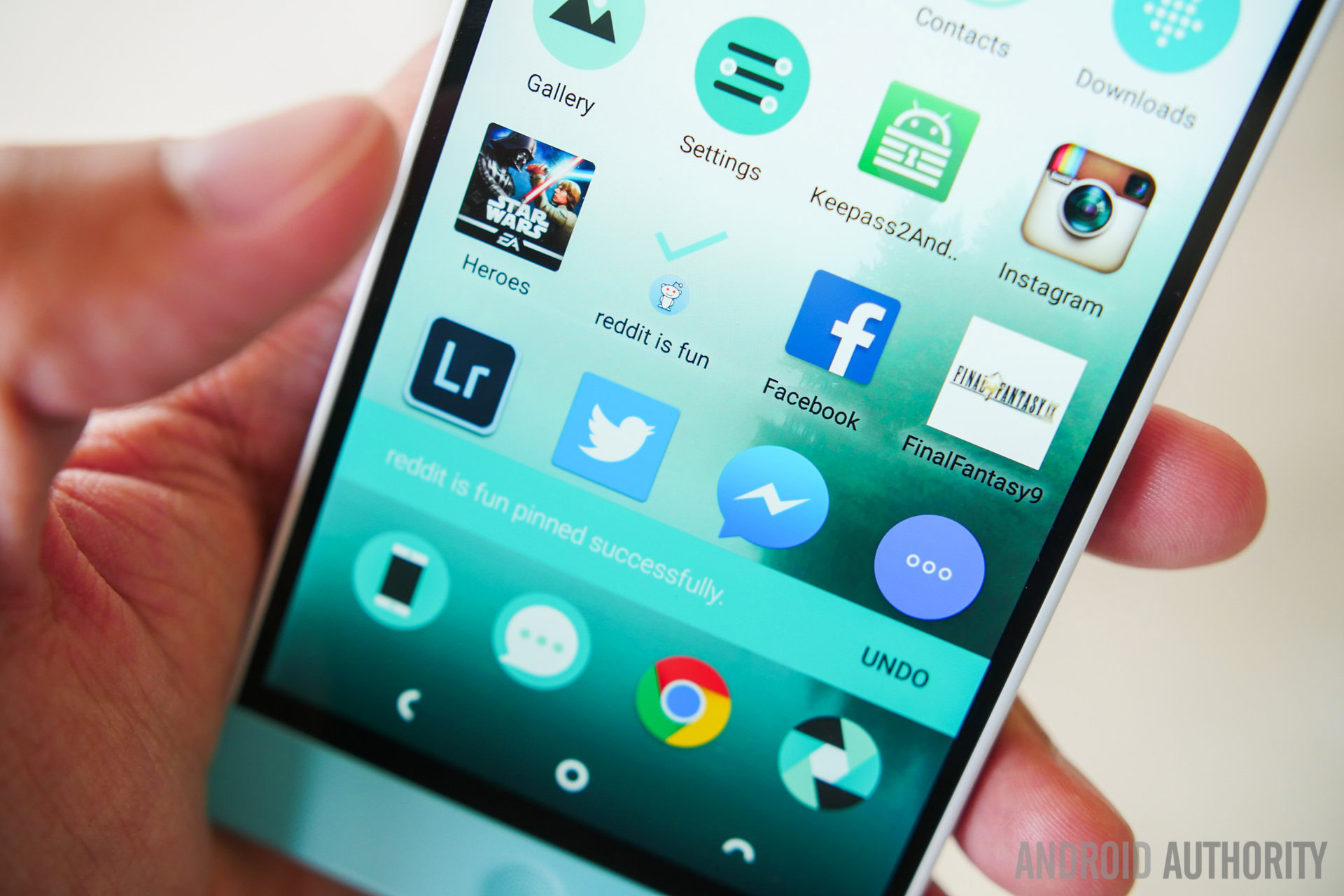
Think about it: you’d have Google Now to the left, your primary home screen next, perhaps a calendar and email widget on the next two screens and then several pages of app icons. So rather than a single tap on the home screen to access your full apps list you’d have to swipe several times to get to it. Adding a primary home screen shortcut to the start of your app list would simply reproduce what the app drawer shortcut already does.
To Android users this setup feels terribly slow and laborious. The argument for doing it this way seems to be that it is simpler and more intuitive than the app drawer because the two-layer system is confusing and people don’t know where to find the apps they install or how to remove them. Perhaps this is true for novice users or those new to the platform, but considering Android has had an app drawer for forever, that’s a difficult pill to swallow.
Anyone that has ever had any contact with an Android phone would understand it has an app drawer in exactly the same way as Android users understand that iOS doesn't.
Anyone that has ever had any contact with an Android phone would understand it has an app drawer in exactly the same way as Android users understand that iOS doesn’t or that automatic vehicle owners are aware of manual transmissions, even if they’ve never driven one. After all, it’s not exactly rocket science: your favorite apps on the home screen and all your apps in the app drawer. Of course, this isn’t to say that Google might not have a new trick up its sleeve for quickly getting the app you want.
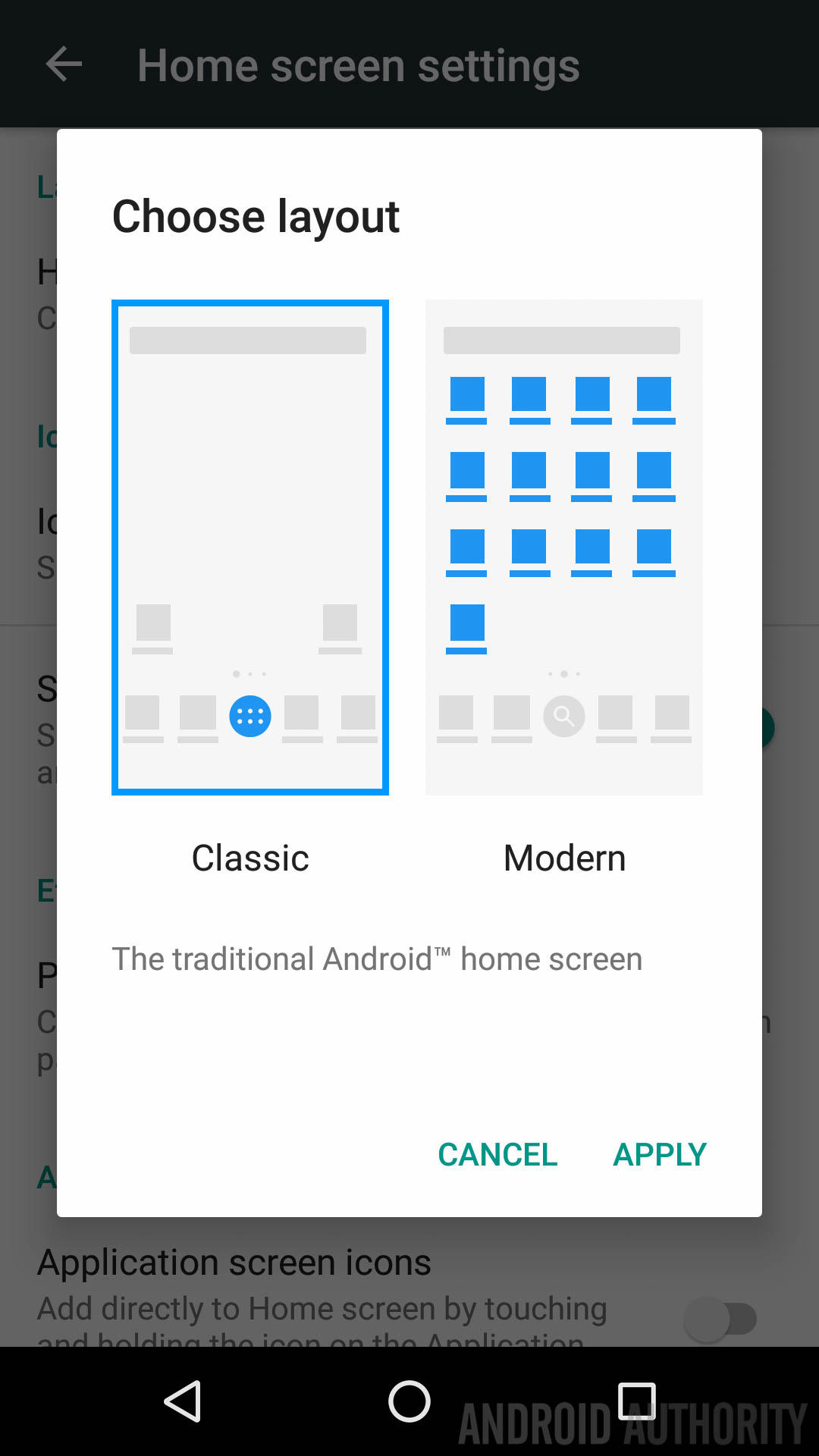
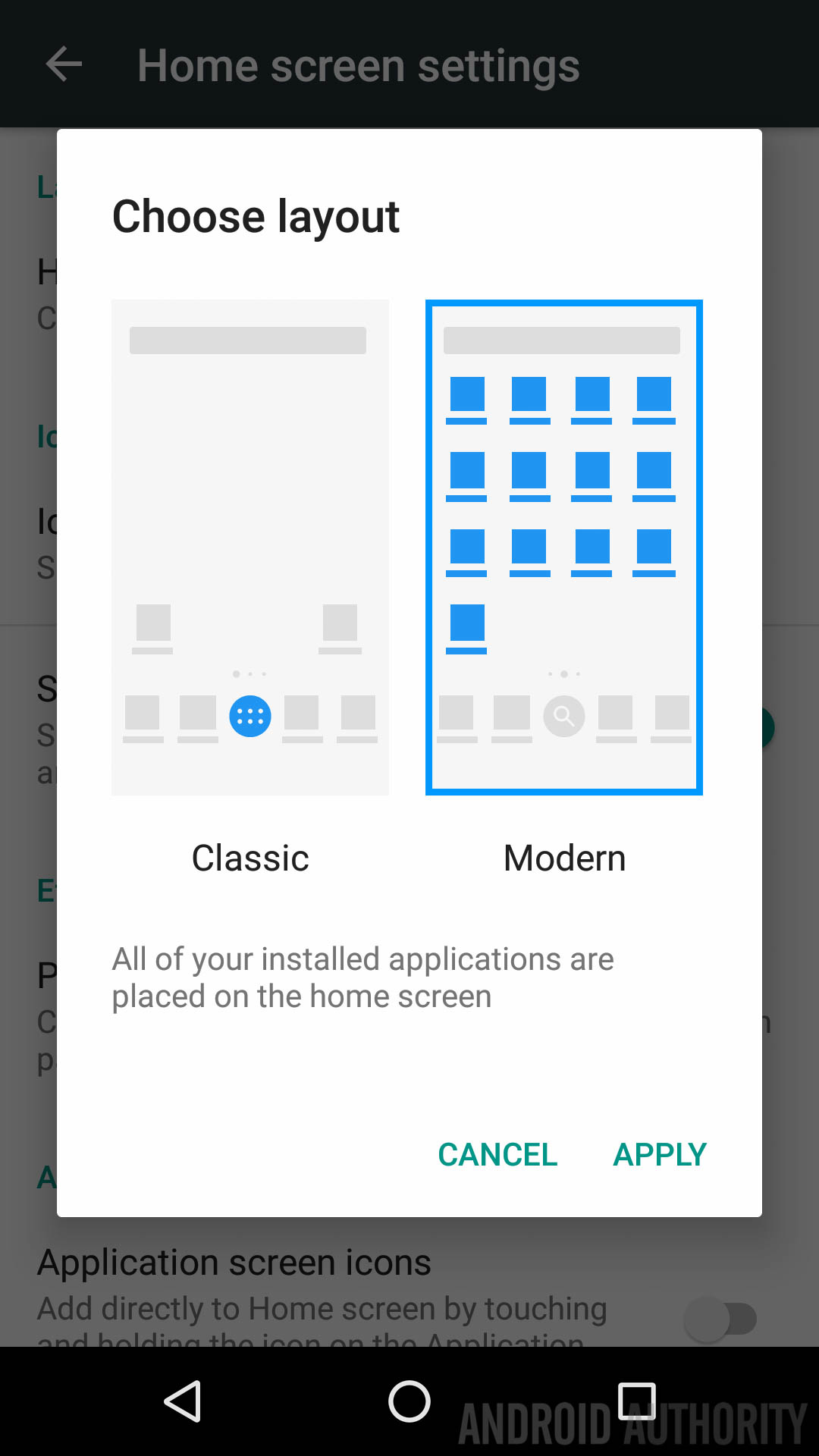
Implications of removing the app drawer
If Android were to remove the app drawer, the increasingly blurry lines between iOS and Android would be further deteriorated and the ease of switching between platforms would increase. Whether this operational similarity would work more in Android’s favor or Apple’s it is hard to say. But whichever way it goes it would mean the “confusing” part of the transition phase would be significantly reduced, making switching a much more palatable option. Again, this could either be very good or very bad for Android.
We can only hope that the early builds were experiments and that Google has added the app drawer back in, or that it at least remains an option in Android N.
On the positive side of the fence, it is a very simple affair to install a custom launcher and keep the app drawer if it does get removed. If Google also changes the Google Now Launcher to remove the app drawer you can simply switch to Nova instead. But for obvious reasons, die-hard Android fans don’t want to have to use an alternative launcher to reproduce what they see as the core Android experience. We can only hope that the early builds were experiments and that Google has added the app drawer back in, or that it at least remains an option in Android N.
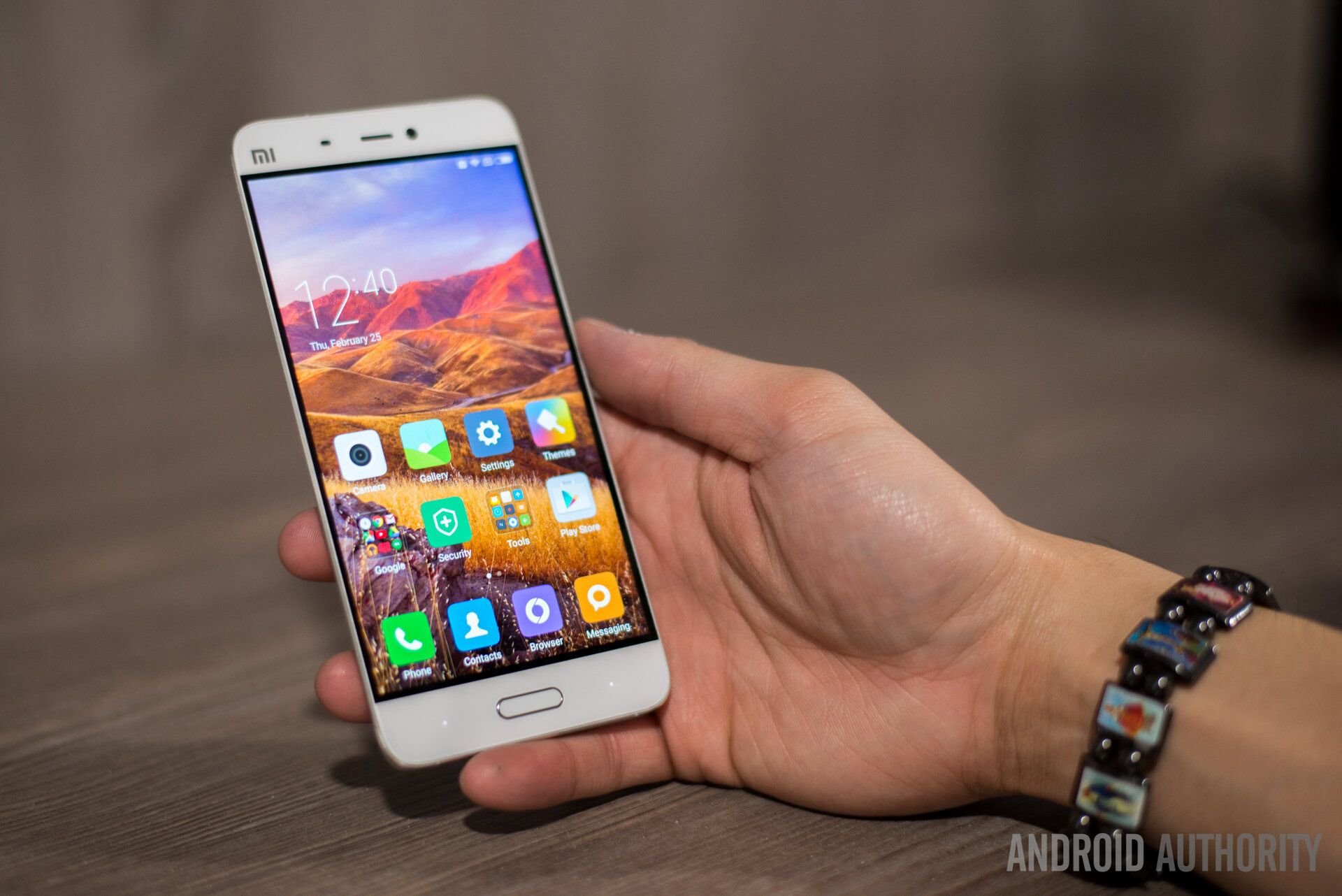
But what if it were to be removed entirely? Is there any real upshot to it’s removal? Not that I can see. Sure, it would make Android a little less confusing to those jumping ship from iOS and might appeal to the apparently significant audience that claims that the two-layer setup makes Android harder to navigate. As members of the Android faithful, we have to admit that what is obvious to us may not be obvious to everyone. But it’s hard to see how removing the app drawer entirely would be adding more than it is taking away.
Whenever something we like gets taken away we all freak out, then we settle in and eventually come to like it. Remember lock screen widgets?
Like most feature additions or subtractions though, we would get used to it. Whenever something we like gets taken away we all freak out, then we settle in and eventually come to like it. Remember lock screen widgets? The removal of the Gallery app? At the time they seemed hugely important but we rapidly forgot about them and moved on. The same would be true if the app drawer goes. We’ll install launchers, flame up in the forums and then not really care anymore. Google might re-introduce the option like it did with true silent mode, but we’ll all survive if it doesn’t.
[related_videos title=”WHERE’S THE APP DRAWER?” align=”center” type=”custom” videos=”674813,676105,674055,656843″]
Do we really need the app drawer?
So the answer to the question “do we really need the app drawer?” is “probably not”. We don’t ultimately need it, it’s not that critical, but we like it and want it, even if it’s not that big of a deal. As Android users we prefer choice over dogma. We want to “be together, not the same”.
While we have the means to keep the app drawer if we want to, there’s understandable resistance to Google removing something this familiar from stock Android. It feels too much like iOS, adds extra steps to app launches and will probably just result in everyone having a home screen folder with all apps in it. For a while at least. Until we get used to it.
Read Next: Everything you can expect from Google I/O 2016.