Affiliate links on Android Authority may earn us a commission. Learn more.
Screenshot mockups of Android N show new notifications shade and quick settings panel
Published onFebruary 29, 2016

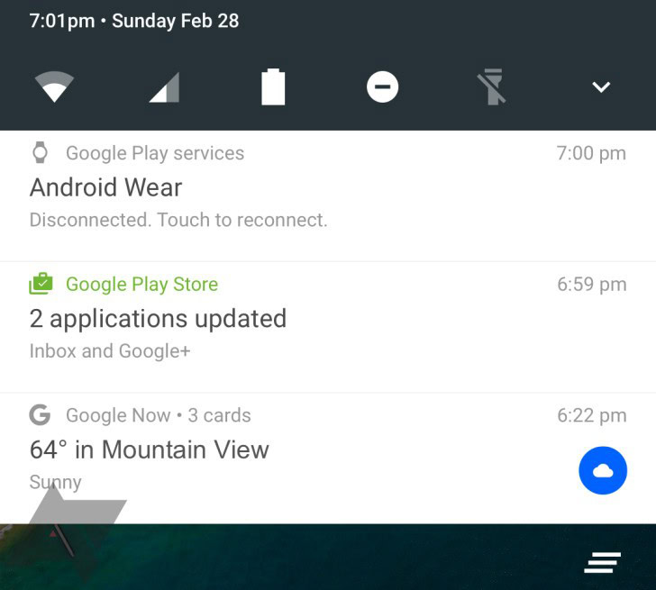
The notifications shade is no stranger to change, and it seems to undergo tweaks and modifications with just about every major update to Android. In some new mockups from the folks at Android Police, we get our first glimpse at what changes it can expect when Android N rolls around.
As you can see, the notifications shade looks like it’ll provide quite a bit more info per notifications, and the height of each notification has been stretched to accommodate this. In Lollipop, notifications on the shade have a card-like feel with gaps of negative space between each one. N looks like it’s filling up these gaps. While both have a very sleek, Material Design look, N opts for a lengthy sheet of contiguous paper over the card layout. We assume they will still be swipe-able.

Moreover, the quick settings panel seems to be one tap quicker than it is on Lollipop. What appear to be quick toggle buttons ride atop the shade so that major tools and services, like wifi connectivity and your flashlight, can be accessed immediately rather than in a larger pull-down menu. It seems that the full quick options menu is available if you pull down once more, but this is a way to provide valuable utility to a part of the screen that wasn’t used this efficiently before.
Granted, this is an early mockup of Android N, and we wouldn’t be surprised at all to see this tossed out, revamped, or overhauled completely by the time the Android version officially starts hitting devices. Nevertheless, it’s a tasty peek into what Google is currently cooking up with the operating system’s ongoing evolution.
What do you think of N’s new notifications shade and quick settings panel? Let us know your thoughts in the comments below!
