Affiliate links on Android Authority may earn us a commission. Learn more.
Media controls in notifications get a makeover [Diving into Android O]
Published onJune 8, 2017

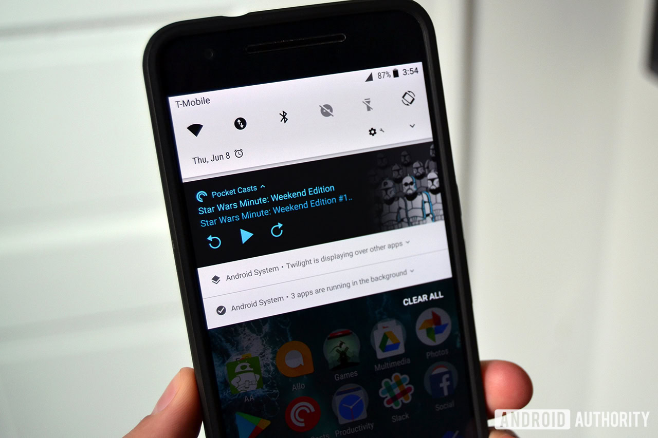
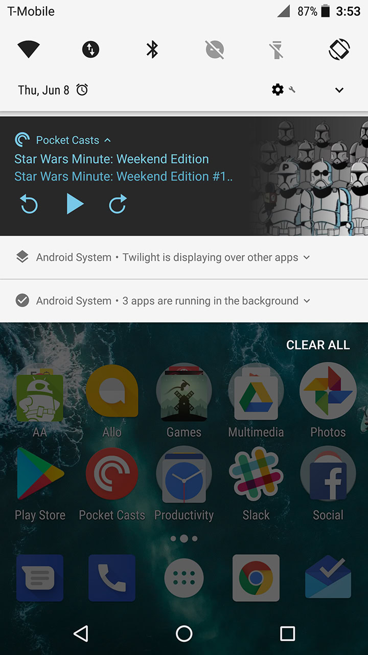
Google just released the third developer preview of Android O a few hours ago for select Nexus and Pixel devices, and we have been busy ever since trying to find any new features in this build of the OS. One of them is admittedly cosmetic, but it’s still pretty cool, and it centers on how media controls will look like in Android O’s notifications.

Previously, if you brought down the notifications bar to check out the media controls when an album or podcast was playing on your Android phone, you would just see the album cover image. With the release of Android O Developer Preview 3, the background of the media control actually changes color, again according to the music’s album artwork. The color also fades into the actual album artwork in the media controls.

Again, while this is not exactly an earth shattering new feature, it does offer up a nice looking transition for Android O users who love to not just listen to music but want to check out at least some of the album or podcast artwork from their favorite artists. Stay tuned as we will be posting up more information about what’s new and cool in this latest Android O preview build. Also be sure to check out our guide here if you need some help flashing this preview on your Nexus or Pixel device.