Affiliate links on Android Authority may earn us a commission. Learn more.
Android O Developer Preview feature tracker
August 23, 2017
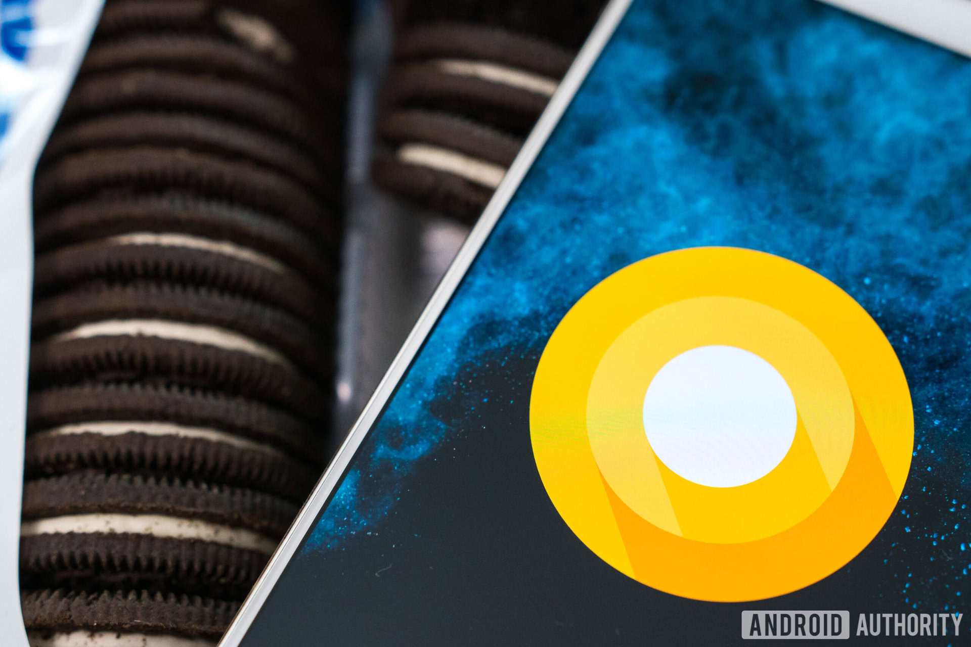
The official Android 8.0 release is here: Android Oreo officially arrived Monday August 21 during the solar eclipse. The over-the-air (OTA) update began rolling out immediately to supported Pixel and Nexus devices and factory images were posted on the Android Developers’ site the same day.
Android 8.0 Oreo looks and feels just like the final developer preview 4, so if you’ve been following the progress of the developer previews here, you’ll know most of what’s in store.
Check out our full Android 8 features overview in the Android Oreo review!
Android O release schedule
The Android O release ultimately became Android 8.0 Oreo, as predicted by pretty much everyone the first time they thought of a sweet treat starting with ‘o’. Like last year, the final public version was preceded by a series of developer preview builds. The first developer preview arrived in mid-March, with the second developer preview dropping during Google I/O in mid-May, and the third in mid-June. The fourth and final preview arrived in mid-July, right on schedule. The public version of Android 8.0 was out for supported Pixel, Nexus and Android One devices starting August 21.

TL;DR
Most of the major visual changes in Android Oreo are relegated to the redesigned settings menu, but there are a few minor tweaks elsewhere in the UI like in the notification shade. Material Design is still the order of the day because Android 8.0 Oreo focuses on important background changes like notification channels to provide even greater control over the Android system.
Some long-awaited features like picture-in-picture mode and unread notification app badges have finally landed while some entirely new features like better Bluetooth audio support and adaptive icons are a welcome addition.
What’s new in Android O developer preview 4:
Octopus Easter egg
In the final developer preview, the Easter egg has changed from the familiar Neko Atsume cat catcher game to an (admittedly Oreo-looking) octopus that kinda just floats around the screen instead. No one has yet managed to divine whether this is all there is to the Easter egg yet, but additional “functionality” may be added with the final release. Make what you will of the presence of the eight-legged creature and Android 8.0. Who knows, we might just get eight recipes for cooking octopus in the final version.
Pixel “powered by Android” boot screen added
The title says it all, the “powered by Android” logo now appears under the colorful G logo on the boot screen for Pixel devices.
Stop apps from displaying over other apps
Toggles now appear in the App Info menu that allow you to disable the ability for selected apps to draw over the top of other apps. If you want to remove the persistent notification alerting you to apps generating a screen overlay, you’ll have to dig into the Android System notifications. Go to Settings > Apps and notifications > App info > Show system (via overflow menu) > Android system > App notifications and flip the “Display over other apps” toggle to off. You can see all the apps with permission to write over other apps by going to Settings > Apps and Notifications > Advanced > Special app access > Display over other apps.
Adaptive notification dots
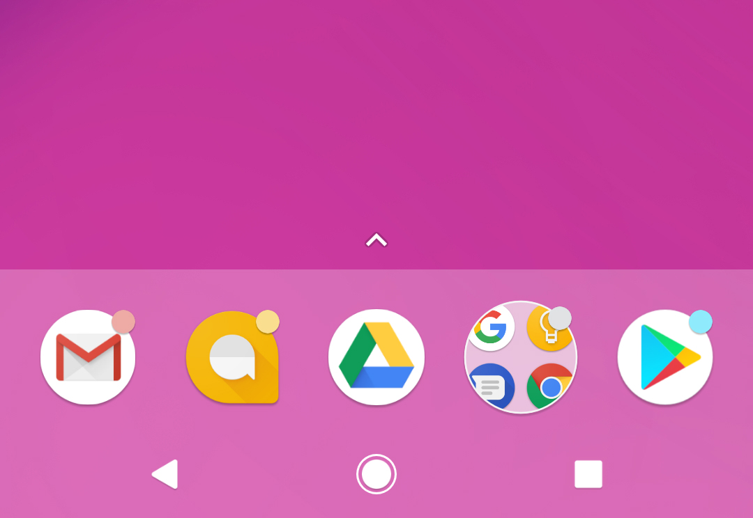
If you cast your mind back to Google I/O 2017 you might remember Google demoing notification dots (which are essentially numberless notification badges with nifty launcher shortcuts) which would be coming up in Android O. In dev preview 3 we saw notification dots with a standard blue color. This time around the dots appear in various colors drawn from the app icon they relate to.
Performance and bug fixes
A lot of early adopters have noted several performance improvements and bug fixes in the final dev preview. The battery drain issue that put a lot of folks off the third developer preview seems to have been corrected and the camera launch delay has also been fixed. Multiple other improvements have been mentioned around the interwebs, so hit the comments and share yours if you’ve noted anything in particular.
Font, lock screen, and notifications changes
For the eagle eyed (mostly Motobug and Phinocio on Reddit, who shared the screenshots below), there are a few font changes in the final dev preview. On the lock screen, the clock is slightly smaller and the date is no longer in all caps. In the status bar, the battery percentage is slightly bolder and the carrier info and time have been given a little more space on the left and right respectively.
In the toggles area at the top of the notifications shade, the date is now in a slightly less condensed font which makes it a little more more legible at a glance and the card-like spacer between the toggles and the notifications has been removed. The mobile data toggle has also been changed back to its old look (see the icon next to Wi-Fi in the two screenshots below).
“Change app icon shape” removed
Not the biggest deal, but the option to force adaptive app icons into a specific shape (round, squircular, rounded square or teardrop) has been removed in the final developer preview. The option was previously found in the home screen settings since dev preview 2, but has now been removed. Similarly, Icon Badging has been moved from this area and instead appears as a Notification Dots toggle in the Notifications settings menu. Notification dots for individual apps can also be enabled and disabled from within the App Info screen under App Notifications.
New system app icon
System apps have received an updated icon that looks a little more Material although it is not implemented in every case, so you’ll still see the old Android head as well (like, for example, in the wallpapers or NFC service). To check it out, just go to Settings > Apps and notifications > App info > Show system (via overflow menu) and scroll through the list. Pixel devices get a circular icon by default while Nexuses get a square icon.
What’s new in Android O developer preview 3:
Android 8.0, final APIs and official SDK
It’s not like we haven’t known this for forever, but in the About phone setting of dev preview 3, the Android version listed is no longer Android O, but Android 8.0. There’s not much to report in dev preview 3, but the second beta did bring with it the final APIs for Android 8.0 and the official SDK for developers. (Update: readers have noted multiple bugs in this preview, mainly relating to battery, stability and speed).
Persistent background apps notification
While having a quick and easy way to see which apps are running in the background (and potentially draining your battery) sounds like a good thing, the implementation introduced in developer preview 3 is less than ideal. An Android system notification lives in your tray near-permanently, constantly reminding you how many apps are running in the background.
System UI options removed
The System UI Tuner is one of those geeky playgrounds nerds like us love poking around in. Unfortunately for us, in the third developer preview Google removed access to several options previously available, including my personal favorite. Fortunately for anyone that had set up custom navigation keys in earlier previews, they continue to appear and work, but don’t expect that to last forever. Lock screen and picture-in-picture options are now gone, presumably until Android 8.1 or the first Android P developer preview.
Camera app
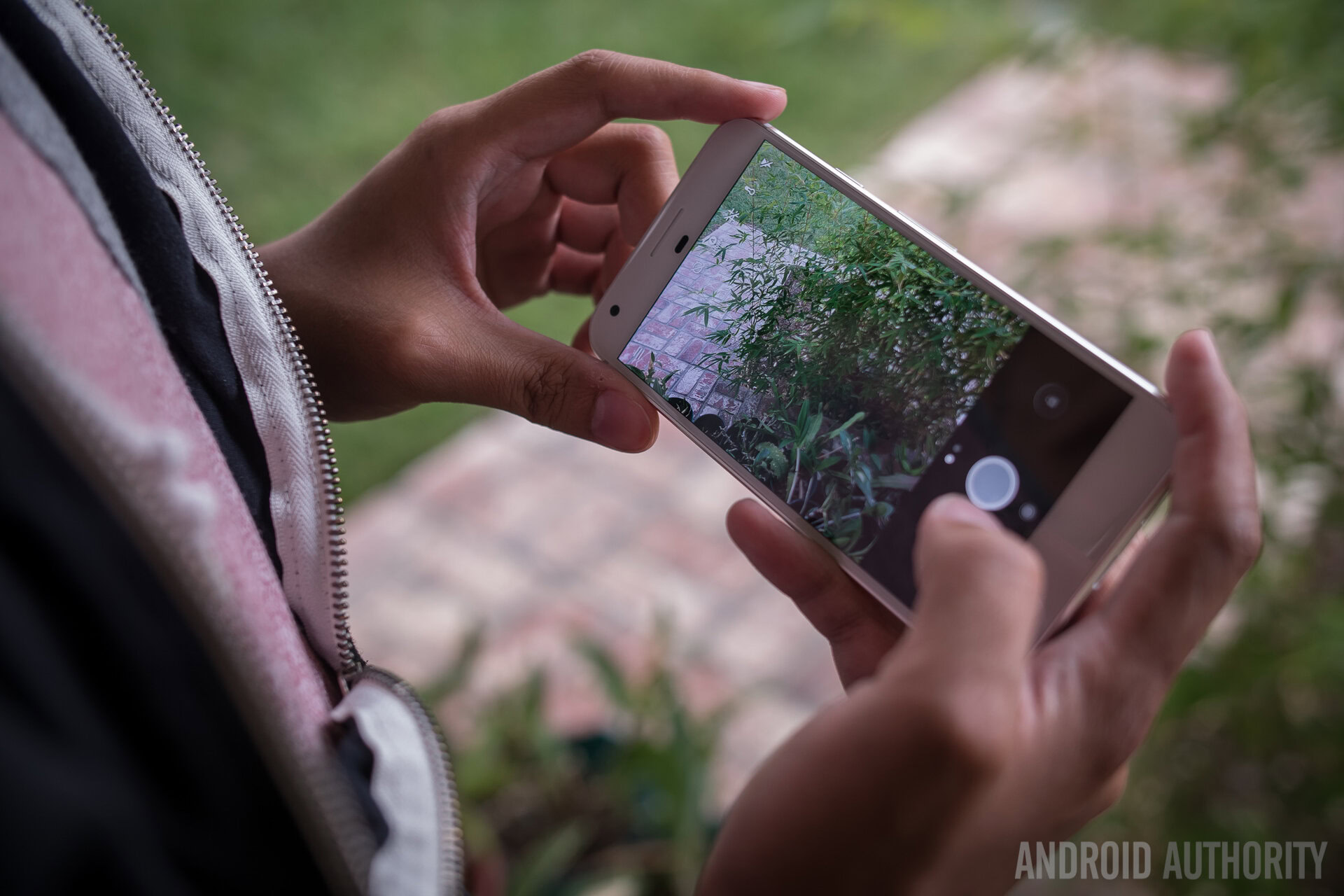
In the camera app double-tapping zooms in 50 percent and there’s now a dedicated button for switching between the photo and video modes. Previously you could only swipe between the modes, which might have kept it a bit of a secret for some users. Now a camera button appears to the left of the record button in video mode, and a video button appears to the right of the shutter button in photo mode.
New icon shape: teardrop
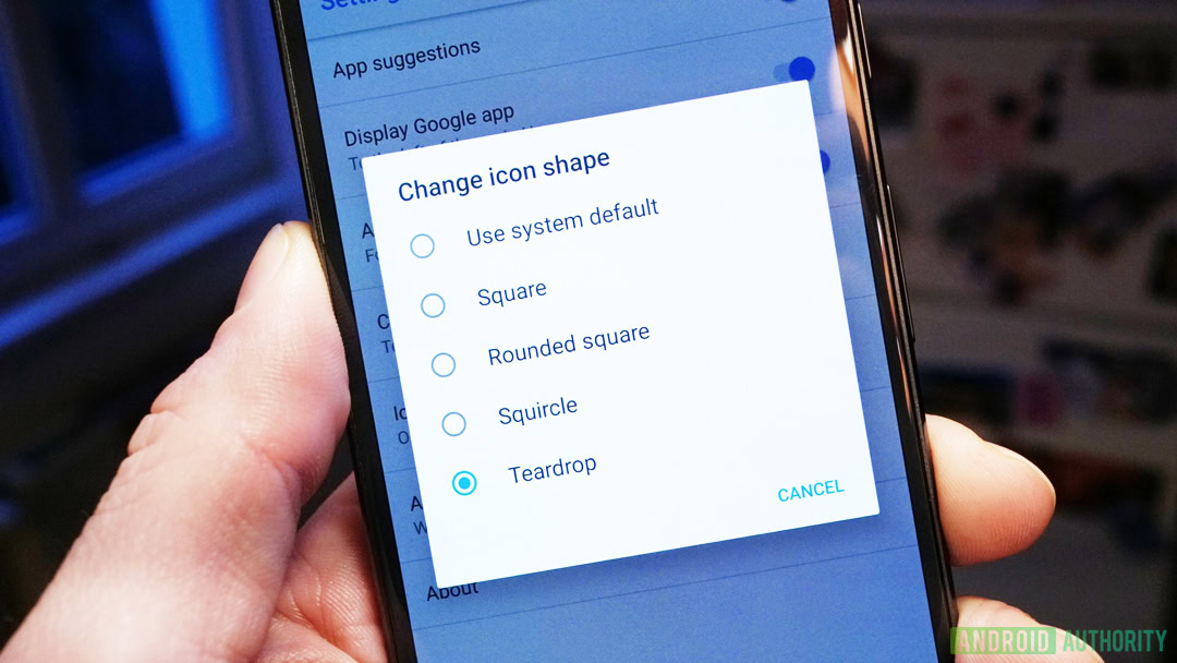
Google is going to war with bad, mismatched and irregularly sized icons. In developer preview 3 you can choose from the default system app shape, square, rounded square, squircular and now teardrop. Teardrop essentially forces adaptive app icons into an Allo-like shape.
Other stuff
A new battery remaining animation has been added, which really only serves to slow down your ability to quickly see what your battery stats are in the Settings menu. The order of the Wi-Fi and mobile data icons have been reversed in the status bar, because Google. An Icon Badge option now appears in the home screen settings, which enables app notification dots (although these only seem to appear in a single color right now).
What’s new in Android O developer preview 2:
Fluid Experiences
Announced at Google I/O 2017, Fluid Experiences is Google’s way of helping you be more productive and enjoy multi-tasking tools in your everyday use.
TensorFlow Lite is a new scaled-down version of Google’s machine learning tool, Tensor Flow. The new tool assists lower powered devices to keep up with the today’s demanding processes. TensorFlow Lite uses techniques like LSTM to improve your experience. Android O has a new framework from Android, it will hardware accelerate neural network features, helping keep some of the AI components on device, avoiding the need to find an online server to compute things like actions on text selections. Watch for these features in a later update to Android O.
Related reading: Google shows off Fluid Experiences, Vitals and more in Android O
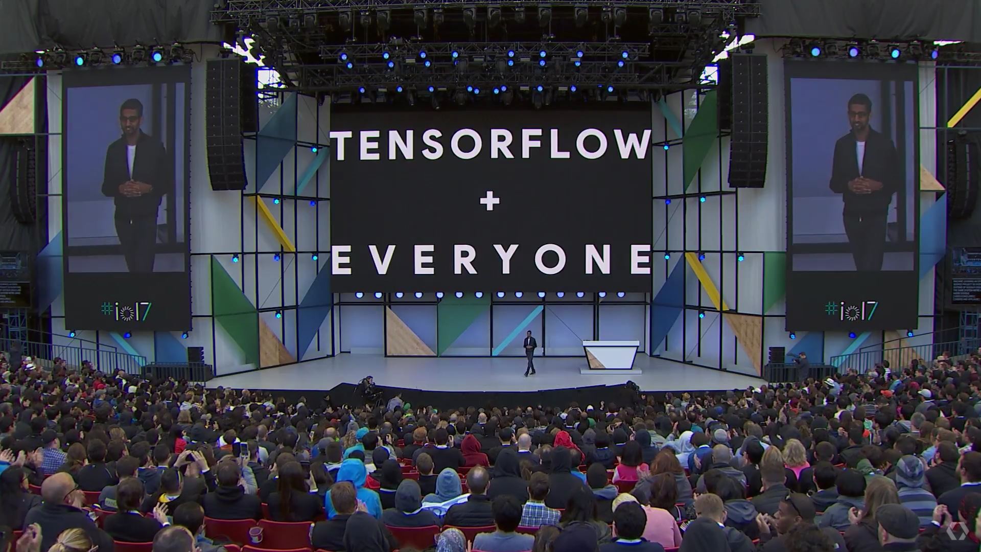
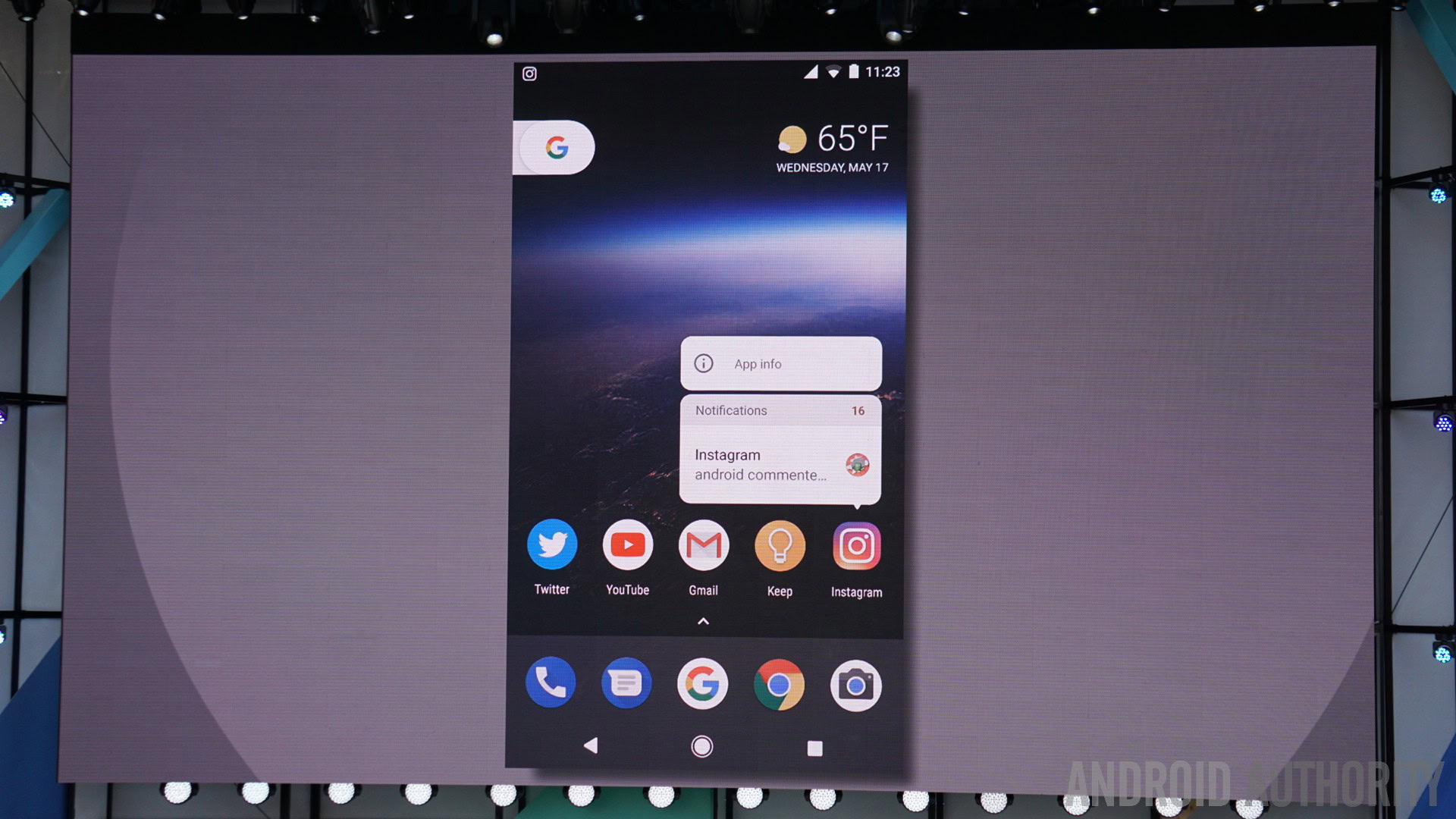
There are actually a few cool tools within this grouping, including Picture-in-Picture, Smart Text Selection, Auto-Fill and Notification Dots with long-press actions on the Homescreen. Let’s explore:
Picture-in-Picture
A familiar phrase and tool in many televisions, within the YouTube app on Android and, yes, in iOS. Google is adding a Picture-in-Picture mode to Android O. With a YouTube video playing, just tap the Home button and the video will pop into a small window that can remain on screen as you navigate other apps on your device. You can slide the video around for best placement, then simply slide it off the screen to terminate. Available now in the Android O Beta.
Notification Dots
Many custom Launcher users already know the power of a notification icon on top of an app icon on your Homescreen. We even used Tasker to build our own once, but now Google is building it into Android. Android O users will see a small dot that appears over top of their app icons with active notifications. This is where the magic starts, now that your app has an icon, new tools are available – Long-press the app icon with Notification Dot to get a short list of immediate shortlink actions you can perform. This includes viewing the notification itself right there in a tiny pop-up window.
The long-press functionality is not yet available in Android O, watch for it coming soon in a future beta release.
New emoji
The second developer preview introduces all new emoji, or should we say, brutally kills off the adorable blob emoji. While some folks won’t mind either way, others are extremely upset that Google could do such a thing.
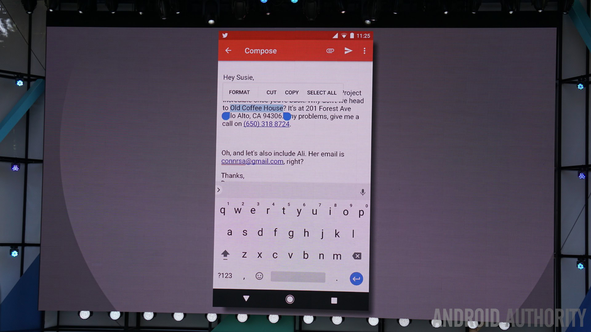
Smart Text Selection
We’ve all seen the basic text highlighting features, the copy/paste dialogue in Android, but now there’s more. With Android O, highlighting text includes further features, using Google AI to intelligently act on the words. For instance, if you highlight a phone number, you can just tap to dial. If you highlight an address, a single tap will start navigation. Best of all, highlighting is more intelligent itself, selecting phrases or full addresses, for example, instead of just single words.
Auto-Fill
For your most used apps on your device, Android O will help quickly log into services. The Auto-Fill feature needs to be coded in by the app devs, but once installed, Android O will remember your usernames, and in some cases your password, to quickly and easily jump into apps on your device.
Stay tuned for more coverage of these tools, check out our Diving into Android O series for all the details.
Vitals
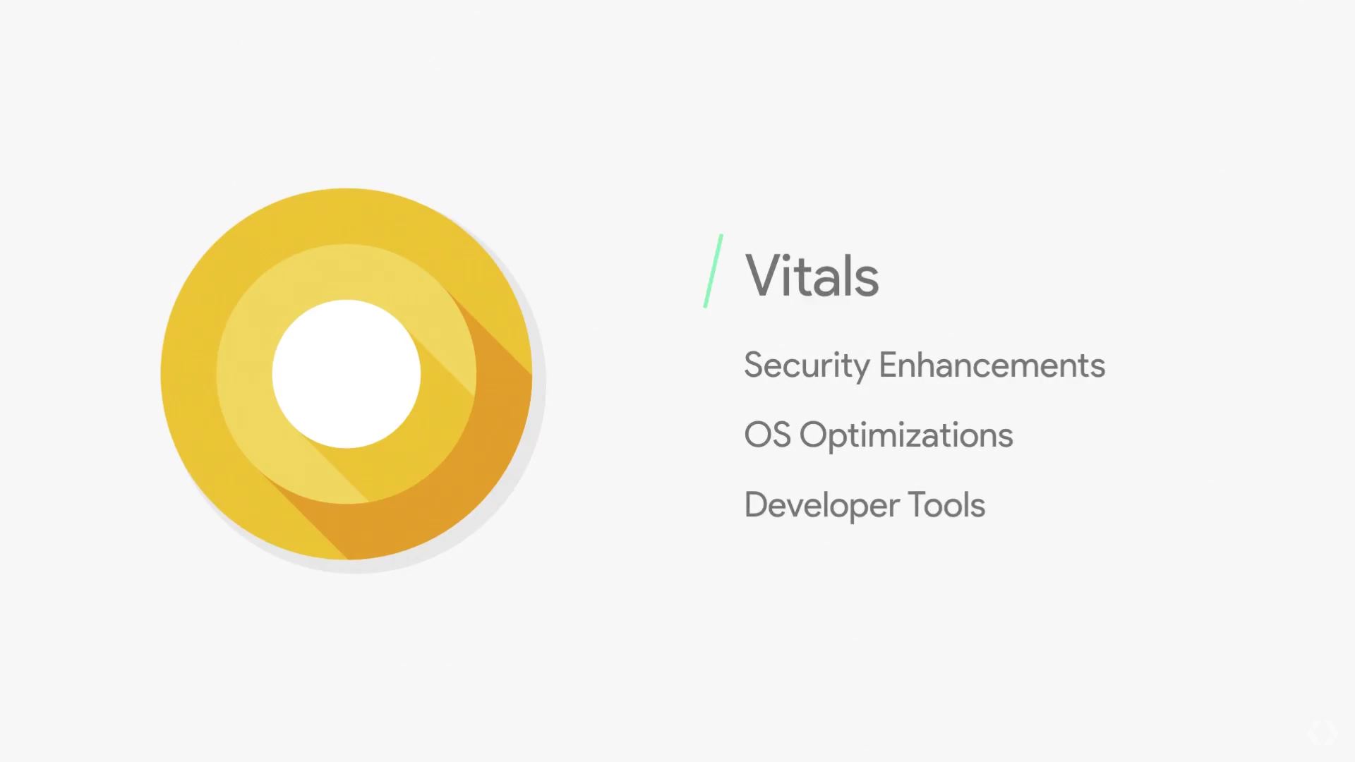
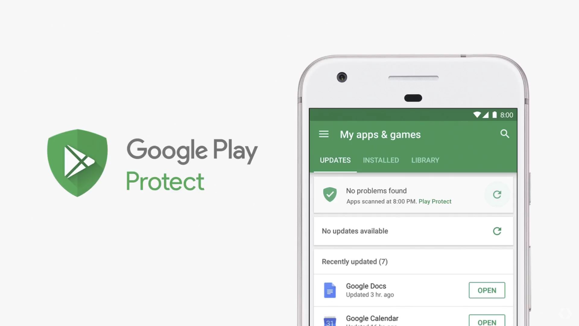
Who wants better battery life? Android O will soon include features under the banner Vitals, including security tools, OS optimizations and tools for developers to better suite your device usage. At Google I/O 2017, the Android team announced Google Play Protect, think of it as a virus scanner for Android apps. So far, the team reports having scanned over 50 billion app installs every day. You’ll see an entry in your Google Play app update window, showing your most recent scan and if there were any issues found.
You won't see these as features on your Android O device, but you will enjoy the improved battery life and security
Optimizations in the OS have the team reporting that Pixel devices are booting up in nearly half the time as before. This speed bump goes for apps as well. Extensive changes to the runtime, including things like concurrent, compacting garbage collection and code locality, but in Google’s words, your apps just run faster. More on this later.
Wise Limits will apply to background services, preventing apps from running in the background for too long. The goal is to dramatically reduce battery consumption, keeping you up and running through your day.
Play Console Dashboard is a new developer tool that provides analytics on app device usage. Developers will be able to see live results of their app running on any Android device – this may not eliminate the need for developers to test their app on most major phones, but it certainly will help them narrow down an issue if a device is acting up. Best of all, the in-depth tools provide insight on how devs can adjust their applications to reduce battery consumption and speed up execution on various devices.
You obviously won’t see these as a feature on your Android O device, but you will certainly enjoy the improved performance.
These and more great new features announced at Google I/O 2017.
Other stuff
There’s plenty of other stuff worth noting too, but a lot of which we can’t see in effect yet. Android O adds font support so app developers can define font style and weight. This could either be a great development or a clusterfont if you’ll pardon my language.
Wi-Fi Awareness allows your Android O device or app to communicate with other devices and apps in the vicinity over Wi-Fi without requiring an actual internet connection. There are also some major optimizations to the Android Run-Time (ART) responsible for handling your apps and WebView has also seen some enhancements you’re unlikely to ever even notice.
What’s new in Android O developer preview 1:
Notifications shade
When you swipe down the notifications shade you’ll see the first visual changes in Android O. The strip of six toggles at the top of the notifications shade now takes up a little more space on-screen and there’s a little re-ordering of the toggles in Android O since Nougat. A new condensed font for the date and time means that information takes up less space, which is fortunate because there are now more status bar icons visible.
A new condensed font for the date and time means that information takes up less space, which is fortunate because there are now more status bar icons visible.
Besides the shortcut to the settings menu and the Quick Settings carat (downward-facing arrow), you’ve now also got Wi-Fi and cellular connection icons as well as the battery icon and remaining percentage (which is shown next to the battery icon).
As for the notifications themselves, they look just the same as in Nougat, complete with bundled notifications and quick reply. If you have multiple notifications, you’ll notice that as you drag the notifications shade down, a tiny icon for each notification appears in a horizontal line at the bottom of the shade. As you drag the shade down, each icon pops up and expands into a full notification as more screen space becomes available.
Notification handling
As for notification handling, there’s some familiar stuff going on as well as some new options. If you long press on a notification you’ll see a toggle for Notifications, allowing you to disable all future notifications from that app (when notification channels are fully introduced you’ll also have access to them here, but more on that below).
However, if you swipe a notification to the side a little, you’ll get two icons: one for accessing the Notifications toggle and a clock icon for snoozing the notification. If you tap the clock you’ll automatically snooze for 15 minutes but you can open the drop-down menu to snooze for 30 or 60 minutes instead or to disable snooze.
- Read more about notification handling in Android O
Quick Settings
When you open up the Quick Settings screen, you’ll see we still have different color schemes for the Pixels compared to Nexus devices. Nexuses get that same dark blue-gray background with aqua accents while the Pixels maintain the near-black and bright blue accent scheme.
Looking at the Quick Settings themselves, Google has changed things up yet again. In Android O, the Quick Settings with a line underneath (Wi-Fi, cellular, Bluetooth, Do Not Disturb) have a double function. You can tap the icon to toggle the setting on and off, but if you tap the word underneath the toggle, you’ll open up the mini settings menu instead.
The non-underlined toggles just enable a feature like the flashlight or cycle through modes like for data saver no matter where you tap them. Just like in Nougat, you can tap the pen icon to edit the order of the Quick Settings or add another page and you’ve got the same shortcut to add a guest or switch between user accounts.
Android O finally adds native support for app badges.
App badges
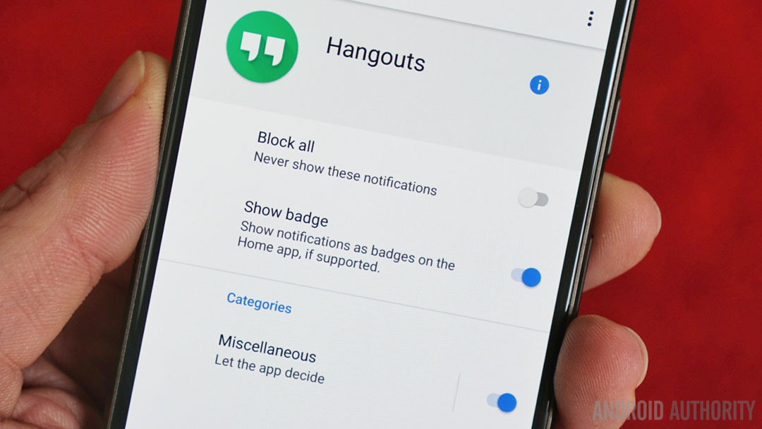
Android O finally adds native support for app badges (later known as “notification dots”). They’re the little number bubble that shows up on an app icon to show you your unread notification count and are yet another custom launcher feature being absorbed into stock Android. Of course, you’ll have complete control over these at the flick of a toggle in the individual app notification settings.
- Read more about Android O app badges
Settings menu
The Settings menu is where most of the visual changes look to be taking place in the Android O release.
The Settings menu is where most of the visual changes look to be taking place in the Android O release. For starters there’s a new color scheme: both the Pixels and Nexus devices get a black and white approach but you’ll still see their individual blue tones used for accents here and there.
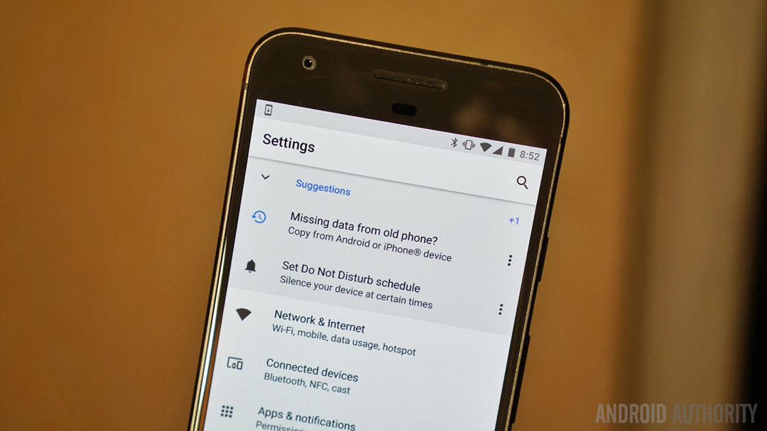
The Settings menu itself has received a bit of a reshuffle as well. I won’t bore you with what section moved into which other section, so take a look at the screenshots below to see for yourself. The slide-out navigation drawer and hamburger menu icon have both been removed in this developer preview.
The major change in Android O is that the Settings menu is much shorter than it was in Nougat, with no more umbrella categories like “wireless and networks,” “device,” “personal” and “system”. Instead, Android O has more descriptive sections that cover more ground, like “networks and internet,” “connected devices,” “apps and notifications” and “security and screen lock”.
- Read more on the new Android O settings menu
Generally speaking, everything is in the same place, but a few changes are noticeable. For starters, in the Display settings, Pixel devices have an option for “device theme” with two choices: Inverted or Pixel. From what we can see right now all this does is change the Quick Settings area from light to dark but it may evolve into the long-awaited system-wide dark theme in later developer previews.
Pixel devices have an option for “device theme” that may evolve into a system-wide dark theme in Android 8.0.
The Pixels also show Night Light in the Display settings while the Nexus does not. As you may remember, night mode made a brief appearance on Nexus devices in the Android N preview builds, but was later removed for failing to meet Google’s performance standards. Dark mode, meanwhile, originally appeared in both the Android M and Android N previews, but has still not made it to prime time on any device.
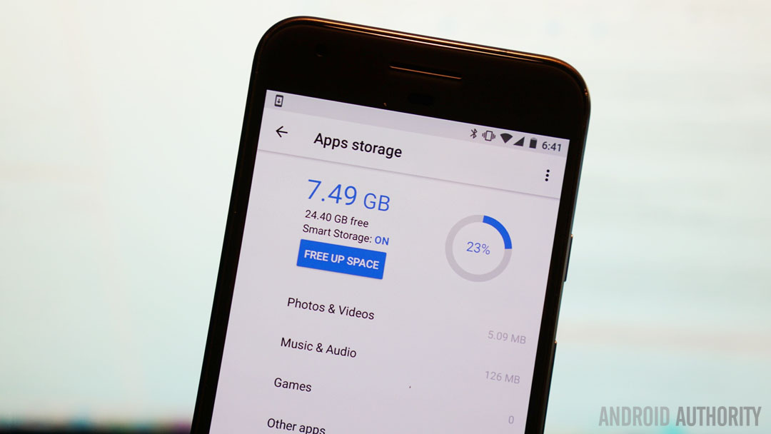
Most sub-sections in the Settings menu have also been overhauled visually. The battery and storage sections are all-new and the app info pages have a new look too. A whole bunch of stuff has now moved into the System sub-section, including languages and input, date and time, updates, about phone and backup and rest options.
Everything you know from Nougat is here, but you'll have to go digging to find it.
Pretty much everything you know from Nougat still exists in Android O, but you’ll have to go digging to find where it now lives. On the plus side, I have to congratulate Google for finally seeming to get things into places and groupings that make sense, without breaking everything down into an interminable list.
System UI Tuner
As with Nougat, you can enable the System UI Tuner to tweak certain things in Android O according to your personal preferences. To enable the UI Tuner, swipe down the notifications shade or Quick Settings and long-press the Settings gear icon. You’ll see it spin and feel a vibration when the option has been added to the Settings menu.
Status bar
In Android O, System UI Tuner now lives under Settings > System. It contains four areas (for now): status bar, do not disturb, navigation bar and lock screen. Status bar still provides a list of toggles for enabling or disabling which icons you see in the status bar, so you can remove persistent Bluetooth or hotspot icons if you so wish.
The option to display the battery percentage inside the battery icon, which was a System UI Tuner option in Nougat, is no longer available though. Enabling “Always show percentage” in Android O will keep the battery percentage visible at all times in the status bar, but it’ll be placed next to the battery icon, just like in the Quick Settings view.
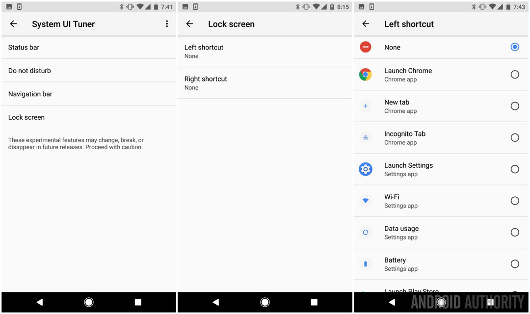
Do not disturb
Do not disturb simply shows two toggles: one for enabling a do not disturb mode toggle under the volume slider and another for adding a volume button shortcut so do not disturb turns on when you press the volume down button once more after vibration only.
Navigation bar
Next up is the navigation bar, which adds a bunch of cool options in Android O. There’s a layout option that lets you choose between normal, compact, left-leaning or right-leaning (which will come in handy on large-screened devices).
- Read more about customizing the nav bar in Android O
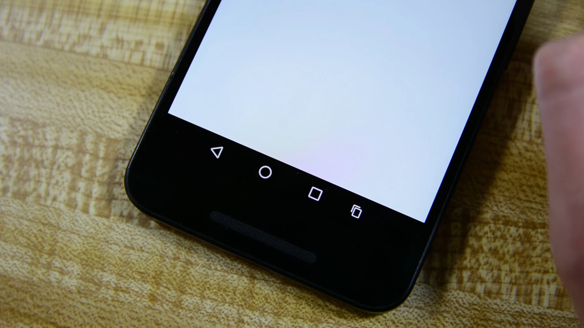
You can also add additional buttons on the left and right of the traditional on-screen navigation buttons. You can choose between clipboard, keycode or keyboard switcher. Clipboard lets you save something to the clipboard and then simply drag it from the button in the nav bar anywhere you want to drop it: a very handy trick for emails, phone numbers and other frequently copy pasted items.
The keyboard switcher doesn’t appear to work yet but Keycode lets you assign a numeric keycode to a button you can place on either side of the nav keys. For example, if you want to add a left and right cursor button for moving one character to the left or right rather than awkwardly stabbing at the screen with your finger, then assign Keycode 21 to the left button and Keycode 22 to the right. You can then assign them left and right arrow keys and start editing your spelling mistakes like a pro. There’s a whole bunch of other cool stuff you can do which you can read about here.
You can add additional buttons on the left and right of the traditional on-screen navigation buttons in Android O.
Lock screen
The lock screen in Android O looks the same as in Nougat but you have options buried in the System UI Tuner for mixing things up. Rather than the shortcuts in the bottom left and right corners for voice assist and the camera, you can change these to whatever you like. The list of options is absolutely huge, making us think it’s a definite Android 8.0 feature.
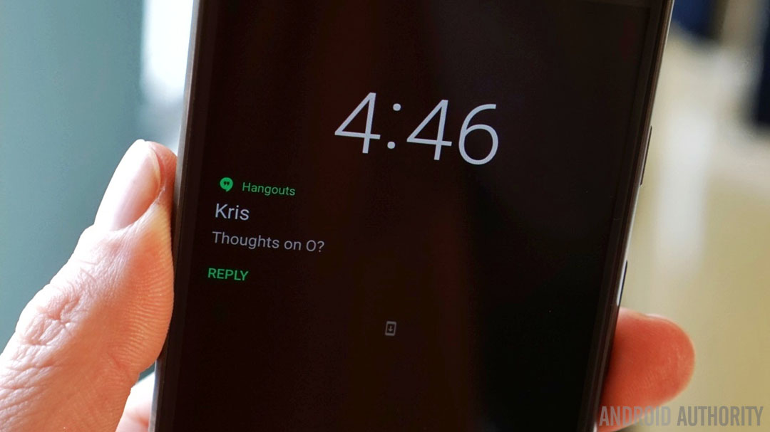
Since we’re talking about the lock screen, Ambient Display has also been revised. While this is more than likely just a developer preview issue, most of the time Ambient Display will only display the clock and some tiny app icons for any notifications awaiting you. With some app notifications, however, like Hangouts for example, you’ll see more information displayed, but only when the notification first comes in.
- Read more on custom lock shortcuts in Android O
Random changes, additions and omissions:
- The Easter Egg is the same cat catching game from Android Nougat
- The Downloads app is gone, replaced by a new Files app
- The Memory section has now been relegated to Developer Options
- If you're enrolled in the beta program you'll constantly see an update notification to roll back to Nougat
Like Android TV, Android O will deliver full support for picture-in-picture mode.
Picture-in-picture support
Like Android TV, Android O will deliver full support for picture-in-picture mode. You’ll already be familiar with this in the YouTube app, but when it is implemented across the board, app developers will be able to have their video apps continue playing in a small floating window while you navigate to other areas of the app or to completely different apps entirely. Android O will have support for custom controls like pause and play and developers will be able to set preferred aspect ratios.
Audio
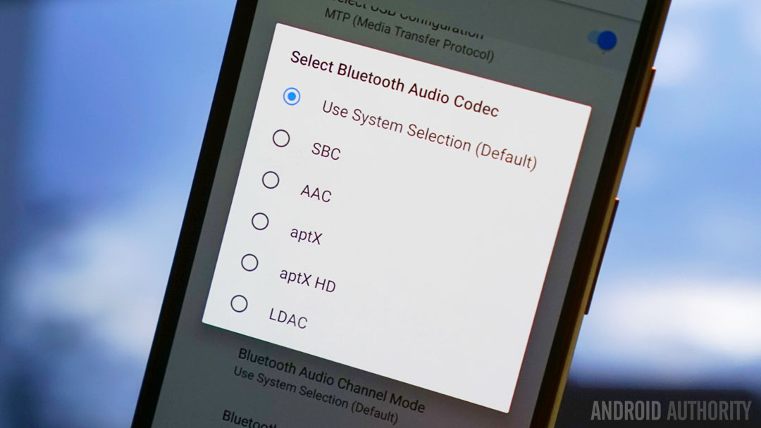
Sony donated their LDAC codec to Google for inclusion in Android O. That means if you have LDAC-equipped Bluetooth headphones you’ll get much better quality in Android 8.0. But the fun isn’t just restricted to LDAC, Android O also has support for aptX and aptX HD as well as SBC and AAC. There are also settings for audio sample rates and bits per sample too, plus Android O adds a native AAudio API for apps that require high fidelity, low latency audio.
- Read more about Android O Bluetooth audio support
Notification channels
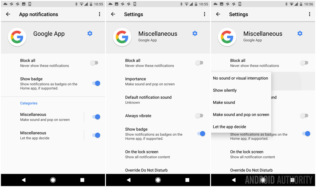
These aren’t yet widespread in Android O, but notification channels are a way for apps to split their notifications into various themes that you can choose to let through or block individually. So instead of picking between receiving dozens of notifications from Twitter every day or none at all, notification channels will allow you to let through the direct reply channel, for example, but block likes and retweets.
You’ll be able to manage these on the fly by long-pressing an app notification in the notifications shade or through the individual apps and notifications section in the settings menu.
- Read more about Android O notification channels
Notification channels are a way for apps to split their notifications into various themes that you can choose to let through or block individually.
Physical keyboard support
Hardware keyboards are going to become a bigger and bigger thing in Android as Chromebooks now have access to all Google Play apps and the mysterious Andromeda platform continues to lurk in the shadows. While we weren’t able to test out Android O’s hardware keyboard navigation support in any meaningful way, rest assured that Google is attempting to introduce more predictable standards for what the tab and arrow keys do when a physical keyboard is used to navigate Android.
We need hardware keyboard support now that Chromebooks have access to Google Play apps.
Unknown sources
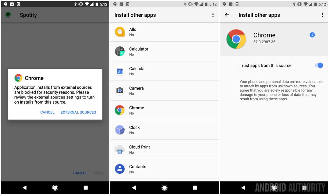
Adding apps from anywhere outside Google Play typically just required you to hit your security settings and enable Unknown Sources. But in Android O things get taken up a notch. You’ll now also have to grant permission to the app you’re using to download the APK.
For example, if you want to download an APK via Chrome, you’ll first be prompted to give Chrome permission to install other apps via the “trust apps from this source” toggle in the special access section of the apps and notifications setting. You only need to do this once per app however and you can always revoke permission at a later date.
Background process limits
Android O will severely limit background processes to intermittent windows of activity.
Google has been optimizing Android more and more lately to limit the amount of battery drain and resource use that apps are allowed to do in the background. As we’ve seen a lot lately, advanced users will have control over exceptions to these rules, but by and large, Android O will severely limit background processes to intermittent windows of activity controlled by the job scheduler.
- Read more on background limits in Android O
Adaptive icons
Adaptive icons are a fancy way of saying that Google is making an attempt to tidy up the hot mess of inconsistent app icons in Android. They basically provide app developers with multiple shape templates for each icon that adapt to the device they appear on. So if the default app icon shape for your phone is a rounded square then that’s what you’ll see across the board. Rock a Pixel with circular icons and you’ll no longer see weird square icons mixed in with all the round ones. On that note, the nav buttons change from white to black when opening the app drawer now too.
- Read more on Android O adaptive icons
Autofill API
The Autofill APIs introduced with Android O simply try to help apps manage passwords and form data better than in previous versions of Android. As Google notes in its blog post, “Users can select an autofill app, similar to the way they select a keyboard app. The autofill app stores and secures user data, such as addresses, usernames, and even passwords”. We’ll have to wait a little while until app developers make full use of the Autofill APIs in Android O, but we should see much more capable password managers in future.
- Read more about the Autofill API in Android O
Wider color gamut for apps
Android developers can now take advantage of devices that have a wide-gamut color capable display.
Android O adds support for “wide-gamut color for apps” which sounds a lot like native HDR support but which is actually just a larger palette of supported colors for app developers.
As Google notes in the blog post, “Android developers of imaging apps can now take advantage of new devices that have a wide-gamut color capable display. To display wide gamut images, apps will need to enable a flag in their manifest (per activity) and load bitmaps with an embedded wide color profile (AdobeRGB, Pro Photo RGB, DCI-P3, etc.)”.
Is it daily driver worthy?
The first question on everyone’s lips is whether or not Android O developer previews are daily driver material. In my experience with all four of them (barring the abysmal third preview), the answer is a resounding yes. As far as dev previews go, Android O has been remarkably stable since day one, and now that we’re at the final developer preview things won’t get much more stable than this, so if you’re keen to try it out, fear not.
Conclusion
With only a few weeks of bug squashing left, Android O is shaping up to follow very much in Nougat’s footsteps, completing some of the work started in Nougat and further strengthening the granular nature of control in Android. User-facing notification and permission management are better than ever before and Android itself is taking an even more aggressive stance to apps that treat precious system resources with reckless abandon.
Android O completes some of the work started in Nougat and further strengthens the granular nature of control in Android.
Other than apparently having an entire team whose job it is to constantly come up with new ways to group things in the Settings menu, there are very little superficial changes here. Ushering in the next phase of Android peripherals is clearly a focus too, with better support for Bluetooth audio and hardware keyboards. But Android O is also catching up on a lot we’ve been waiting for, from adaptive icons, to the Autofill APIs, picture-in-picture mode, app badges and nav bar tweaks.
As in previous years, the first and second developer previews were the most feature-rich, with only a few notable additions in subsequent previews but a lot more subtractions as Google got a grip on what was possible in the time remaining. Several features won’t make the Android 8.0 cut, like the long-awaited dark theme, but others, including the ability to change the shapes of app icons and add custom navigation keys, might just make it into Android 8.1 yet.
Have you flashed Android O? What are your thoughts?
Thank you for being part of our community. Read our Comment Policy before posting.