Affiliate links on Android Authority may earn us a commission. Learn more.
Android O Quick settings have been slightly reworked [Diving into Android O]
Published onMay 18, 2017

For every big change that comes with a new Android release, there are typically dozens, if not hundreds, of very minor changes that you might overlook at first glance. One of these such minor changes has to do with Quick Settings.
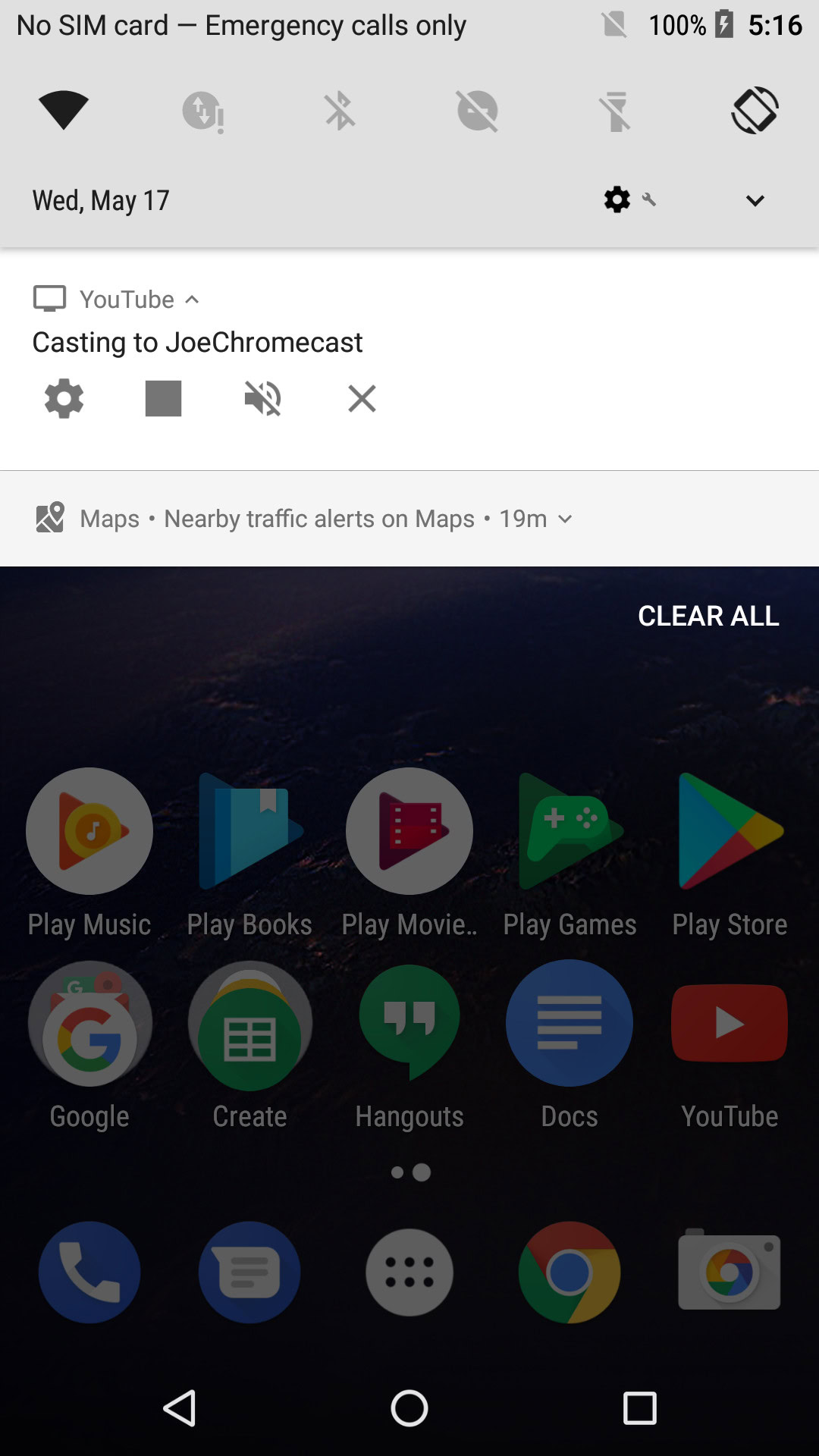
Going back a few years now, the quick settings area was dominated by a teal/dark color palette, but no longer. Android O Developer Preview 2 has now introduced a grayscale theme that honestly, I have to say looks much nicer to me because I like that minimalist look. Of course, I’m sure not everyone is going to agree.
In addition to the color, a few things have been moved around. Settings, time, and profile are now at the bottom of the quick toggles when you bring them down. They are also at the bottom of quick settings when you pull it down. Previously, the time and date were on the top left, with settings and expand buttons on the top right. Lastly, at least a few icons have been minorly reworked as well.
That’s about it. All in all, a pretty minor change, but one worth pointing out. For more, be sure to check out our Diving into Android O series.