Affiliate links on Android Authority may earn us a commission. Learn more.
Android P revamps the nav bar and recent apps menu – check it out now
Published onApril 16, 2018
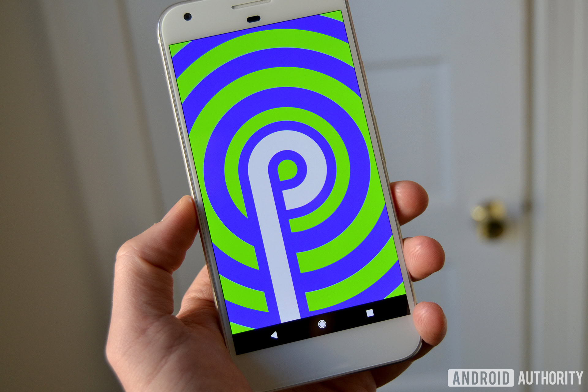
- The Android P nav bar gets a complete revamp, with a new home “pill” icon, a contextual back button, and the removal of the recent apps button.
- The recent apps section also will be revamped from a vertical scroll to a horizontal scroll.
- 9to5Google made some artist’s renderings of the changes which we’ve posted below. However, these are not real screenshots.
The Android P developer preview launched about a month ago. While there were certainly some new and interesting things to see in the “first draft” of the next iteration of the Android operating system, it didn’t seem like any revolutionary changes happened. However, the developer preview is just that — a preview. Things are still in the works and could drastically change between now and the stable release.
With that in mind, 9to5Google obtained information from an inside source on how the navigation bar and the recent apps section of Android will be revamped for Android P. We’ll tell you how it works and show you an artist’s interpretation of the new elements. Before we do, please keep in mind that this is not an official guide, and these aren’t screenshots. This is all based on an anonymous source, so take it with a grain of salt.
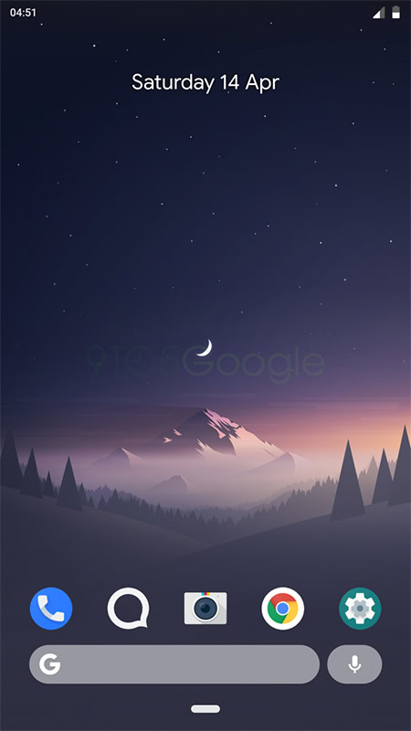
First up, the navigation bar is doing away with the circle icon that represents a Home button, instead using a “pill” icon. This information was actually leaked by Google in a screenshot on the Android Developers Blog, which was almost instantly removed, cropped, and re-uploaded.
The square icon that you’d usually tap in the nav bar to see your recent apps is removed entirely. Instead, you’ll swipe up on the pill icon to access the recent apps page.
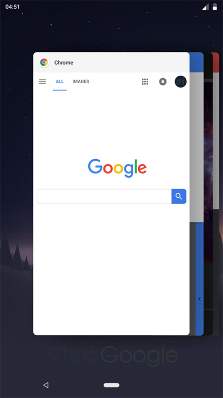
Once you are looking at your recent apps, you’ll see a horizontal layout rather than the current vertical layout. Things work the same way; it’s just that instead of swiping up and down to scroll through your open apps, you’ll swipe from side to side.
To go back home, you’ll tap the pill icon, much as you would now with the circle home icon.
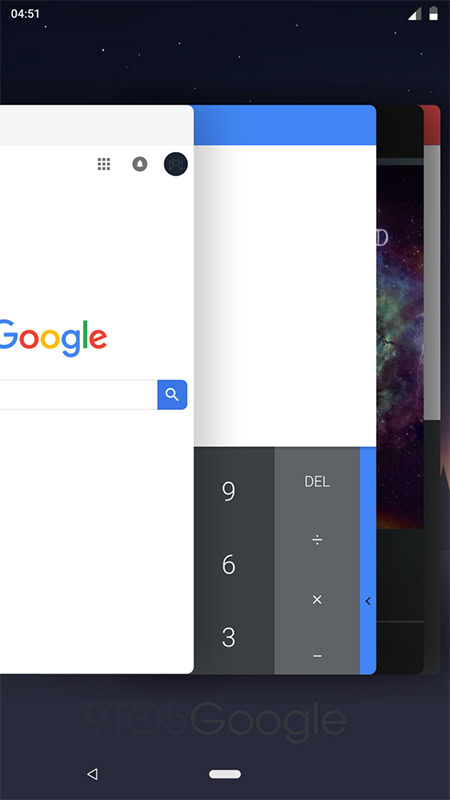

As far as the back button goes, it appears Google is making it more contextual. For example, there’s no need for a back button when you’re on the home screen, so it automatically vanishes there. However, for now, it seems to reappear when you are in the recent apps section, which seems superfluous since you would hit the pill icon to go back home and thus not need a back button.
However, this could be changed at any point between now and the stable release of Android P.
With Google I/O right around the corner, you can expect a lot more Android news to drop soon. Remember that until Google officially announces something, it needs to be viewed as speculation and rumor only. That being said, what do you think about these potential changes?
NEXT: Do Google’s new wallpapers include an Android P name hint?