Affiliate links on Android Authority may earn us a commission. Learn more.
Diving deeper into Android P's new notifications and quick settings
Published onMarch 8, 2018
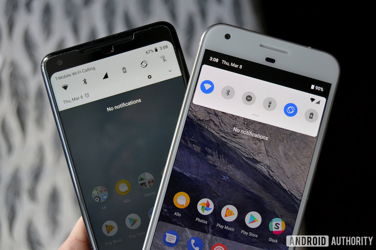
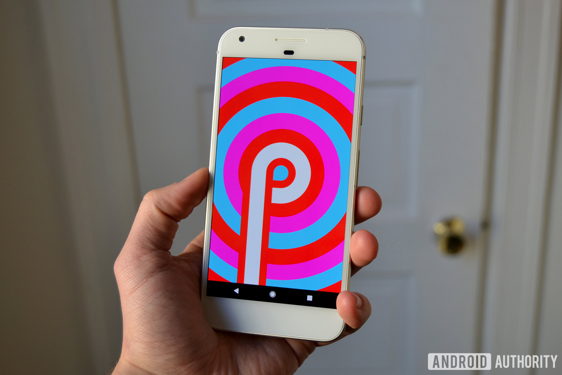
Even in its alpha state, the first Android P Developer Preview includes a slew of user-facing and underlying changes to tinker around with. Some of the more significant changes include a redesigned notification panel and “messaging” notification style that is reminiscent of iOS in more than one way.
When you first swipe down from the top, you will notice how different the notification panel appears. Google went for a rounded-corner aesthetic for the quick settings and notification areas, which are now slightly separated from each other. This differs from Android Oreo, which separates the two areas with a gray line.
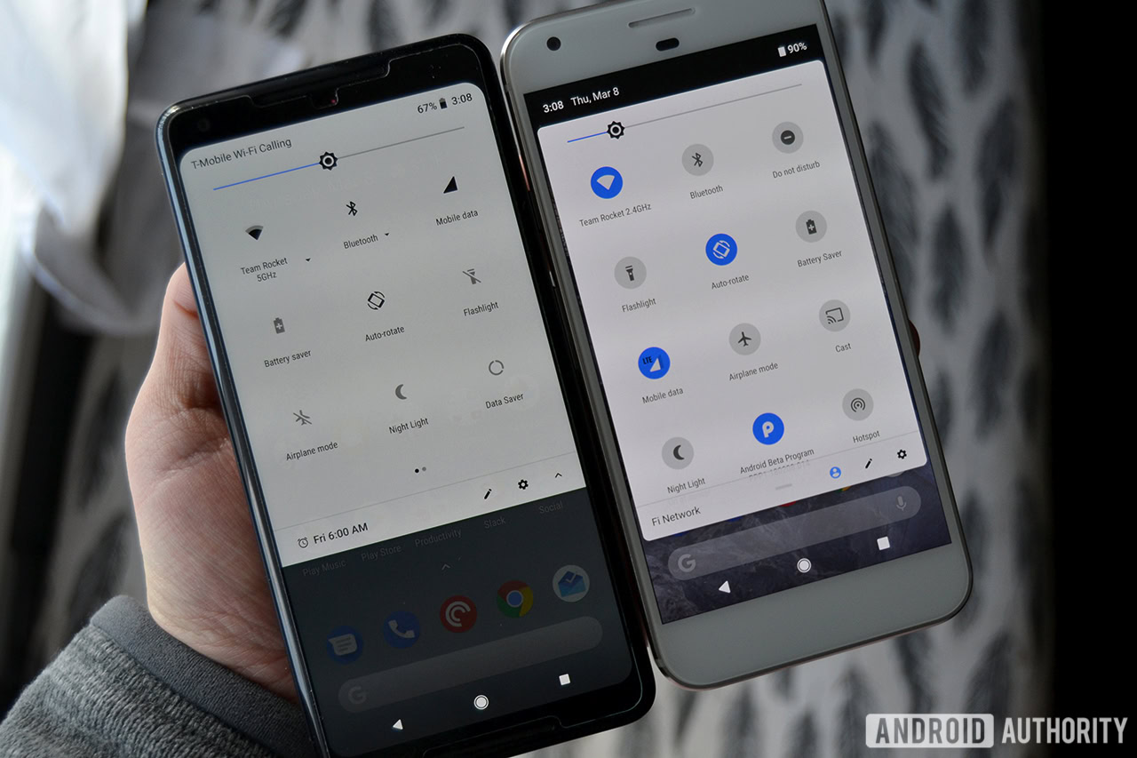
Apart from the rounded corners, the quick settings area also features a bit of color. When Wi-Fi or Bluetooth is on, for example, the icon bubble turns blue. When either is inactive, the icon bubble turns gray to stand out from the white, non-translucent background.
Unfortunately, you cannot further expand certain quick settings for more information. You can either toggle the setting on or off, or press and hold a quick setting to jump into Settings for more information.
Continuing our quick settings area tour, it no longer scrolls horizontally as it does in Oreo. Instead, as you add more quick settings, you can vertically scroll through them in a single-card view.
Other smaller changes include the time and date on the top left and battery percentage on the top right, carrier information on the bottom left, and the inability to get into Settings from a single swipe down.
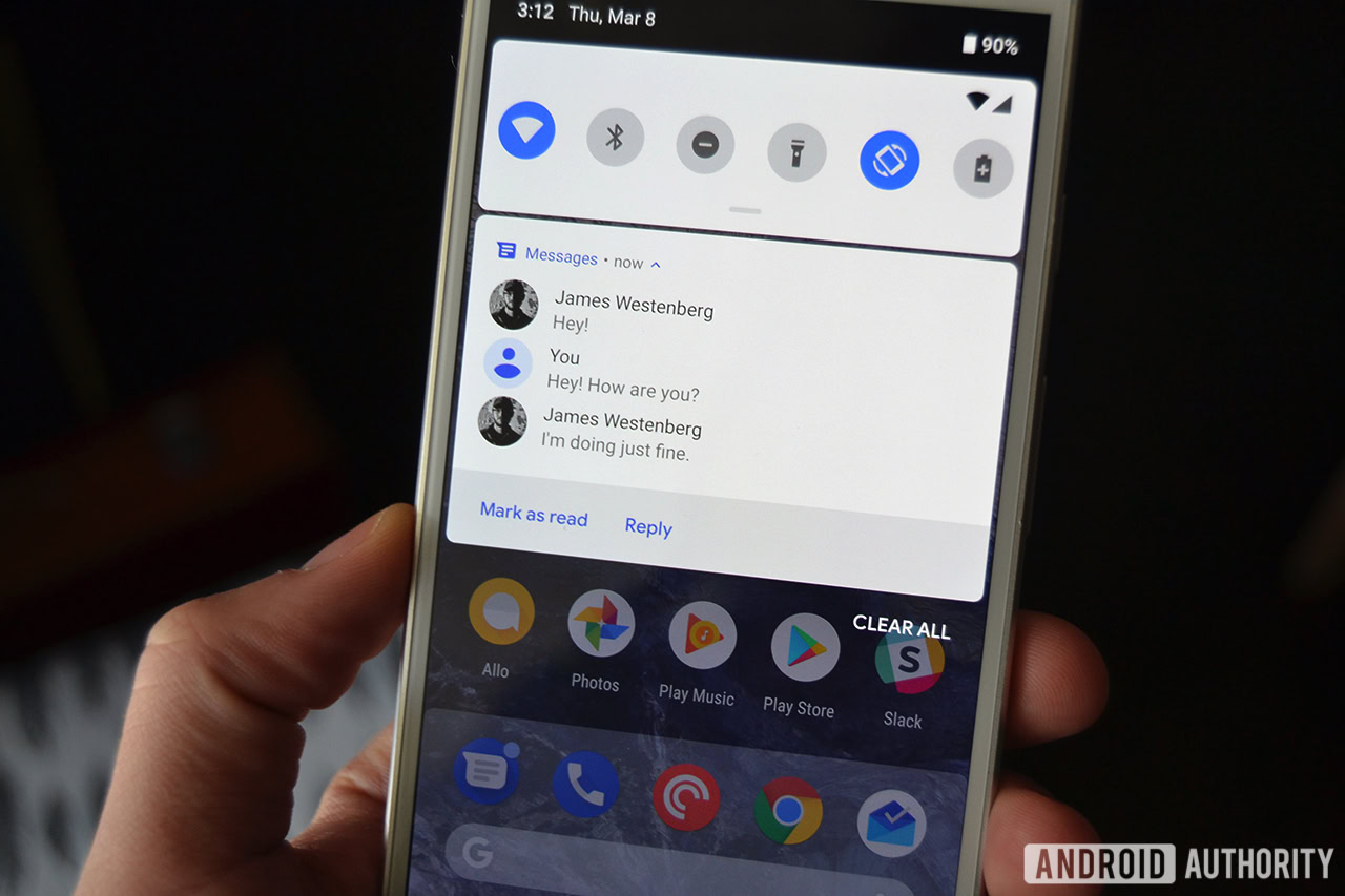
Moving to the notification area, the biggest change is with the revamped “MessagingStyle” notification type. Android P displays more contextual information from your conversation, including a few lines from you and your contact, full images, and Smart Replies. Originally an experiment that manifested into the “Reply” app, in-notification smart replies are now baked into Android.
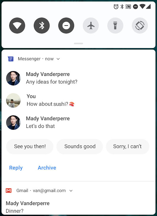
The feature scans your messages and, with machine learning, suggests three custom replies. These replies are usually short and terse, but are useful if you are in a hurry and do not have time to type out a full reply. You can still type out something for yourself, but Google presumably hopes that more folks give the feature a shot.
Android Messages already works with the revamped notification type, so developers will have to integrate the API into their messaging apps if they want to take advantage of the new features.
These changes might not be ground-breaking, but remember that this is the first Android P Developer Preview. We still have at least four more releases to go until we get the final release, so we could see more changes and enhancements to how Android P handles notifications.