Affiliate links on Android Authority may earn us a commission. Learn more.
Android P's Quick Settings menu interface gets a new design
Published onMarch 7, 2018

- The new Android P Developer Preview 1 includes some visual changes to the Quick Settings menu.
- All of the menu’s icons now have a circular design, and they also come with some blue color accents.
- Also, you can now just scroll down to see all of the icons in the menu.
The just released Android P Developer Preview 1 brings with it a bunch of new features, improvements and changes. One of things that has visably changed is the Quick Settings menu, which has a couple of noticable design alterations.

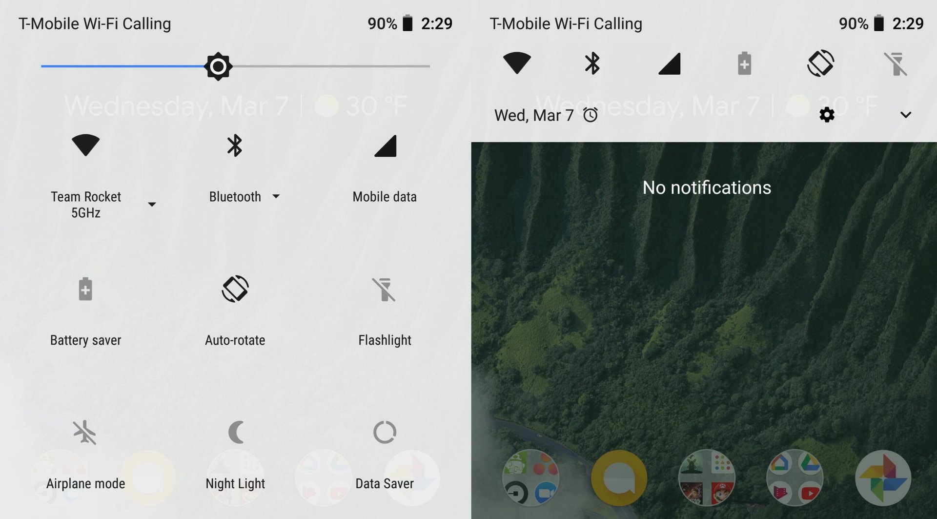
In the current Android 8.1 Oreo, bringing down the Quick Settings gives phone owners a rather bland looking interface with black and grey logos on a light grey back ground.
However, as you can see from the images above, the Quick Settings menu with Android P has now got a bit more lively, with the icons now showing up with blue color accents. In addition, you will notice that the icons in the menu now all have a circular look to them, in contrast to the stand alone icons found in Oreo.
One other bit about Quick Settings in the Android P Developer Preview is that you can now scroll down to see all of the available icons when the menu is fully open, rather than having to go through pages to see all of them.
What do you think of the new look of the Quick Settings menu in Android P? Do you like it that you can just scroll down to see all of the menu’s icons? Also be sure to check out our Diving into Android P series, where we highlight some of the new features as we stumble upon them.