Affiliate links on Android Authority may earn us a commission. Learn more.
Everything new in the sixth Android Q developer preview
Published onAugust 7, 2019
The sixth Android Q developer preview is here!
The first and second developer previews may not have brought a ton of user-facing changes, but that certainly wasn’t the case for Android Q beta 3. A system-wide dark mode, a new gesture navigation system, and much more were added to the third Android Q preview. The fourth beta build was much more about refining Android Q. Instead of shaking things up, Google decided to introduce new theme colors, slightly tweaked icons, and more. Android Q beta 5 was in a similar boat, gaining improvements to gesture navigation, Google Assistant “handles” to make it easier to trigger Assistant from any screen, and more.
Now, Google is rolling out Android Q beta 6. This is the final beta release for Android Q ahead of the official, consumer-ready version that’s launching sometime in Q3 2019. Aside from improved gestures, you should find general performance improvements and bug fixes throughout this build.
Here are all the changes we’ve been able to find so far.
Further reading: How to install Android Q on your phone right now
Android Q Beta 6
Back gesture sensitivity
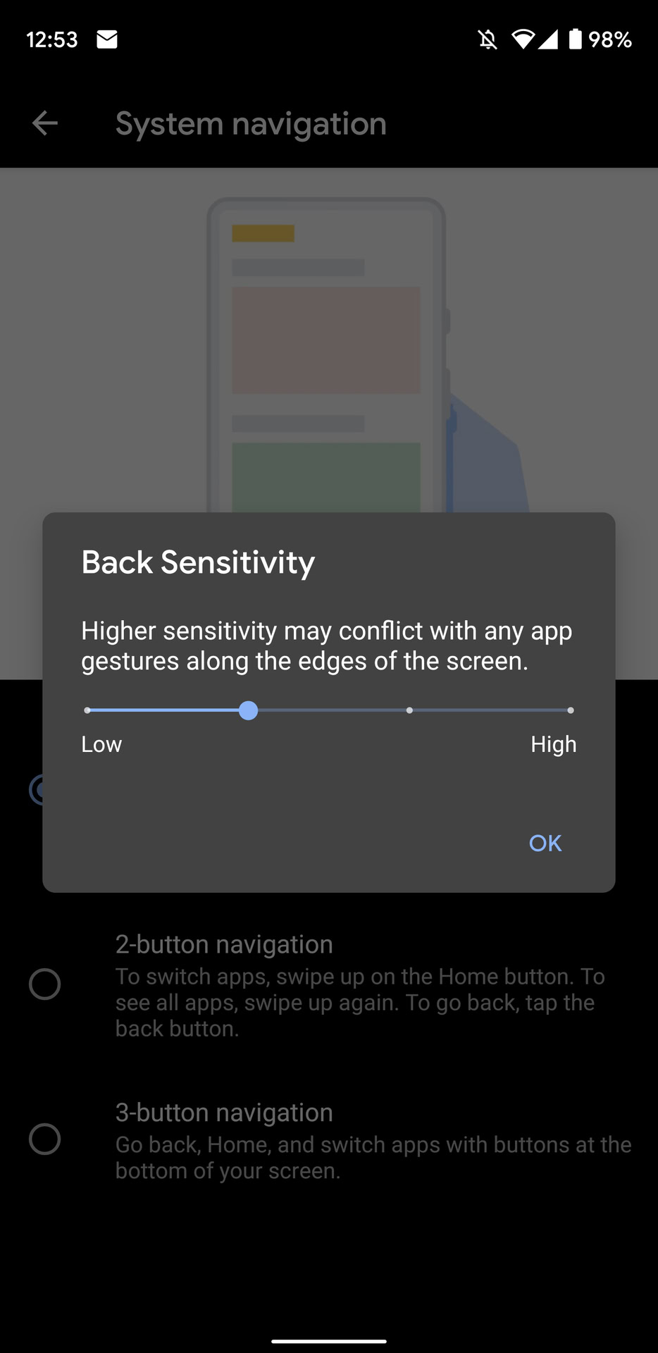
Android Q beta 6 adds a new “Back Sensitivity” option if you choose the “gesture navigation” option in the System navigation settings. Just click the settings cog on the right side of the “gesture navigation” option and you’ll be presented with a slider with four different sensitivity levels. The default is the second sensitivity level.
I’ve tested out all four levels and the default is by far the best for me. Switching it to the first sensitivity level makes it way too difficult to trigger the back gesture, so this might be a decent option if you’re always triggering the back gesture by accident. Alternatively, the fourth sensitivity level is very touchy, which means you should choose this option if you have trouble triggering the back gesture.
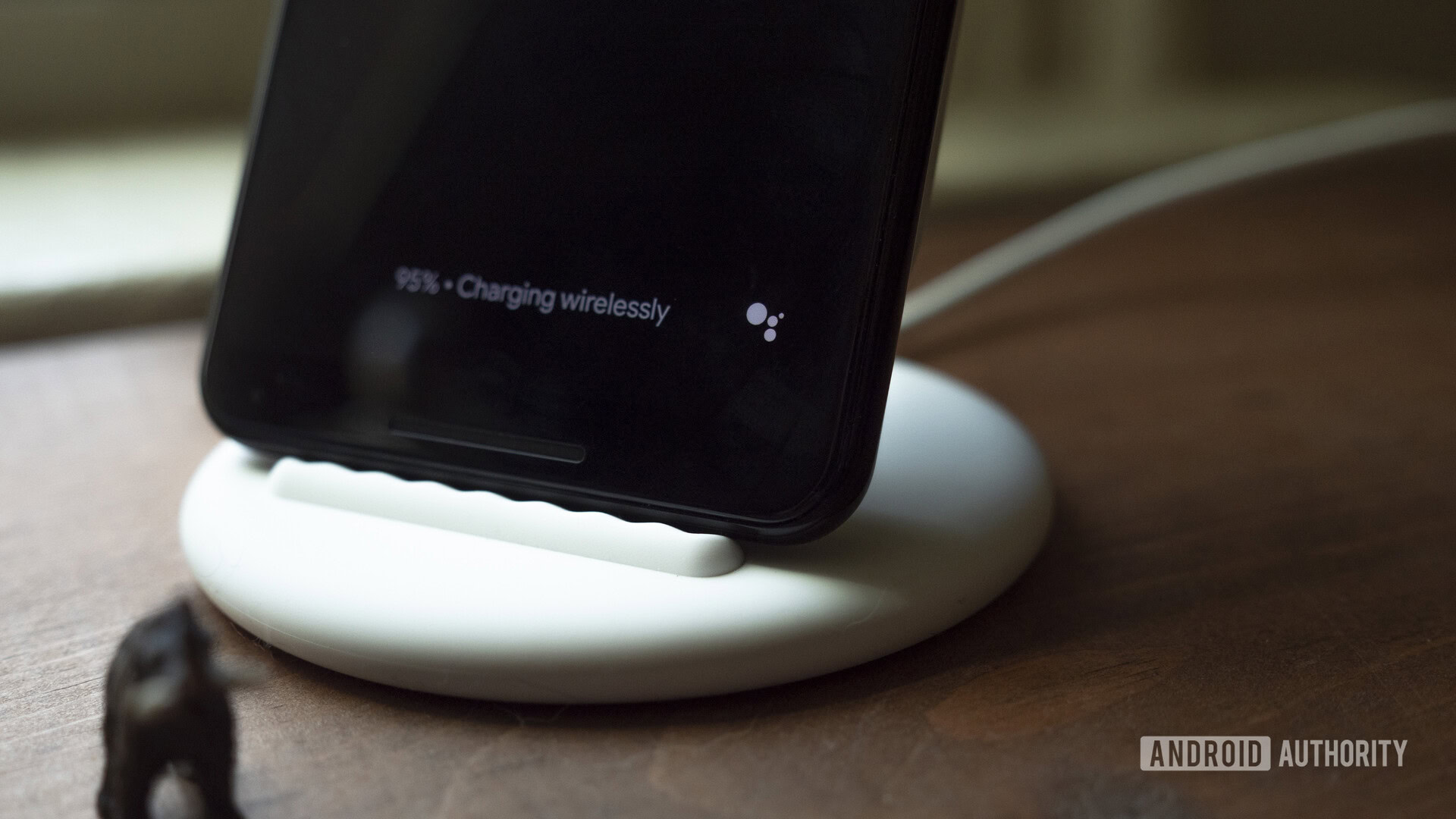
Google Assistant icon on Pixel Stand ambient mode

New in Android Q beta 6 is a small, black and white Google Assistant icon on the Pixel Stand ambient display (h/t Justin Duino). When tapped, the icon will bring up Google Assistant voice search.
This new icon is only available on the Pixel 3 and 3 XL, as the Pixel and Pixel 2 do not support wireless charging. Thus, they don’t have access to the Pixel Stand ambient mode.
Fewer Google Assistant “handles”
Android Q beta 5 introduced Google Assistant “handles” – little curved lines on the bottom two corners of the display that prompted the user to activate the Assistant by swiping in from the corners. The handles appeared all the time in beta 5, but they’re much more subtle in beta 6.
Notably, they don’t appear on the Pixel’s always-on display in beta 6, but they do in beta 5. They’re also much quicker to vanish on the home screen on beta 6 compared to beta 5.
No more gesture navigation bar on the home screen
In Android Q beta 6, the small gesture navigation bar on the bottom of the display no longer shows up on the home screen. Previously, it showed up on just about every screen in Android Q beta 5 and earlier.
Night Sight is now a default camera setting in Google Camera
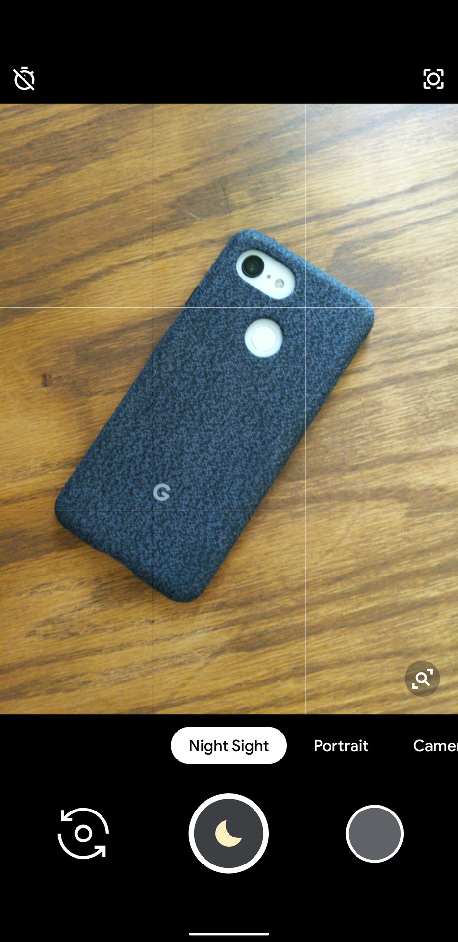
You can now get to Night Sight mode much easier. Previously, you’d need to go to the More settings in the Google Camera app to reach Night Mode. Now, it’s a simple swipe or two away on the main camera interface.
New emergency icon in the power menu
This one is short and sweet. Check out the difference in the screenshots above.
Android Q Beta 5
Google Assistant “handles”
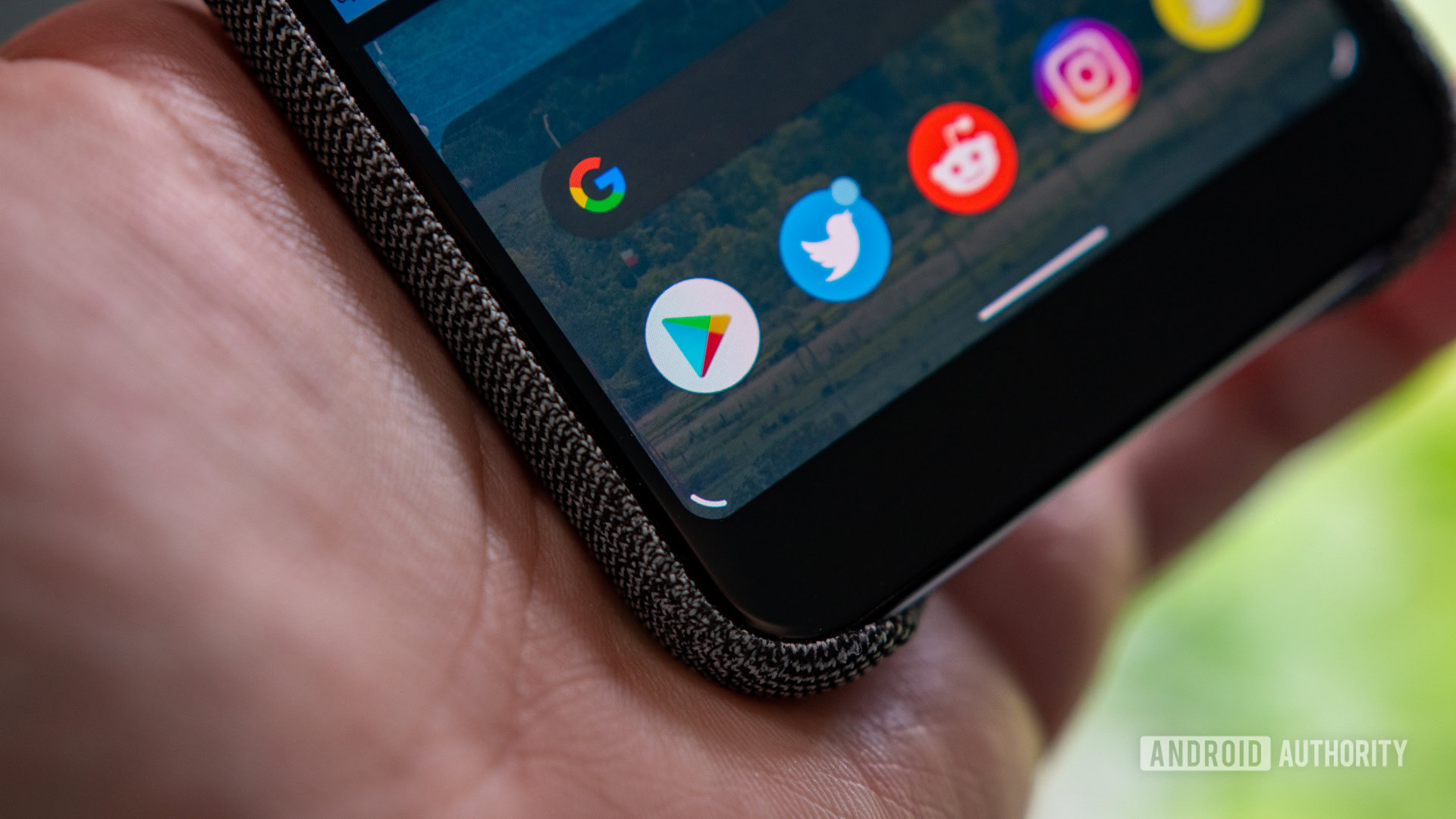
As mentioned by Google in the Android Q Beta 5 announcement, the company has implemented what it calls “handles.” As there is no Home button to long press to trigger the Assistant while using Android’s new gesture navigation system, Google needed a way to still give users access to the voice assistant.
This minor UI element pops up in both of the bottom display corners to let you know where to swipe from. They only appear for a second while switching apps or opening the Recents menu. A multi-colored animation will play at the bottom of the display to indicate that the Google Assistant is launching.
Navigation drawer peeking
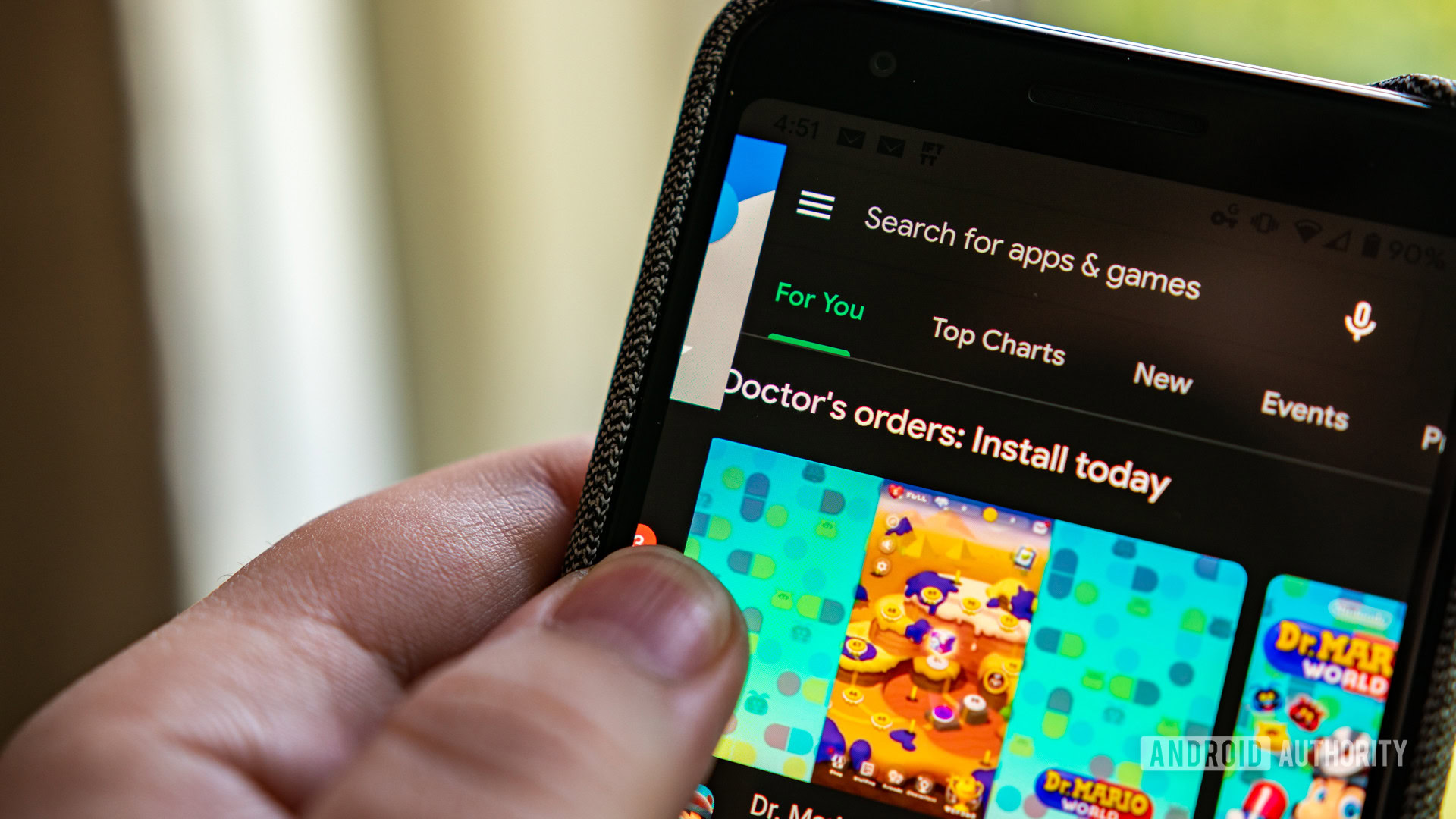
Love it or hate it, Android Q’s new navigation system is here to stay. While you can switch back to the old three or two button setup, it’s clear that Google envisions a future of swiping around the operating system. The problem with this change is that it introduces a new back button that works by swiping in from the left or right edge of the display. This new feature broke support for navigation menus that also relied on an inward swipe.
Android Q Beta 5 sort of fixes this problem. As hinted at earlier this month by a Googler, the firmware now supports “peeking.” Now, if you want to access an overflow menu, you need to precisely place and hold your finger on the very edge of your screen for a full second. A slow or fast swipe will trigger the back action.
The process isn’t the most intuitive, which is why it took 9to5Google and the rest of the internet half a day to figure out how to make it work.
Silent notifications
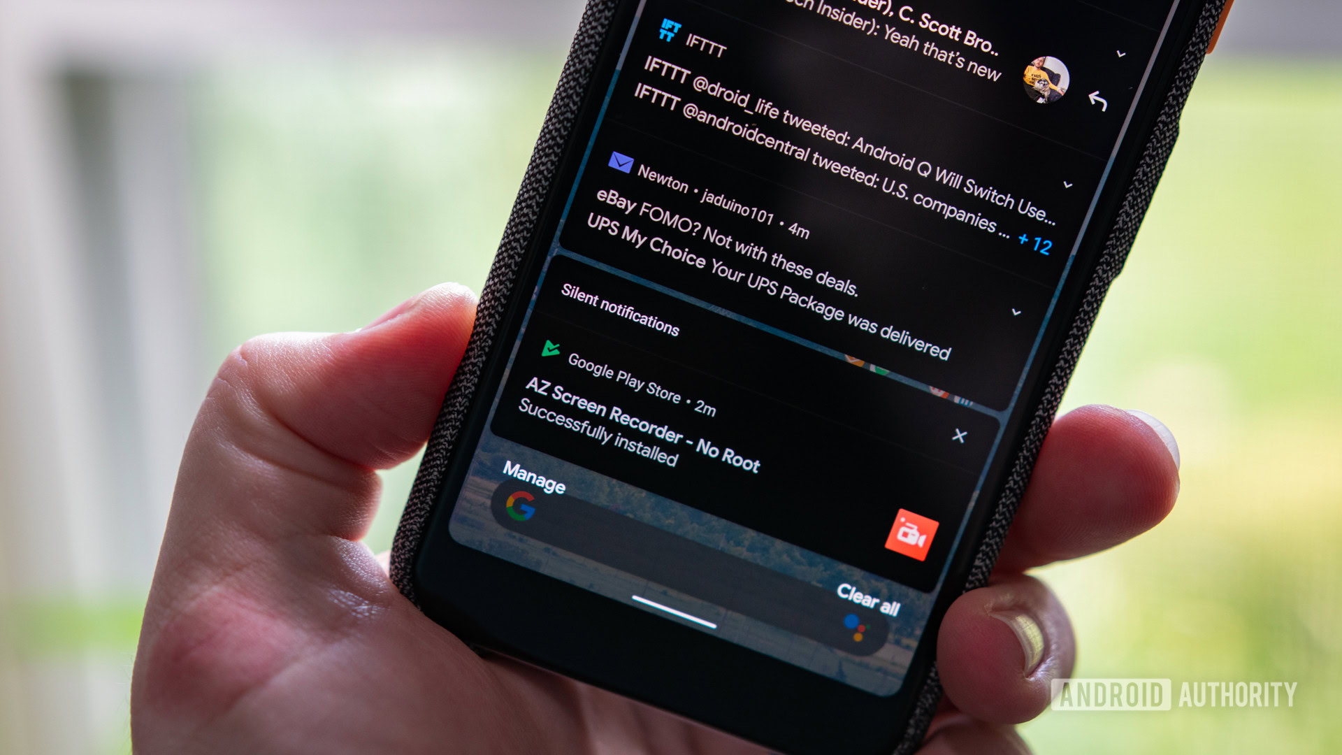
Google spent a lot of time at I/O 2019 talking about Digital Wellbeing and making Android less distracting. One way it did this was by silencing and not showing some notifications that it believed to be less important.
With Android Q Beta 5, these silenced notifications are now being grouped. You won’t see the notification on the lockscreen or in the status bar, but you will see everything added to a small section after swiping down the notification shade.
Dark boot animation
Android Q is all about dark mode. With Beta 5, this new theme is making its way to the operating system’s boot animation. To enable the feature, all you need to do is turn on the dark theme within the phone’s Display settings.
For now, the dark theme appears to only work on the Google Pixel 3 and Pixel 3 XL. Newer handsets, as well as the Pixel 3a line, don’t appear to support this feature just yet.
Screen pinning with gesture controls
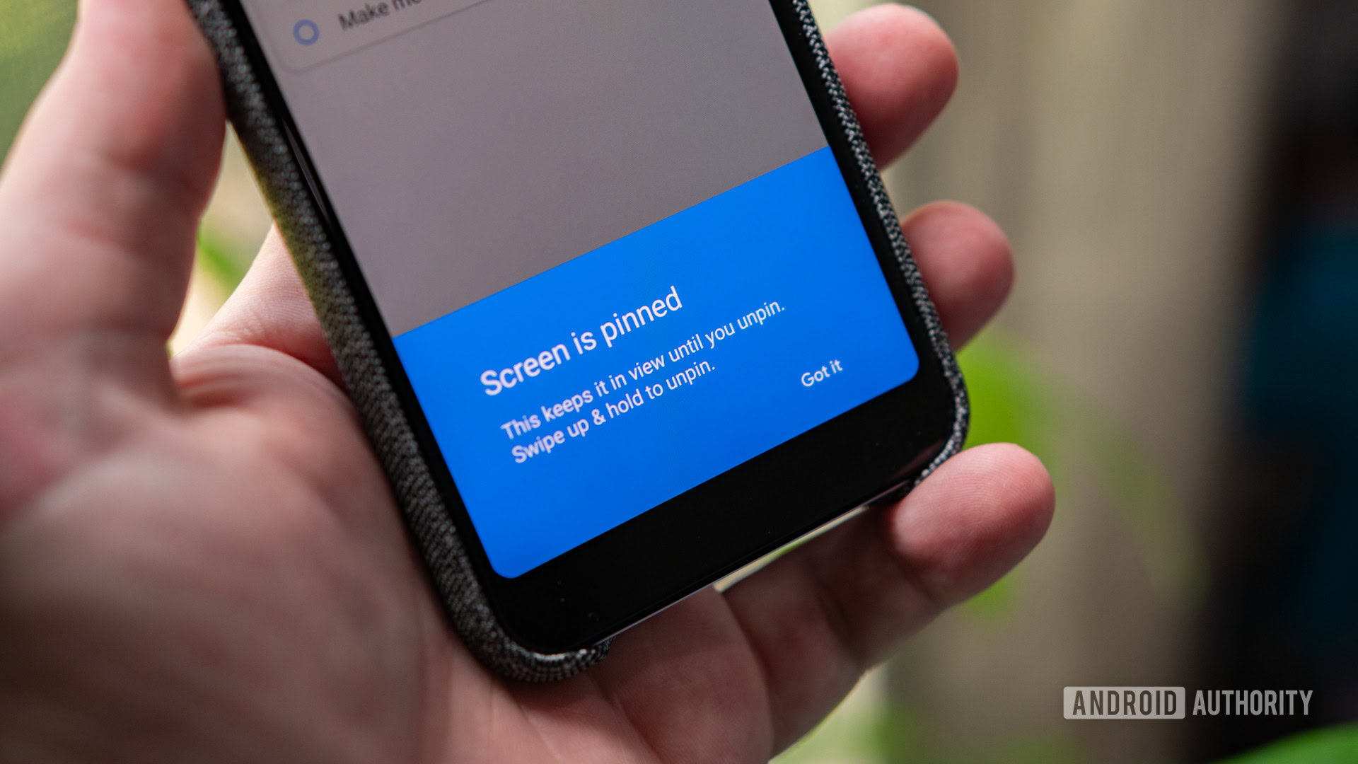
When Google introduced gestures into Android Q, it removed the ability to pin apps. As the procedure of holding down the Home and Back button at the same time was no longer an option, the feature was removed. With the release of Beta 5, Google has brought back screen pinning and found a way to make it work with gestures (via 9to5Google).
To use the feature, you’ll first need to enable screen pinning. To do this, go to Settings > Security > Screen pinning. After it is toggled on, open an app and half swipe up to jump into Recents. Tap on the app’s icon and choose Pin. As seen above, swiping up and holding will unpin the app.
Squeeze to talk
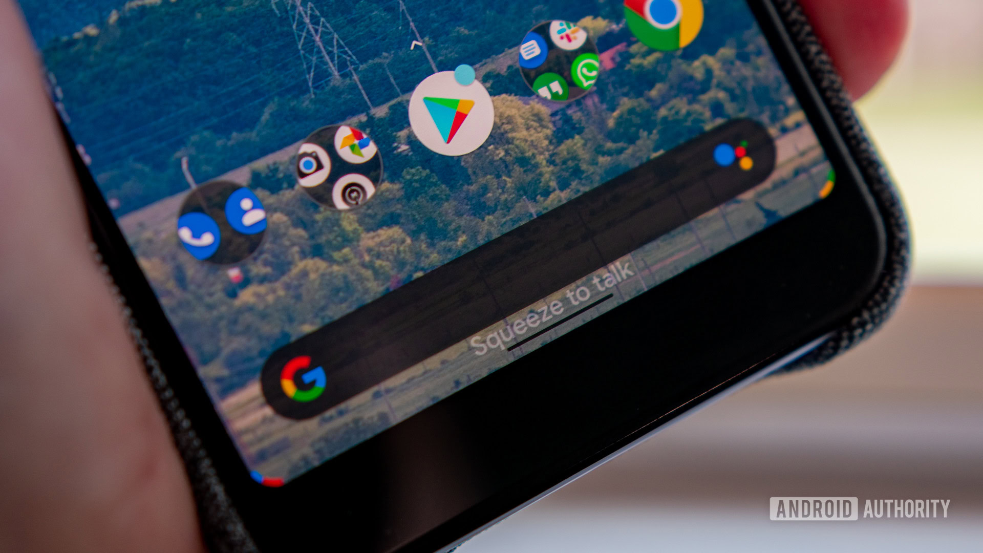
Active Edge allows some Pixel owners to launch the Google Assistant by squeezing the sides of their handsets. To go along with the “handles” animation, there is a new “Squeeze to talk” dialog that pops up when using Active Edge (via 9to5Google). The message only pops up when you squeeze extremely slowly.
Force dark mode is back
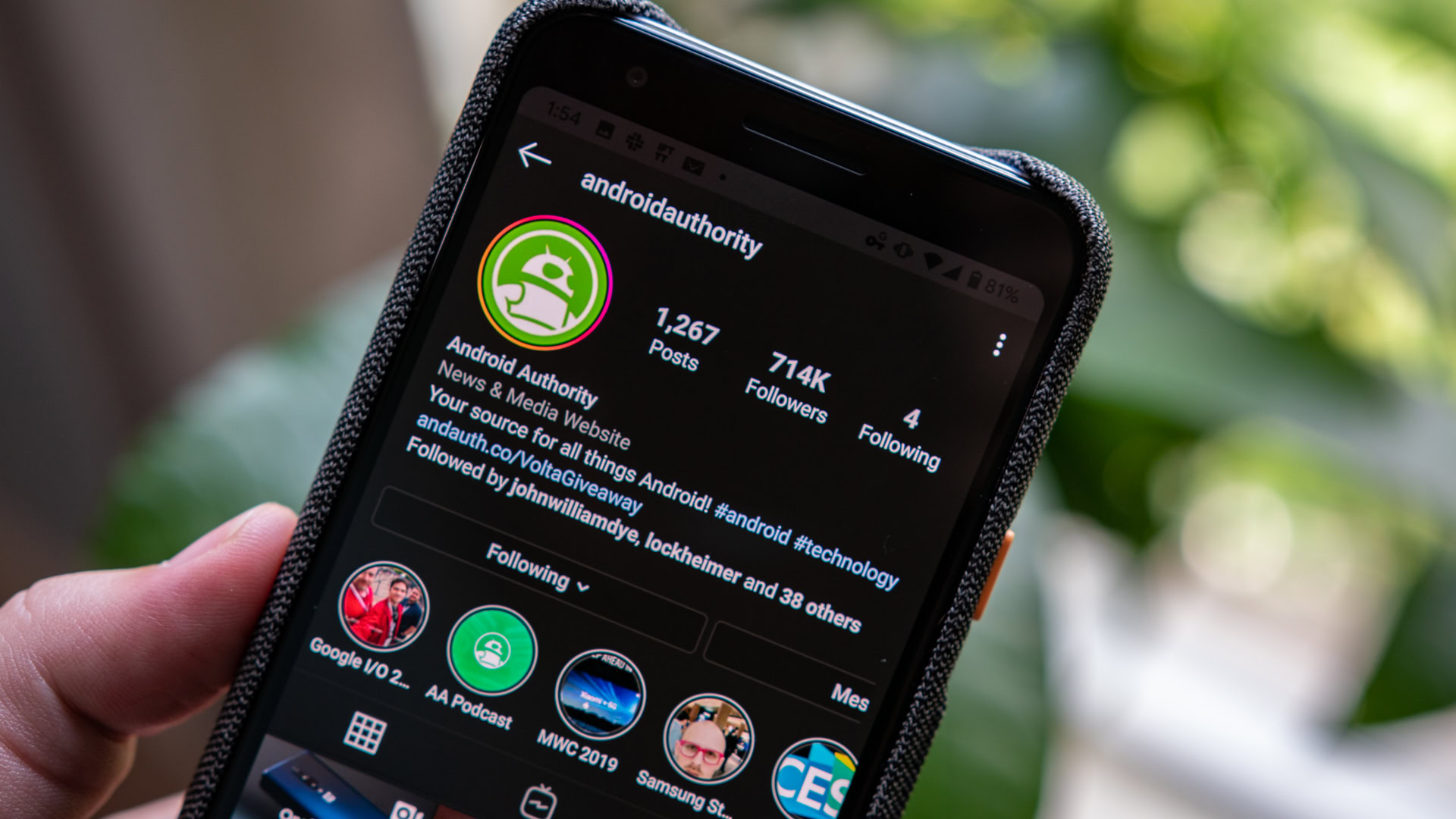
When Google rolled out Android Q Beta 3, it included a feature that would force dark mode within apps. This was great for apps like Instagram that haven’t implemented its own theme changer. Unfortunately, the functionality broke with Beta 4.
We’re happy to report that things are back in working order with Android Q Beta 5. Follow this guide to enable the feature.
Minor UI changes
There are a handful of almost unnoticeable UI changes sprinkled throughout the update. Some that we spotted include a thinner lock icon on the lockscreen and a slightly lighter background in folders.
Android Q Beta 4
New accent colors
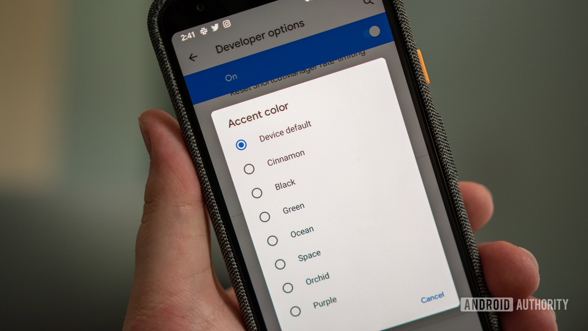
The first Android Q developer preview launched with a limited number of theme options. In addition to the Pixel’s default blue accent color, users could switch between black, green, and purple. With Beta 4, Google has added four more color options (via 9to5Google).
As seen below, the new accent colors include cinnamon, ocean, space, and orchid.
You can access the new color options by going to Developer options > Accent color.
Face authentication
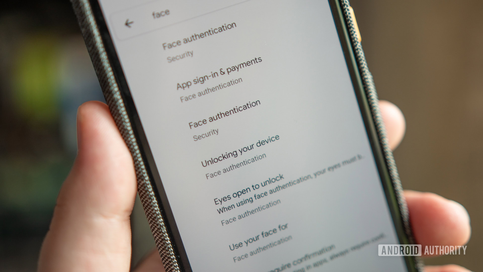
Android has had a basic form of facial recognition built into the operating system for quite some time now. It isn’t the most secure, so OEMs typically developed systems for individual devices.
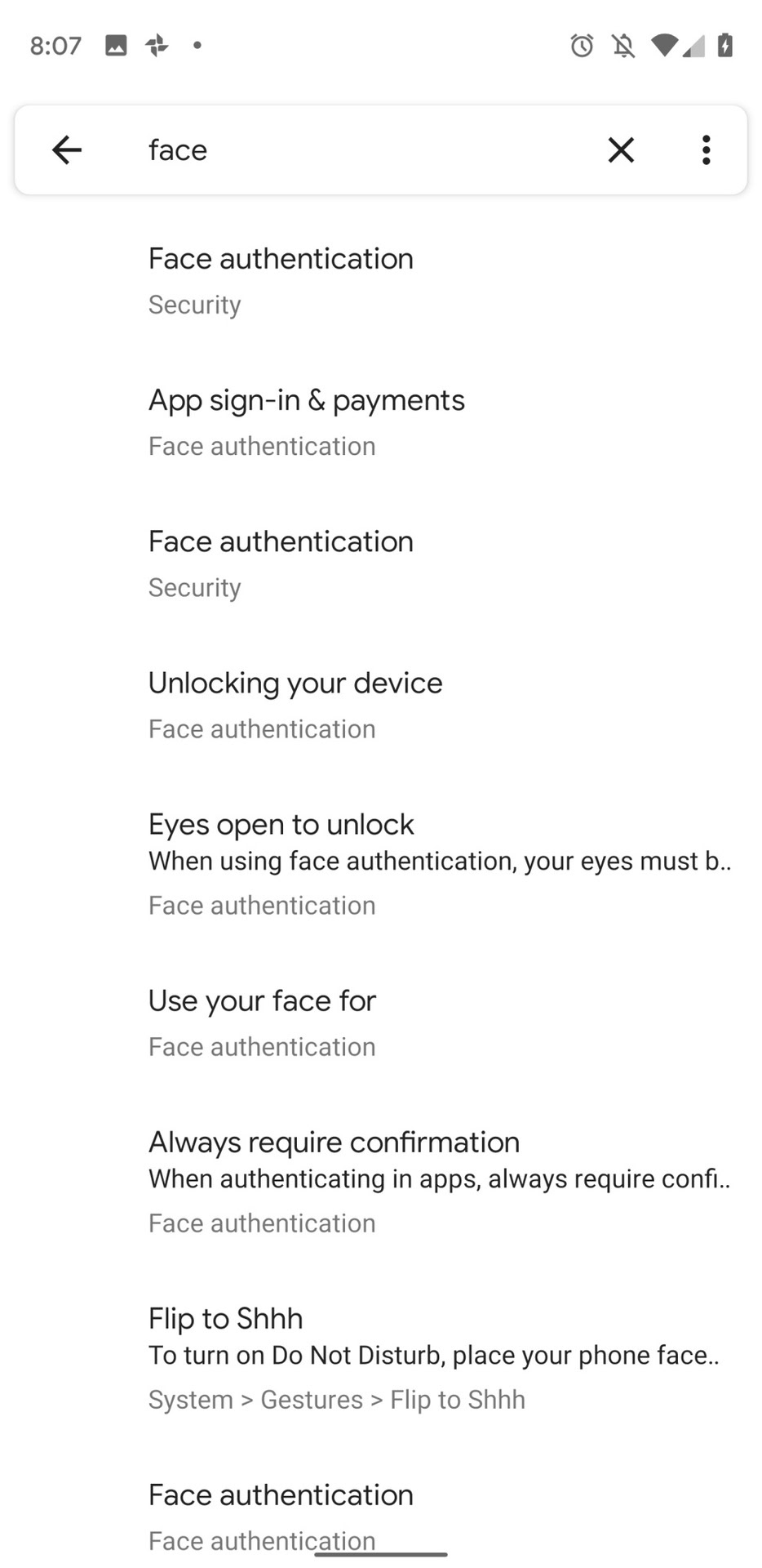
Thanks to some snooping done by 9to5Google, it appears as though Google close to finishing a new face authentication feature. Information is still scarce, but the below screenshot shows that when the option is completed, users should be able to use their face to unlock the handset, sign into apps, and more.
9to5Google also found evidence within the new Settings app that points to the option to delete face data.
Lock screen icon location
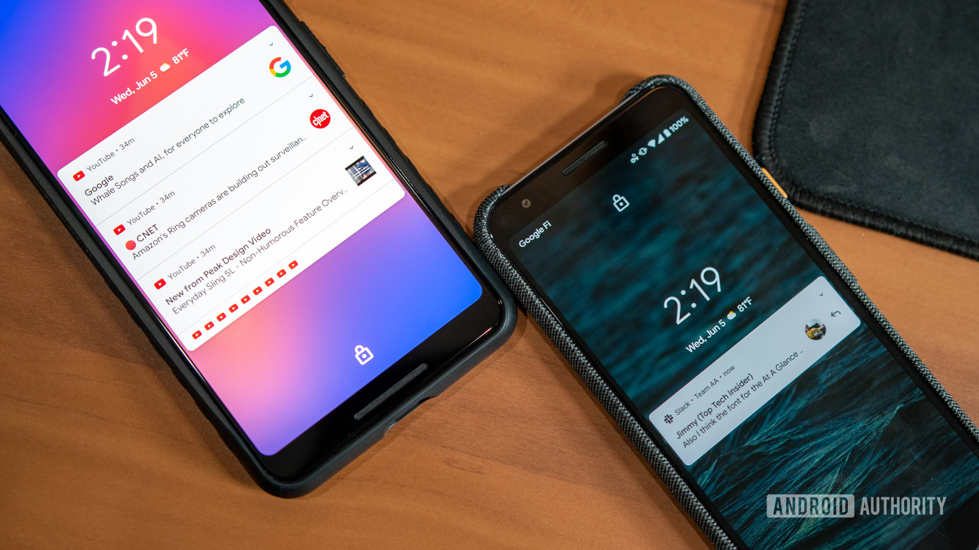
This is a small change, but Google moved the lock icon from Android’s lockscreen to the top of the screen. As you can see, the icon was previously located at the bottom of the display just above the area where you would swipe up to unlock the device.
Interestingly, Apple made a similar change not too long ago. For iOS, the icon at the top of the screen made sense as the Face ID technology is located at the top of the device. If Google is working to bring more robust face authentication to Android (see above), this change makes sense.
Improved back gesture icon
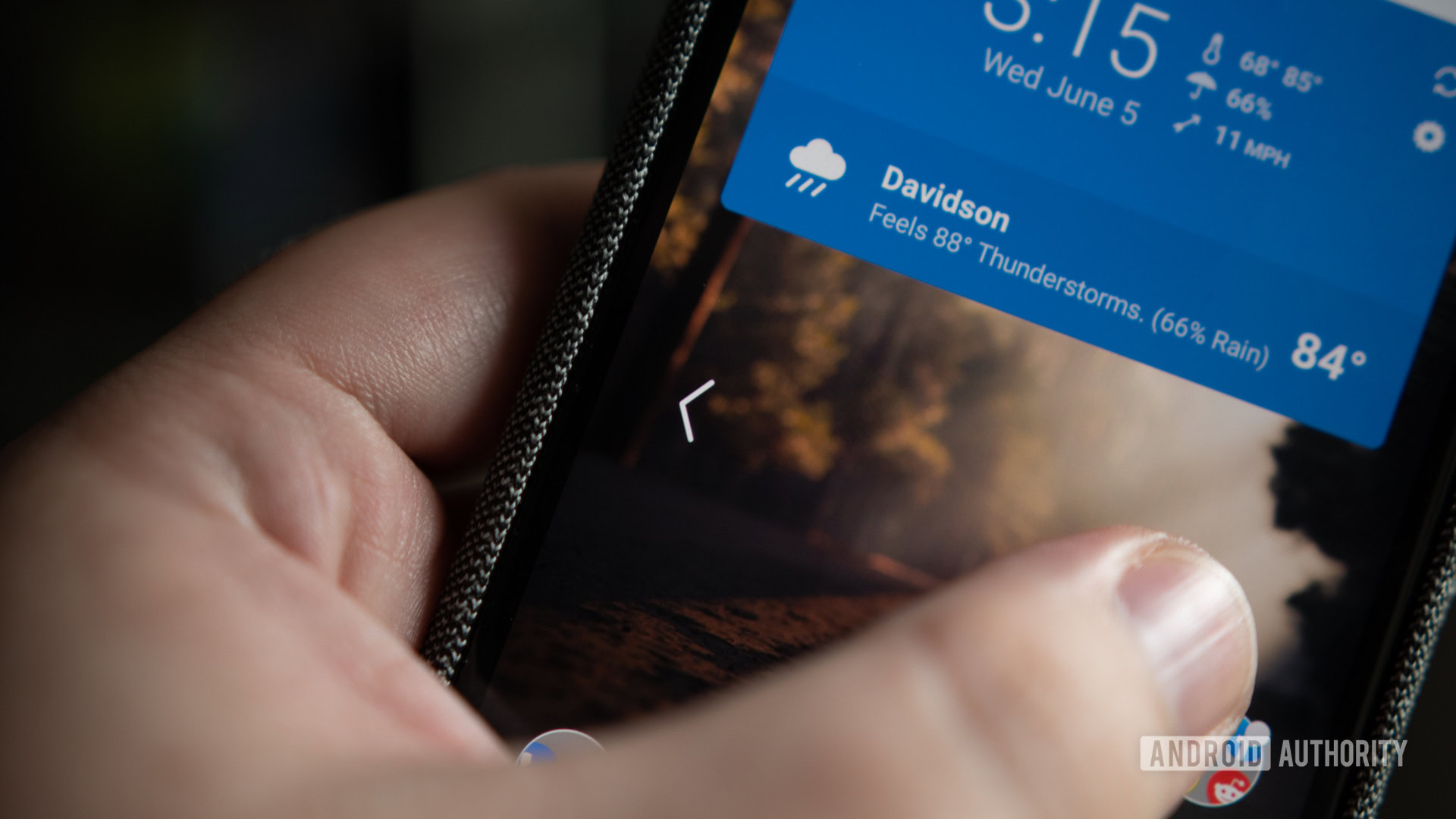
When Android Q’s new gesture system is enabled, a swipe inward from the left or right side of the display acts as the back button. When the fourth beta, Google has improved the gesture’s icon.
First, the arrow changes between being white and black based on the background. Second, the icon has a bouncing animation when it’s used. These two changes in combination make it much easier to identify what is happening when you swipe inward.
Notifications can be swiped away from either direction
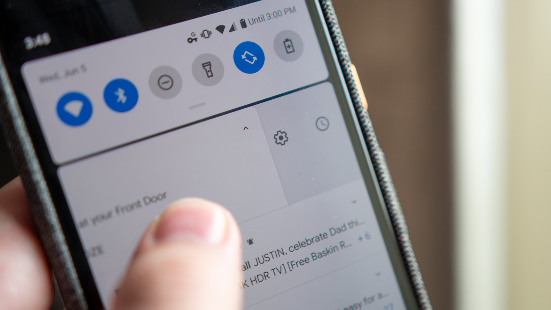
The first Android Q developer preview made it so that users could only swipe away notifications from one direction. Google later added the option for users to customize which direction they wished to swipe away items. Even with the ability to choose a swipe direction, the opposite still pulled up Android Q’s notification menu.
With the fourth beta, things have reverted to how they work in Android Pie. Without changing anything, users can once again swipe a notification away from either direction. The notification menu is still accessible, but now from a long press.
As 9to5Google points out, this change might be short-lived. According to the publication, the “Swipe Actions” toggle is still present in Beta 4’s Settings menu. This means that the next developer preview might bring back single swipe direction actions.
I have my fingers crossed that the final Android Q build allows users to select an option that keeps the current configuration.
Additionally, the beta build brings back the ability to snooze notifications for a given period.
Contextual rotation button makes a return
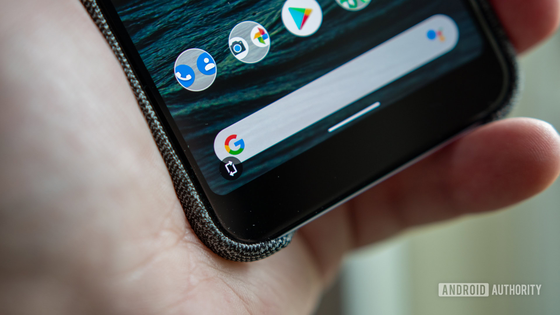
Google introduced a contextual rotate button with Android Pie that would pop up if auto-rotate was turned off. The feature seemingly disappeared with Android Q, but now it’s back.
Like before, when auto-rotate is turned off, the above button will pop up when the handset is moved to a landscape orientation. Tapping on it allows the screen to switch around without enabling the system-wide auto-rotate setting.
Preview button on live wallpapers
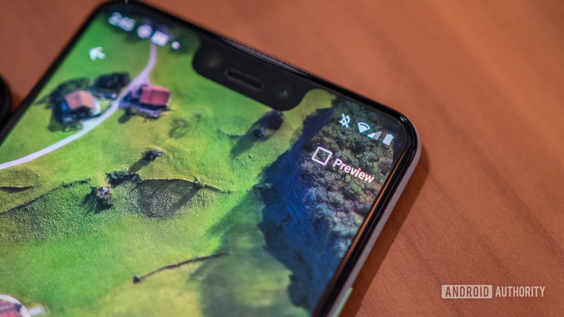
If you use live wallpapers on your smartphone, you will now see a small preview box. As you can see from the below screenshots, when the box is checked, the text that describes the image will be hidden.
Google Pay in the power menu
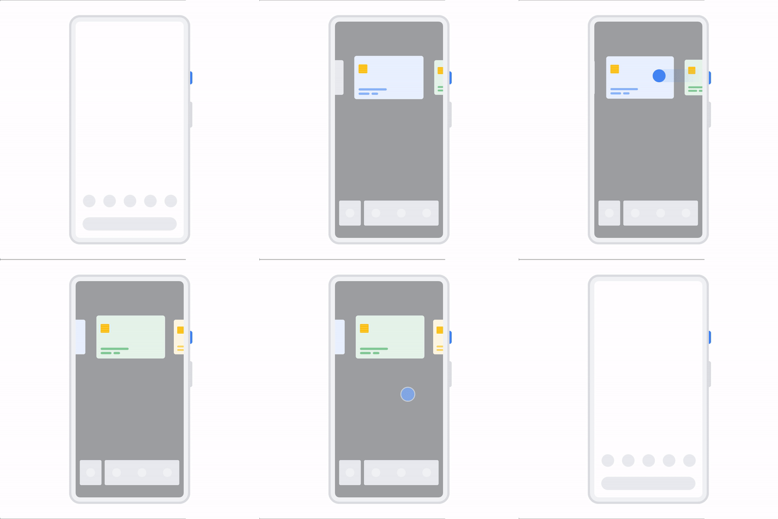
Google Pay still does not work in the fourth Android Q beta, but 9to5Google found evidence that mobile payments could soon be integrated into the mobile OS’ power menu. As you can see from the above animation, the current power buttons would be shifted to the bottom of the display while a carousel of cards from Pay are displayed at the top.
This feature is very similar to how Apple handles mobile payments on the iPhone. Whether this is copying or not, it does show that Google is putting effort toward getting people to use Android as a mobile wallet.
Smart Lock might get rebranded to “Pixel Presence”
9to5Google received a tip from a Pixel user who had updated to Android Q Beta 4 and noticed that their phone had replaced “Smart Lock” with “Pixel Presence.” After a bit of digging, the site found that users outside of the U.S. were shown the new branding while those of us stateside, for now, get to keep the Smart Lock name.
It’s unclear why Google has seemingly decided to rebrand Smart Lock on Pixel smartphones. I hope the company doesn’t decide to stick with this change.
Small user interface tweaks
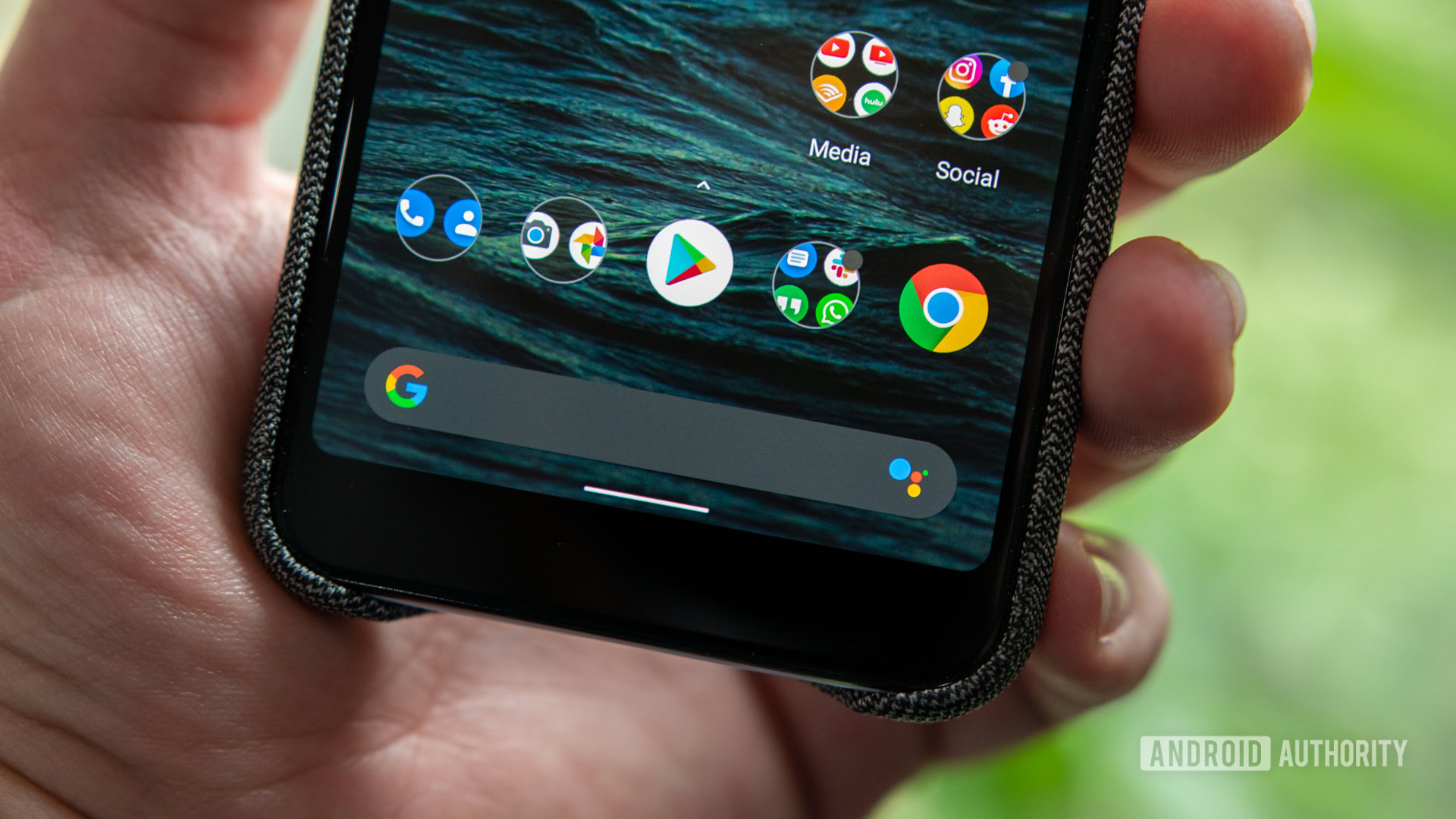
Google has further refined Android Q’s dark mode and with beta 4 in addition to a handful of other UI tweaks. You will likely spot a dozen or more changes scrolling through the update, but some of the differences that stuck out to us is a dark search bar on the homescreen, slightly bolder text on the “At A Glance” widget, colored icons in the notification shade, and overlays that are now dark gray instead of black.
Android Q Beta 3
System-wide dark theme
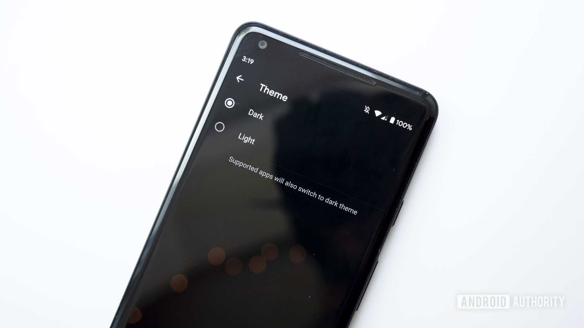
Google added a system-wide dark theme to Android Q!
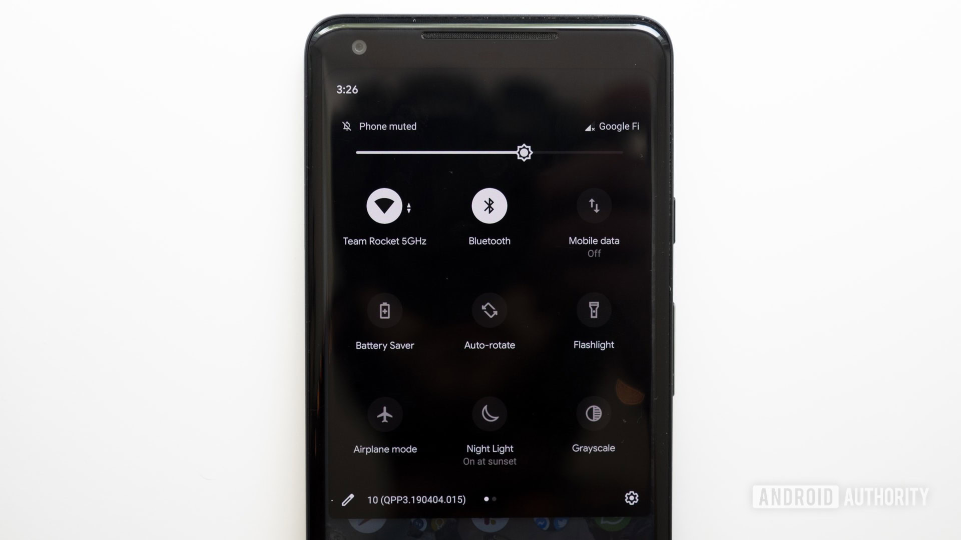
You can toggle it on or off in the settings menu, or by tapping the Dark Theme quick setting. By doing so, your notification shade, app drawer, home screen folders, settings menu, and much more will turn almost completely black.
Some apps will abide by Android Q’s dark theme, others will not. If you want everything dark all the time, there’s a way to do that.
An all-new gesture system
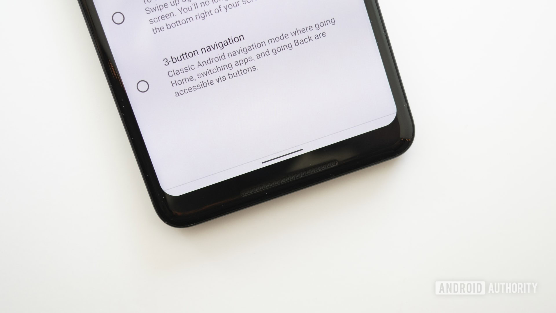
Google yet again revamped gestures in Android Q. Now, Android’s gestures work a little more like iOS’ gestures. Here’s a brief overview of how the new gestures work.
- To go home: Swipe up on the navigation bar
- To go back: Swipe in from anywhere on either side of the screen
- To launch the app switcher: Swipe up (like you’re going to the home screen) and pause
- To quickly switch between apps: Swipe left or right on the navigation bar
- To launch the app drawer: Swipe up on the navigation bar from your home screen
If this sounds absolutely terrible to you, you can choose a different gesture system. The two-button gesture layout is still available, and Google even added the old school three-button navigation system back into Android Q Beta 3.
No more notification snoozing
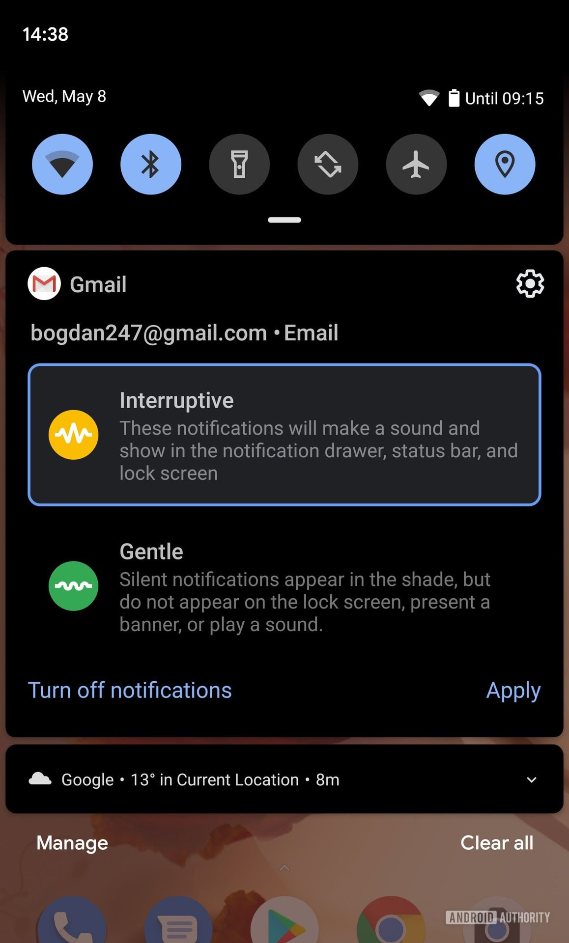
Google removed the option to snooze notifications in Android Q Beta 3. However, swiping on the notification now presents two notification options: Interruptive and Gentle.
Interruptive notifications make a sound when you receive them and appear in your app drawer and lock screen. Gentle notifications are silent and don’t appear anywhere but the notification shade.
Battery saver turns off when your phone is charged
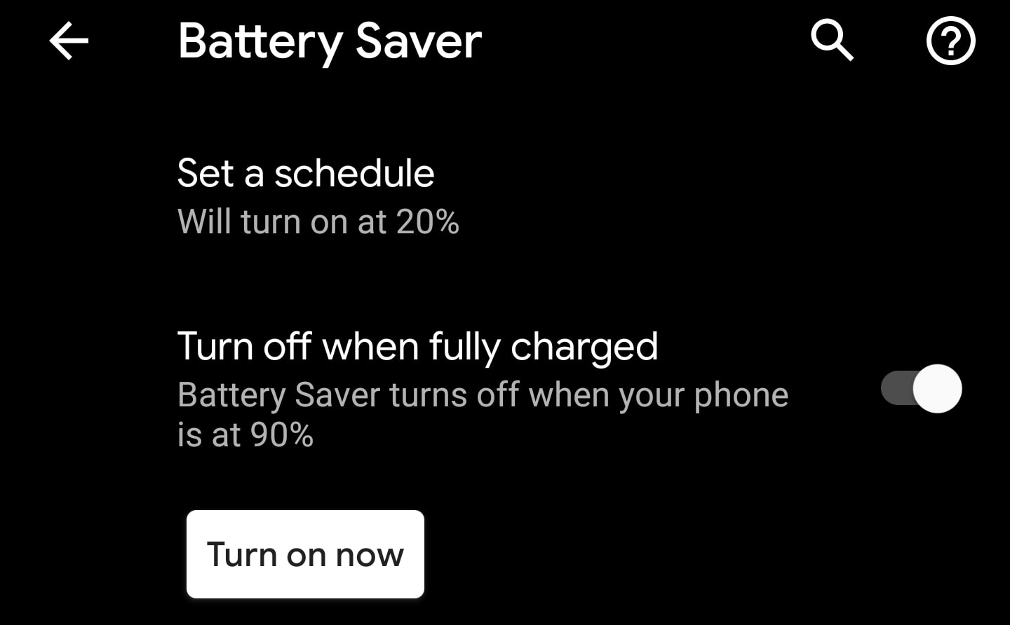
Android’s built-in Battery Saver mode already turns on automatically when your phone drains to a certain percentage. In Android Q, Google added a toggle to turn off Battery Saver when it charges up to a certain percent.
It’s a small feature, but a useful one. In the past, if Battery Saver was turned on and you charged up your phone, Battery Saver wouldn’t turn off automatically — you’d have to do it manually. Now, once you charge your phone up to 90 percent, Battery Saver will automatically turn off when you take your phone off the charger.
Emergency Information page receives an update
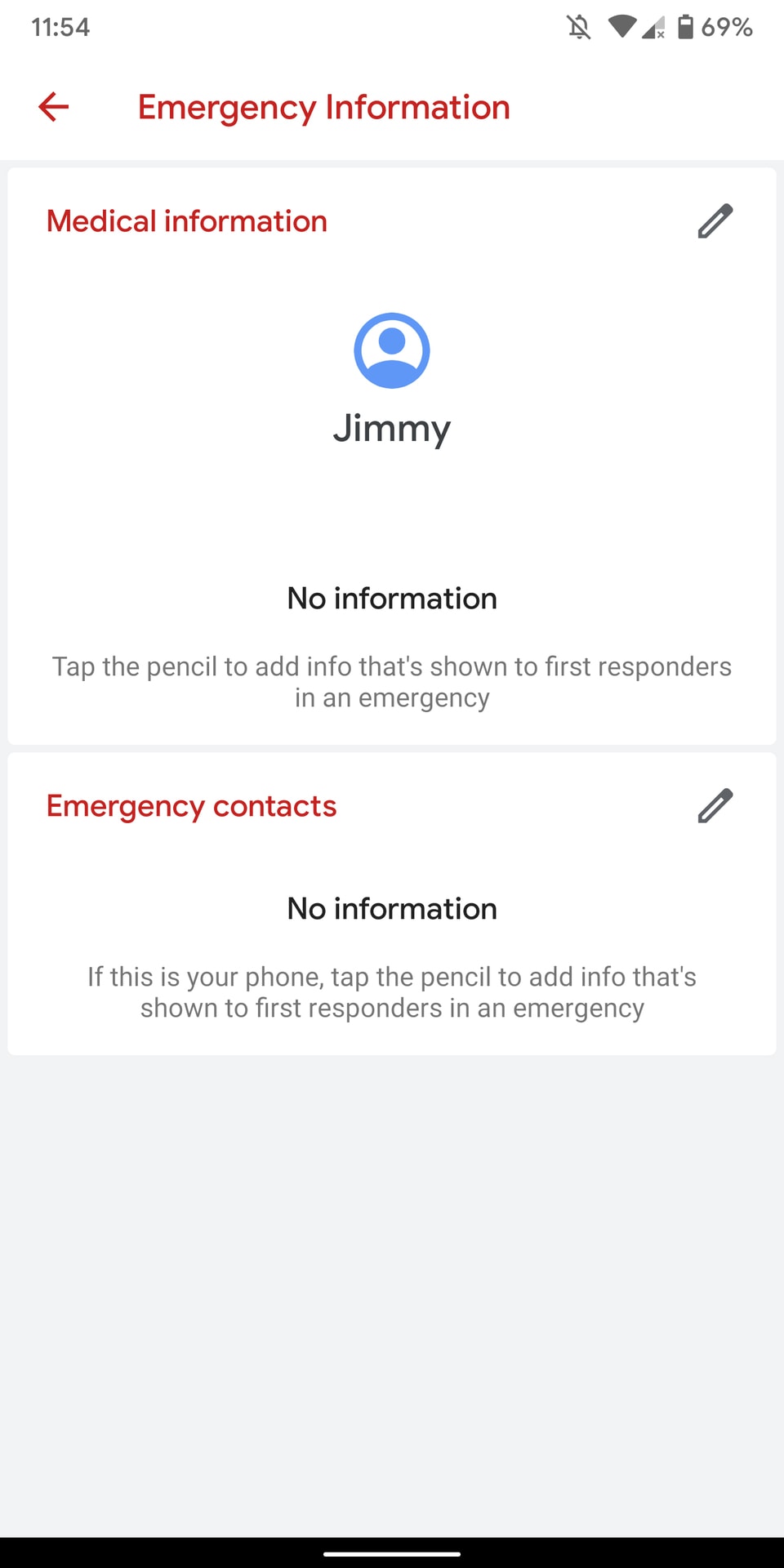
The Emergency Information has received a visual update to the new Google Material theme. Again, a small update, but a welcome one.
Always-on display battery percentage moves back down
In previous Android Q builds, the battery percentage on the always-on display was located in the top-right corner of the screen. I’m not sure why, but I could not get used to that change.
Now, the battery percentage is moved back down to the bottom center of the display, though it is slightly higher than before.
Wi-Fi passwords now shown in plain text
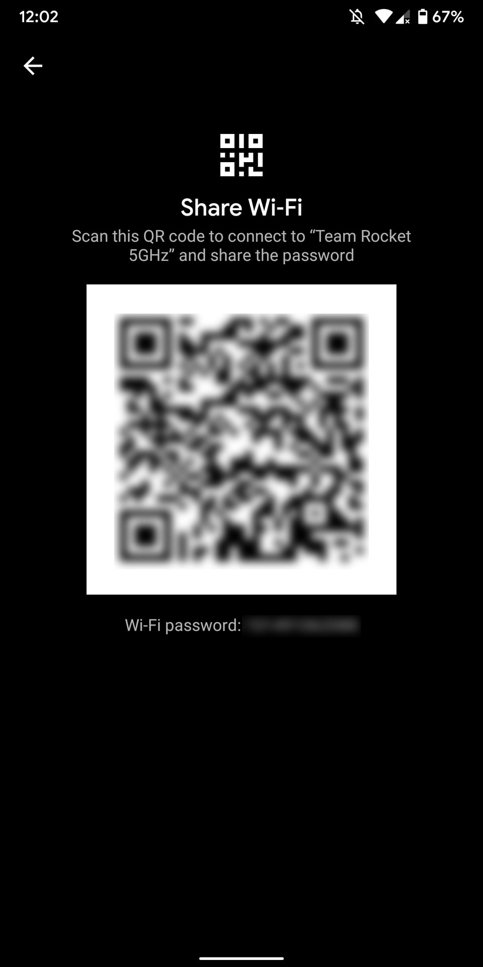
Android Q already makes it easier to join Wi-Fi networks, but what if you don’t want to scan a QR code to do so? Now, when you share your Wi-Fi QR code with someone, Android Q will now display your password in plain text. This means you can easily copy it to your phone’s clipboard and text it to the person trying to join the network.
Features confirmed for Android Q that we haven’t been able to test
- Smart Reply is coming to all messaging apps, along with
- Digital Wellbeing’s new Focus Mode will prevent you from opening time-wasting apps.
- Security and privacy updates will roll out through the Play Store, thanks to Google’s new Project Mainline effort.
- Live Caption will bring captions to just about any media on your phone, whether it’s a video, podcast, or even a Google Duo call.
- Incognito Mode is coming to Google Maps, along with a much easier way to switch your accounts.
- Android Q will let apps and games take action when your phone gets too hot.
- Google is adding platform support for 5G in Android Q.
Android Q Beta 2
Better volume settings
In Android Pie, hitting the volume buttons would adjust the noise level of whatever was prominent on the phone. While this aspect stays the same in Android Q beta 2, Google did change the ease of adjusting other items on the phone for the better.
Previously, when you chose to hit the adjustment button found at the bottom of the volume bar, you would be taken in the device’s settings menu. Now, as you can see from the second photo, a volume card will load on-screen. This change is more user-friendly and doesn’t take you out of whatever you were already doing.
Support for directional, zoomable microphones
The second Android Q beta brings a noteworthy audio addition by supporting microphone directivity functionality via a new API. This feature lets apps specify a focus direction for the microphones, such as the front-facing mic when filming selfie videos (or the rear mic when filming a live gig).
The API also enables support for audio zooming, much like HTC’s Sonic Zoom. This functionality lets you focus the mics on a specific subject or range, such as one person in a noisy environment. In other words, apps using this API could be pretty handy for vloggers and journalists.
Screenshots no longer include the notch
One of the most controversial changes found in the first Android Q beta was the fact that screen curves and display notches were included in screenshots. We’re happy to report that this decision was quickly reversed with the second beta.
iOS-like app-switching gestures
It was no secret that most people weren’t fans of Google’s gesture-based navigation controls introduced in Android Pie. To fix them, it appears as though the search giant is working to copy iOS.
As you can see from the above GIF, in Android Q you can now swipe left or right on the Home button to move between apps. This behavior is very reminiscent of the gesture controls found on modern iPhones and the latest iPad Pros.
If this doesn’t remind if enough of Apple’s way of doing things, it was found that Google might be working to remove the Home button altogether. With a bit of adb work, Android Q actually replaces the current navigation bar with a long and thin one that is almost identical to the bar used on iOS.
Media playback progress bar in notifications
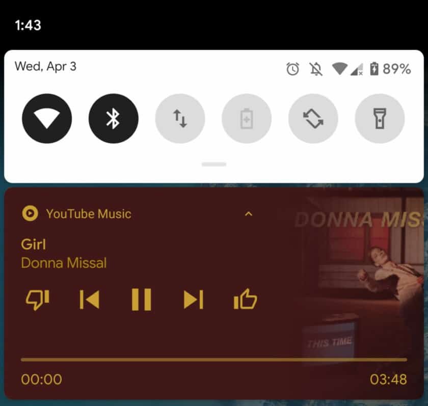
Android has always made the notification center a key piece of using the OS. With the second Android Q beta, is improving the media playback widget to show a progress bar in addition to playback controls.
Choose your own notification swipe directions
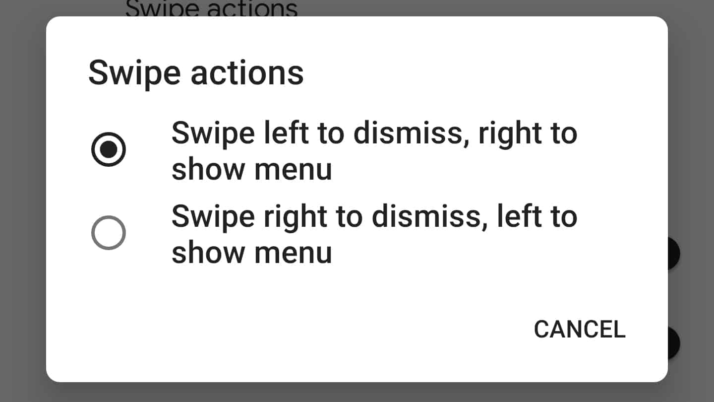
In the first Android Q beta, Google introduced a new way to swipe away notifications. Instead of being able to swipe something away in either direction, the OS made it so that notifications would disappear when swiped to the right and would show a menu when swiped to the left.
With the second Android Q beta, Google is giving users control over which way they would like to swipe away notifications. As you can see from the above photo, you can now decide if you want to dismiss notifications to the left or the right.
To change the way notification swipes work, simply head to Settings > Apps & notifications > Notifications > Advanced > Swipe actions
Facebook Messenger-style ‘chat head’ Bubbles
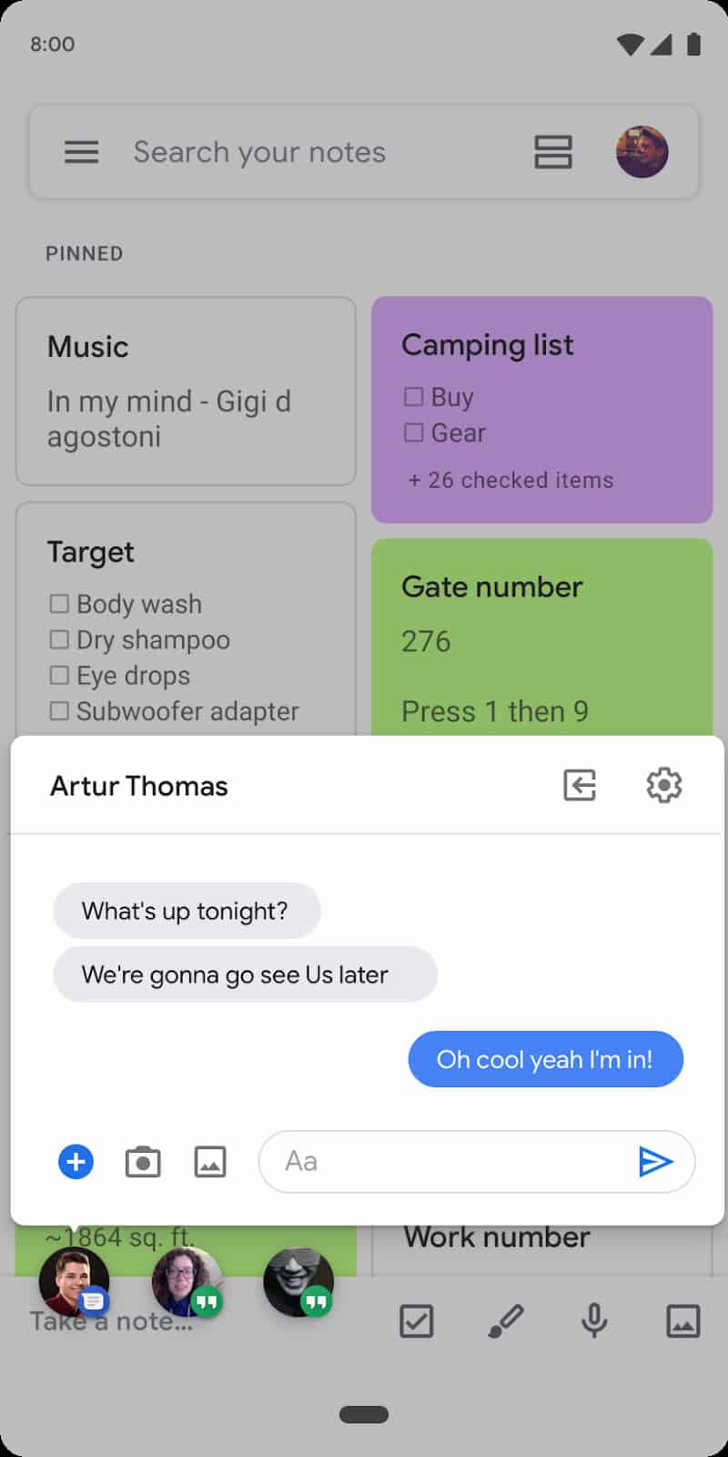
If you’ve ever used Facebook Messenger on Android, you should be familiar with the app’s “chat heads.” Basically, when you receive a new message, a circular icon will pop up over the rest of your phone. Google appears to be borrowing this feature with Android Q.
As you can see from the photo, the second Android Q beta introduces something Google is calling “Bubbles.” This new type of notification works identically to chat heads, but is a feature that any messaging app will be able to implement.
Google account integration in settings
Android Q beta 2 adds a new Google account element to the settings menu (via 9to5Google). As you can see from the first photo, your avatar photo gets added to the search bar.
What’s even more interesting is what pops up when you tap on the image. Seen in the right photo, you can quickly manage your Google account, find information about the device, edit emergency info, and more.
Android Q Beta 1
Accent colors and theming options
It’s been a long time coming, but Android Q finally (finally!) supports different accent colors. In the developer settings at the very bottom, you’ll find a new “theming” section with three options: Accent color, Headline / Body font, and Icon shape.
You now have the choice between four accent colors: default blue, green, black, and purple.
Choosing the Headline / Body font option in your settings menu will allow you to choose between the device default font (the one shown in the images above) and Noto Serif / Source Sans Pro. Here’s what it looks like:
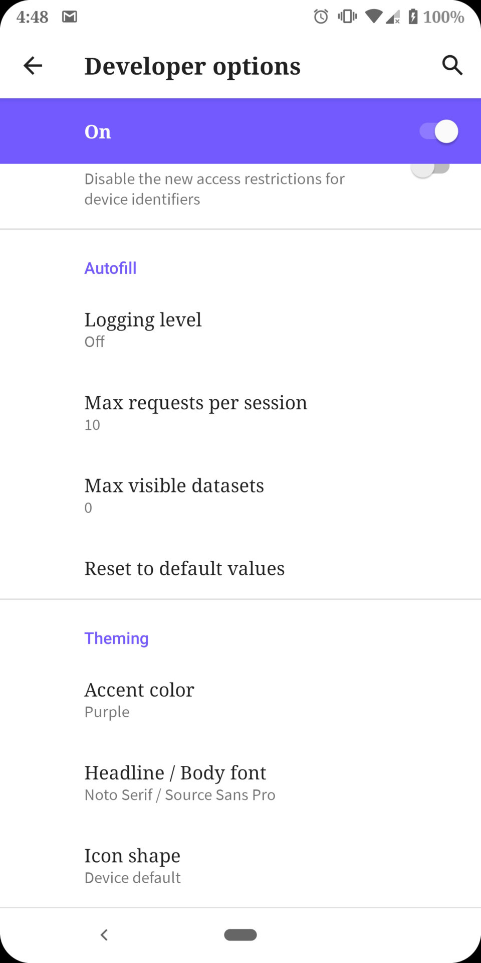
Finally, the Icon shape option will look quite familiar. From here, you can change all your app icons to the device default (circle), teardrop, squircle, or rounded rectangle.
Battery icon on the always-on display

Google has moved the battery icon from its bottom-center position to the upper-right corner of the always-on display.
Estimated battery in quick settings
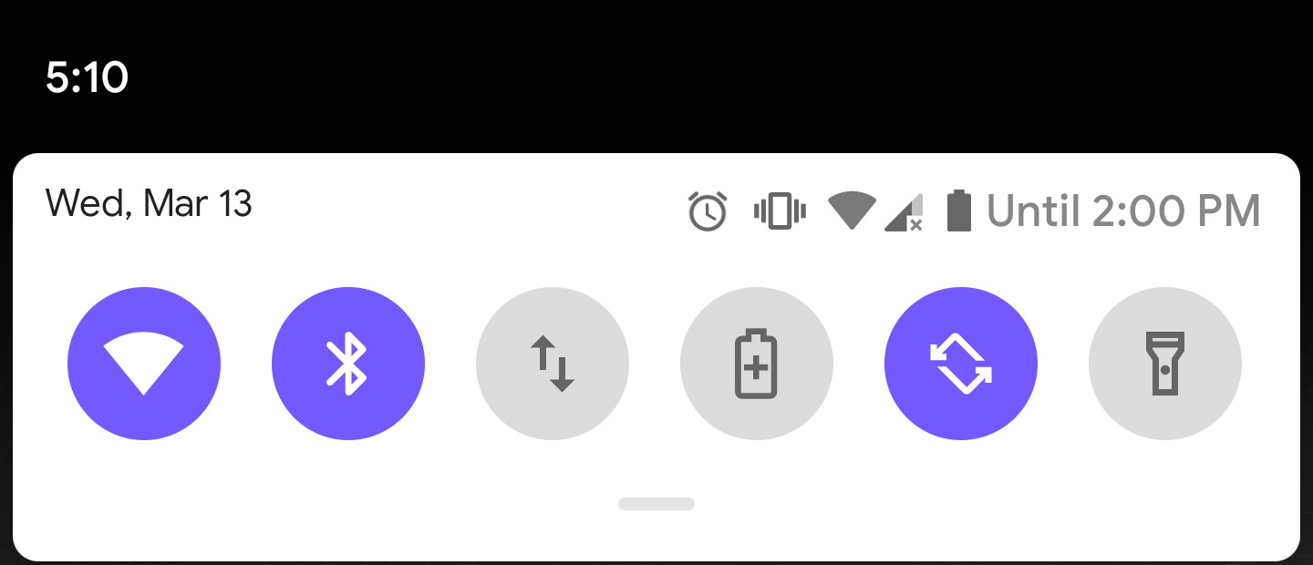
Android Q’s quick settings menu will now show you how long your battery is expected to last.
Sharing menu improvements
Google is bringing some much-needed improvements to Android’s sharing menu. Not only does the share menu look a bit different than it did before, the entire menu shows up way faster than it did in previous Android versions. Take a look at the GIF attached here to see what I mean.
Notches and rounded corners in screenshots
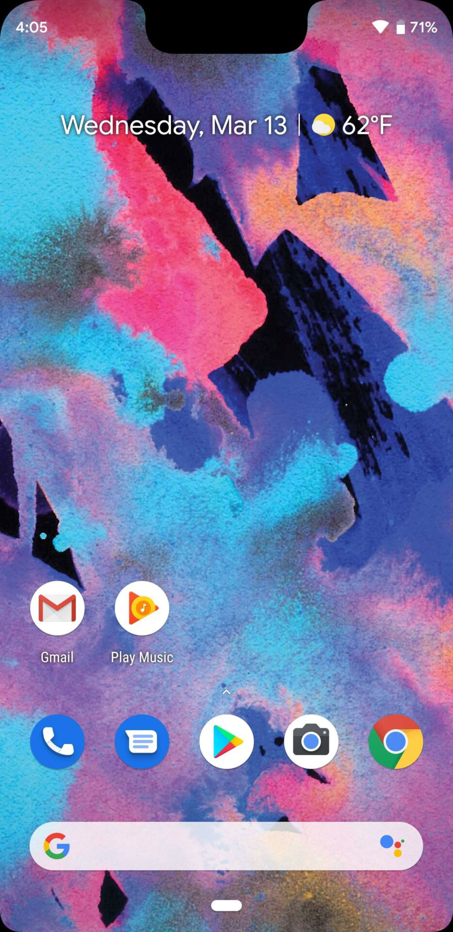
In previous versions of Android, the system would fill in the gaps if it noticed a notch cutout or rounded screen edges. Not anymore! Take a look at that glorious screenshot of the Pixel 3 XL to see what I mean.
Swiping right on notifications
You can no longer swipe notifications away willy-nilly. A quick swipe right will still clear your notifications, while a swipe to the left will bring up the context menu — something you could only bring up with a half-swipe in previous Android builds. A swipe to the left will give you options to ‘snooze’ or ‘mute’ a notification, while expanding it gives you even more options, such as ‘block’, ‘show silently’, or ‘keep alerting’.
Android Q night mode is gone… but don’t worry!
In Android Pie, Google introduced a “device theme” section in the display settings menu. From here, you could either turn on Android’s dark mode at all times, or just when you set a dark wallpaper. Now that option is gone, unless you enabled the dark theme when you installed Android Q. If you did, you should have the option to turn on a system-wide dark theme that even expands into the settings menu.
There are two workarounds to enable dark mode, however, either by toggling the Battery Saver option or via ADB commands. Nevertheless, this is a very early build of Android Q, and Google adds and removes things from developer previews all the time. So there’s a good chance dark mode is coming back in a future build, without the need for workarounds.
Bell next to notification timestamps
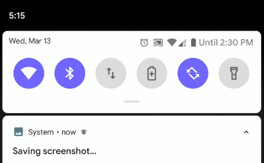
Have you ever wondered which one of your notifications made your phone actually ring? Google is clearing that up in Android Q. Now, if your phone rings from a notification, you’ll see a little notification bell right next to the notification’s timestamp. It’s a little change, but a welcome one for sure.
Sharing Wi-Fi with QR codes
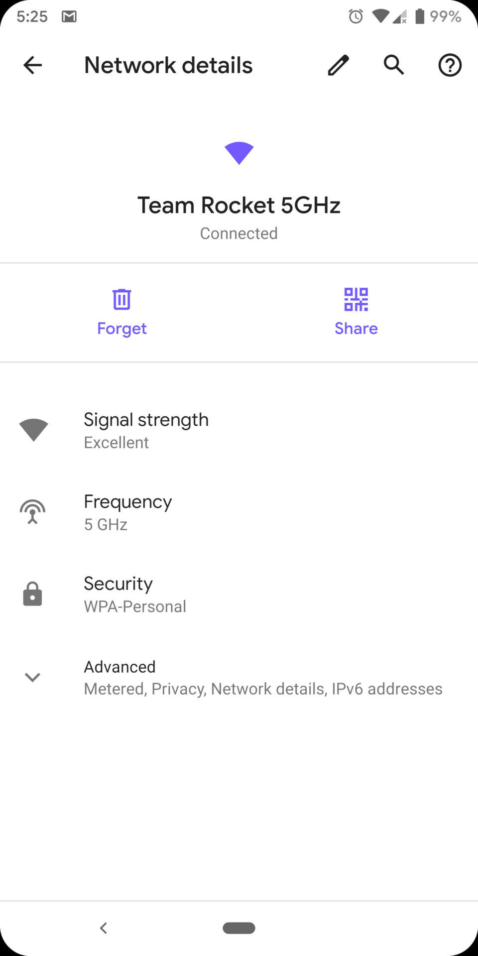
If, by chance, you’d like to share your Wi-Fi network with a friend, you can now do so via QR code. Just select the network you want to share, click the Share icon, and verify your phone’s passcode. A unique QR code will show up that your friend can use to easily scan and join the Wi-Fi network.
Emergency button in the power menu
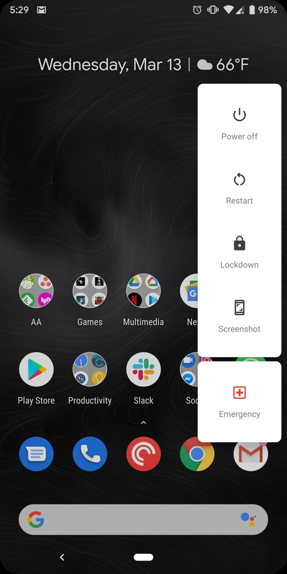
In Android Q, long-pressing the power button will display a new Emergency icon. Tap this icon and you’ll have quick access to an emergency dialer.
Privacy section in Settings
Privacy is front and center in Android Q, and that starts with a new section in the settings menu. This new privacy section will give you access to your app permissions, lock screen content settings, preferred autofill service, location history, and usage and diagnostics settings.
Revised Material Theme throughout the whole OS
Google has streamlined many areas that looked “off” in some of the menus around Android. In Android Q, things like the wallpapers app, app info pages, and more have been tweaked with Google’s new Material theme.
A secret desktop mode
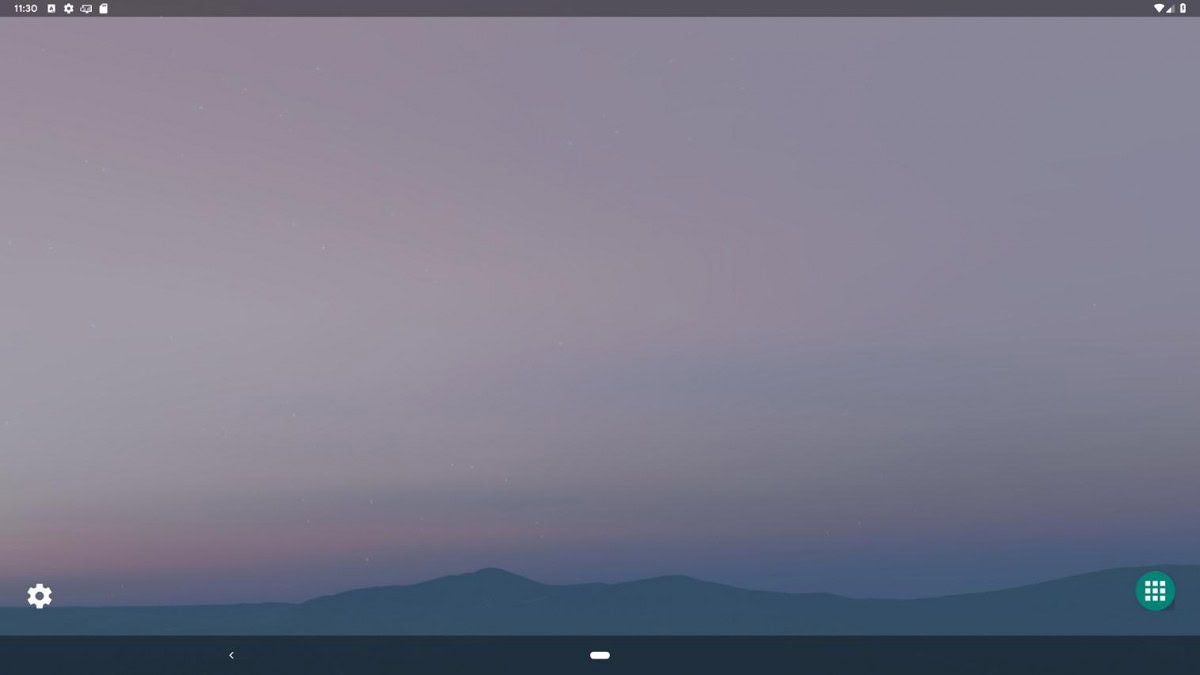
Google has followed in HUAWEI and Samsung’s footsteps by offering a desktop mode on Android. This will deliver a computer-style interface when you connect your phone to an external display. You might have to dig to find this feature though.
That’s it for now. We’ll update this list as we find more changes in Android Q. Have you found any that aren’t listed here? Let us know in the comments, and check out even more Android Q coverage below: