Affiliate links on Android Authority may earn us a commission. Learn more.
Android skin blunders that make no sense
Published onMarch 22, 2018
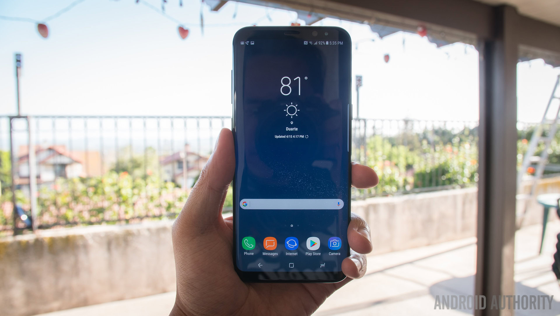
Aside from the Android vs. iPhone debate, the fight between stock Android and skinned Android is probably the argument Android enthusiasts are most passionate about. There have been countless articles written and videos made featuring users proclaiming their love for stock Android and how they wish all phones came with as much of a vanilla ROM as possible.

But Android skins have come a long way. Sure, five years ago some Android skins were so bloated that it was easy to point to them as the worst examples of abusing the Android platform. But nowadays, most OEM’s seem to understand that if a company messes too much with Android, users don’t like that company’s skin. And if they don’t like the skin, many of them won’t buy the phone, custom launchers be darned.
That being said, OEMs have recently made some incredible blunders when it comes to their Android variations. They’ve made changes that not only make the user experience much worse than stock, but also don’t make sense from a branding, design, or functional standpoint. We’d like to highlight some of those examples to hopefully learn from their mistakes.
Apps
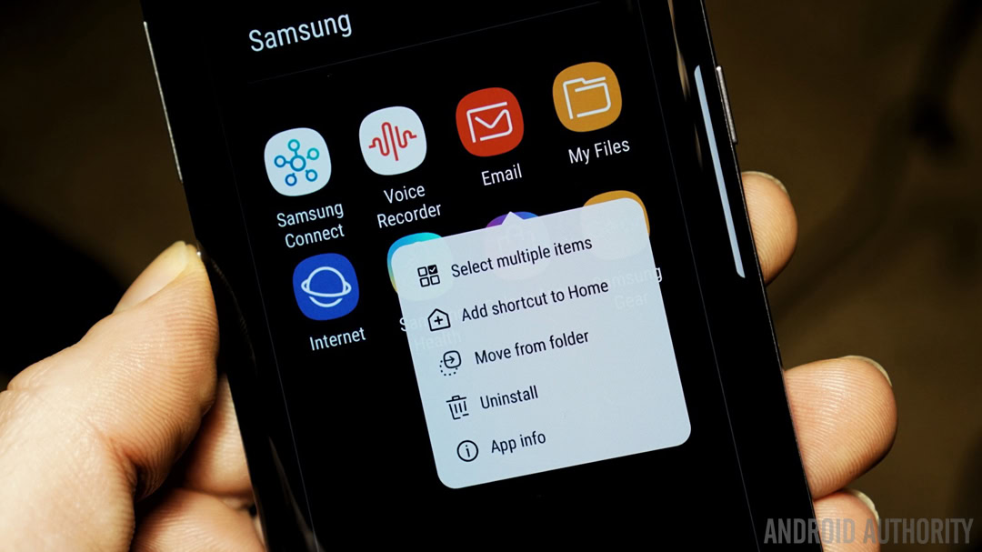
So-called bloatware has always been a problem on the Android platform. OEM- and carrier-branded apps take up space, drain battery life, and in most cases cannot be removed or even turned off without rooting the device. But having branded apps on a phone can make sense. For example, the Samsung Health app on Samsung devices is quite useful, especially if you pair it with a Samsung Gear smartwatch. And a carrier-specific app that gives you quick access to your account and data usage is entirely welcome.
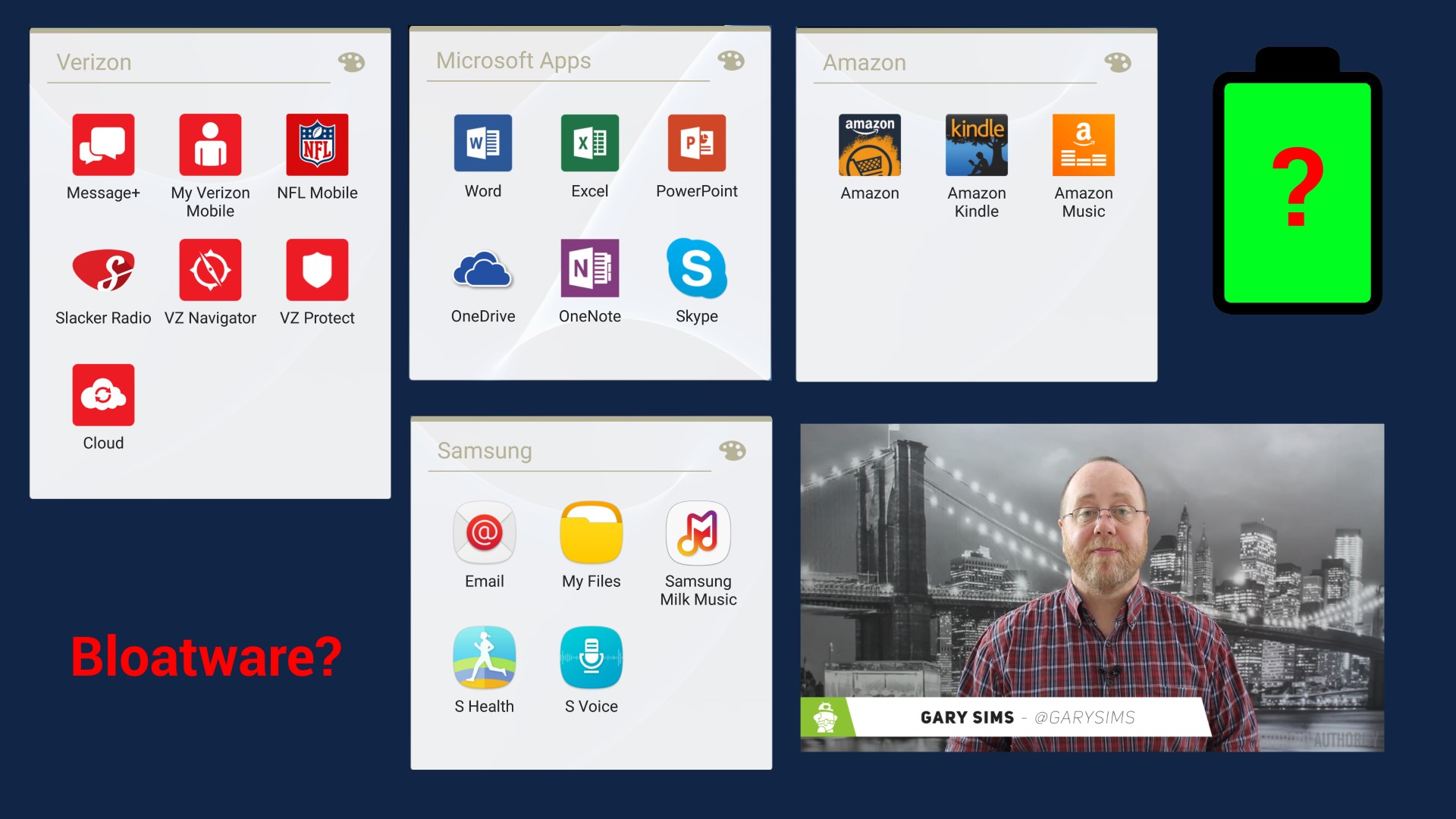
But many OEM’s take it way too far and add superfluous apps to their phones — apps that already come with stock Android. Samsung, Huawei, LG, and Sony, are just a few of the guilty parties that pre-install unremovable versions of apps that are the same, as or worse than, stock apps. Examples include calendar apps, contacts apps, notes apps, and even the phone dialer. This is completely unnecessary; they’re doing extra work to make things worse for the user!
We don't need extra apps that do the same thing as the stock apps.
LG takes things one step further into head-scratching territory and turns off the app drawer by default on its devices, even on its most recent release, the LG G6. What would ever possess the company to think that what Android users want is all their apps to appear on home screens just like in iOS? Sure, it might make the transition easier for users coming from the iPhone to an Android phone, but is LG really banking its entire branding approach on being a “transition” device?
HUAWEI was even worse than LG for a long time when it came to the app drawer: not only was there no app drawer by default, but there was no way to bring it back without installing a third-party launcher. It wasn’t until HUAWEI released the Mate 9 in 2016 that the option to turn on the app drawer was finally introduced (but it’s still turned off by default).
Come on, OEMs! Giving Android a branded feel with some extra apps is fine, but don’t mess with the stock apps. And please, leave the app drawer alone. The app drawer is a signature part of the Android experience, and removing it just upsets the majority of users.
Notifications
The difference between a great notification experience and a bad one is sometimes the difference between life and death — literally. After all, if you miss a notification about an incoming storm or a text from your mother asking where her heart medicine is, that could have incredible ramifications on your life.
But if that’s true, why do some OEM’s make a habit of messing about with how Android notifications work?
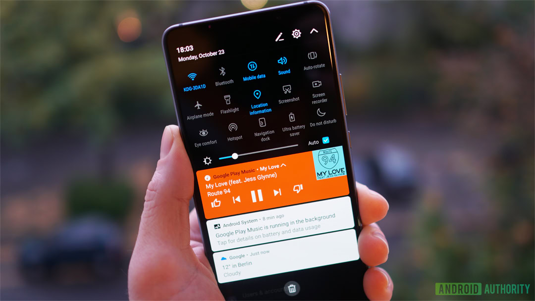
As an example, HUAWEI’s notification shade hides lock screen notifications once you’ve dropped the shade. Many of us have gone through the following steps:
- A text message notification appears on the lock screen.
- We unlock the phone and draw down the notification shade.
- After reading the text message in the shade, we decide we can’t answer it now, and leave it alone.
Why would OEM's alter Android code to make notifications less effective?
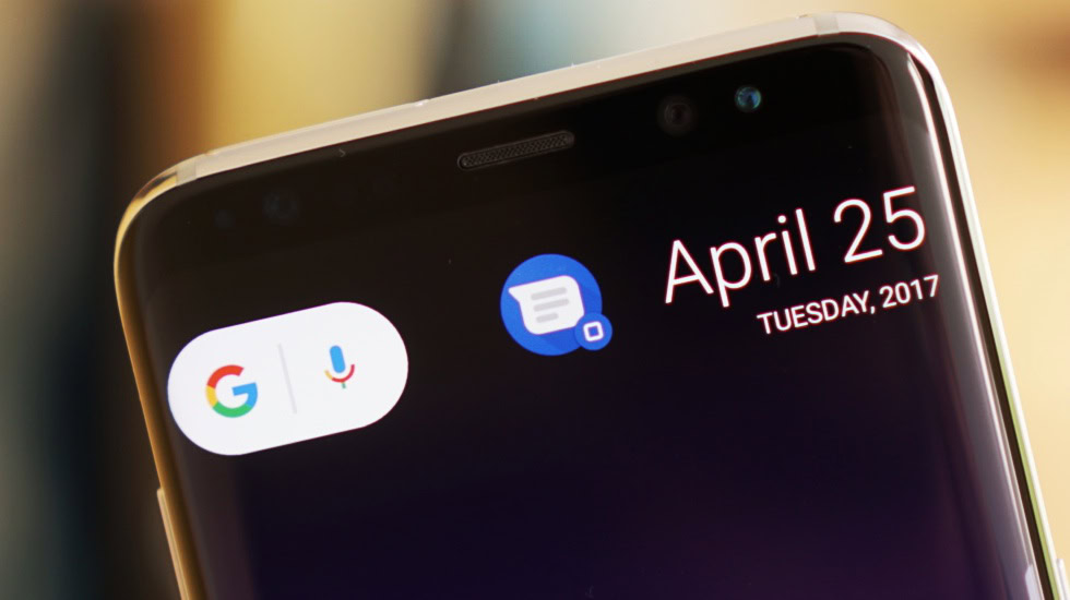
Every Android user has probably done this at least once. But if you’re on a HUAWEI phone, you probably know that now that you’ve dropped the notification shade, the text message notification disappears from your lock screen. Why would HUAWEI do this? Stock Android leaves the notification on the lock screen until you actually interact with the notification, so it’s kept front-and-center. By removing the lock screen notification, HUAWEI is putting users in a position to forget that the notification remains unanswered.
Beyond that, some OEM’s alter how a user can interact with notifications. On Xiaomi devices, to expand notifications in the shade, you have to use two fingers instead of one. And in HUAWEI’s EMUI, you can’t expand notifications at all! Did these companies think that expandable notifications are something users don’t like? Why put in the extra code to alter this feature when the feature itself never needed fixing?
Google works hard to make the notifications experience a good one for users. For years, notifications were so much better on Android than on iOS, to the point that that fact alone was a reason not to switch. So please, OEMs, don’t mess with the notifications!
Design
Of all the changes an OEM makes with its particular Android skin, none is more integral than the overall look and feel of the software. Custom icons, animations, fonts, and more can make Android look like completely different software in comparison to stock.
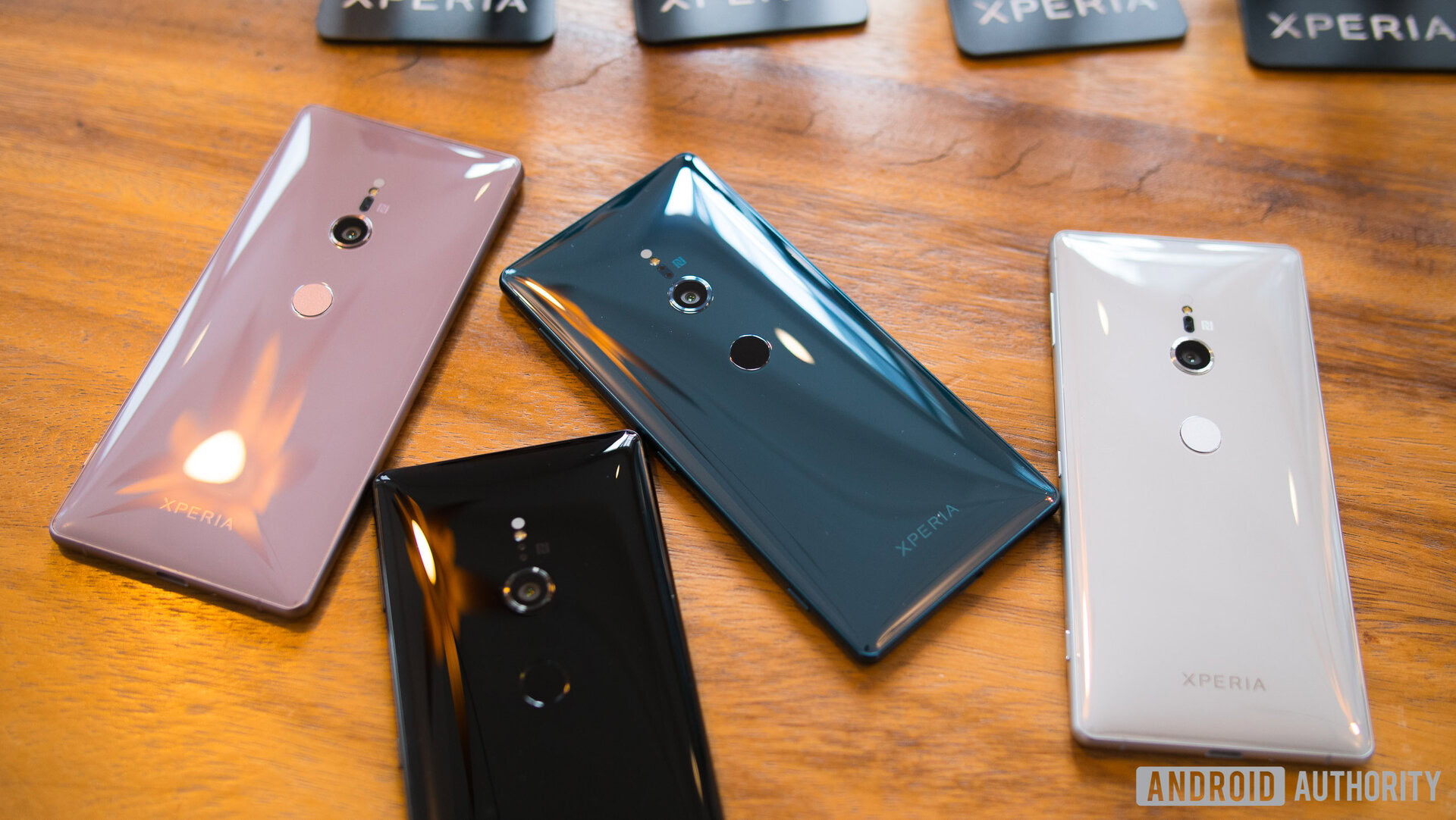
Now, whether or not you like specific design changes is a fairly subjective thing, but we can all agree that the intention OEMs have with their designs is to reinforce the brand identity. That’s why, for example, stock Android’s wallpapers are minimalist designs, and Samsung’s are usually HD photos of environments.
The design of and Android skin should align with the company brand, not go directly against it.
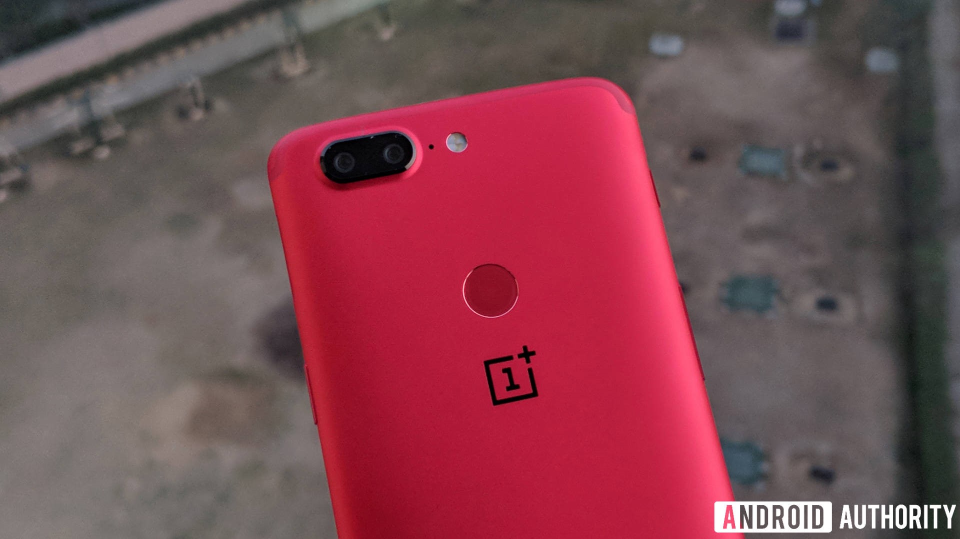
You can imagine our surprise then when we found out that OnePlus gives users the ability to customize the color scheme of their devices in Oxygen OS, but the company’s own distinctive red-color branding is not an option. One would think that if you wanted to keep the brand identity congruent within the device, the color red would be all over the place, like the outside of the Lava Red OnePlus 5T.
But nope, you are given eight color choices to theme your phone in OxygenOS: traditional Android blue, a lighter shade of blue, purple, a slightly lighter purple, light brown, neon green, orange, and pink. No red to speak of.
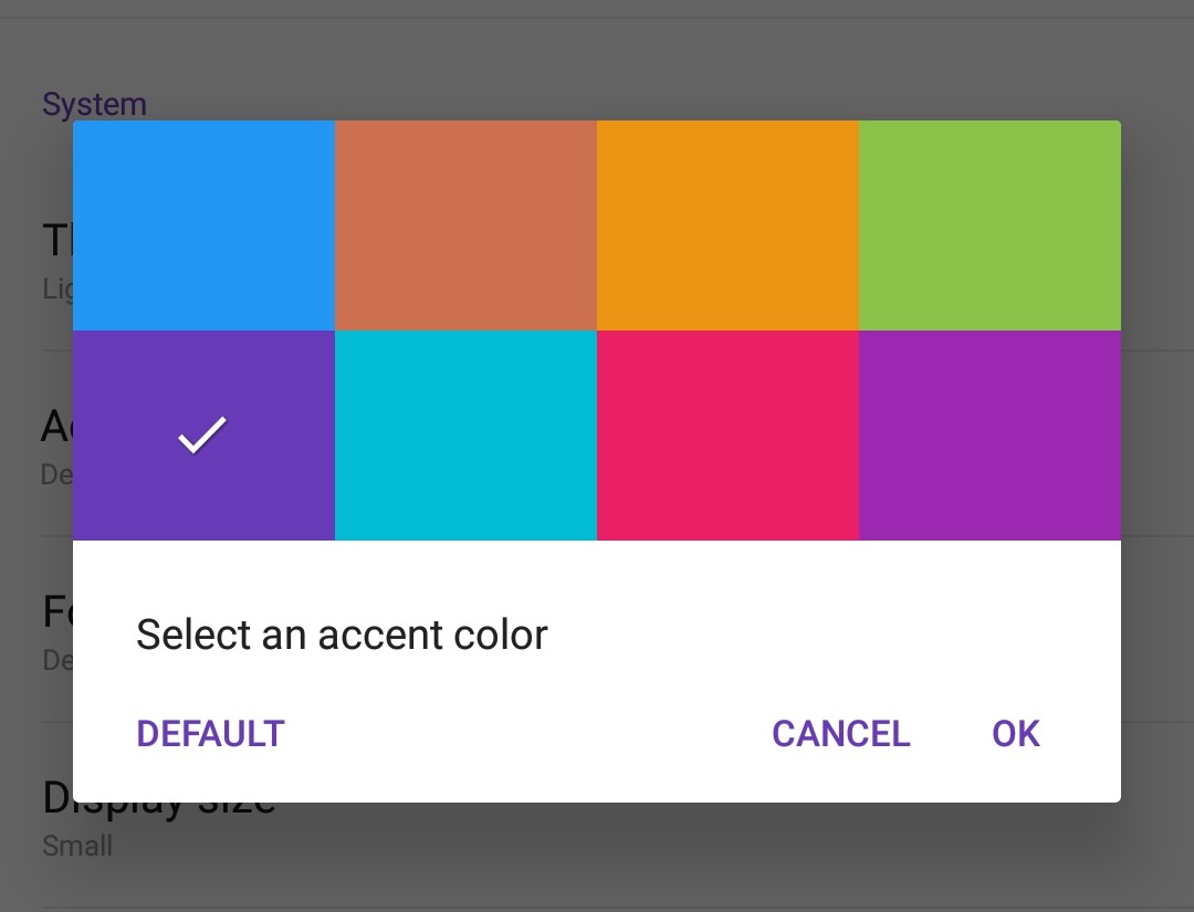
One would think that if OnePlus could bake in seven new color schemes, in addition to the regular Android blue, it would include its own red, or just make the feature a color wheel so users could choose the specific theme color they like. But no, OnePlus fails here on both counts.
Some OEMs offer full theme stores, like Samsung and HTC, in which you can download or create themes of all kinds. This is wonderful because it gives the user complete control over how their device looks. In a world full of iPhones that all look the same, one of the biggest appeals of Android is the ability to make the device one’s own.
Why OnePlus, with the company motto “Never Settle,” would settle for seven non-red color selections is a mystery. Especially when you consider how easy it would be to add.
Settings
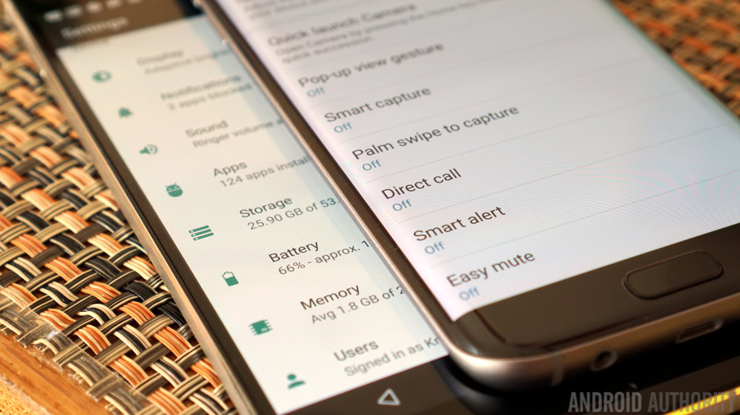
Android’s settings options are integral to the user experience of the device. There are so many important features and options controlled by the Settings app that Android 5.0 Lollipop added a dedicated settings search bar to help youfind what you need.
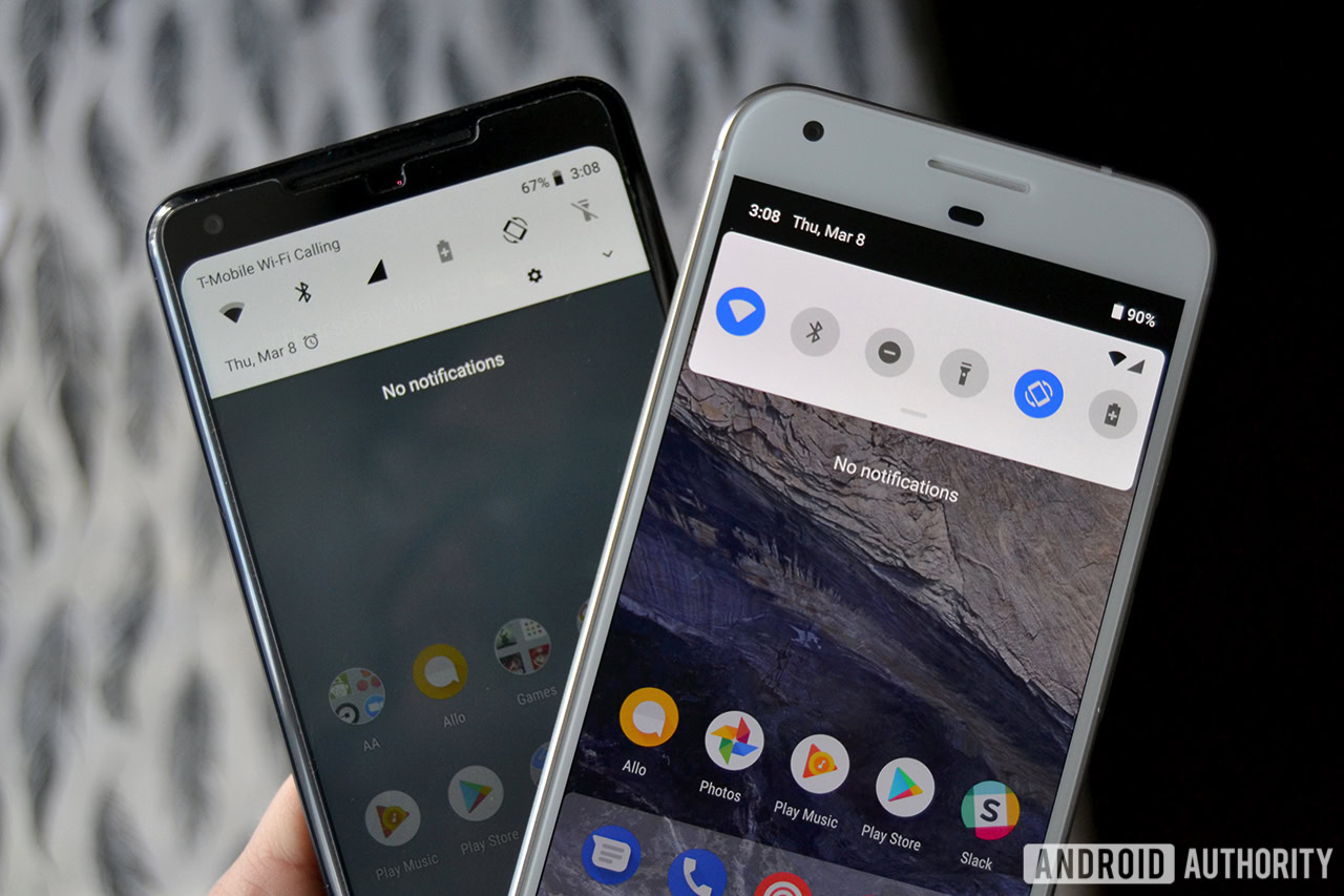
But sometimes even the search bar doesn’t help, so you have to go online and read a tutorial on how to change something. The only problem is, some OEM’s move the settings options around or even completely reformat the Settings app, so the tutorial may or may not apply to your device!
Please don't move the settings around; they are where they are for a reason.
Samsung is probably the most well-known culprit when it comes to this Android skin head-scratcher. When you open the Settings app, everything is in a completely different spot than it would be in stock Android. It’s so out of order that if someone were to say to you, “Open Settings and click on Battery, and then Battery Optimization,” you would already be lost at the second step. To get to Battery Optimization in Samsung Experience, you would go Settings > Device Maintenance > Battery > Battery Usage > Menu Icon > Optimize Battery Usage. Hardly a more efficient process.
Samsung helpfully adds many of its own settings to its devices that sometimes supersede Android’s stock settings. This is no doubt why it moves the settings around in the Settings app, but all that does is make things more confusing. We get that you have great ideas for settings, Samsung, but leave the stock Android settings alone, so people don’t have to tear their hair out looking for what they need.
The greatest thing about Android is its ability to change for every different kind of device. OEMs making changes to the OS to benefit the user are welcome and part of the excitement of the Android ecosystem. But when OEM’s start making changes for seemingly no reason, it merely frustrates users and makes them dissatisfied. Android stock purists out there are wrong that nothing should ever change with Android, but OEM’s sometimes make it hard to argue that point.