Affiliate links on Android Authority may earn us a commission. Learn more.
Don't be shy, Android skins. Flaunt your best features.
Published onJanuary 22, 2022

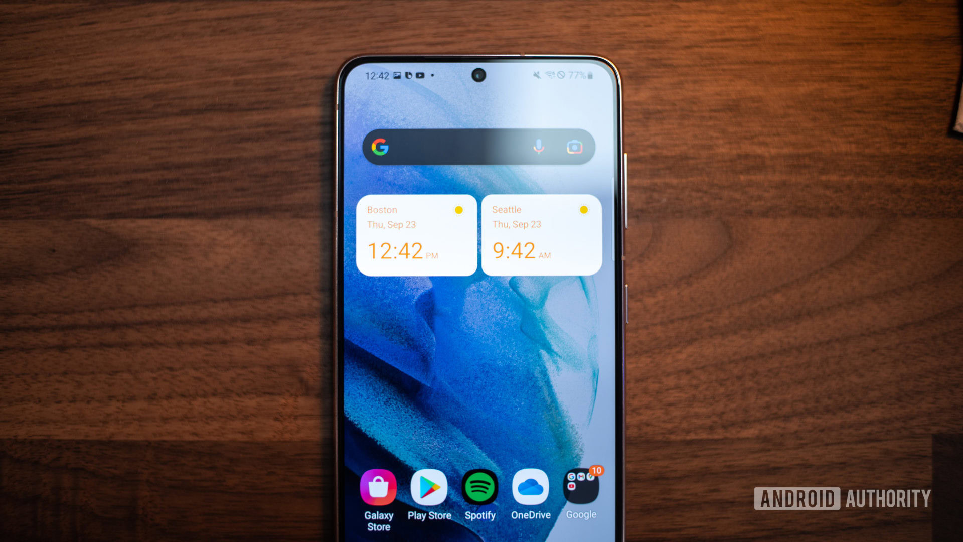
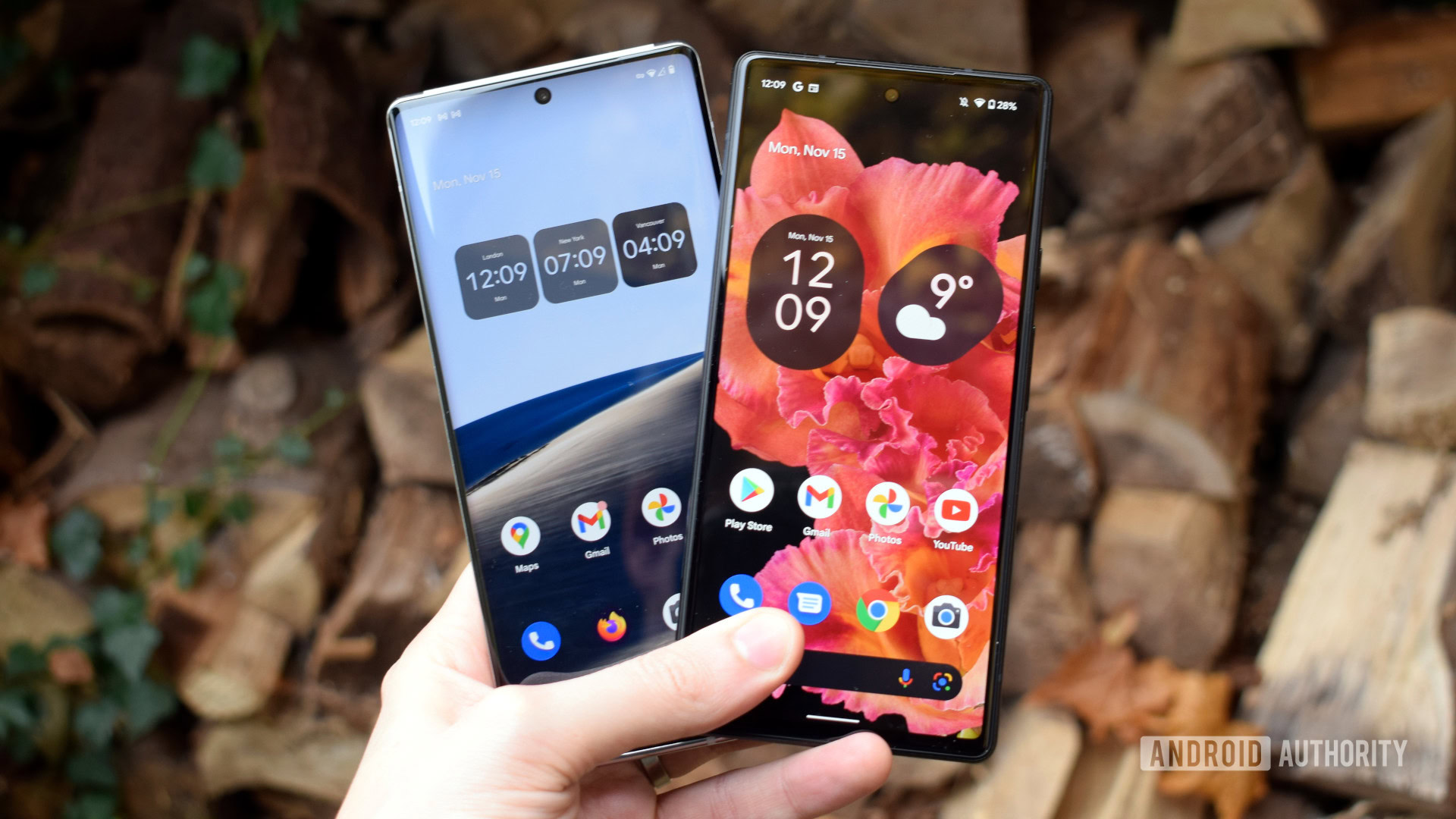
As of today, there are about a dozen prominent and unique Android skins. Samsung’s One UI is the most popular, but people all over the world use Google’s Pixel UI, OnePlus’ Oxygen OS, and Motorola’s My UX, among many others.
Some skins look pretty much like stock Android. Others — such as Oppo’s Color OS and Xiaomi’s MIUI — have a wildly different aesthetic. However, no matter which skin you use, it inevitably has unique features that set it apart from others on the market.
Required reading: A look at the major Android skins
Pop quiz, hotshot: What unique features come with your phone’s skin? Can you name a dozen of them? How about 10? Ok, can you name three? I’d wager the majority of people reading this couldn’t do it. Even if they can name a bunch of cool tricks their phone can do, they likely don’t know if those tricks are or aren’t built directly into Android and thus not a unique feature of the skin.
If manufacturers are going to put all this effort into crafting unique software experiences, why don’t they make it easier to find those unique experiences?
Some attempts were made
There are two notable attempts to make unique software features easily accessible to Android users. They are Motorola’s Moto app and Google’s Pixel Tips app. Both come pre-installed on Motorola and Google phones, respectively, and both are actually pretty helpful.
The problem with these two apps, however, is their incompleteness and lack of organization. Each one mixes features unique to its skin with other features that are simply part of Android. For example, both apps tell you how to choose custom backgrounds and fonts — an option available in all other Android skins. They also tell you about various gesture shortcuts — some lifted from stock Android and some unique to the skin — without differentiating between the two. Both apps also leave out descriptions for some notable features.
Apps exist to help show off these unique features, but they aren't very useful.
Both apps also lack an integral tool: a search bar. Without a way for users to intentionally hunt down a feature they want, figuring out how to do something becomes a slog. This becomes especially tricky when things aren’t organized intuitively. In the case of the Pixel Tips app, Google puts the overview gesture (swipe up from the bottom and hold) in the Navigation section. Meanwhile, the fast app-switching gesture (swiping horizontally on the navigation bar) is in the Pro Tips section. This is not well-organized, and the lack of a search bar means someone looking specifically for app switching gestures might not find what they want.
We do need to give Motorola and Google credit, though, since Samsung, OnePlus, and many other OEMs don’t even have something as basic as these apps. At least attempts were made.
Android skins need to do better

With only a few exceptions, most Android phones on the market nowadays are built using off-the-shelf parts. This is why hardware from one smartphone OEM bears a striking resemblance to hardware from another. The primary way OEMs can differentiate their product is through software, which is one of the reasons why companies spend so much time and money on it.
What’s so hilarious, though, is that there isn’t a single company out there that does a pitch-perfect job of showing users just how great its software is. Samsung — which has one of the most bloated Android skins on the market — doesn’t even have an app similar to Pixel Tips or Moto. Instead, it relies on pop-up suggestions that are sometimes useful but oftentimes simply annoying. Even when they are handy, they don’t cover everything. Inevitably, there’s no way a user would know every single feature of One UI since there’s so much to wade through.
Why would Samsung spend so much time and money crafting unique software tricks but skip telling you about them?
Why would Samsung (or any other OEM) spend so much time crafting terrific and unique software tricks but pass on figuring out a way to let users know the tricks are there? With so much hardware sameness on the market, why wouldn’t proprietary software take center stage at all times? It doesn’t make any sense.
Ultimately, Android smartphone manufacturers need to figure this out. The solution is so obvious, too.
A link in Settings and a well-curated app

Google and Motorola both have touched on the solution to this quandary, but neither went all the way. The Moto and Pixel Tips apps are certainly useful, and the majority of other OEMs out there have nothing that compares.
However, even Google and Motorola lack comprehensive and well-organized apps. Additionally, some users might not totally understand what these apps do. The obliquely-named Moto app could be anything, for example. Is it an app-based version of the Moto store? Does it give you information about Motorola as a company? Who knows, right? The Pixel Tips app has a better and more appropriate name, but it still doesn’t adequately promote its usefulness to users.
Every skin needs a well-curated app to show off its features, and it needs to be obvious where the app is and what it does.
Really, what’s needed here is a link in Android settings. Right at the top, there should be a prominent link that simply says, “Find out what your phone can do.” Users could tap that and it would simply open the OEM’s pre-installed app. After all, when pretty much any Android user is looking for something, the first place they’re going to go is the Settings panel.
Obviously, Samsung, OnePlus, and other Android OEMs would need to develop apps similar to Moto and Pixel Tips. This needs to happen regardless. But creating the app is the same as creating the features themselves; it needs to be easy and obvious to find what you need. As far as I’m concerned, all Android OEMs are dropping the ball here, and it’s about time they started to shape up.
Continue reading: The best customization apps on Android