Affiliate links on Android Authority may earn us a commission. Learn more.
Hands on with Android Wear 2.0!
Published onMay 19, 2016
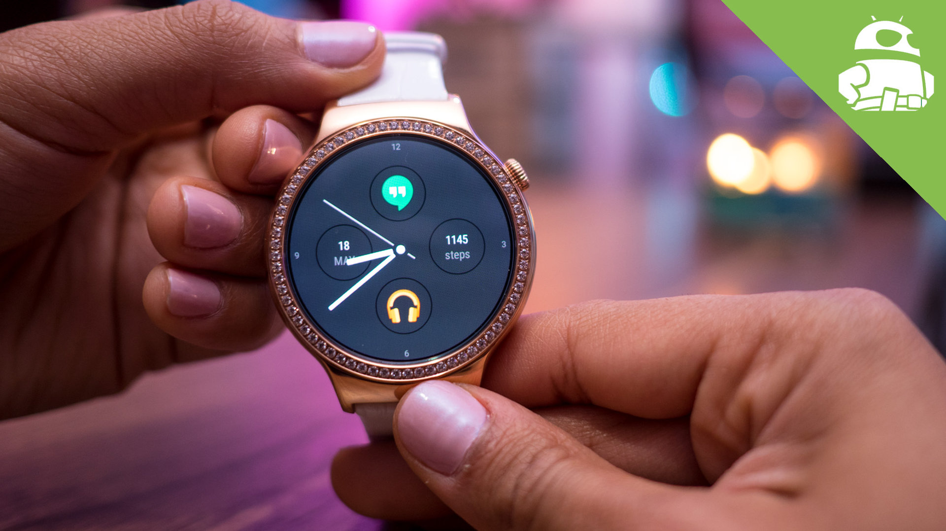
There were a lot of announcements made at yesterday’s keynote presentation at Google I/O 2016, and while there is a lot to get excited about, nothing was met with as much enthusiasm as the much awaited update to Google’s wearable ecosystem.
Android Wear 2.0 brings with it several key updates and improvements, as well as a slew of new features, aimed at taking the wearable experience to a whole other level. Android Wear 2.0 will officially be available in the latter half of the year, but for those who can’t wait to check out all that it has to offer, there is a developer preview available already.
Here is a first look at Google’s latest wearable OS, as we go hands on with Android Wear 2.0!
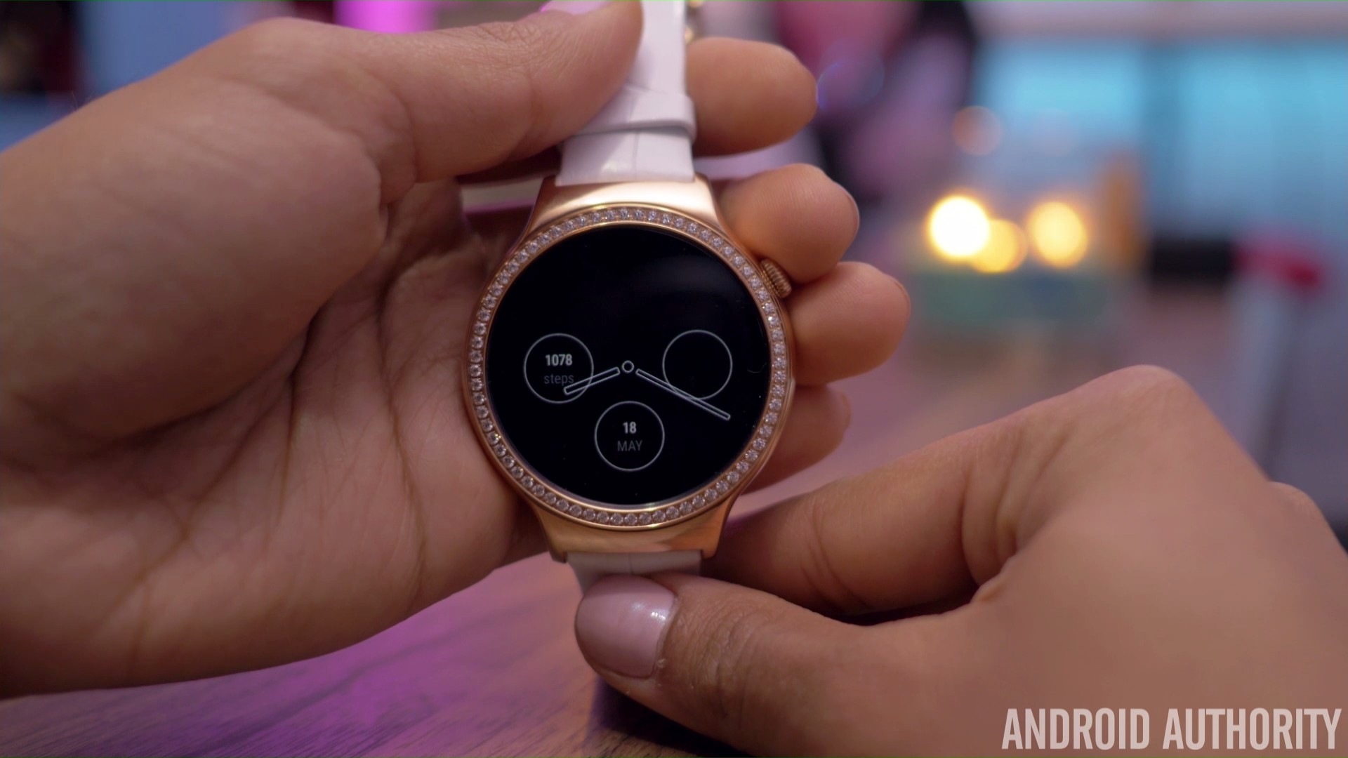
The main focus of Android Wear 2.0 is to make your smartwatch function better as a stand alone device, without being completely dependent on the connected smartphone. In fact, the smartwatch doesn’t even need to be paired to a phone anymore, and even if it is connected, the latest version of Android Wear allows for far better interaction with notifications, which means that you don’t have to turn to your phone that often.
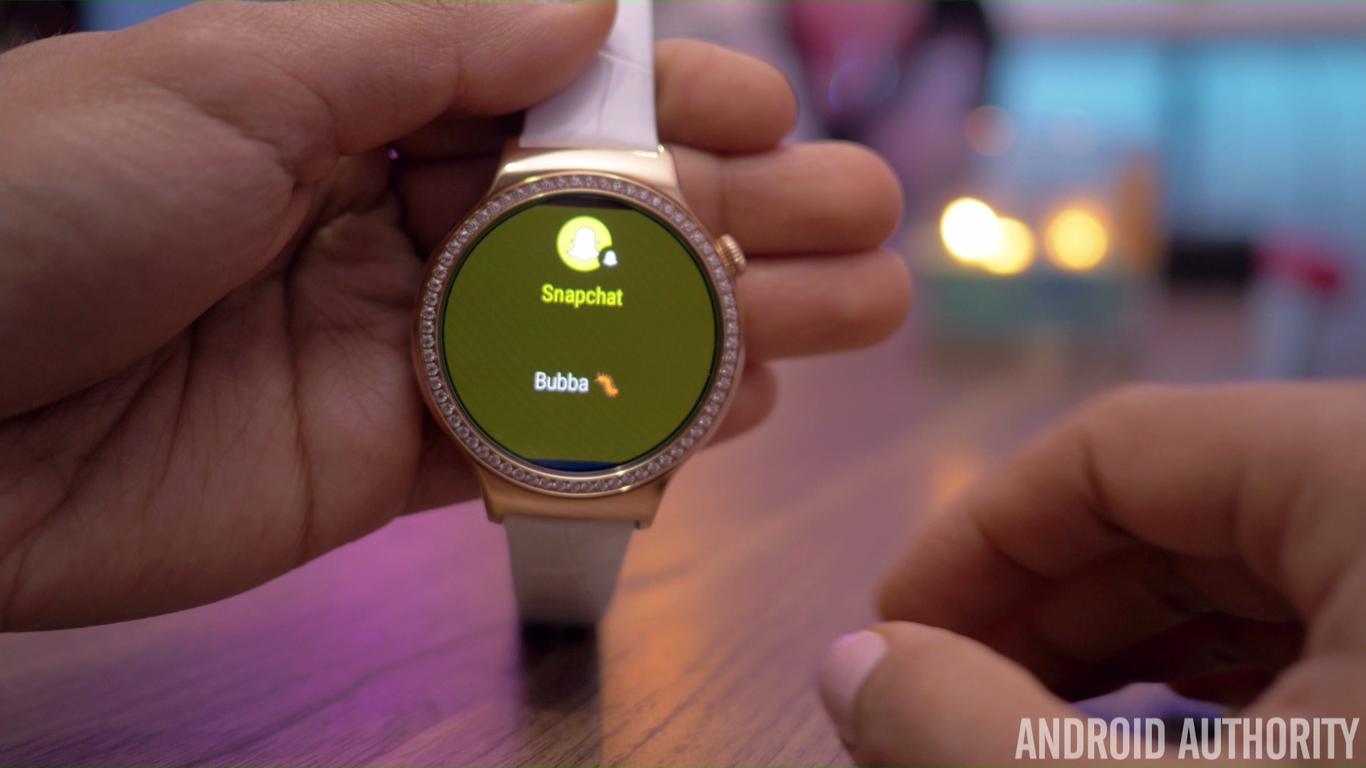
The notification cards have received a design overhaul, with the cards now almost filling up the entire screen, and with the background color changing to differentiate between the various apps. A key addition here is the availability of a scroll bar that curves along the side, which now makes it possible to know how many notifications you have left. Now, when receiving messages or notifications from saved contacts, their profile pictures don’t take up the entire background, and what you will now see is a small thumbnail avatar at the top.

When interacting with notifications, you had to swipe to the left to bring up an action, and swipe left again for more options. This process has been streamlined and made a little easier now. Tapping on the notification card brings up a primary action, and a swipe up from the bottom brings up other ways to interact. More often than not, the primary action is all you will need however. For example, when seeing a text message, a tap on the card brings up the option to reply, with a swipe up adding the options to view the conversation or place a call to that contact.
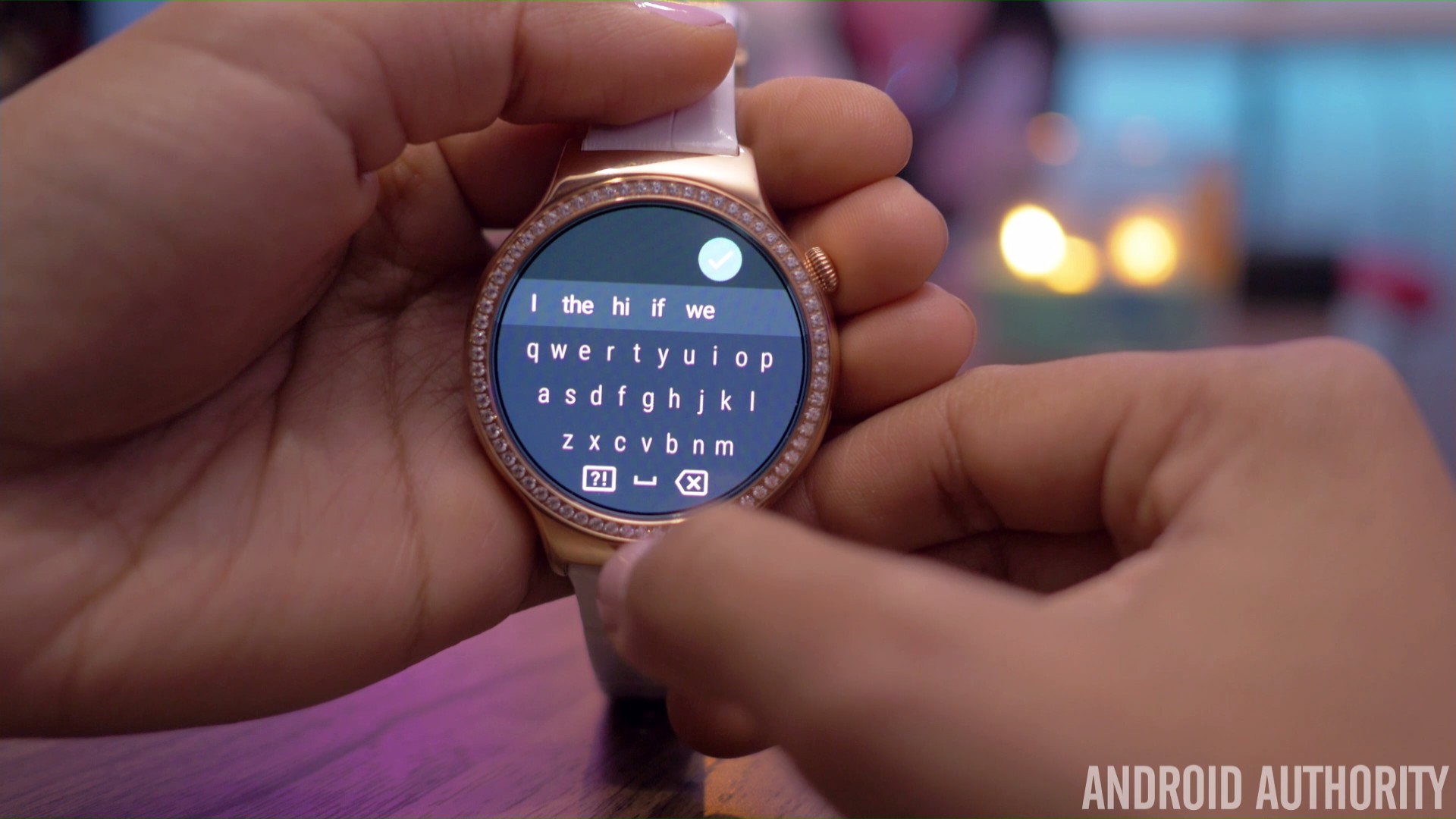
When replying to messages, you are no longer dependent on just using your voice to do so, with Google adding a keyboard with Android Wear 2.0. It may seem silly and difficult to use a full QWERTY keyboard on such a small display, but it actually works quite well, and is definitely a nice feature to have, that allows you to interact with notifications silently. All said and done, typing on such a keyboard will take some getting used to, but there is a nice alternative. A long press of the keyboard lets you change the input method to “handwriting.” You can now draw large letters on the screen, and the word recognition is good enough to automatically put the spaces between different words.
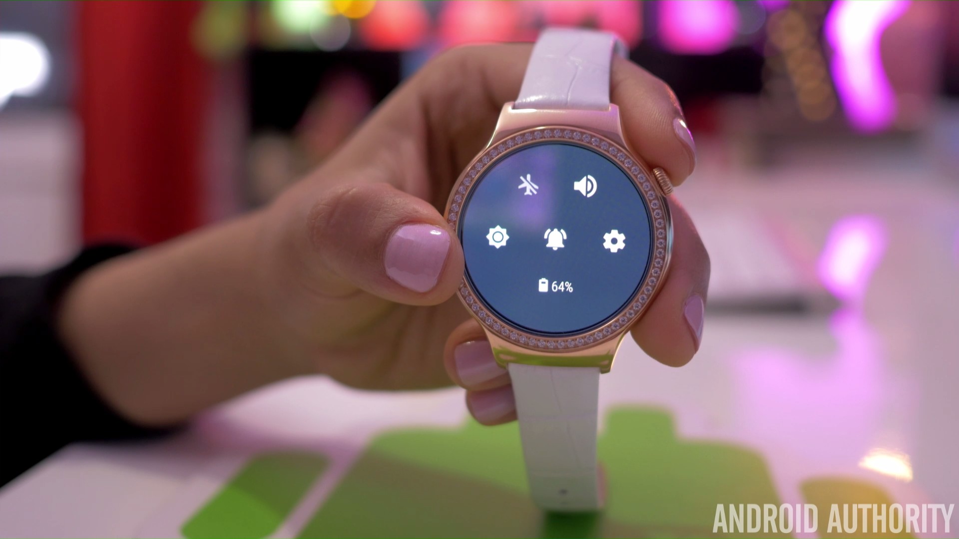
Google is introducing a more Material Design-friendly user interface with Android Wear 2.0, which includes a darker theme, that makes more sense on a wearable, along with an easier way to interact with the settings. A swipe down from the top brings up all the toggles in one screen, which is a far better implementation than having one toggle on each page and having to swipe across them.
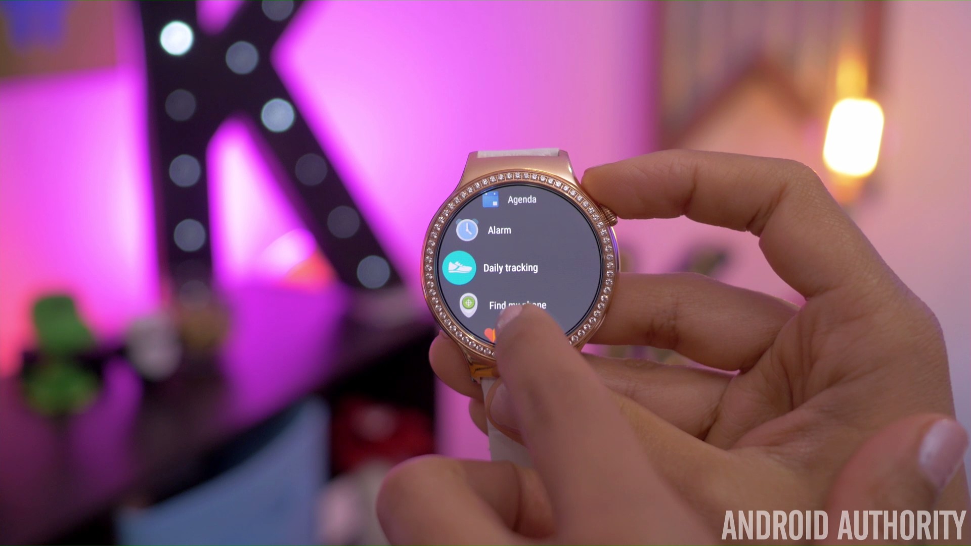
Tapping the crown brings up the list of applications installed on the watch, and as you can see, the white background has been replaced in favor a dark one that will be easier on the eyes. There is a new animation when scrolling up and down the list, with the apps moving along the curve of the display, which looks fantastic on a round display smartwatch. Also available here is the scroll bar on the right side.
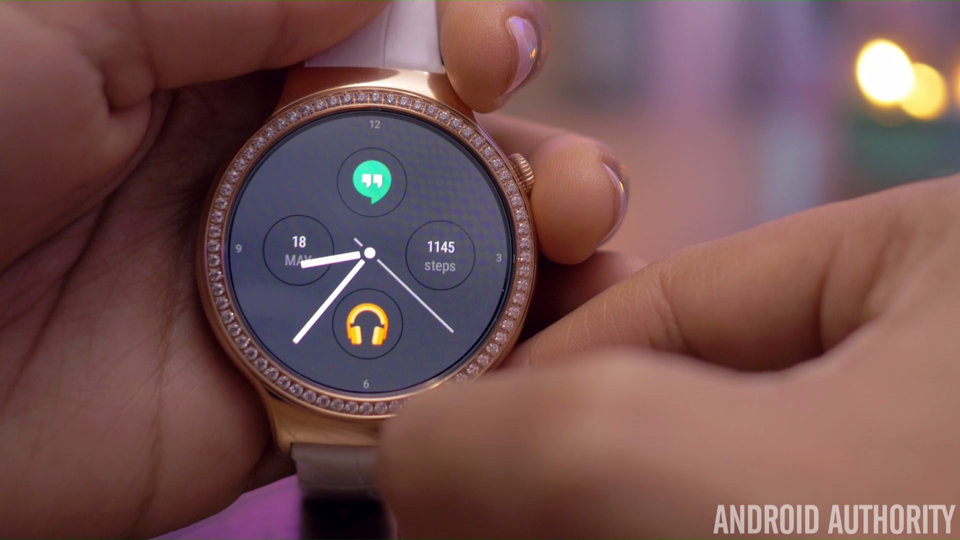
Another useful addition is the Complications API, that allows for any watch face to show data from any application. You can first choose the placement of the app, and then select the app itself, to have it on the watch face of your choice. This basically feels like having shortcuts on the screen, with a tap on the icon opening the application, and the best part is that it can work with any watch face.
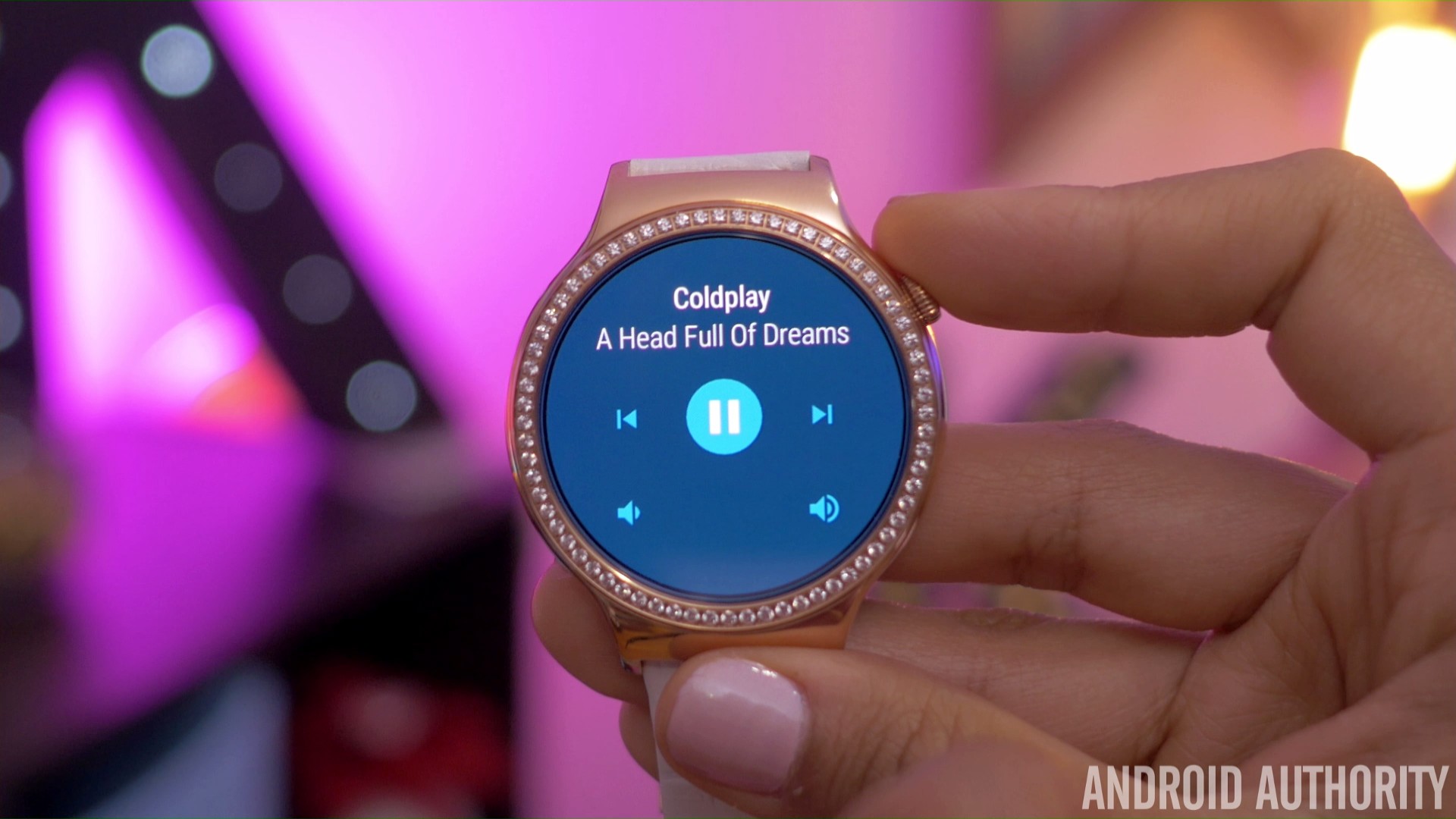
However, the main story with Android Wear 2.0 is standalone apps. Apps can now run on your watch even if your smartphone isn’t with you, or connected to the watch. The apps now have direct access to the cloud via Bluetooth, Wi-Fi, or cellular, assuming you have a smartwatch that supports the last connectivity option.
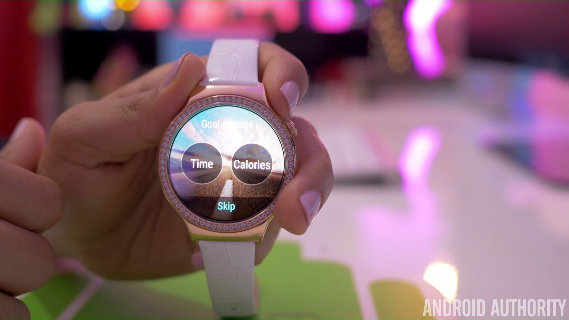
If fitness tracking is a key part of your wearable experience, you will be excited to see the improvements made to Google Fit with Android Wear 2.0. Certain apps now have the option to automatically recognize and launch when you are running, walking, or biking, or even performing exercises like push ups and other strength training activities, and apart from fitness trackers, this includes music apps as well.

So there you have it for this first look at Android Wear 2.0! Google says that the latest version of Android Wear brings with it the biggest update to ever hit the wearable scene, and so far, all these new features are definitely promising. The changes to the UI make for a far more intuitive experience, and all the new updates and features means that your smartwatch will now be a lot more than just a fancy notification center.
As mentioned, Android Wear 2.0 will officially be available this Fall, and any new smartwatches released at the time will arrive with the latest version of Android Wear out of the box. Until then, if you are a developer, you do have the option of checking out Android Wear 2.0 for yourself, by following the steps listed here.
What do you think of the Android Wear 2.0 update and are you looking forward to having it on your smartwatch? Let us know your views in the comments below and for more from Google I/O 2016, check out the links below.
All our Google I/O 2016 coverage:
- Android N getting a beta-quality release later today (Update: rolling out now!)
- Google’s progress by the numbers: app installs, phones made and more
- Google Home officially announced, takes aim at Amazon Echo
- Google Daydream platform is Cardboard’s much more advanced successor
- Google unveils Assistant: a smarter, more conversational voice assistant
- Daydream VR reference unit showcased at Google I/O
- Google announces Allo, a feature-rich new messaging app
- Duo is Google’s new cross-platform video calling app
- Android Wear 2.0 launched: standalone apps, supercharged watch faces, and more
- Android TV and Google Cast coming to a bevy of new devices
- Family Library allows sharing Google Play Store purchases with other devices