Affiliate links on Android Authority may earn us a commission. Learn more.
5 features the Google Play Store should steal from the iOS App Store right now
Published onDecember 22, 2019
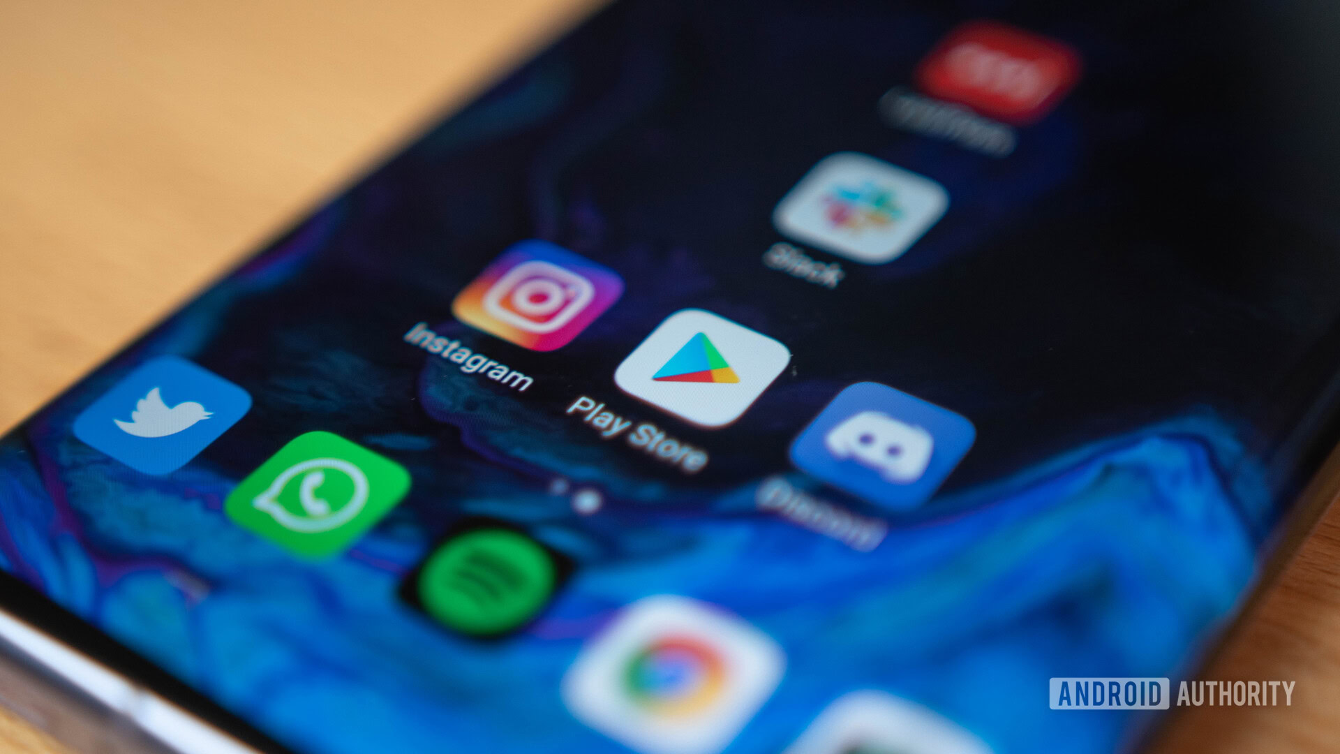
It’s no secret that the Play Store is an absolute mess. Even the most hardcore Android enthusiasts have to admit that Apple’s App Store is light years ahead of Google’s app marketplace, despite Android being in the hands of far more users worldwide.
Read also: Android and iOS are more similar than ever, and that’s a good thing
Android may have some advantages over iOS, but in the app store wars, Google really should be taking cues from its main mobile rival. Here are five App Store features that the Play Store needs to implement right away.
App and game lists
App lists are everywhere. Here at Android Authority we have literally hundreds of them. The demand for these kinds of lists is huge on Android precisely because of how awful the Play Store is at recommending anything.
When you first open the Play Store app, half of the home screen is taken up by paid advertisements. The rest is filled with endless lists of garbage games and apps. The only connecting factor is that they’re all somehow “recommended for you.”
Read also: 15 best Android apps available right now!
Contrast this with the App Store, which has daily lists of apps and games for all kinds of categories in the main Today tab. These lists aren’t simply generated by an algorithm either. They’re crafted by a dedicated editorial team with at least some semblance of taste.
The most frustrating thing is that the Google Play Store actually has these lists as well. I’m not talking about the auto-generated lists in the New and Premium tabs. I’m talking about fully curated lists that actually offer a bit more than Apple’s lists.
The Play Store's curated lists were clearly abandoned shortly after they were started.
You can find them hidden deep within the app (in the tab labeled Editors’ Choice). These lists are actually great and give explanations of why those apps were chosen, but it’s clear that the project was abandoned shortly after it was started. The most recent list was updated six months ago and there’s only a total of about 15 lists of games and apps to choose from.
Daily deep dives, interviews, guides, and more
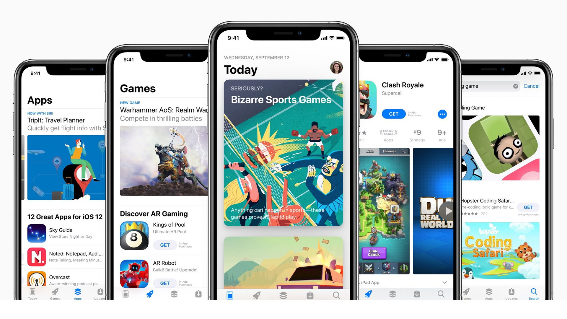
Another great feature of the App Store’s Today tab is all of the interviews, deep dives, how-tos, tips, and other stories. Each day there are more than 20 pieces of unique content to read. As an example, today’s stories include a list of tips for the latest Outlook update, a basic user guide for a popular video editing app, a feature about a new roguelike game, and more.
While none of this is groundbreaking stuff, it’s listed right as you open the App Store and makes the experience feel more like a personalized magazine than a soulless list of crummy apps. The editorial team also limits coverage to high-quality apps only, which is a nice change from the Play Store’s promotion-first approach.
Communication has never been Google’s strong suit, but it would be nice if the Play Store offered more than just a repository of apps. The Google Play Points rewards program is nice, but it doesn’t improve the experience of using the Play Store in the slightest.
App/game of the day
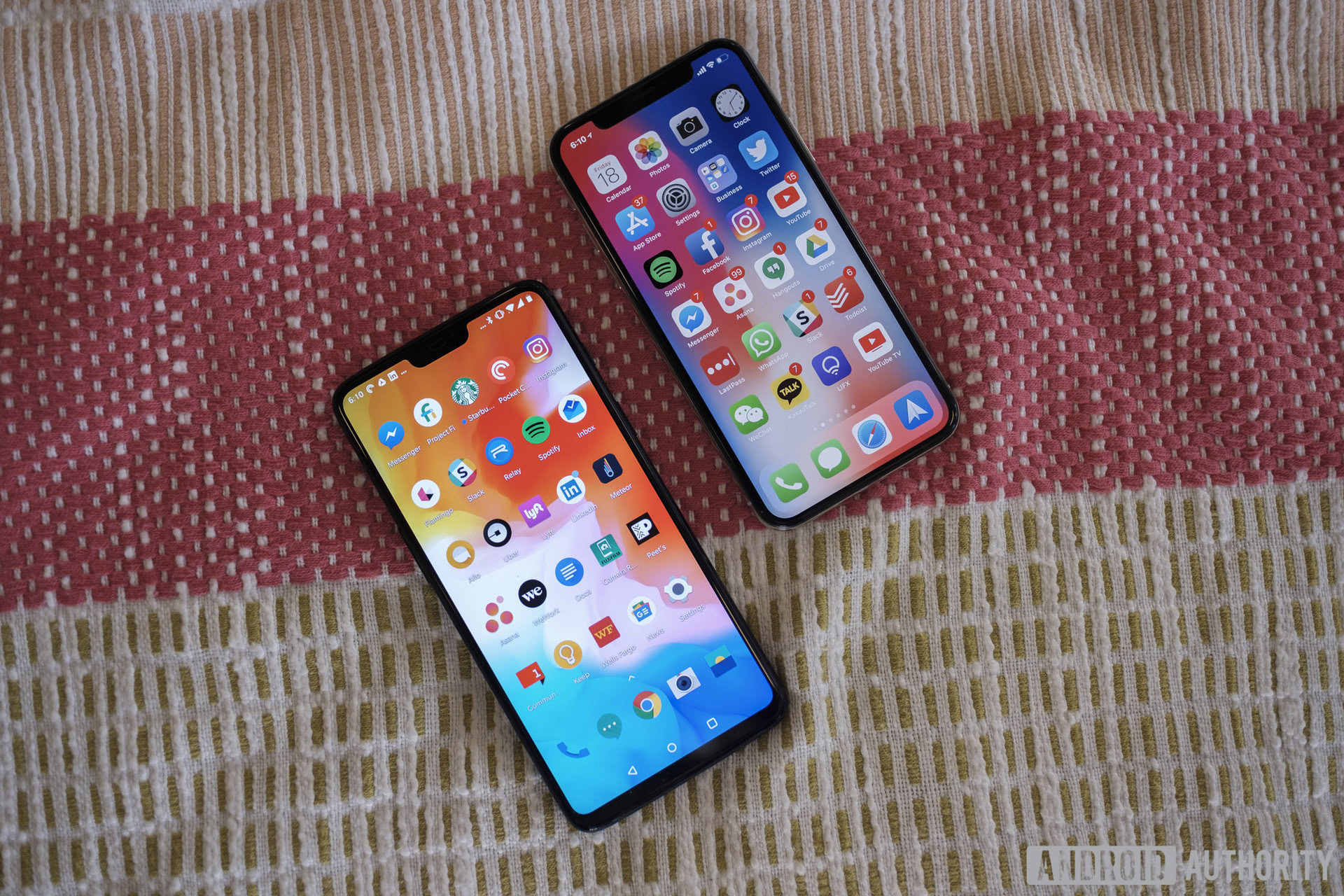
When it comes to discovering new apps, the App Store once again bests the Play Store with a simple daily feature. Every day an app and game of the day are handpicked by App Store editors. Even better, they come with an in-depth explanation of what the app is all about, which goes a step beyond the typical app page description.
If you don’t catch it on the day it’s featured you can still easily find it later on as previous entries appear further down on the page for a short time. Currently there are ten apps featured in separate posts, all of which I would at least consider downloading.
When it comes to sorting through the deluge of new apps on the Play Store, users are left to their own devices.
When a featured game hasn’t come out yet, you can pre-order it on the spot and it will automatically download to your device within 24 hours of release. I can’t even count the amount of times I’ve pre-registered for a game on Google Play and not gotten a notification when it came out.
The Play Store is also notoriously lenient with which apps make it onto the platform with tens of thousands of new apps and games added every day. When it comes to sorting through this deluge of new apps, users are left entirely to their own devices.
There is a Game Spotlight section that pops up from time to time on the Google Play home screen, but this doesn’t offer anything more than the same images and descriptions found on app pages. Plus, it’s buried between 50+ other app icons that are desperately trying to grab your attention as you scroll down the page.
App purges and selectivity
Apple’s whole deal (for better or worse) is exclusivity, and that transfers over to the App Store. Developers looking to get their apps on iPhones and iPads have a long tedious process to navigate through, plus a hefty yearly fee to keep their license.
The App Store actively polices clone apps, while on the Play Store they run rampant.
On Android, it’s a one-time $25 fee and you’re off to the races. As long as your app more or less works and doesn’t break any big rules, it’ll be on the Play Store in no time. Sure, it isn’t the 24-hour process that it used to be, but it’s still considerably faster than on iOS.
The App Store not only has a higher standard for the apps it lets through, but it also enforces more strenuous policing than its Android counterpart. Starting in 2016, Apple began purging apps en masse for not adhering to current review guidelines, with hundreds of thousands of clones and spam apps removed from the App Store. This might sound harsh, but if you want to keep the platform in good shape you have to trim the fat from time to time.
It’s true that the Play Store screens and purges apps as well, but with a scope that’s mostly limited to privacy and security. Low quality apps and copycat titles are still welcome on the platform, leading to a serious clone problem that continues today.
A decent subscription service
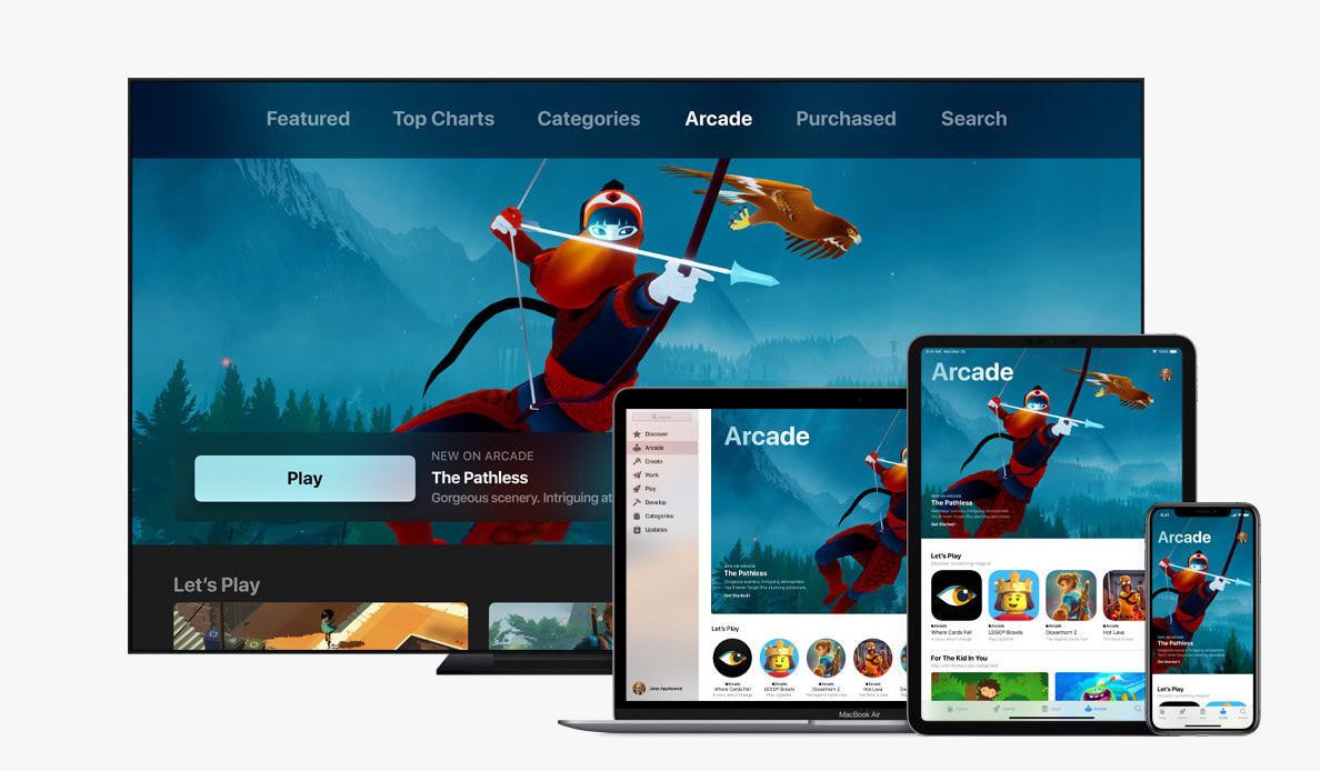
Perhaps the best example of the Play Store’s complete lack of selectivity is Play Pass. It was released shortly after Apple Arcade, and the two seemed to run neck and neck — if you take the sheer quantity of apps on Play Pass at face value.
Read also: Google Play Pass vs Apple Arcade: The battle of the curated app subscriptions
The truth, however, is that most of those apps are useless, repetitive, or both. When it comes to games, Apple Arcade is entirely comprised of fun exclusive titles like What the Golf?, Oceanhorn 2, and Sayonara Wild Hearts, while Play Pass has eight solitaire apps, five sudoku apps, and three 2048 clones. There are a few great games slipped in there, but all of them were already available on Android and iOS.
If Google really wants to take mobile gaming seriously, it needs to invest in some exclusive content for Android. Apple Arcade is fantastic not only because it offers great value, but also because it seeks to elevate the mobile platform beyond free-to-play trappings and expand access to truly premium titles.
Google is already investing in first-party studios for its cloud gaming platform Stadia, so this one should be a no-brainer. The $2 a month pricing for the first year is the only thing Play Pass has going for it, but once that year is up it’s the same price as Apple Arcade. I know where my money would go.
What other features does the Play Store need to match the App Store? Let us know your thoughts in the comments below.