Affiliate links on Android Authority may earn us a commission. Learn more.
Apple copies Material You, adds ability to customize home screen and icons to iOS 18
Published onJune 10, 2024
- iOS 18 will give users the ability to customize their home screen and app icons.
- Users will be able to place their icons wherever they want on the home screen.
- The OS update will allow users to customize the color of the icons for their apps.
Apple’s big WWDC event is underway with plenty of software announcements to be made. One announcement of note came near the beginning of the event where the company revealed that users will soon be able to customize their home screens and app icons.
For decades, Apple has restricted what users can do to customize the appearance of their phone’s screens outside of changing the background. The software always had to match the clean lines and simplicity of the hardware. However, the tech giant is giving users a little more freedom to choose how they want their screen to look.
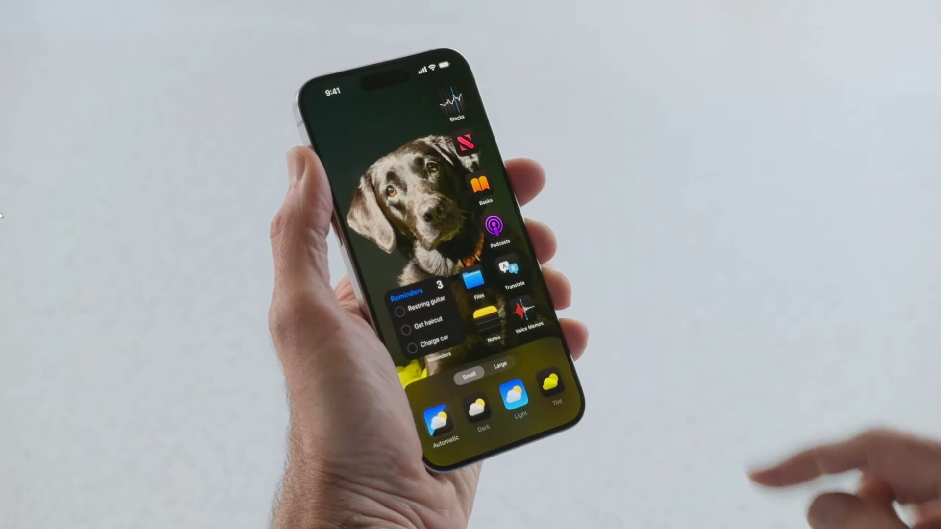
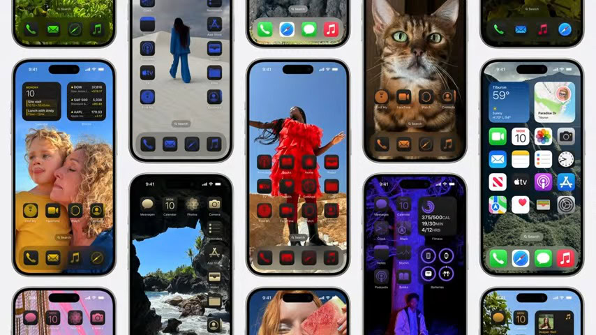
When iOS 18 arrives, apps will no longer have to stay within a neat grid. You’ll be able to move your apps to anywhere on the screen. An example provided during the livestream showed a line of apps arranged at the top and bottom of the screen. While another configuration had all of the apps lined up on the side of the display.

In addition to app arrangement, the company also showed off dark mode for apps. As demoed in the live stream, switching apps to dark mode can be assigned to the Action Button. Just as it sounds, switching to dark mode changes the app icons so they are surrounded by a dark border.
Meanwhile, users will soon also be able to change the color of their icons to whatever tint they want. This is done by long pressing an app and tapping on edit in the top left corner, which brings up a new customization sheet. If this sounds familiar, you would be correct, as it is similar to Google’s Material You app themes.

However, to Apple’s credit, it allows users to select the tint they want to use instead of restricting them to preset colors like Google does. That’s a great way to open up customizations, but it’s also a recipe for visual disaster that ignores contrast and other good design principles.