Affiliate links on Android Authority may earn us a commission. Learn more.
Apple iPhone 14 Pro revisited: The good and bad six months later
Published onMarch 19, 2023
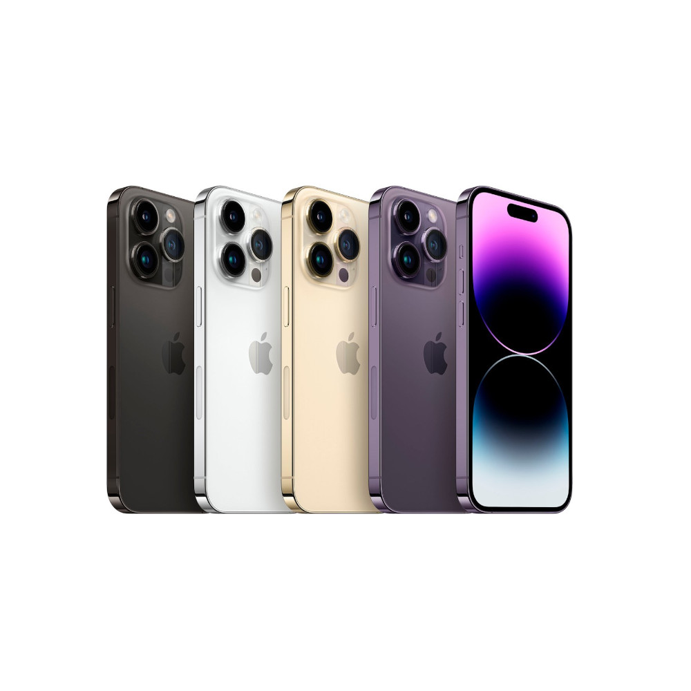
The launch of the iPhone 14 series marked a new era for Apple. Never before have we seen such a stark divide between the standard and Pro models. While the standard iPhone 14 was little more than a repackaged iPhone 13, the iPhone 14 Pro leaped forward to catch and match the best Android phones. The iPhone 14 Pro introduced a dramatic upgrade in camera sensor resolution, as well as a powerful new way to multitask — a pill-shaped cut-out dubbed the Dynamic Island. But while the upgrade might sound big on paper, using the iPhone 14 Pro tells us a slightly different story. In typical Apple fashion, the changes are subtle, meaningful, and thought out — to a degree.
I’ve been using the Apple iPhone 14 Pro ever since its release in September. How well has it fared in the six months since? Let’s find out in the Android Authority iPhone 14 Pro review revisit.
The good
Design
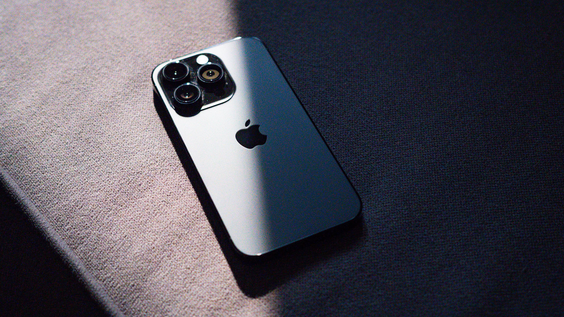
There are two ways to look at the design of the iPhone 14 Pro. If you subscribe to the minimalist school of style, the back of the phone is a timeless classic that, even now, in its third iteration, continues to look premium. I’ve got the all-black variant on hand. It might be boring to some, but six months later, the stealthy look still evokes a sense of understated luxury that not many other phones are able to match up to. I love it.
The iPhone is a slow-moving beast, but the laid back minimal design continues to look and feel great.
The iPhone, and Apple, for that matter, is a slow-moving beast by its very nature. The company’s focus on design conformity across generations of phones is a feature that polarizes users and design nerds. If you look for excitement and drama from your phone, the iPhone 14 Pro is definitely not going to cut it for you.
It’s also a relatively high-maintenance phone. For example, even though the general construction and materials have held up very well, and the buttons retain their high tolerance tactility, the polished high-gloss side rails are a pain to keep fingerprint free. Similarly, the camera module attracts a lot of lint and dust, more so in a dusty city like Delhi. Apple’s claims of resilience against drops with its use of Ceramic Glass seem sound, but I still racked up some dust-related micro scratches in the few days I used it without protection. I’d highly recommend most users slap on a case — check out our list of the best iPhone 14 Pro cases for a few options — or at the very least a high-quality screen protector
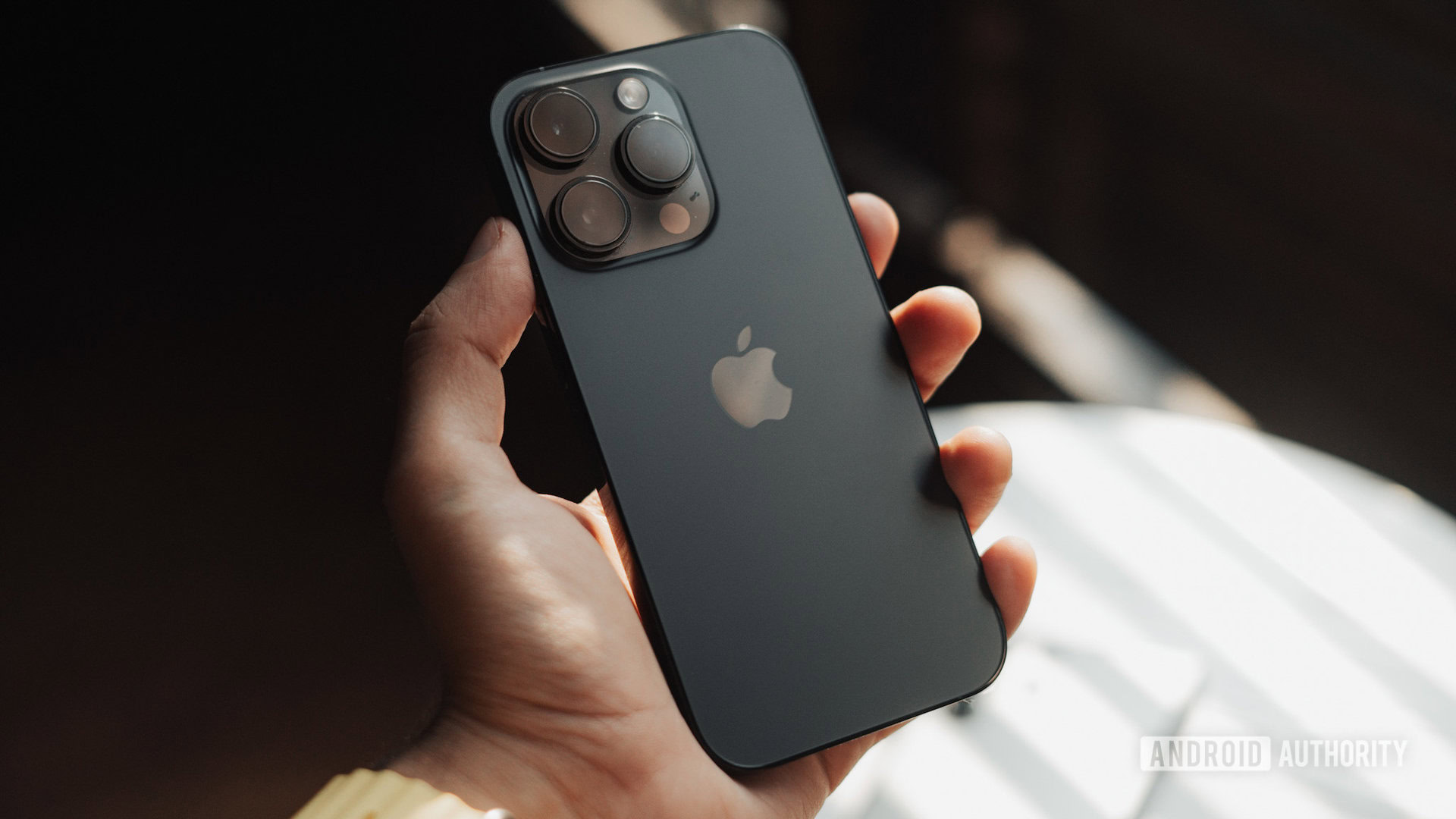
Despite all this, for me, the 6.1-inch form factor of the iPhone 14 Pro remains one of the most comfortable on the market, and the reassurance of having a familiar form factor works in my favor.
I’m dual-wielding the phone with a Samsung Galaxy S23 Ultra, and that giant of a phone can often be hard to slip into a pocket. Moreover, one-handed use is nigh impossible without some careful maneuvering. For those who appreciate larger-sized phones, Apple has the iPhone 14 Pro Max on offer, but, in my experience, that phone is even more unwieldy than the S23 Ultra. All of which to say, there’s nothing new to discover here. If you like what Apple has been doing with the last few generations of iPhones, you’ll like the iPhone 14 Pro. And if you don’t, well, tough luck.
Dynamic Island
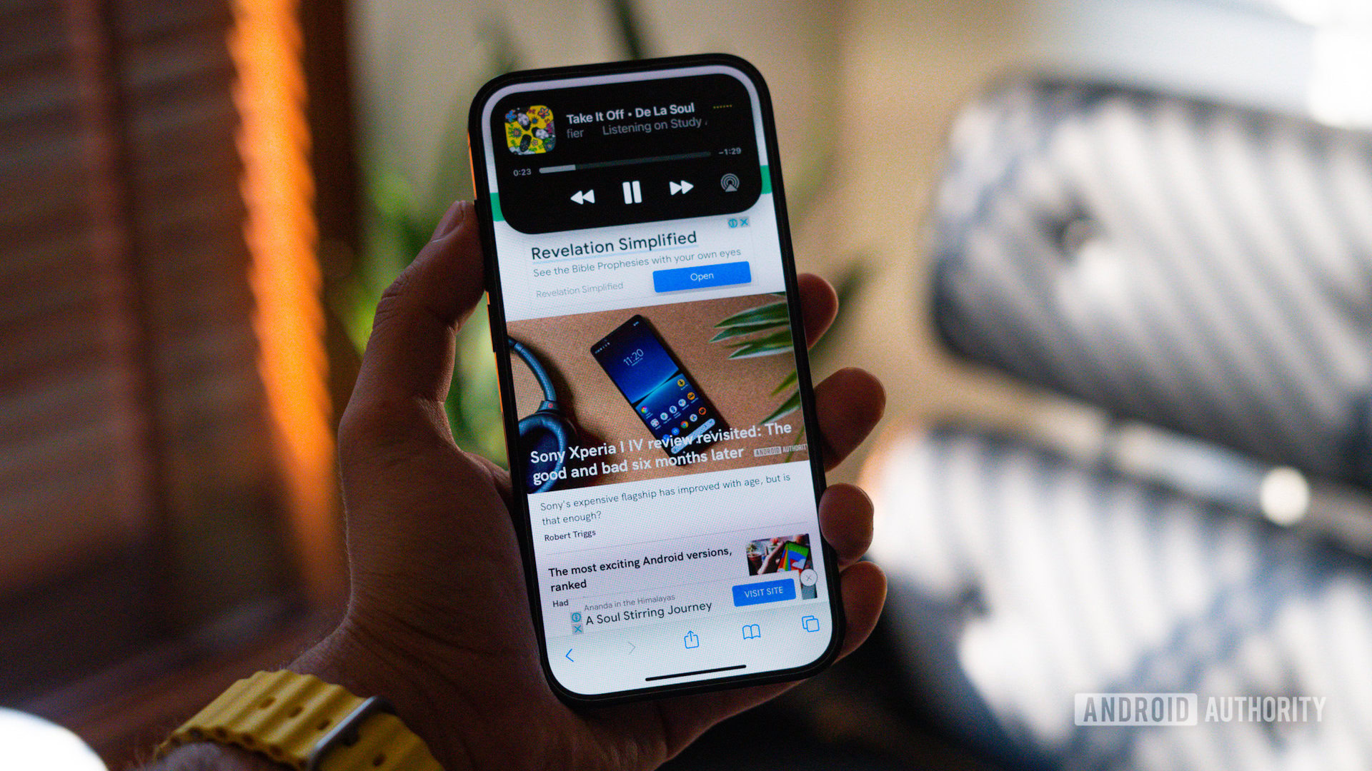
For all its similarities with previous generations of hardware, Apple did add one new design feature to get people excited. Love it or hate it, the Dynamic Island on the iPhone 14 Pro is a bold new attempt at reinventing multitasking on the iPhone. But once you’ve stepped off the pulpit of Apple’s marketing hyperbole, it is easy to see some good ideas and a few not-so-great ones.
On the face of it, Dynamic Island is nothing more than smart utilization of space between the front-facing camera and the Face ID authentication system. However, that innovative use and its implementation are what give it legitimacy as an interesting, almost ingenious move.
At launch, Dynamic Island was supported by little other than Apple’s first-party apps. But while having an always-accessible music player in the notch is nice, it’s not essential. Six months since launch, the situation has improved by leaps and bounds, though not quite as much as I’d have hoped. Popular apps like Carrot Weather and Apollo have added interesting use cases for the dynamically adjusting notch.
Most days, I find myself using it to jump between two activities. All these months of use later, I’d stay shy of calling the island a roaring success, but just like the Touch Bar-enabled Mac, it’s proven itself as a nice-to-have feature that adds a little bit of utility and fun. Once the novelty wears off, you mostly forget about it unless needed. I see it as a stop-gap measure and expect Apple to get rid of it entirely once it’s figured out under-display cameras in a few years.
Performance
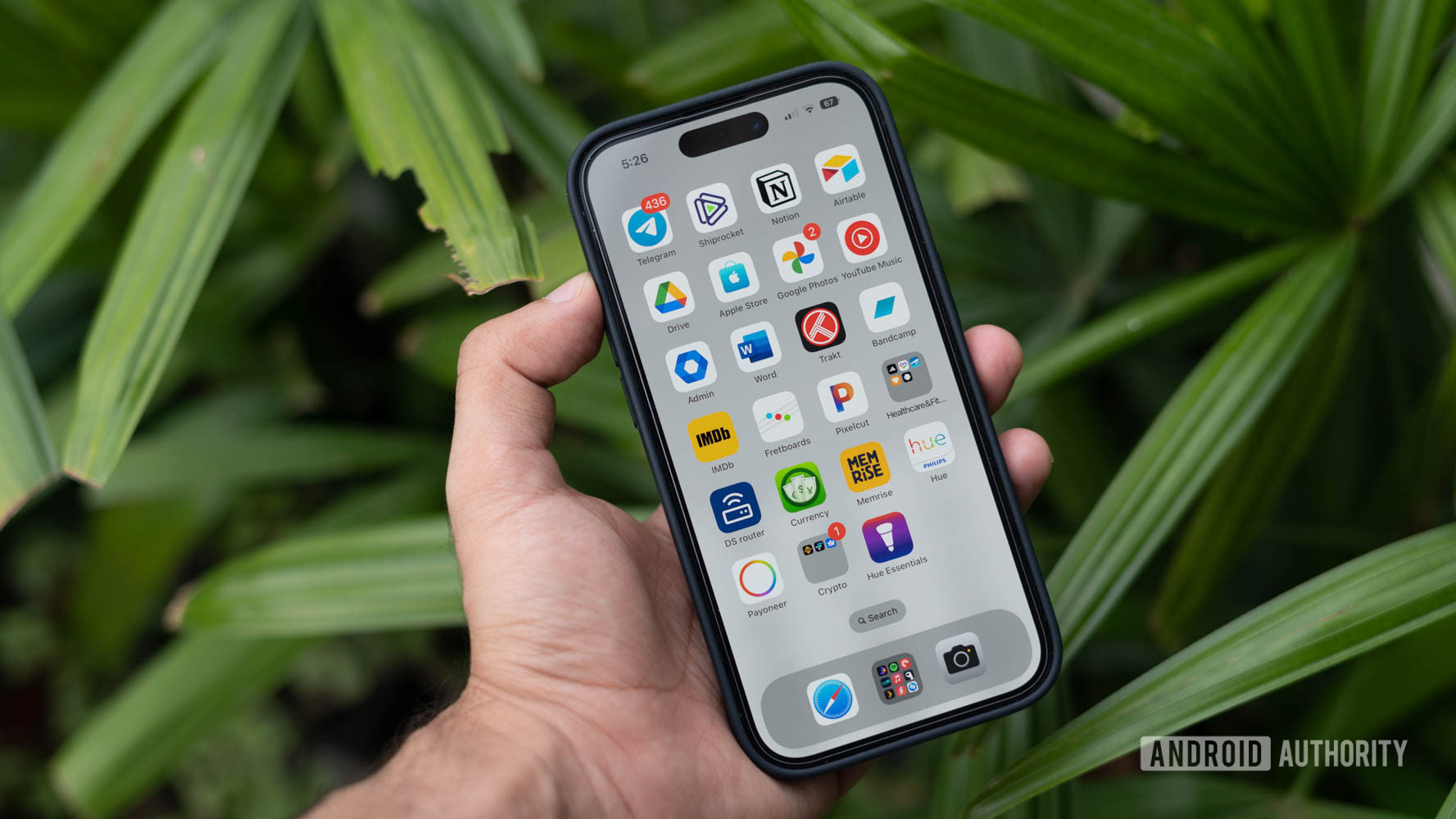
To Apple’s credit, the company has a knack for nailing down long-term software fluidity and optimization. Animations are just as fluid as day one, and the general user experience, if you like Apple’s way of doing things, is a joy to use. If you care about benchmarks, the iPhone 14 Pro’s A16 Bionic chipset continues to beat the more recent Snapdragon 8 Gen 2 chipset in CPU-bound tests but lags behind in GPU-based tests.
The not so good
Cameras
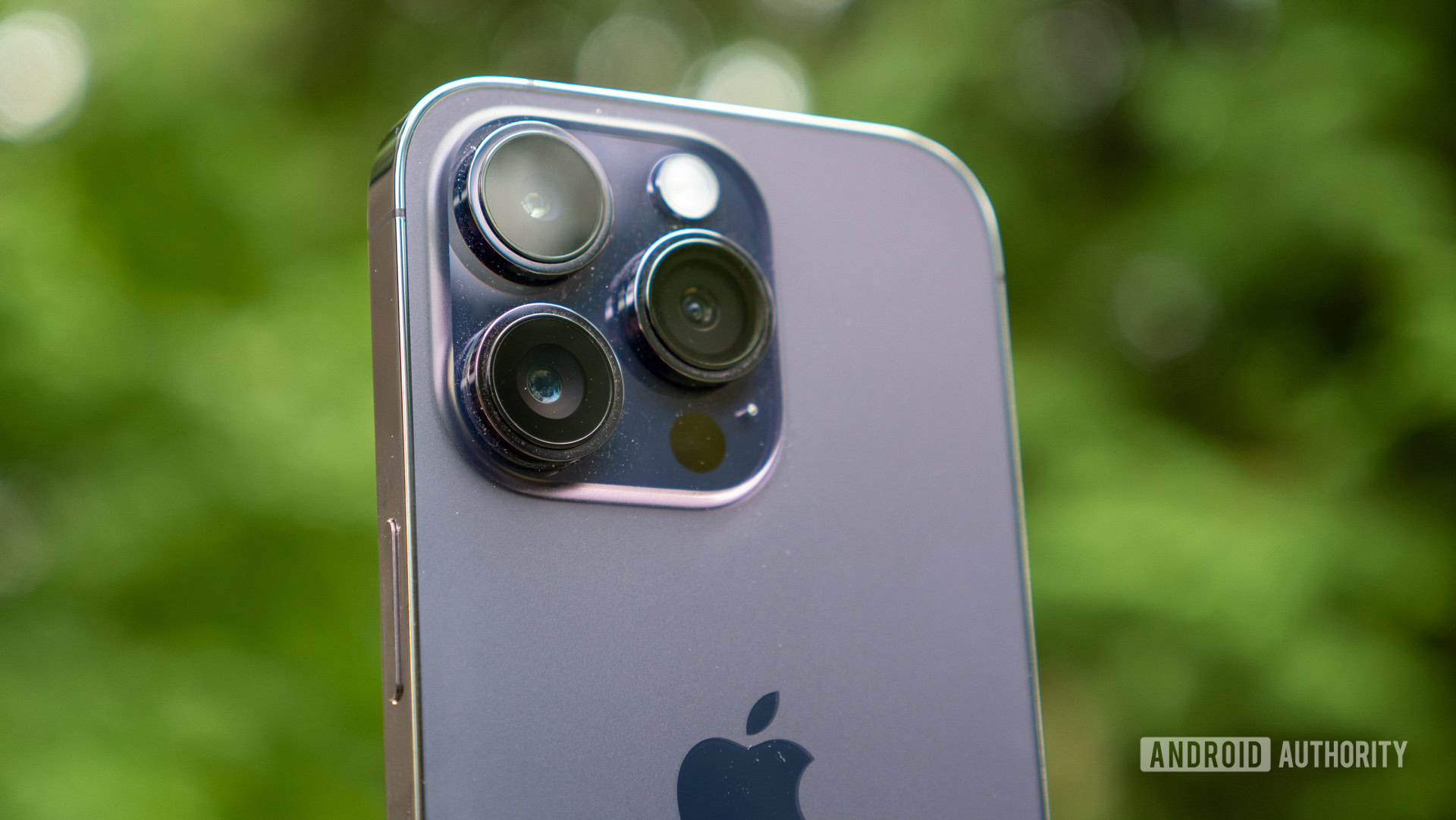
But photography isn’t really an objective art. Processing, final output, dynamic range, and myriad other factors play a role in deciding whether you like the output from a camera. Unfortunately, the iPhone 14 Pro took a slight step back. Straight-out-of-camera JPEGs have too much sharpening going on with a slightly oversaturated color profile. There’s also the warmer-than-normal color profile. Again, something I personally like but isn’t for everyone. It’s not bad, but for the subset of users coming from the last generation’s phone, there’s a slight degradation in picture quality. Apple’s lackluster HDR implementation is also a recurring concern with blown-out skies, highlights, and lens flares in nighttime shots. That said, nitpicking aside, the iPhone’s camera remains a crowd-pleaser even if it isn’t the very best option on the market.
The JPEGs are fine, but RAW photography using the iPhone 14 Pro opens up a whole new dimension of possibilities for creative users.
However, there’s one additional aspect about the camera that keeps me coming back to the iPhone — RAW capture. Most phones today can capture RAW photos, but the sheer amount of dynamic range in RAW images from the iPhone is astounding. As an amateur photography enthusiast, my preference lies toward RAW captures and a Lightroom editing workflow. Photos from the iPhone fit perfectly into that process and allow me to push for more details in the shadows and highlight retrieval.
As we noted in our original iPhone 14 Pro review, video capture here remains some of the best you can get out of a smartphone. While other phones extoll the benefits of 8K capture, the iPhone has them beat in the sheer quality of the footage — and that’s what truly matters. It’s just a shame the rest of the camera package can’t match that elite standard.
Charging
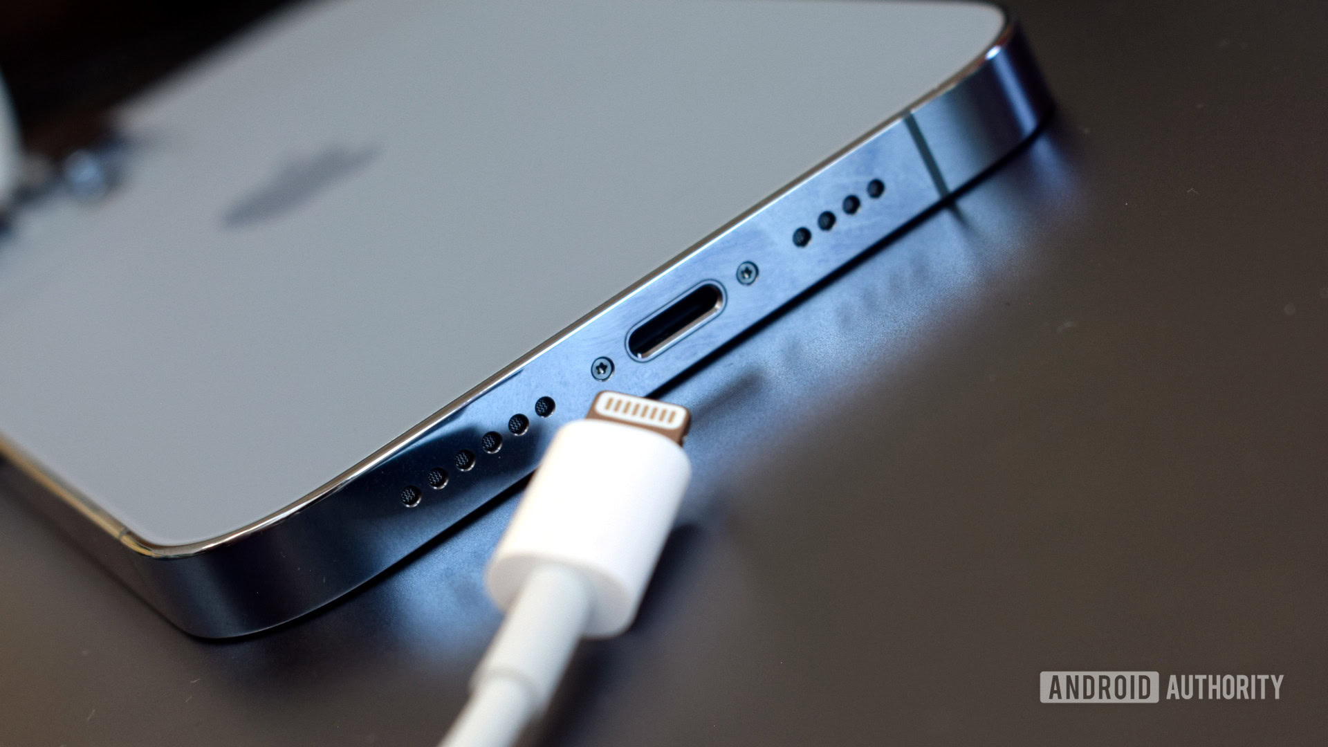
The iPhone might finally be ready to join the USB-C party next year, but the iPhone 14 Pro is still hamstrung by the Lightning connector and its slow-as-heck charging speeds. The maximum you can hope for is 23W with an appropriate charger and 15W wireless charging if you pay the nosebleed prices for Apple’s MagSafe charger. Standard Qi charging remains locked to 7.5W in typical Apple fashion. Basically, expect to wait upwards of 80 minutes for a full charge.
The Lightning connector comes with its own set of issues that are even more annoying today. For example, I use a USB hub with my Samsung Galaxy S23 Ultra and iPad Air to transfer files or output video over HDMI. That’s a no-go with the iPhone. If you, like me, want to make full use of lossless audio streaming from Apple Music, you’ll likely want to use an external DAC and amp. Once again, I had to scramble around to find an appropriate cable to use with the iPhone. Robust accessory support for Apple’s ecosystem means it isn’t particularly hard to find the right connectors. Still, with everything else in and beyond Apple’s ecosystem moving to USB-C, the company’s dogged allegiance to the connector is a nuisance you shouldn’t have to deal with in 2023.
Battery life
Apple’s been leading the charge with its battery life optimization over the last two generations of phones. The iPhone 13 Pro was an easy two-day smartphone for me. The iPhone 14 Pro, on the other hand, has been somewhat inconsistent, and I’m not entirely sure it’s down to the hardware. You see, Apple managed to stuff a slightly larger battery into the shell of the iPhone 14 Pro. But while it compensates for the higher clock speeds of the processor, there’s more to the story here.
The battery size went up, but battery life went down. Blame the buggy software for that.
For one, Apple’s software, starting from iOS 16, has been surprisingly buggy. And while we’ll come to that shortly, it’s also directly impacted the phone’s battery life. Overnight battery drain has increased from 2-3% on the last generation’s phone to 5% and beyond this time around. While the iPhone 14 Pro still lasts me a full day of use, I usually have to plonk it down on a charger at the end of a long day. Six months and a hundred-odd wireless charging cycles later, my battery health is still at 100%, which makes me question the veracity of those claims. Don’t get me wrong, battery life is plenty good here, but there’s a noticeable decrease over the iPhone 13 Pro models, and I’d bet that’s mostly down to the software.
Software
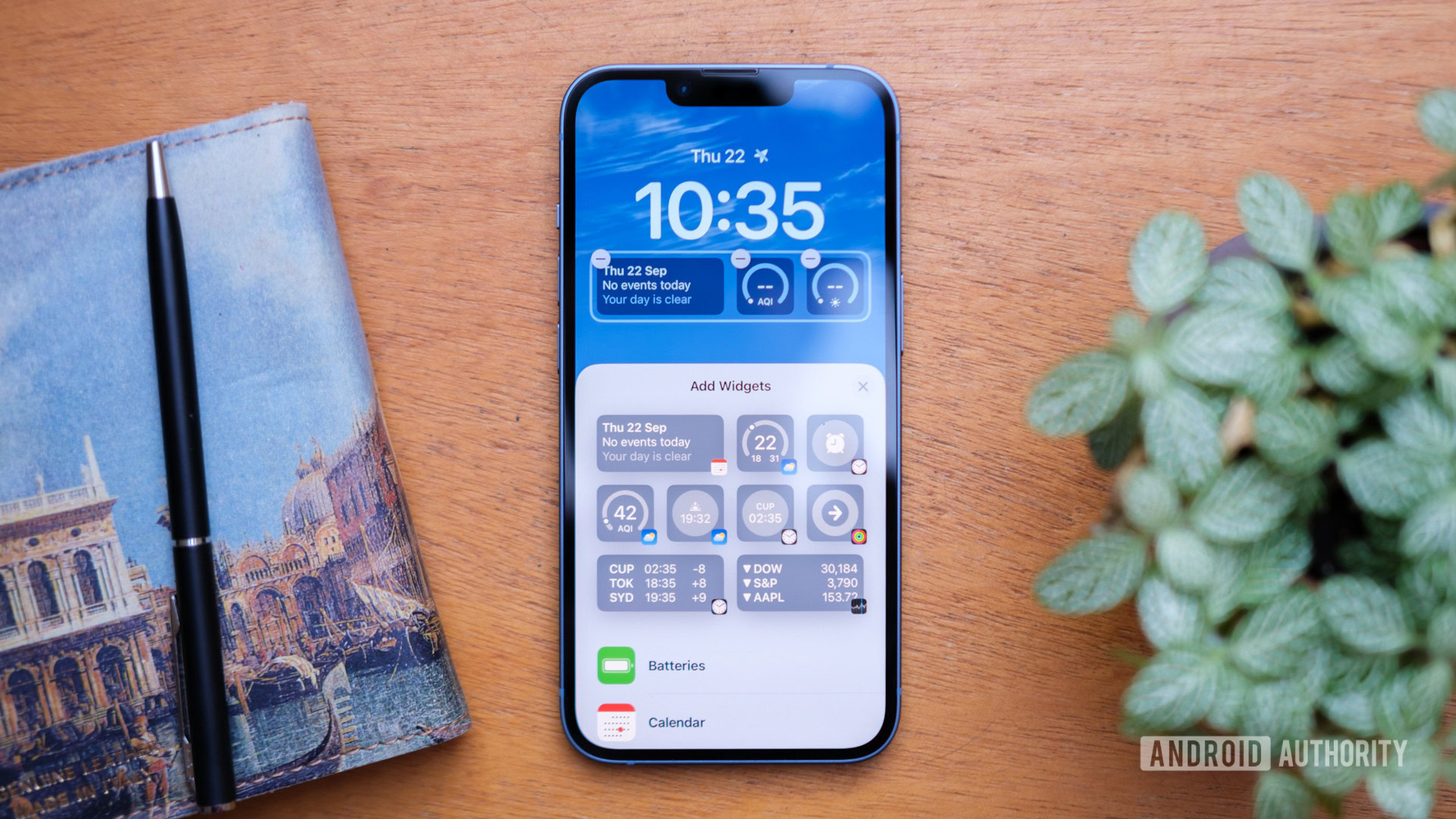
Much as I like the iPhone’s user experience, iOS 16 has been the buggiest software release from Apple that I’ve experienced in years. From battery life woes to glitchy apps, Apple’s most recent big software update has fallen far short of Apple’s usual high standards for software stability.
Bugs and the occasional force-closed app mar an otherwise exemplary user experience.
At launch, battery drain was a major concern with iOS 16, but Apple largely fixed it with the next release. Until the following release brought it back with a vengeance. Similarly, I’ve faced app crashes and errant keyboard bugs over the course of six months of software releases. Even today, my iPhone 14 Pro doesn’t always successfully switch from Wi-Fi to 5G. Suffice it to say; this is not the experience you expect from a phone that costs as much as the iPhone does.
iPhone 14 Pro review revisited: The verdict

The fact that the iPhone line-up fends off a litany of Android flagships to defend its title of the most popular premium phone in the world is no joke. For all our nitpicks and issues, the iPhone 14 Pro offers an exemplary albeit confirmative user experience. Buying an iPhone means living in Apple’s world and by Apple’s rules. That’s not necessarily a bad thing. The close match-up of hardware and software delivers a generally brilliant user experience with thoughtful flourishes strewn about. The cameras aren’t exciting or world-beating, but they deliver on point-and-shoot goodness for the masses and have a lot of headroom for the creatives. Meanwhile, the design continues to age like fine wine.
Is the iPhone 14 Pro still a good purchase six months later?
Things like the Lightning connector and slow charging are issues, for sure. But are they dealbreakers or mere annoyances? That’s for the buyer to decide, but I’d say that even with a generational decline in battery endurance, it’s still decent enough to alleviate any serious battery anxiety. Honestly, my biggest gripe is something I’d never thought I’d be complaining about with an Apple product. Apple’s rush to integrate newer interface elements and feature sets comes with the trade-off of occasional glitches. Perhaps the software team could do with taking a more stoic approach like the hardware team.
Ultimately, buying an iPhone has always been a trade-off between bleeding-edge specs and a formula Apple deems perfect. If you’re okay with that, the iPhone 14 Pro remains an exceptional smartphone in 2023.
