Affiliate links on Android Authority may earn us a commission. Learn more.
The iPhone’s Dynamic Island is like the Mac’s Touch Bar: A promising failure
Published onAugust 20, 2023

Apple’s design iteration of its principal money maker, the iPhone, is one of slow deliberation. In fact, Apple rarely, if ever, takes bold steps with the design. That said, it wouldn’t be unfair to call 2022 a special year. The company pulled a one-two surprise by introducing the Dynamic Island to the iPhone 14 Pro and gave the phone an all-new interface mechanism.
Sure, Dynamic Island’s quasi-multitasking approach is a clever ploy to hide the comically large camera and Face ID cutouts, but it’s also reminiscent of the quickly-retired MacBook Touch Bar in a way. It’s a quirky and innovative addition to the otherwise intentional-to-a-fault design of the iPhone, but it slowly faded in the background. One week into using the iPhone 14 Pro, I was loving the Dynamic Island’s heads-up approach toward critical alerts, quick access shortcuts, and navigation. One year later, I’ve all but forgotten about it.
Do you find Dynamic Island on the iPhone useful?
I liked Dynamic Island until I forgot about it

When the iPhone 14 Pro launched, I spent a week trying out and falling in love with Dynamic Island. I even shared my Dynamic Island experience and how the system had been misunderstood by many in the tech industry. Almost a year later, I continue to stand by it, as it solves some problems with everyday use that I didn’t realize I faced. But here’s the catch — those use cases aren’t nearly enough to justify the prime real estate it occupies.
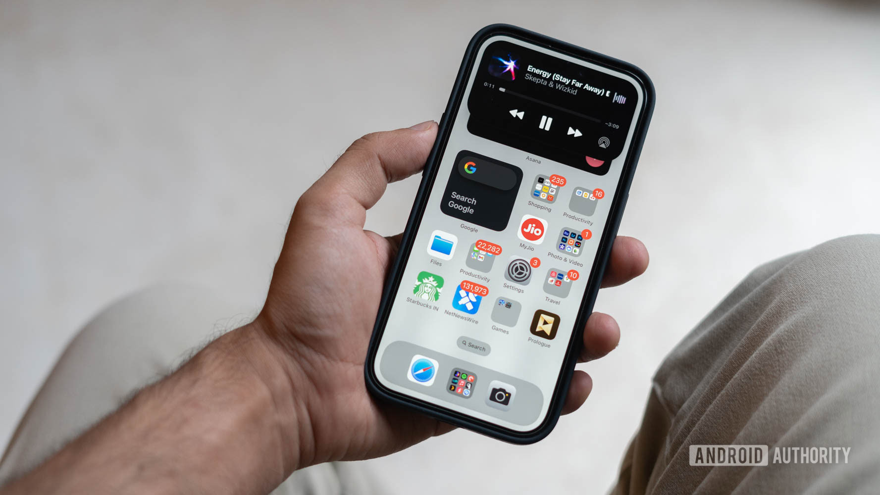
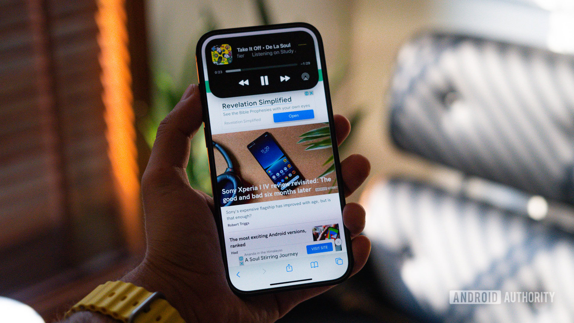
I love the convenience of switching audio tracks from Dynamic Island, but that pretty much sums up everything I use it for.
Let’s start with the obvious. I love the convenience of switching audio tracks without pulling down the notification shade or heading into the app. Heads-up alerts for timers are convenient too. But I’ve found some other use cases, like dynamic turn-by-turn driving navigation alerts, to be less useful since I prefer to open the full-screen app anyway. People living in pedestrian-friendly cities might find it more convenient, though.
Unfortunately, that pretty much sums up the extent of my use cases. Dynamic Island just doesn’t do enough. Moreover, even for these highlight features, my usage has dropped to a mere once or twice a week, and, for the most part, Dynamic Island remains out of sight and out of mind.
Ironically, it’s a fear I’d expressed in my initial piece. When I first started using the feature, Apple’s Live Services API hadn’t rolled out yet. Almost a year later, the list of supported apps remains woefully short. In fact, in India, outside of my preferred food delivery app, there have been precious few occasions to use Dynamic Island.
So much promise, so little delivered

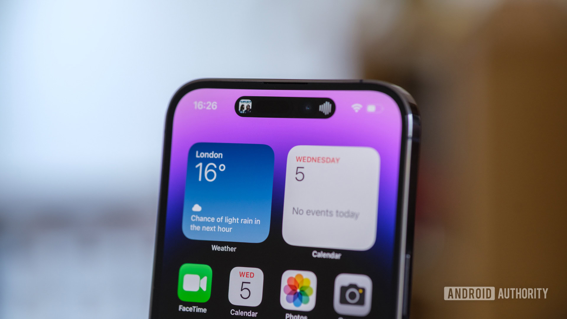
Splitting out the notification hub into a section that displays time-sensitive alerts has certainly had its benefits. However, Dynamic Island’s utility is almost entirely dependent on app support. And the lack of broader developer support means I usually stare at a large black blob on my screen most of the time.
Instagram could’ve used the hub to display a progress circle to indicate the status of an upload, but it doesn’t. The same goes for any file transfer apps I use. If I’m editing a video in LumaFusion, I should be able to see the render status in Dynamic Island, but I can’t.
You'll struggle to find use cases outside the expected timers, navigation alerts, and music player controls.
Instead, the most popular use cases are the expected timers, navigation, and music player controls. Of course, there are a few exceptions to the norm, like flight tracking service Flighty. After adding your boarding pass, the app guides you all the way to your gate. If you’re a global jet setter, the feature could be immensely useful, but most people are not flying around the world every other day.
My issues with Dynamic Island are an extension of Apple’s entire approach to multitasking. Swapping out of LumaFusion or the Instagram app will likely cancel the export or uploads, making Dynamic Island a lonely paradise. Unfortunately, this makes possible applications inherently limited.
Additionally, unlike the MacBook Touch Bar, which presented sizeable real estate for developers to experiment with, the Dynamic Island is essentially an aesthetic bandaid to cover up cutouts for the Face ID and camera sensors. And Apple can crib only that much screen real estate from the display before it begins hampering the actual user experience.
I want Dynamic Island to succeed

Much as I’m disappointed by the current state of Dynamic Island on the iPhone 14 Pro, I like the potential to make it useful. Given the right tools and APIs, there is room for a fair amount of multitasking, which appeals to me as a power user. But I’m not very optimistic.
Dynamic Island could be a great pseudo-multitasking system, but it might be headed the way of the Mac's Touch Bar.
The lack of feature additions and limited appeal makes me think that Apple also considers it a short-term fix until it can enable an under-display camera sensor and, perhaps, even a tucked-away under-display Face ID sensor. In fact, rumors of Apple’s 2025 line-up already talk about the debut of under-display sensors, which makes garnering developer support for the doomed Dynamic Island a losing battle.
However, at least in the short term, there appears to be some light on the horizon. Rumors suggest that Dynamic Island might be a part of the entire iPhone 15 line-up giving developers more incentive to develop intriguing ways to adopt it.
The iOS 17 betas, too, have brought along some updates to Dynamic Island in the form of a better UI for AirDrop, initiating SharePlay and proximity-based Airplay detection that pops up around the UI.
However, that’s just not enough. Perhaps Apple is holding back on announcing new features till its fall release schedule. One can only hope. But unless Apple introduces a slew of dramatic software upgrades for Dynamic Island, I’m afraid it will end up as the promising but quickly-abandoned Touch Bar: yet another short-lived experiment.