Affiliate links on Android Authority may earn us a commission. Learn more.
Apple's designs are 'iconic' because of repetition and laziness
Published onOctober 2, 2024
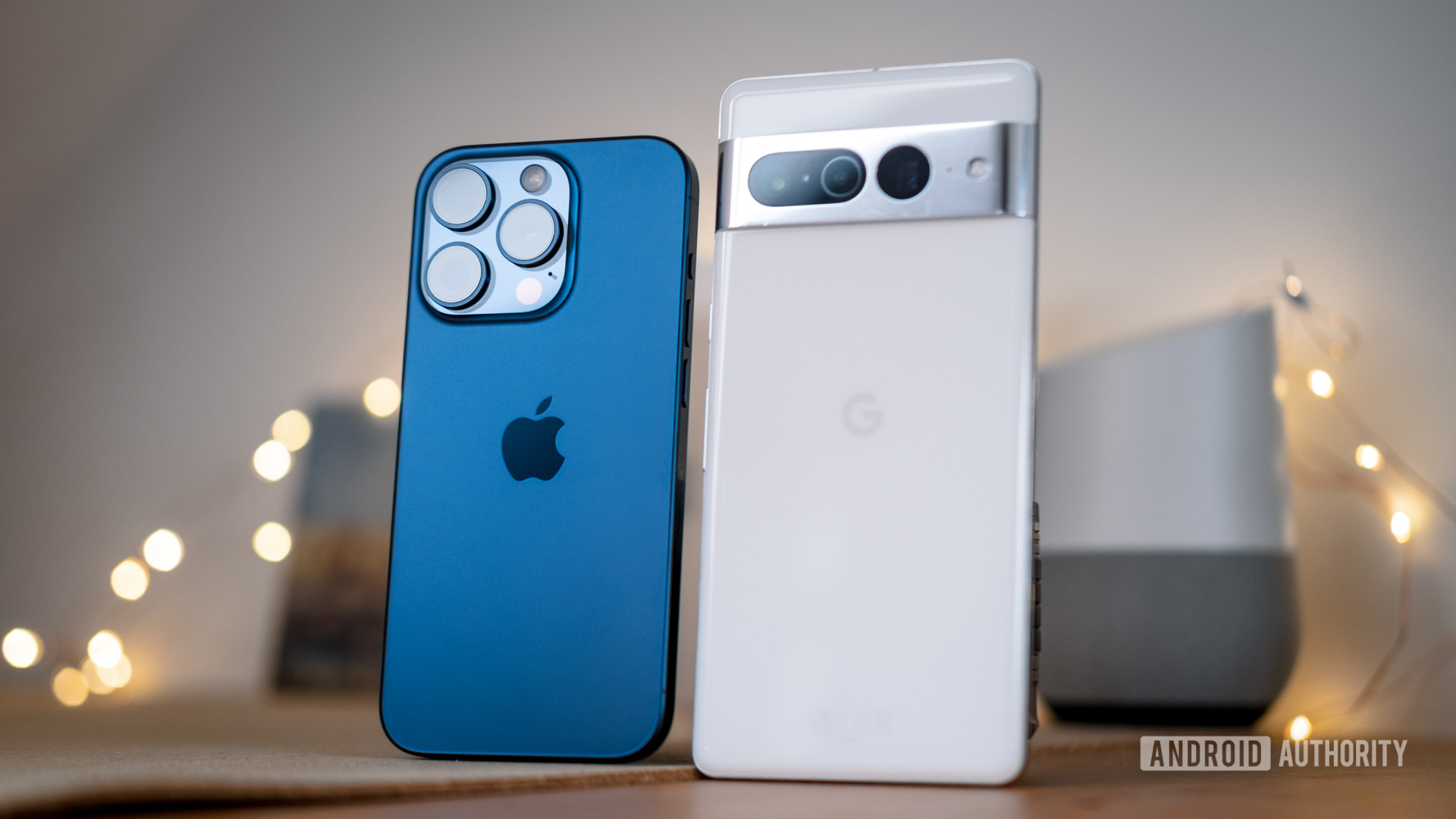
Looking at the new Apple iPhone 16 series, it’s hard to tell what’s new at a glance. Year after year, we’ve seen minor variations on inoffensive colors (with the occasional exciting addition), the familiar boxy metal trim, and an ever-growing camera island. An iPhone always looks like an iPhone, and that’s the way Apple likes it. But it’s not just us in the Android camp who are becoming a little bored by this seemingly lazy approach to smartphone design.
Of course, you can take a closer look at recent iPhones, and you’ll spot the introduction of the Action Button, Dynamic Island, a USB-C port in place of Lightning, the new camera control, and other odds and ends. Things do change, and you’ll find even more specs tweaks from generation to generation. I won’t accuse Apple of being completely bereft of ideas, but all these adjustments are just tinkering around the edges of a core look that the company is clearly hesitant to change. For Apple, design consistency has helped cement brand identity. For us consumers, it’s difficult to get super excited about something that looks and feels very similar to a product we already own.
Apple has built a premium brand based on an iconic look.
Still, there’s no doubt that the iPhone is an iconic piece of technology. Like the iPod before it or the ongoing MacBook range, Apple’s physical design stands out in the sea of equally and sometimes more capable, but not necessarily more in-demand, competitor products. The aesthetic is as much a part of Apple’s products as any of its internal components, and the now classic iPhone look has ingrained itself deeply into public consciousness. To change the iPhone’s design without good reason would be like aiming for blackjack while you’re already sitting on 20.
That being said, we’re now six generations on from the iPhone X — the last major design shift in the series — and that’s long enough for the stale air to sting the nostrils of even the most ardent Apple fan. If anything, the new iPhone 16’s straightened cameras are revisiting that seven-year-old iPhone X design. If pre-order numbers are any indicator, the iPhone 16 series looks like it will ship notably fewer units than its predecessor. Even Apple Intelligence isn’t moving the needle due to a combination of consumer apathy towards AI and the fact that so few features are available at launch. This was enough to shake Apple’s stock price earlier this week and should serve as a wakeup call that the iPhone needs a far fresher lick of paint to kickstart consumer interest.
Has Apple become too risk-averse?

If I were to feel generous, I would argue that Apple has been a victim of its success. It now owns the lion’s share of the US smartphone market and has a solid hold on its global share while others are struggling. When the market is competitive and precarious, Apple can’t afford to give up that golden goose. Don’t fix what isn’t broken, as they say, but that’s also a recipe for complacency.
With my Android hat on, I see plenty of outright laziness in Apple’s approach, too. Apple Intelligence is a prime example of Cupertino caught napping, so little is ready for the iPhone 16 launch. If they arrive on schedule, customers still won’t see many of the promised features until 2025. The company was blindsided by this year’s Galaxy AI and Gemini announcements and resorted to the desperation tactic (as did Google when ChatGPT burst onto the scene) of announcing first and hoping to follow through later. Considering AI is regularly touted as the next big thing, Apple failed to see it coming.
But it’s not just AI; the brand’s other recent hardware changes have almost always been well behind the curve. 90Hz/120Hz and dynamic refresh rates took years to hit iPhone displays after Android debuted them, while the regular iPhone 16 still has a sluggish-feeling 60Hz panel. Apple took years to move to bigger image sensors for improved photo quality but is still well off the pace of China’s best camera phones. The EU had to strongarm Apple to adopt USB-C, so that design change doesn’t even count, and the non-Pro models suffered from sluggish USB 2.0 speeds. Even the once-heralded Dynamic Island has been pushed to the sidelines like the placeholder feature it always was. And let’s not get started on all the iOS 18 features Android has had for years either.
Apple has seldom been first but is now looking increasingly far from the cutting edge.
While Apple could have been innovating, it’s often settled for doing just enough new things to fill Cook’s stage minutes while staying neatly in the lines of what everyone expects an iPhone to be. To be fair, it’s certainly not alone in that. Samsung is infamously reluctant to change its design or hardware too much, though it dabbles in minor refreshes every few years.
Still, from an aesthetic perspective, Google’s upstart Pixel line has successfully experimented with a broader camera-bar design language in a bid to find something that really stands out. It’s finally accomplished this with the very iPhone-feeling Pixel 9 series. Google hasn’t been particularly big on sweeping hardware changes either; it’s been slow on camera hardware upgrades, for example. However, a combination of all-new software features in a shiny new casing has made the series far more interesting, for both fans and casual observers, than its bigger Galaxy and iPhone rivals. Apple better take note, it’s fast becoming one of the most boring smartphone brands around (if it wasn’t already).