Affiliate links on Android Authority may earn us a commission. Learn more.
Apple Journal is nice, but it's no Journey or Day One alternative yet
Published onOctober 29, 2023

Apple’s announcement earlier this year that it was foraying into the journaling app ecosystem was not entirely surprising; mental health and wellness are increasingly central to the company’s software decisions. The introduction of Mindfulness capture in Watch OS 10 and iOS 17 is just one way Apple hopes you’ll begin logging your mental wellbeing. Coupled with all the health data, it is possible to draw a correlation between, say, an elevated heart rate and mental stress levels. However, as someone who has struggled with anxiety and depression most of my life, I can confirm that capturing your current state of mind is only one part of the equation.
Journaling is an immensely personal activity that can help you relive moments or destress. Digital journaling makes it a lot more accessible.
Journaling is an immensely personal act that lets you pour out your exact mental state — positive or negative, onto paper. It’s no replacement for a therapist, but daily journaling is a highly effective way to relieve mental burden. While I’ve maintained a physical journal most of my teenage life, I switched to digital journaling a decade back when I picked up the Journey app for my Android phone. I’m also well aware of the extremely popular Day One journaling app.
But as someone who prefers first-party, deeply integrated solutions, I’ve been curious about Apple’s take on journaling. The feature still hasn’t had a widespread rollout yet, but I’ve been testing out Apple’s new Journal app on the iOS 17.2 beta, and I believe it’s a good gateway to maintaining a digital trail of your life’s moments, feelings, and emotions, while balancing feature overload. However, it could do with a few improvements to compete with Journey or Day One.
Do you use an app for journaling?
The perfect gateway to journaling

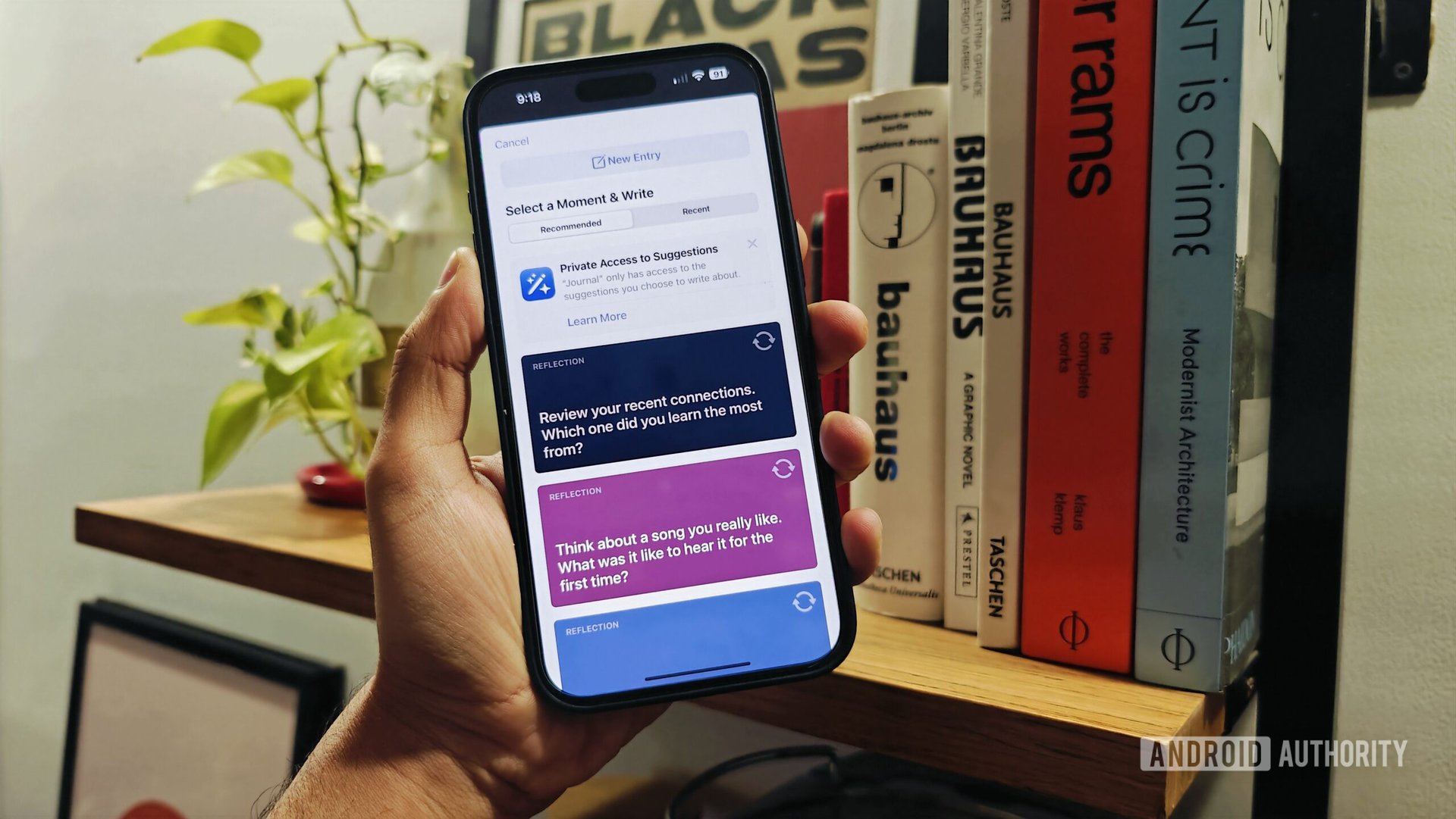
The Journal App on the iPhone takes an interesting two-pronged approach towards maintaining a digital diary — even though it doesn’t make it immediately apparent. Opening the app takes you through a set of prompts to get you started with the act of journaling. Apple calls them “reflections,” and to me, they came as a bit obtuse and not necessarily helpful. But more on that later. The entire user journey is straightforward in typical Apple fashion. Tapping the plus button along the bottom of the app pops open a fresh section with more of those suggestions and the option to start a new entry.
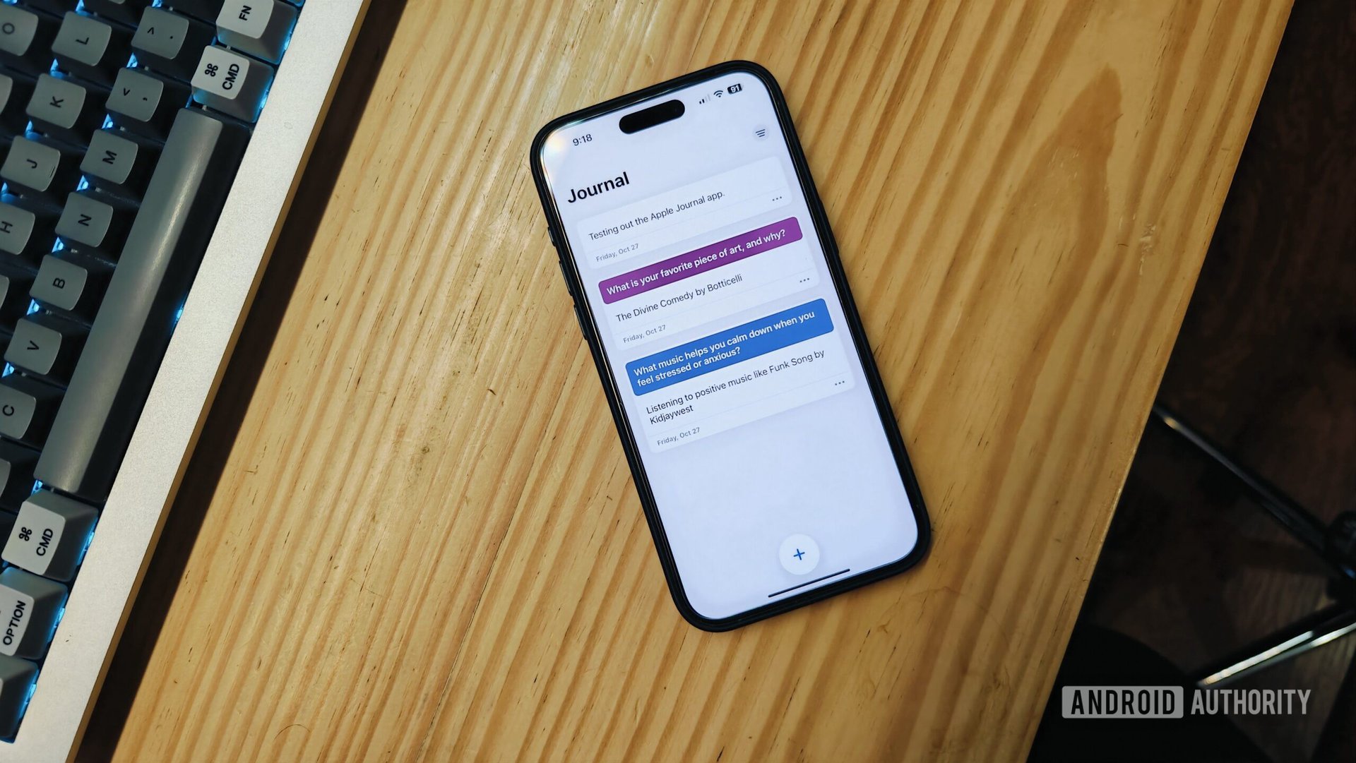
The spartan interface presents the perfect canvas to journal your daily thoughts.
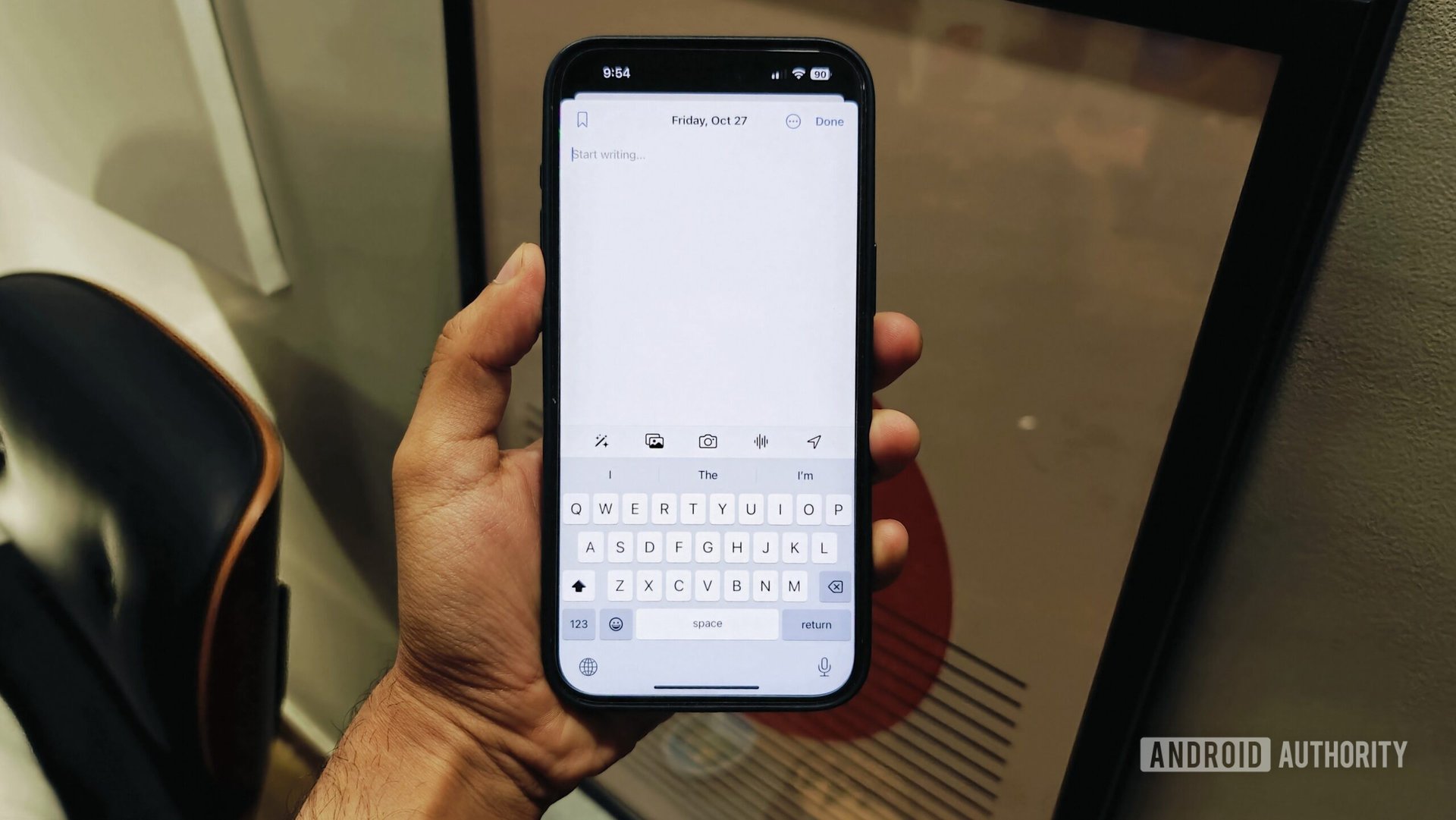
A new entry is a blank page to start writing on. You can add images, videos, an audio recording, a location, and even take a photo directly through the app. This can be handy when marking a specific location or incident that impacted you. For particularly noteworthy entries, it is possible to add a bookmark and return to the entry through a dedicated bookmarks toggle on the main page.
Apple talked about using on-device AI to come up with prompts that help users get started with journaling when it introduced the app. In my experience, this has been less than helpful so far. The “reflections” have varied from questions about music that helps me calm down to what nice thing someone has done for me recently. Don’t get me wrong, these can be interesting, reflective moments to look back on. But there was nothing personal about the suggestions. Perhaps the on-device machine learning models need more time to pick up on my habits, but it doesn’t make an excellent first impression.
Apple was supposed to harness AI for better journaling suggestions, but its prompts came across as more of a gratitude journal to me.
The app is supposed to pick up recent music listening habits or workouts for suggestions, but I haven’t been presented with such prompts yet. Regardless, I went in expecting more of a template or even ChatGPT-style suggestions on filing my journal entry for the day. Apple’s current implementation comes across more as a gratitude journal than a tool to help me journal better.
A little too barebones
And that brings me to my other gripe with the journal app — it’s remarkably barebones. Outside of the aforementioned functions, there’s precious little to look at here. Moreover, the feature set pales compared to my go-to journaling app — Journey. In fact, the app won’t even let you log your current mood while writing up your daily entry. I haven’t had much experience with Day One, one of the best apps for iPhones, but looking at the feature set, it’s clear to me that it also vastly supersedes what Apple offers.
The Apple Journal app misses out on too many essential features from favorites like Journey and Day One.
I didn’t expect Apple to go after dedicated journaling apps, but missing basics like the ability to scroll through your timeline by date is egregious. I’ve often used Journey to log my thoughts about a place I’m visiting and stamp the entry with a GPS location market. The app lets me look at a map view and dive straight into a country or city to look up entries from that place. Apple’s Journal app has no such option.

I also expected to find the ability to look at throwback posts. That feature is commonly available in almost all journaling apps and lets you look back at random entries from the past. I find it’s an effective tool to reflect and relive a specific moment in time. Once again, this isn’t available in Apple’s Journal app.
Add to that the lack of basics like, say, templates or even a widget for quick entries, and it’s pretty evident that Apple isn’t positioning Journal as a comprehensive replacement for apps like Day One or Journey. Apple could also show its strength in on-device machine learning and its broader ecosystem by correlating health metrics and journal entries. Deeply embedding links between, say, a music track that I’m listening to and a journal entry would also be excellent additions. However, none of that is available at launch.
I was also left scratching my head over the lack of iPad or Mac support for the Journal app. You heard that right: Apple’s only product that could let you pencil in entries does not have access to the app. It’s very typical of Apple to not follow through on the obvious. I’m still waiting for that calculator app on my iPad, but I’m hoping that sooner or later, the Journal app will make its way to the tablet — it’s an obvious fit for longer writing sessions. While my iPhone 15 Pro Max is large enough, I still wouldn’t want to use it for marathon writing sessions.
The Journal App is a barebones introduction to journaling but will need serious upgrades to be a genuinely useful tool.
Overall, the Journal app might be one of those instances where Apple hyped up the feature a bit more than it delivered. It’s a functional, handy solution to get started with journaling. However, unless it adds basics like a throwback feature or the ability to go back to diary entries using a calendar interface or maps, it’s just too barebones to be an effective alternative for journaling fiends. It might be an excellent gateway to get people used to journaling, but it needs much more polish before it can be a compelling alternative to long-standing favorites.