Affiliate links on Android Authority may earn us a commission. Learn more.
The Apple Watch Ultra 2 needs more than a better display to win me over
July 8, 2023

I love my Apple Watch Ultra. It might be my first Apple Watch, but coming from a smorgasbord of the best fitness watches ranging from Fitbits to Garmin and Suuntos, nothing else has gripped me the way that Apple’s near-perfect marriage of fitness features and smartwatch… err… smarts have. But I’m a compulsive upgrader, always on the lookout for the next big upgrade. Despite that, after reading all the Apple Watch Ultra 2 rumors, I’m convinced I’ll skip this one. If the leaks are to be believed, the biggest upgrade this year will be a larger display. Having used the Apple Watch Ultra for the better part of a year, that’s the last thing I want to be upgraded. Here’s why.
Do you want Apple to switch up the design of the Apple Watch Ultra 2?
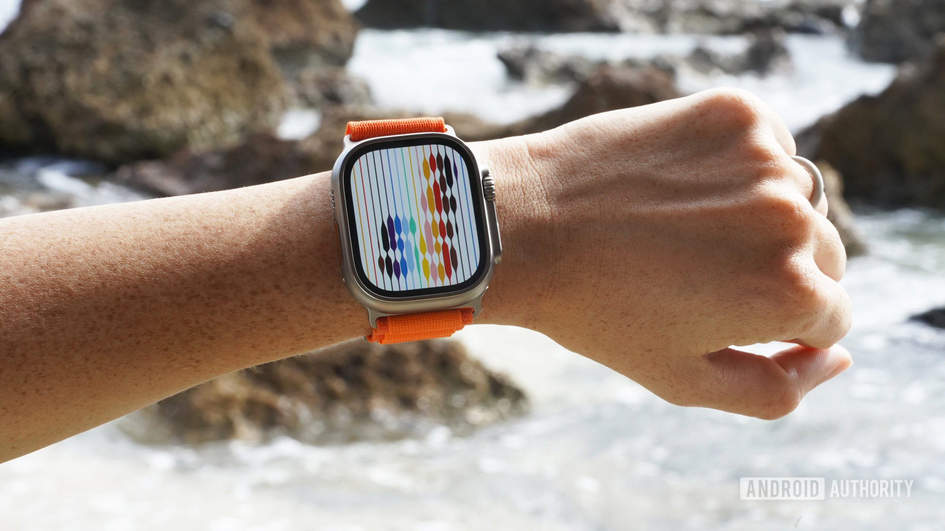
The Apple Watch Ultra is already a beast of a wearable, so I don’t expect Apple to increase the watch’s dimensions much, if at all. I suspect the increase in screen size from 1.92 inches to 2.1 inches might come from reduced bezels. That sounds great but also unnecessary. The Apple Watch Ultra has other issues that need sorting out before I’d consider parting with another $800.

My issues with the Apple Watch Ultra mostly stem from the watch’s ergonomics or, rather, the lack thereof. I don’t have tree stumps for arms, and the enormous dimensions of the Apple Watch Ultra make my wrist look positively dainty. It’s also heavy, and my sore wrist can feel the full brunt of it at the end of the day. Should I hit the gym to bulk up my wrists? Probably. But I’d much prefer a less conspicuous size, even if it means slightly lower battery life.
Unfortunately, it’s still early days, but given how accurate the rumor mill has gotten, I’m not very hopeful of a smaller-sized variant of the Apple Watch Ultra 2. It doesn’t stop there, though. If there’s one thing that annoys me even more than the sheer size of the Apple Watch Ultra, it has to be the protruding island on the right. It doesn’t favor the watch in terms of functionality or design.
I'm no gorilla, but I don't want my arm hair getting tugged by the digital crown one more time.
Hear me out before you claim I’m being pedantic about a digital watch. Have you tried twisting the digital crown on the Apple Watch Ultra? I’m no gorilla, but I really don’t want to wince in pain every time the crown tugs a hair or more because of the protective cowl around it.

Similarly, it is way too easy to press the wrong button when you are huffing and puffing on the 20th mile of a marathon attempt. The low profile button makes no sense on a sports and adventure-oriented watch.
My gripes extend to the ‘International Orange’ action button on the left. It looks cool, but a single spongy button is a nice convenience and not quite the game-changing solution Apple markets it as. If Apple intended to recreate the spirit behind a tool watch, it’s fair to say that it took a rather ugly and not-completely practical approach towards it.
A non-conformative design for the heck of it isn't ideal when watches with functional design have been perfected for close to a decade.
Apple’s insistence on a distinctive, non-confirmative design has been debated for years. For example, the company refuses to consider round watch faces as an option. But that same stubbornness towards being distinctive is working against it in the case of the Apple Watch Ultra.
Watches aren’t new, and neither are tool watches like divers or chronographs. These invariably prioritize comfort, accessibility, and access to functions. After all, that’s what you’re paying for.
At the very least, I would love to see Apple drop the protruding module on the right on a future Apple Watch 2. I’m sure the company has its reasons, but the button layout simply isn’t convenient for real-world active use, let alone aesthetics.
I wouldn’t mind an additional action button, either. Heck, adopt pushers while you’re at it. Not only have they been tried and tested for decades, but they minimize accidental pushes and might leave space for a larger battery or additional controls.

I’m well aware that the number of Apple Watch Ultra buyers actively pushing the wearable to its limits is in the minority. Heck, wearing a Garmin watch, too, has become a subtle flex to indicate a more active personality. However, unlike the Apple Watch Ultra, even conventional tool watches like a Tudor Black Bay or the Rolex Daytona prioritize practicality and functionality. Is anyone wearing a $10,000 luxury watch while diving? Of course, not. But will it perform the intended function with ease? Yes. I can’t say the same about the Apple Watch Ultra with conviction.
Attention to detail, easy access to a maximum number of features, and ergonomics would help justify the cost of an expensive smartwatch.
It might sound like a rant, but here’s the thing — I love the Apple Watch Ultra. Unlike my embarrassingly large collection of mechanical watches, it’s the Apple Watch Ultra that sits on my wrist all day long, every day. My concerns might sound like nitpicking, but the minor things and attention to detail make an expensive product worth it.
I wouldn’t think twice about plonking down a significant figure to upgrade to a prospective Apple Watch Ultra 2, but it will take much more than a bigger or better display to convince me.