Affiliate links on Android Authority may earn us a commission. Learn more.
Are there any truly bad Android skins still out there today?
Published onJuly 12, 2020

It used to be the case that many Android phones had bad Android skins. From Huawei, OPPO, vivo, and even smartphone kingpin Samsung, it seemed like phone brands couldn’t resist turning stock Android into a visually unappealing, inconsistent, stuttering mess in the early years of Android.
Sure, many of these Android skins also introduced new features that have since become commonplace on all phones. But it still didn’t change the fact that these overlays were ugly and/or demanding on resources.
That was a long time ago though and all the major players appear to have stepped up their game when designing their customs skins. In fact, is there even such a thing as a bad Android skin today?
Read more: The history of Android OS: its name, origin and more
What makes an Android skin bad?

First off, what actually constitutes a bad Android skin? The arguments could rage forever, but based on the comments we get here at Android Authority the core factors seem to be visual appearance, the number (and quality) of features, tweaks made to the underlying system itself, and whether it’s resource-friendly. When judging by these metrics, there are several examples of Android skins in years gone by that could be considered bad or at least disappointing.
Samsung’s TouchWiz was the most ubiquitous Android experience for years, owing to the success of phones like the Galaxy S3 and more. Samsung tossed in a ton of features and gave it a distinct, nature-themed look, but many of these features were gimmicks and performance suffered in a big way. This was a persistent issue with early Galaxy phones until TouchWiz was replaced by Samsung Experience which debuted with the Galaxy S7.
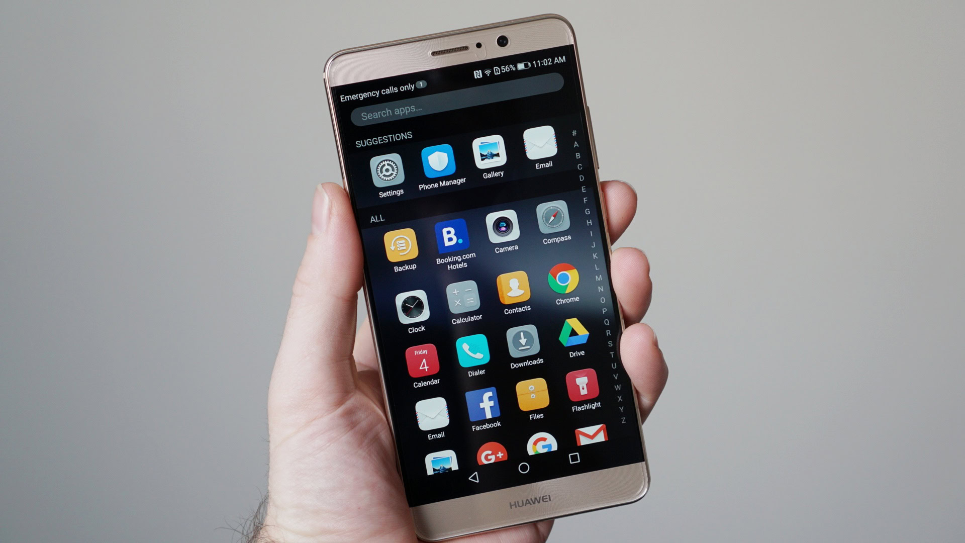
Huawei’s EMUI was in a similar position in the early to mid-2010s, as it too offered plenty of features while neglecting performance. HUAWEI also tinkered with memory management in the name of better power consumption, but this often came at the expense of notifications and poor multitasking capabilities by default. Much like TouchWiz, phones running EMUI suffered from lag over time too.
Visual appearance, features, and performance are just a few of the important factors to consider when judging an Android skin.
Features and performance are often tied together, as you can see. Haphazardly cramming plenty of features onto a phone often eats into system resources such as RAM, storage, and more depending on the features.
Another example of heavy-handed changes comes from OPPO, as earlier versions of its ColorOS skin also offered aggressive RAM management that hobbled multitasking. These changes extended to only allowing you to swipe away notifications in one direction. Bizarre.
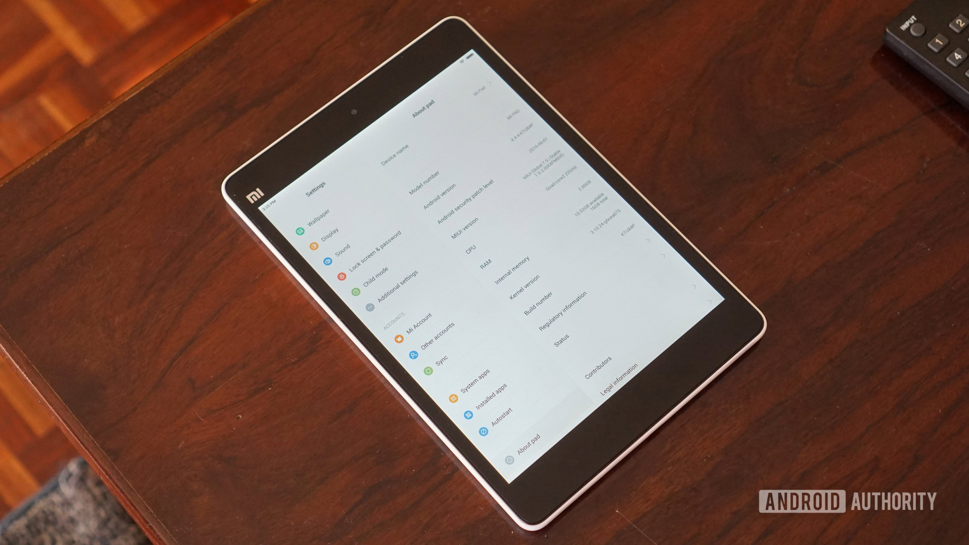
Even if you have plenty of features, keep performance in check, and preserve system behavior, that’s still not enough to avoid the label of being a bad Android skin. Take a look at early versions of MIUI as an example. Xiaomi’s skin initially lacked its own identity and looked like an iOS clone. This even boiled down to things like the settings menu being a close copy of Apple’s platform. Check out the first-generation Mi Pad running MIUI 7.5 below and tell me it doesn’t look like an iPad.

Of course, appearance is subjective and Android skins are no exception. Some people won’t mind an iOS-inspired ROM or something with vibrant colors. But there’s no point in offering a visual reskin of another, more popular OS if it’s half-baked in concept and execution.
Many Android skins in the early 2010s clearly emphasized features, extensive customizations, and a different look over performance then, but stock Android back then showed the opposite approach wasn’t necessarily the best solution either. Early versions of stock Android lacked features like dual-SIM support, data usage tracking, a battery saving mode, and multi-window capabilities. Most of these features are taken for granted on today’s phones and have been incorporated into the base Android experience.
Android skins have grown up

Thankfully, when judged by the aforementioned factors, it’s clear to see that many takes on Android have matured into smooth, visually pleasant experiences. And while the feature bloat has been reduced across the board, they mostly haven’t compromised on innovation either.

A lot of this has to do with manufacturers learning what consumers actually want, as well as healthy competition in the space. For one of the best examples, we’ve seen the likes of Huawei, Samsung, and Xiaomi all introduce machine learning algorithms that learn from your usage to improve performance and thwart degradation over time.
The impact of stock Android can’t be understated though, as it’s now developed into a full-featured platform with a distinct identity before OEMs even get their hands on it. From foldable support and Digital Wellbeing to Smart Replies and gestures, manufacturers now have a comprehensive foundation for their skins. And Google hasn’t really sacrificed performance to get to this point.

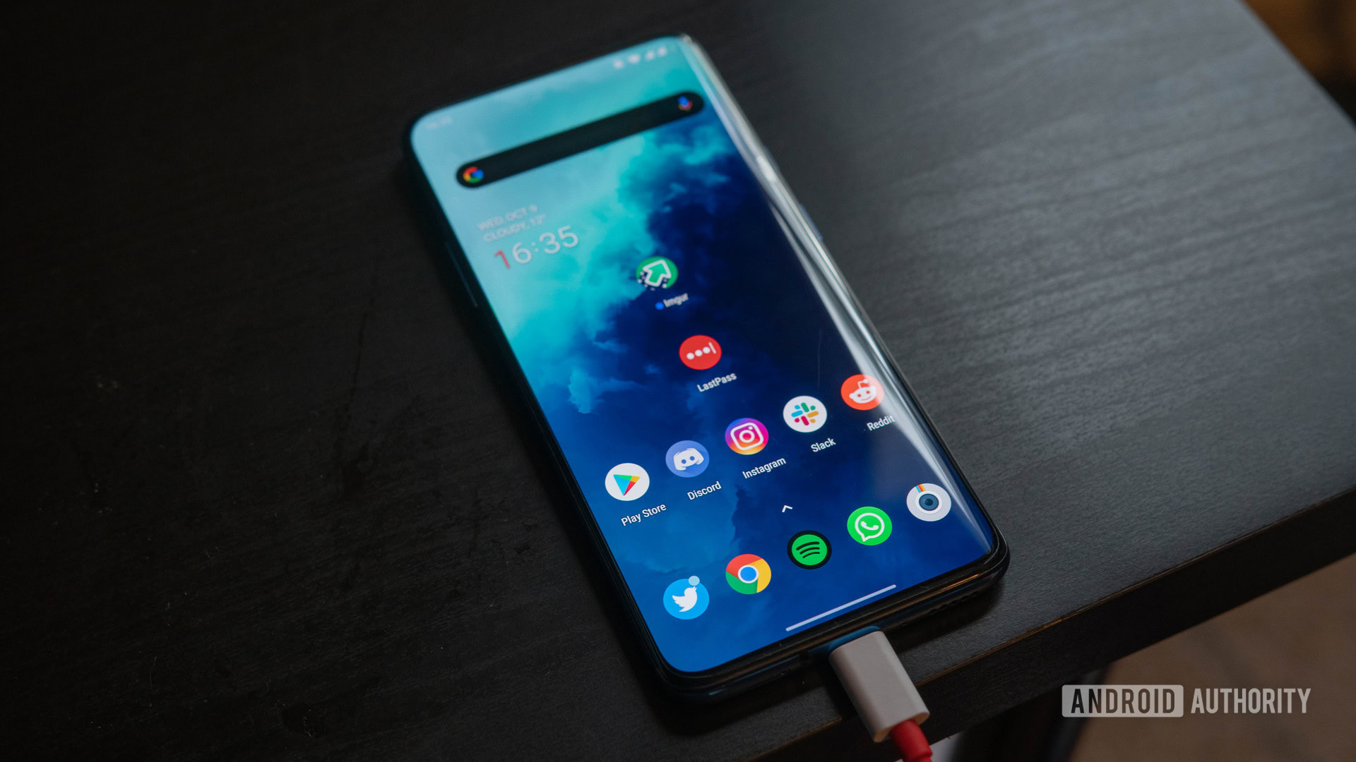
Some examples of solid to great Android skins these days include Samsung’s One UI, HUAWEI’s EMUI 10, OnePlus’s OxygenOS (seen above), and OPPO’s ColorOS 7. All of these skins either offer their own unique style while building on stock Android to offer plenty of features without a major performance hit.
Sticking closely to stock Android or actually adopting it also means that phone manufacturers theoretically have less work to do when it comes to updates. We’ve seen this with the likes of HMD’s Nokia phones, as almost all of its recent devices are on Android 10.
Related: Oxygen OS vs One UI: A thorough comparison of the two popular Android skins
That’s not to say things are perfect though. Realme and Redmi have made great strides with their skins in recent years, but a lot of that good work is undone by the presence of ads. There’s nothing wrong with this in theory, as it allows brands to offer lower device prices by making cash on ad sales. It does leave a sour aftertaste when one appears, however.
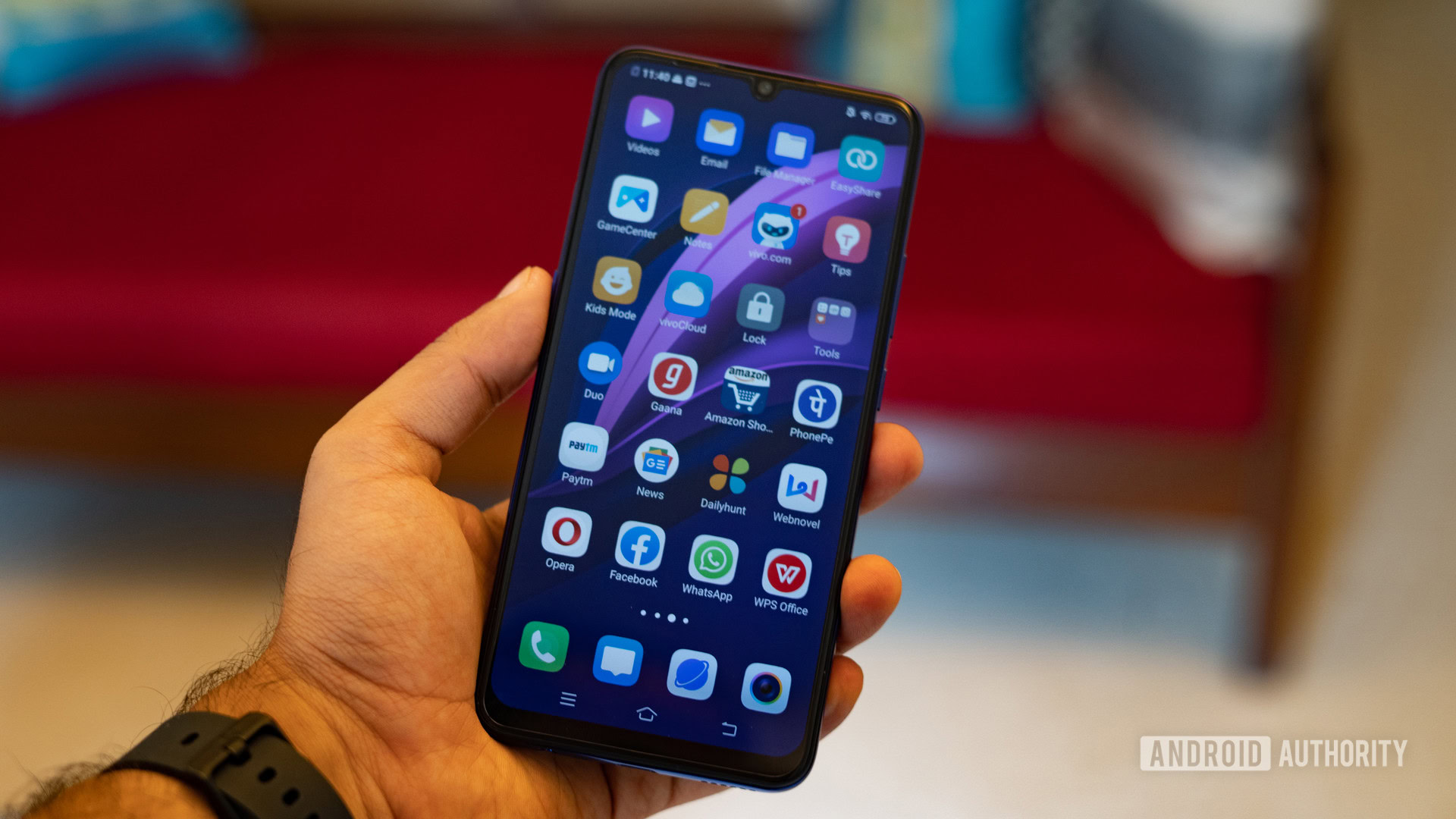
Still, you have to look really hard to find bad Android skins. Sorry, vivo, but the awfully-named FunTouchOS is perhaps the closest out of all the major brands.
While it isn’t necessarily bereft of novel features, the platform still insists on the Apple-inspired Control Center-style menu instead of using the notification shade for quick settings toggles like other Android skins. Toss in iOS-style icons and a completely missing app drawer, and it’s apparent that vivo still has some way to go before it’s on par with its stablemates.
On a personal note, I’ve also had the displeasure of using an Infinix phone before and the Android skin still felt stuck in 2011. A garish, inconsistent UI and heavy-handed ads combined to make a truly miserable experience. Fortunately, it seems like bad Android skins are restricted to minor brands these days. While there are some exceptions, sticking with a reliable industry name should guarantee a decent software experience these days.
Is there still such a thing as a bad Android skin?
Are there any bad Android skins in your book? Vote in the poll above and hit the comments to call out your terrible skin experiences.