Affiliate links on Android Authority may earn us a commission. Learn more.
Become a Nova Launcher power user
Published onDecember 12, 2016
Because Android is an open-source operating system, other tech manufacturers have been able to create alternate versions of Android in their own images. These alternate versions are what we refer to as “skinned” versions of Android and include Samsung’s TouchWiz, HTC’s Sense UI, LG’s LG UI, and Sony’s Xperia UI. At their core, these skins are still fundamentally Android, but they usually have a different look from stock, or “vanilla”, Android with added customization features, too.
That may sound appealing, but many Android enthusiasts actually dislike skinned versions of Android. Despite the added customization options they usually bring, skinned Android almost always pales in comparison to stock, especially when it comes to smoothness, speed, and stability. Moreover, the skins often make Android look cartoonish with obnoxious colors and juvenile-looking icons, prompting downloads of third-party launchers from the Google Play Store.
Launchers are a great way to change the look — and, to a lesser degree, functionality — of Android without having to install custom firmware. In short, launchers take the place of your device’s homescreen and app drawer. Some of them can even take advantage of the many custom icon packs you’ll see on the Play Store. While there are a number of popular launchers currently available, Nova Launcher remains one of the most beloved of all third-party Android launchers for a number of reasons. But rather than simply giving you a Nova overview, I’m going to give you a run-down of the best and most important features of the king of Android launchers. By the end of this walkthrough, you’ll be a Nova power user who can truly make your Android smartphone your own.
As a note before we dive in, I should tell you that it’s not really possible to cover every feature that Nova Launcher has to offer. A guide that in-depth would be something much longer than I’m sure you’d want to read. Fortunately, Nova is incredibly well-designed with its numerous settings and customization options available in the launcher’s settings menu. Instead of focusing on every feature, I’ll be focusing on some lesser-known features, ones that add functionality or accessibility to Android, to help you take your use of Nova to the next level.
New interactions with Nova Launcher
There are two main ways that we use our fingers to navigate our smartphones: tapping and swiping. We tap things to select them and we swipe to move from screen to screen or to move things from one location to another. In stock Android, there’s very little overlap between these two actions; tapping is for selecting and swiping is largely for navigation.
Nova Launcher adds another dimension to how you interact with the Android ecosystem by giving you the choice to either tap or swipe when you want to select an app. If you simply want to open an app or folder, you tap the corresponding icon; alternately, you can also swipe on an icon or folder to trigger some other type of response.
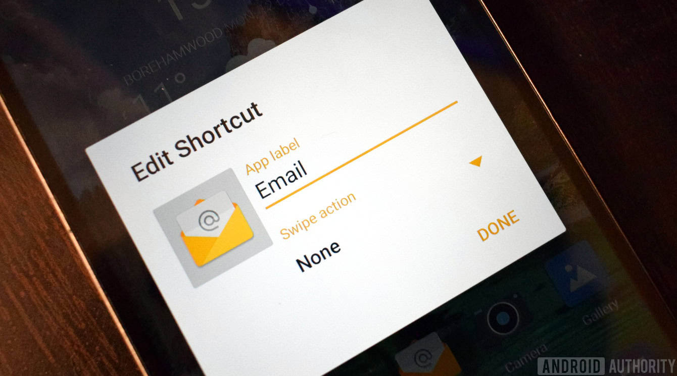
By holding down on an icon or folder located on the Nova Launcher homescreen and choosing “Edit”, you’ll be given the option to assign a “Swipe action”. The options from which you can choose are sorted under three tabs: Nova, Apps, and Shortcuts. Under “Nova”, you can choose things like opening the app drawer, expanding notifications, putting your device to sleep, and activating your device’s voice assistant. Under “Apps”, you’ll find a list of all the apps that are installed on your device. Under “Shortcuts”, you’ll find a number of specific actions related to the apps you have installed on your device, including opening a new text message to a specific contact, playing a specific playlist in the music player, and adding a new card in Trello. Many of the available options are the same for both individual apps and folders, but folders also have the option for swiping to open the first app in the folder.
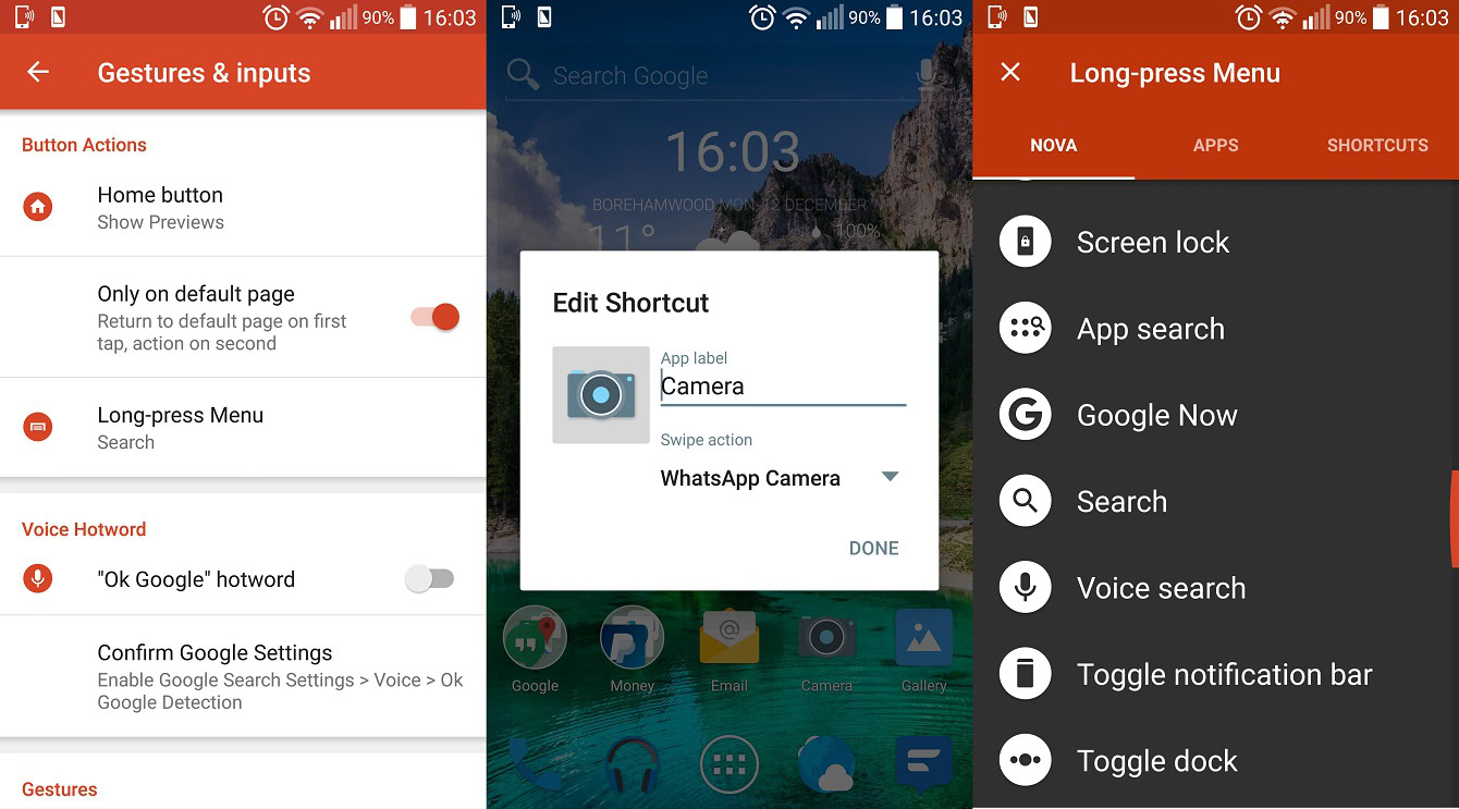
Here’s an example: You keep the camera app in the dock on your device’s homescreen because you take lots of pictures; however, you use WhatsApp for messaging your friends and have started using the built-in camera to make sending pictures to your WhatsApp contacts a little faster. With Nova Launcher, you could assign the WhatsApp camera to the swipe action for your stock camera app. This means that when you give your camera app a regular tap, it opens, and when you swipe on the camera app, the WhatsApp camera opens. The two cameras that you use on your device are tied to a single icon and can each be triggered with a different, yet similar, action.
If your Android device lacks the popular ‘double-tap to sleep’ feature, you can restore it by assigning the screen lock/device sleep option to the double-tap gesture
Of course, there are many other use cases for this extremely useful feature that you won’t find in stock Android. The closest thing Android has to swipe actions would be the long-press options that are currently only available in Android Nougat 7.1 on the Google Pixel and Pixel XL; however, Nova lets you choose your swipe action while the long press on the Pixel phones only works on a handful of native apps and can’t be customized by users.
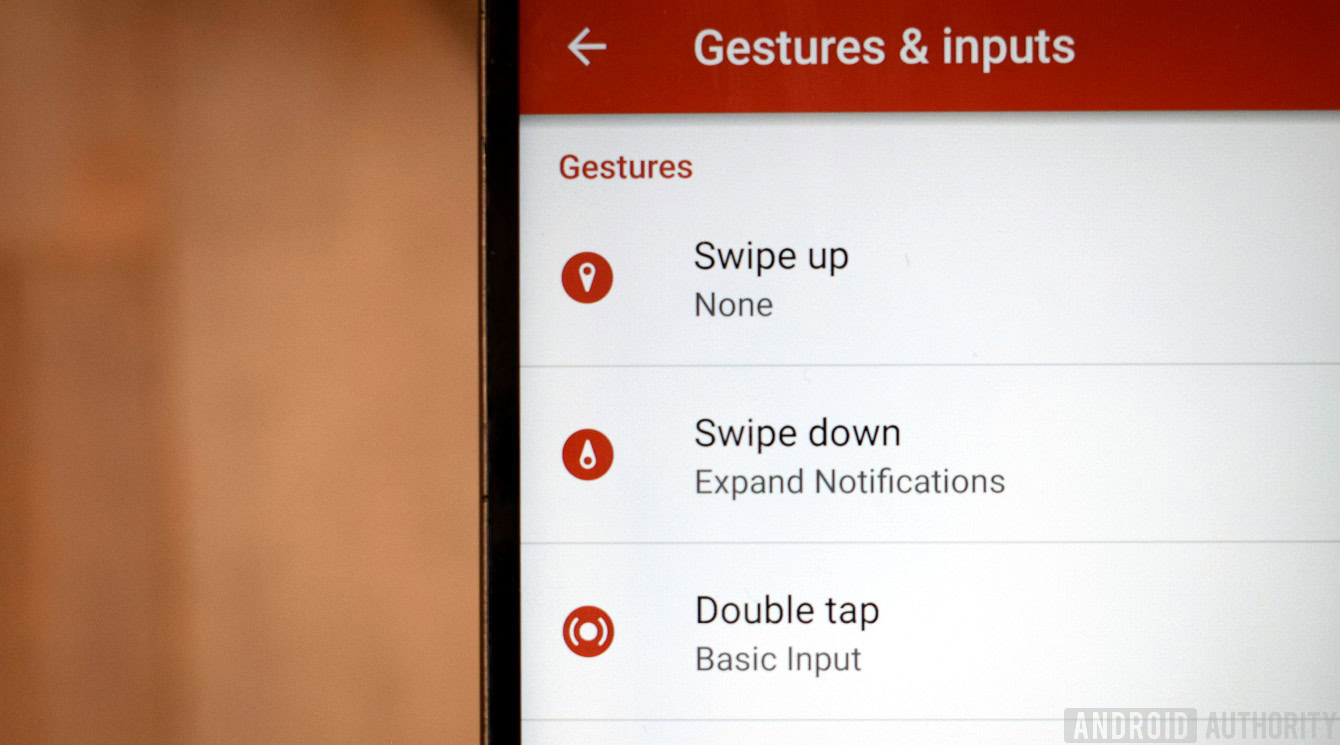
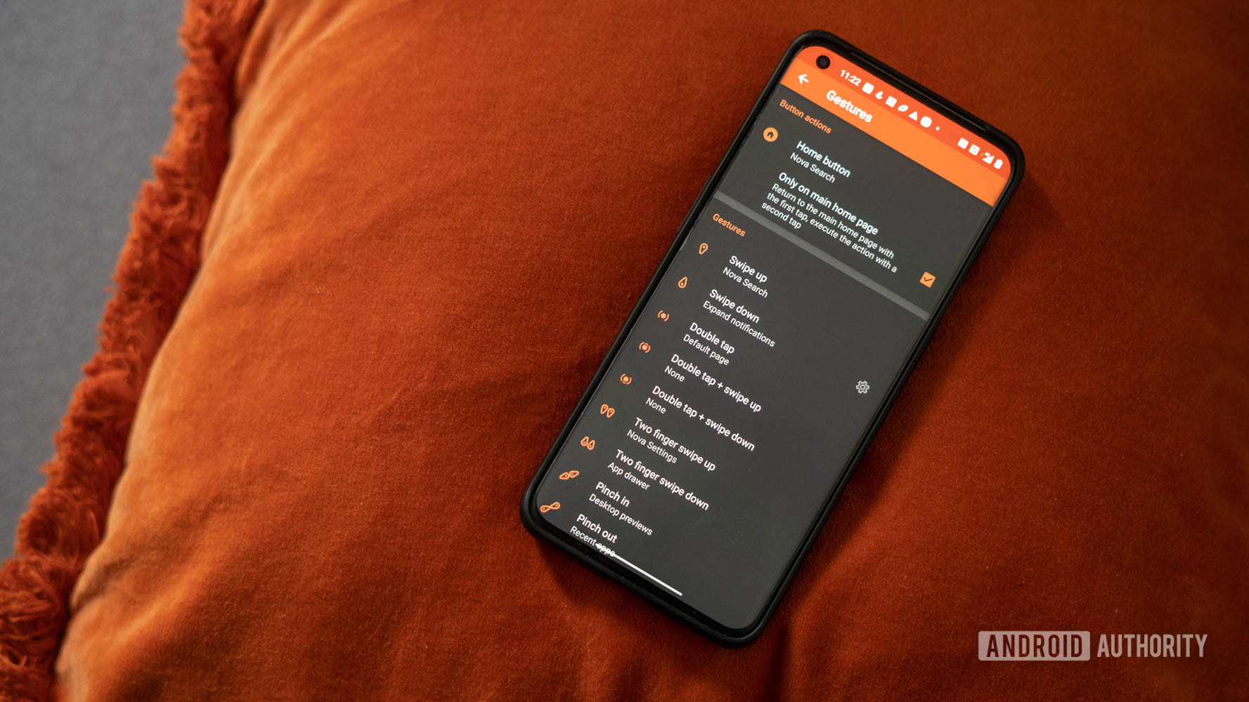
In addition to the swipe actions for folders and icons, there are some gesture options that Nova Launcher brings to Android on a more system-wide scale. Navigate to the Nova Settings menu and select “Gestures & inputs” where you’ll find a list of gestures you can use to activate a variety of different actions, apps, or shortcuts from essentially anywhere in the Android OS. In fact, the options for these gestures are largely the same as for app and folder swipe actions, but the list of gestures is much broader: swipe up, swipe down, double tap, swipe up with two fingers, swipe down with two fingers, pinch in or out, and rotate clockwise or counterclockwise.
For instance, if your Android device lacks the popular ‘double-tap to sleep’ feature, you can restore it by assigning the screen lock/device sleep option to the double-tap gesture. You might also choose to bring down your quick settings with a downward swipe and your notifications by swiping downward with two fingers. Again, there are many use cases for this, making this a great way to add a layer of accessibility to your Android experience.
Granular icon control
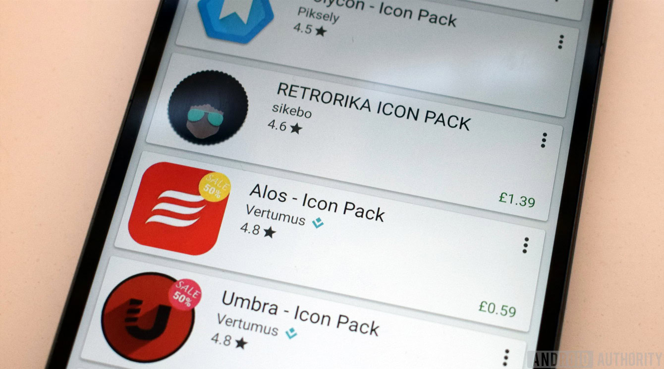
The ability to deploy icon packs to give Android a fresh look is one of the best customization features that certain Android skins and ROMs bring to the table. If you find stock icons to be lacking in inspiration, you can choose from countless icon packs in the Play Store to make your app icons a different shape, monochromatic, Star Wars themed to match your wallpaper, or to mimic the icons of the flagship you’ve been wanting. Some of them cost as much as a dollar or two, but many of them are free.
Nova takes icon packs a step further by giving you granular control of your app icons. Let me explain.
In Nova’s settings menu, you can navigate to a page where you can invoke the icon packs you’ve downloaded from the Play Store. When you activate an icon pack, every icon in that pack is assigned to the corresponding app installed on your device. The problem with this scenario is that you can’t pick and choose, or mix and match, icons from different packs. Because no matter how much you may like an icon pack, there will inevitably be at least a few icons that are less than awesome.
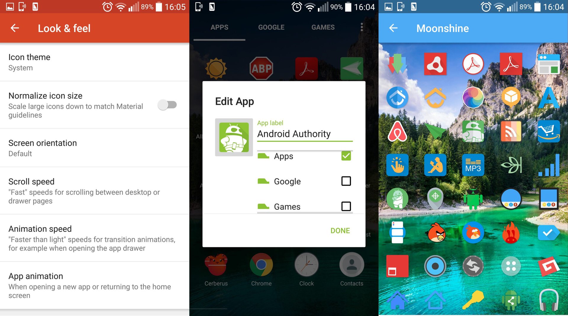
Typically, you’d be forced to just deal, but Nova gives you control of your apps’ icons on a granular basis. In other words, you can choose icons on a per-app basis, and it’s pretty simple to do. The one caveat is that the app must be on your homescreen rather than in the app drawer. However, once the app is on your homescreen, you simply press and hold on the app to bring up a small window with advanced options. This is the same place where you can choose the swipe actions mentioned earlier. Click on the app icon from within this window to open a list of the icon packs you have installed on your device. Simply choose your desired icon pack and icon, confirm your selection in the window, and it’s done.
What’s great about granular icon control is that it opens up a world of other possibilities for styling your homescreen and dock. Normally, your icon pack applies to all your icons, which may limit your wallpaper selection. But with granular icon control, you can make the app icons on your homescreen totally different than those in the app drawer. Or perhaps you want to have a completely clean homescreen with only a handful of apps in the dock; you might choose to give those dock apps outline-style icons to match the wallpaper you’ve chosen. Essentially, being able to choose icons on a per-app basis makes it that much easier to make your Android phone your own.
Homescreen grid options
It seems we’re entering an era when “phablets” are no longer phablets; they’re just smartphones. Most new flagships have displays of 5.5 inches or larger, and we want to be able to make the most out of all that screen real estate. Personally, it always plucks a nerve when I see a smartphone with a big, beautiful, QHD display and a 4-by-4 grid structure on its homescreen, which is a colossal waste of space. Fortunately, Nova Launcher offers an elegant solution to this problem by letting you choose your own homescreen grid structure.
Navigate to the main Nova settings menu and select “Desktop”, which is the very first option. In the desktop menu, select “Desktop Grid”, which will bring up a window in which you can choose the exact number of rows and columns you’d like to have on your homescreen. Although you probably wouldn’t want to go beyond maybe five or six rows and columns for the sake of visibility, you can technically go up to 12 by 12. As well, you’ll find a toggle for “Subgrid Positioning”, which gives you to option to position and move your icons around the grid in half-square increments rather than having to keep each app centered in each square.
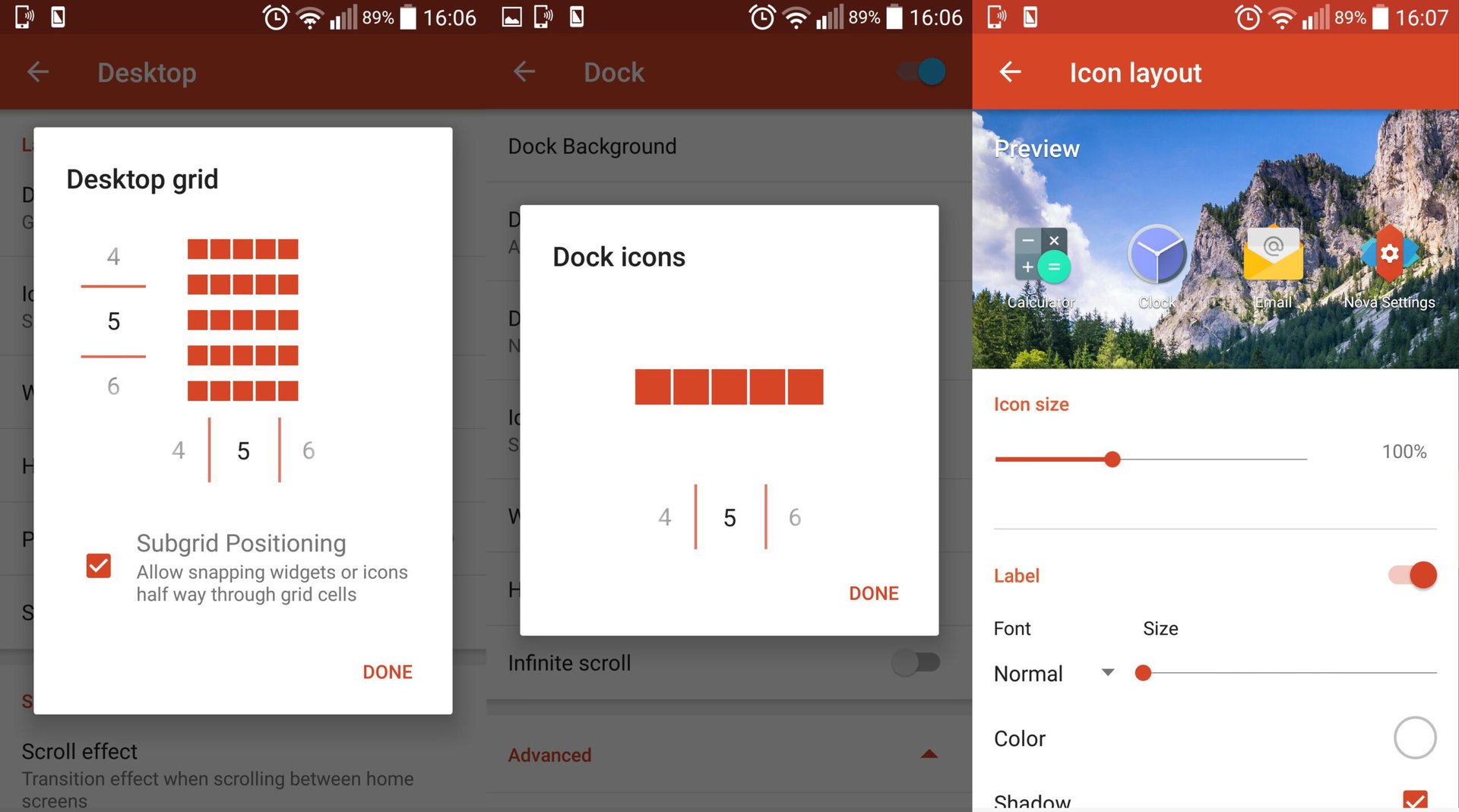
Back in the desktop menu, you’ll find options for width and height padding as well as an option to remove the Google search bar from the homescreen. Some of the other options that are available include the scroll effect when scrolling between homescreens, choosing what type of page indicator you want to use to indicate which of your homescreens you’re on, and a toggle for widget overlap. These many options will allow you to further customize the utility of your homescreens.
Having the option to customize the grid structure of your homescreen can potentially be a game changer. If your device has a skinned version of Android in which the homescreen grid is limited, Nova gives you the chance to bring much more utility and take greater advantage of your device’s display. Meanwhile, having the option to position apps in half-grid increments is a more subtle level of control that can be useful when you’re playing with the arrangement or layout of apps on your homescreens.
The Pixel touch
This year, Google decided not to continue with its beloved Nexus line of smartphones and, instead, has given us the Pixel. You probably remember how the Pixel’s new launcher leaked almost two whole months before the Pixel and Pixel XL actually launched, and this new launcher showed some pretty interesting aesthetic changes compared to what we’d come to expect from a vanilla Android experience. For instance, the Google search bar had been replaced with the “pill” located in the top-left corner of the homescreen, and tapping on the pill extended the more familiar Google search bar.
Initially, the only way to get the Pixel look on non-Pixel devices was to download the leaked file and install it manually; and unless you installed the file while booted into recovery mode, certain parts of the launcher wouldn’t function properly, including the new Google search pill. Savvy users found a way to mimic aspects of the Pixel launcher in Nova, but it was a prompt Nova update just weeks later that made it possible to replicate the Pixel launcher almost perfectly. In fact, you’d probably have a hard time telling the real Pixel launcher from the Nova launcher once you set it up correctly. Another reason why you might want to follow these instructions to duplicate the Pixel launcher is because you’ll get hands-on experience with some of the many customization options that are available with Nova.
There are a number of steps required for Nova to make your Android device look like it’s using Pixel’s launcher, but they’re all pretty simple. First, navigate to Nova Settings > App & widget drawers. Choose “Icon layout” and make the app icons 115 percent in size. Select “Drawer app grid” and make sure the drawer grid is 5 by 5. Disable the toggle for “Card background” and enable the toggle for “Swipe to open”. Make sure that the drawer background is set to white with no transparency. You’ll also want to enable the search bar option since that’s an option in the Pixel’s app drawer.
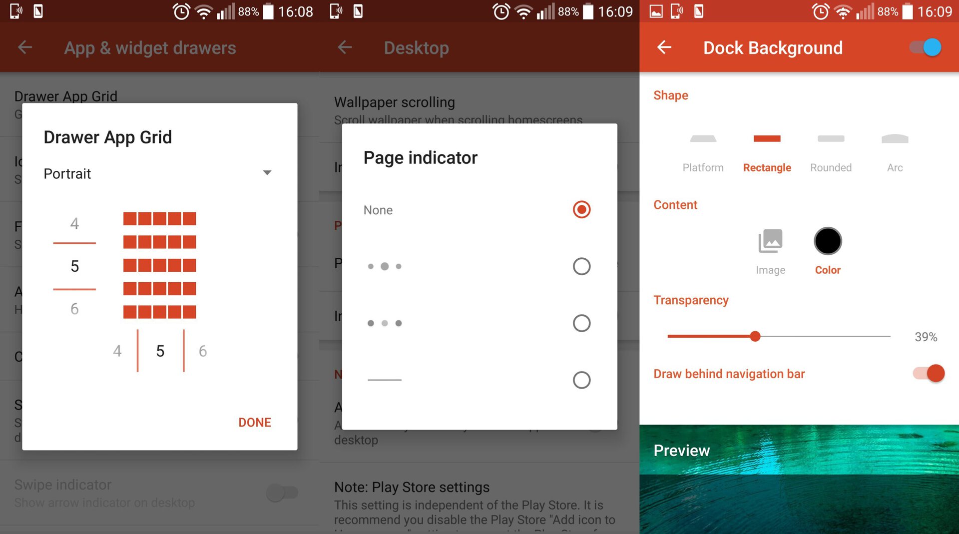
The next step is to remove the page indicator — the dots near the bottom of your homescreen that show you which of your homepages you’re currently on — by navigating to Nova Settings > Desktop and scrolling down to where you select the page indicator style. Simply select “None” and the page indicator will disappear. You’ll also want to enable the “Swipe to drawer indicator” option, which will put a small arrow over the dock to indicate the swipe-to-open gesture as on the Pixel’s launcher. Make sure the desktop grid is 5 by 5 and bring the size of app icons on the homescreen to 125 percent.
Back in the main Nova settings menu, select “Dock”. In the dock settings, you’ll want to select “Dock background” and choose the rectangle. For content, choose white as the color and make the transparency around 40 percent. If your device has on-screen navigation buttons, enable the option for “Draw behind navigation bar” so that the dock background extends behind your navigation buttons, too. These are the only changes you’ll need to make to the dock.
Once you’ve returned to the main settings menu, select “Folders”. For the folder preview, select grid and choose “N Preview” for the folder background. This will make your app icons appear the same way in folder previews as they do on the Pixel, which is in a four-quadrant grid layout within a circular window.
At this point, many of the smaller details are in place; we need only to change the icons and put the finishing touches on your homescreen. Navigate to Nova Settings > Look & feel > Icon theme. There are a number of icons to choose from in the Play Store that would work for a Pixel-like look. I recommend using almost any of the icon packs that are based on Android Nougat, but there are similar icons — CandyCons, Moonshine, and Sunshine to name a few — that would work well, too. Remember that the icons on the Pixel are primarily circular, so you may make your decision based on which icon packs have mostly circular icons.
Finally, we need to add the Google search pill to the homescreen. This can be done in one of two ways: Either tap and hold on the default search bar on the homescreen and select “Edit”, or navigate to Nova Settings > Desktop > Search bar style. Select the pill-style option, which should be fourth on the list of search bars that are available to you. Scroll down and choose the multicolored “G” for the Google logo and make sure to activate the weather option on the very bottom. Return to the main desktop menu and enable “Persistent search bar”. At this point, you’ll have successfully duplicated the launcher of the Google Pixel.
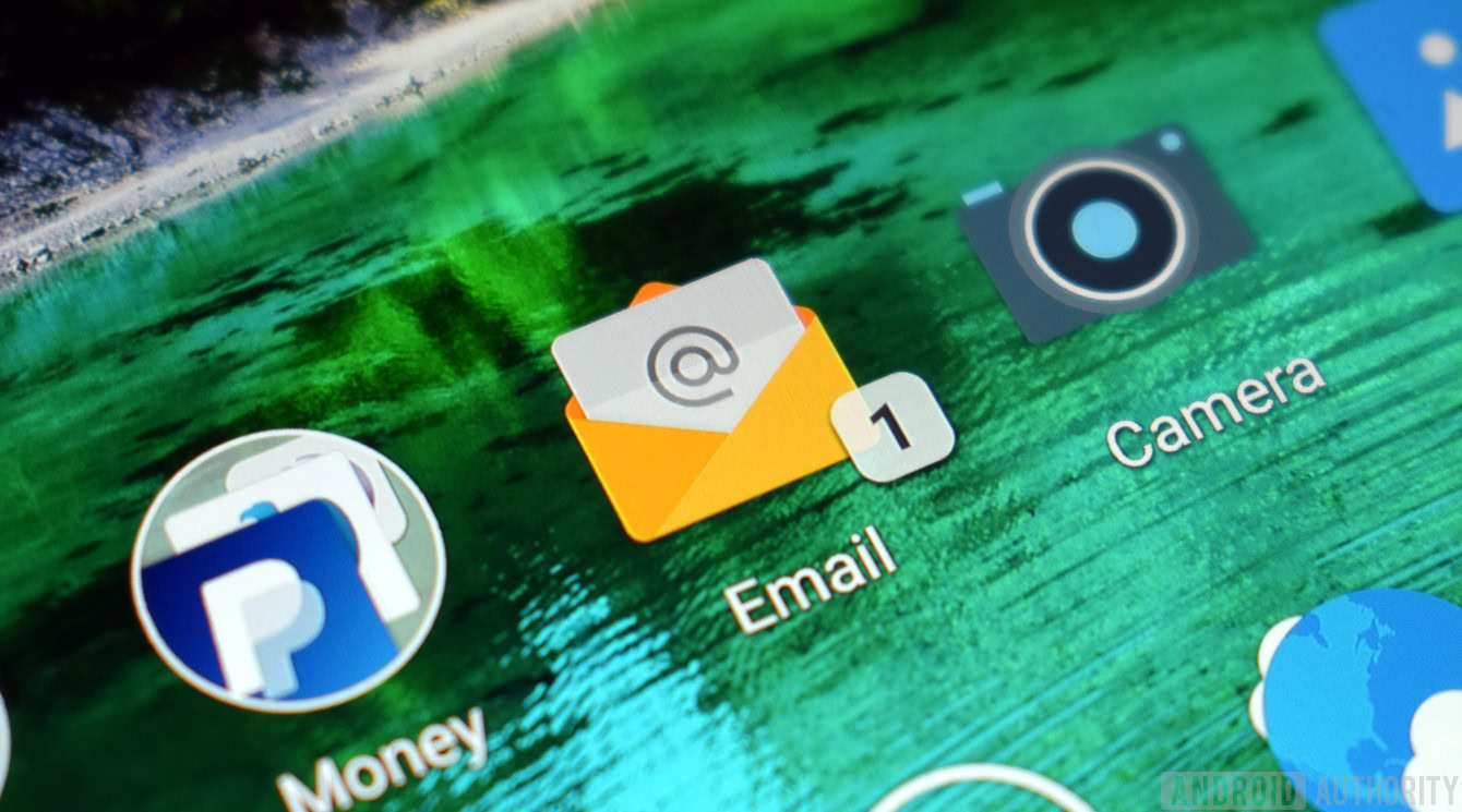
App badges for unread notifications
Fans of Samsung devices tend to cite the notification badges that appear over app icons to alert them of unread notifications as one of their most-beloved features of TouchWiz. There’s no denying this is an extremely useful and very elegant solution, and it’s unfortunate that this is a feature of TouchWiz (and perhaps a couple other Android skins) rather than a feature of Android at large. Enter: Nova Launcher.
You, too, can enjoy these unread badges by using Nova as your launcher of choice. With this feature activated, any app of your choosing will appear with a small badge on the corner of its icon, and within that small badge is a number that signals how many unread notifications that the app has waiting for you. Activating this feature is as straightforward as most others, requiring only that you have Nova installed as well as an accompanying app called TeslaUnread.
With TeslaUnread installed, navigate to Nova Settings > Unread count badges. Once here, it’s as simple as customizing how you want your badges to look and choosing which apps you want to have notification badges. You can choose the exact corner on which the badge will appear over an app icon, the shape of the badge, the color, and the size. After you’ve designed the badges to your liking, select “TeslaUnread Settings” below the badge customization area, and you’ll find a populated list of your apps for which you want to see badges. Then you’re good to go.
Obviously, there are far more Nova features than what I’ve highlighted here. However, I had hoped to provide a run-down of key features that Nova has to offer, most of which you won’t get from regular Android. Many of these features are intended to make the navigation of Android much smoother or certain functions of Android more convenient. Others are more for aesthetic purposes, to replicate the look of one of the hottest phones on the market today or to simply customize your Android phone in new ways.
The features I’ve described can be mixed and matched in really diverse, unique ways. Ultimately, the purpose of this Nova tutorial was to help bring a little more excitement back to your Android experience by making you a Nova power user. But now I’d like to hear from you: What are your favorite features of Nova Launcher? Have you used it before or do you plan to use Nova in the future? Sound off in the comments below!