Affiliate links on Android Authority may earn us a commission. Learn more.
15 best designed Android apps of 2014
Published onDecember 29, 2014
Every year, developers and designers take bold moves to see what they can do and the winners are us, the users. It was a wild year in terms of Android apps design as we saw a number of great apps that challenged the best of the best when it comes to design. Let’s take a look at the 15 best designed Android apps of 2014.
[Price: Free]
Inbox by Gmail stormed the headlines for two reasons. It was made by Google and because it challenged the current email app paradigm. The results were polarizing because some people liked it and other people hated it. However, once you get passed the shock of the change, Inbox is a very clean and organized email application. It also integrates with Google Now’s reminder functionality which is nice. It’s also free to use.

[Price: Free / $3.99]
Link Bubble is a browser hidden in a floating notification. The idea is that you can open a bunch of links from your favorite apps and social media sites and then go back and look at them when you so choose. It’s an amazing idea and it definitely alters things like how often people engage with content. You don’t have to wait for the browser to open so you end up opening more stuff. The free version gives you a taste and the full experience costs $3.99.


[Price: Free]
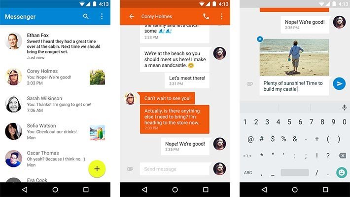
Not a lot of people knew the purpose of Google Messenger since Google Hangouts exists but it turned out to be a very well designed app and very useful. It is a light text messaging app that first made its appearance on the Nexus 6 and it’s now available for most devices. There are some light customization options like changing the color for various contacts and it’s totally free to use.

[Price: Free]
Muzei Live Wallpaper isn’t the most popular app on the list but it has a very loyal following. It’s a live wallpaper that shows you the most classic artistic pieces in history. It definitely adds a little class to the home screen and there is even an API available that other developers have used to integrate this app into their own such as Chris Lacy’s Action Launcher. It’s totally free and a good way to enjoy some classic art.


[Price: Free with in app purchases]
MyStocks is a stock market application that lets you keep an eye on the stock market, your stocks, and news revolving around the stock market and your stocks. It has a bucket load of features that are cleverly hidden behind a solid Holo interface that is complete with analytics, graphs, and other information. What makes this app impressive is how much information there is and how well it is organized. If you do stocks, try this one.

[Price: Free]
Microsoft released Next Lock Screen from their Microsoft Garage project and it is something a little bit different. It warps your lock screen into a combination of a lock screen, contacts app, app drawer, and calendar app. It’s great for people who use those functions regularly and the ability to put that much right up on the lock screen without that overwhelming feeling is something special. It has some problems with bugs but the design is solid.

[Price: Free]
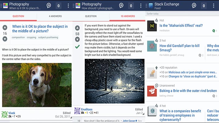
Stack Exchange is a huge website with a lot of content that has helped countless people over the years and they released an Android app this last year. The design is a classic Holo and it manages to give you access to all of its websites and subsidiaries without too much effort and without making it feel too crowded. There are even some customization options available if you need that. It’s a great app and everyone should have it.

[Price: Free]
Sunrise Calendar was a big deal for its colorful and organized design and it was around before the announcement of Material Design. It’s compatible with Google Calendar, Exchange, and even iCloud for those who may need those services. Other than that, it does what calendars do. There are some behind the scenes stuff that could be fixed but the design is extremely pretty and solid. Plus it’s totally free.

[Price: $3.99]
Talon for Twitter has been a huge hit in 2014. It’s sleek design, fun layout, and customization made it a favorite for many Twitter users. So much so that the original app hit its Twitter token limit so the developers had to release a second one. More recent updates added a bunch of Material Design and that has allowed Talon to remain probably the best designed Twitter app currently out. The only bad part is that it’s currently only for Android Lollipop.

[Price: Free with in app purchases]
Unclouded was such a great idea and it’s coincidentally wrapped up in a great design. The premise for the app is that it allows you to check and clean your cloud storage of useless junk and free up space for other files. It also lets you find duplicates so if you uploaded your camera roll to two different places, you can identify that and correct it. The interface is a simple Holo UI mixed with a card UI that makes this app very effective and easy to use.


[Price: Free]
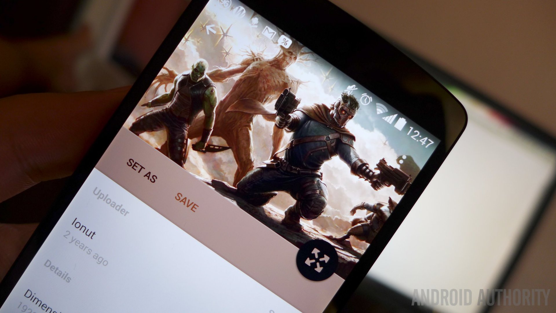
Wally is another Material Design app that grabbed headlines and took the internet by storm. Unfortunately it was shut down after the website that hosted the wallpapers this app showed went down. It’s back now with a new set of wallpapers and all of its Material Design glory. This app is a great example of what Material Design can do for an otherwise boring task like finding wallpapers and it’s also totally free.

[Price: Free]
WeMail is another application that wants to change how people email on mobile. Unlike Inbox, which requires a bit of organization skills, WeMail turns the email experience into something akin to a chat application. Emails are organized by sender rather than chronologically and there are a few features like voice emails and a solid, if incomplete Material Design. It’s free to try and it’s definitely something different.


[Price: Free]
Aviate Launcher received so much press this year that Yahoo went and bought it for a reported $50 million dollars. It simplifies the home screen and puts apps in categories for easy reference. There are some customization options but the big thing here is how Aviate managed to simplify the Android experience and still look really good. It remains totally free even after the Yahoo buyout and it’s a unique style of launcher.


[Price: Free / $2.98]
YoWindow Weather is a beautifully done weather application that turns your device into a window of the weather. When it’s sunny, the app is sunny and when it’s rainy, the app is rainy. You can check weather by the minute using a very nifty slider functionality and you can get your weather forecast as you normally would. It looks amazing and it’s definitely worth picking up the free version to try it out.

[Price: Free]
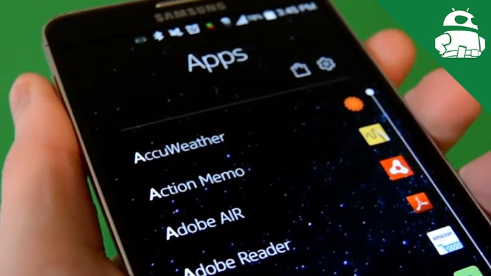
Nokia’s Z Launcher is another launcher that tries to simplify the Android experience using some very unique interface choices. There is one home screen with a clock widget that can be swiped to look at other information like weather. The rest of the home screen is dedicated to trying to guess which apps you need. The big feature is the ability to write on the home screen and search for apps very quickly. It’s still in beta but it’s an interesting choice.

Wrap up
If we missed any well designed Android apps, let us know in the comments!