Affiliate links on Android Authority may earn us a commission. Learn more.
The Blloc Zero 18 is a minimalist's smartphone with some great ideas
Published onOctober 23, 2018
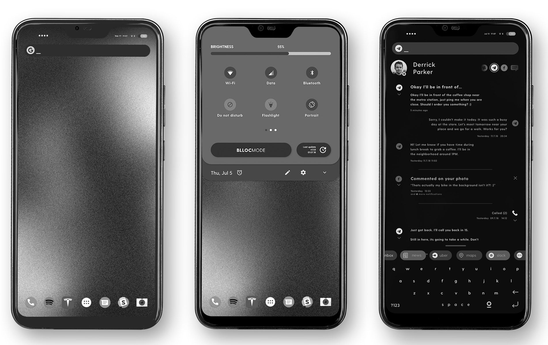
- The Blloc Zero 18 is the first smartphone from a new startup.
- The new phone is designed to work primarily in monochrome — and to prevent you from opening any of your apps.
- At any moment the Blloc Zero 18 can become a “normal” smartphone, but it’s designed to help you not use it as such.
With the idea of “smartphone addiction” on many people’s minds — and the development of programs which curb smartphone use coming from the very companies which build them for us — never before has the amount of time we spend on our phones been so scrutinized.
Many companies are responding to this with the creation of new kinds of smartphones designed not as a flagship product you salivate over, but rather a utilitarian tool you own to do what needs to get done. The Light Phone 2 and the recently-revealed new Palm phone are two such examples.
Now, we have another entry in that relatively-new market: the Blloc Zero 18.
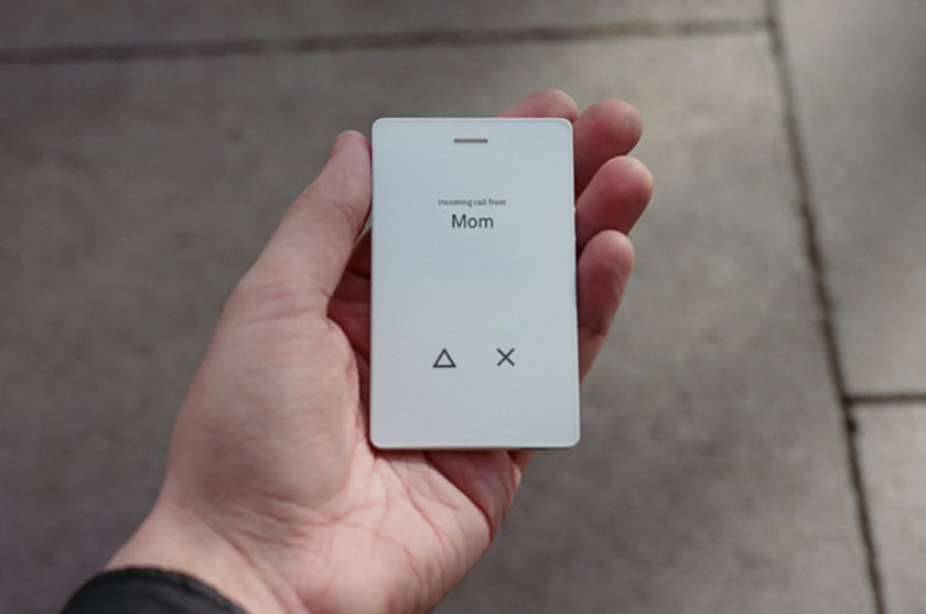
Unlike the Light Phone 2, the Blloc Zero 18 has all the functionality of a “regular” Android smartphone, and you can use it like that at any time. And, unlike the Palm phone, the Blloc Zero 18 looks a lot like pretty much any mid-range Android smartphone in 2018 (that is, it looks a lot like a cheaper iPhone X).
Where the Blloc Zero 18 shines (or, rather, doesn’t shine) is with its Blloc Mode — a revamp of Android’s UI which focuses on keeping you on task by delivering everything in monochrome and doing whatever it takes to prevent you from opening any applications.
Before we get too deep into that, let’s talk about the device’s hardware.
Hardware
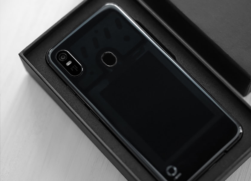
The team at Blloc didn’t set out to reinvent the wheel when it comes to the Zero 18’s hardware. On the front, the device is a dead ringer for the OnePlus 6, with a notched-display up top housing the front-facing sensors.
The back is made out of a translucent material which gives it a unique look, while not being overly flashy. The overall aesthetic of the rear is like an iPhone X with a vertical camera module in the left corner (although it only has one lens, unlike the iPhone’s two). There’s also a rear fingerprint sensor and the Blloc minimalist logo in the lower left corner.
On the bottom, you’ll find a USB Type-C port and a headphone jack.
Inside, the device is running a MediaTek Helio P23 chipset, 4GB of RAM, 64GB of storage, and a 3,000mAh battery.
If all that makes you yawn, that’s kind of what Blloc wants you to do when it comes to the hardware. Where Blloc clearly put all its focus is the software.
Software
There are two modes to the Blloc Android skin (called Blloc Mnml): Minimal Mode and Blloc Mode. Minimal Mode looks like regular old Android, with a five-icon dock at the bottom, home screens, an app drawer, etc. Granted, everything is in monochrome and all the icons are simple white lines (courtesy of popular Android icon pack Lines), but it still feels like Android. Using this, you can launch all your apps and use your smartphone as you already do.
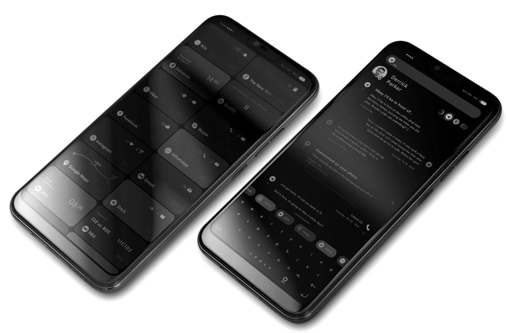
If you switch over to Blloc Mode, things get wildly different. The main screen of Blloc Mode is filled with tiles which represent your most-used applications. Each tile shows you notifications for that app, with some even offering simple functionality (the Spotify tile, for example, has play/pause/skip buttons). If you tap a tile, it will show you the notifications for that app. However, you have to tap through again to actually open the app — Blloc Mode doesn’t want you to open any apps, though.
If you swipe to the left from the tile screen, you’re presented with what Blloc calls a Root: a unified notifications/command center where you can use all your apps without actually opening them. Here, you can check the weather, read the news, set alarms, etc., all from within the Root.
If you swipe back twice to the right, you’re shown a messaging center. This center pulls in all your conversations from your various messaging apps: SMS, Messenger, WhatsApp, Instagram, etc. The conversations are all in one tree, which means you can do all your chatting from right there — once again, without having to open an app. Noticing a trend here?
This is cool…but monochrome?
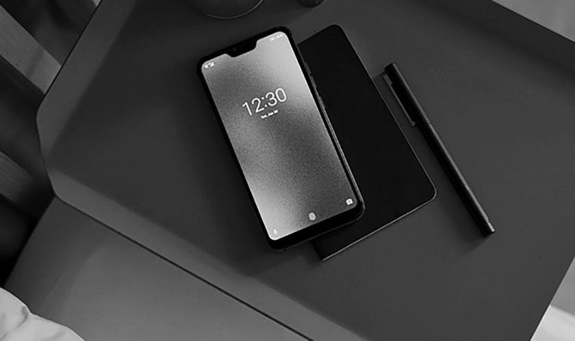
Unlike the aforementioned Light Phone 2, Blloc understands that at certain points you’re going to want to use your phone like a normal one. To do so, all you have to do is switch back to Minimal Mode and then — with the screen on — place your finger on the rear fingerprint sensor. That quick tap will turn your screen into full color, allowing you to use apps, take photos, etc., just like usual.
When you’re done, a quick tap on that fingerprint sensor turns everything back to monochrome. In other words, you’re never stuck in monochrome — Blloc just really wants you to avoid color interfaces whenever possible.
While the Blloc Zero 18 clearly isn’t the smartphone for everyone, it does have a lot of interesting ideas going on. It seems almost like Google’s Digital Wellbeing initiative but expanded into an entire smartphone rather than just some Android settings.
That, unfortunately, might be the problem with the Blloc Zero 18. Why does this need to be an entire smartphone? Why not just make an Android launcher which does all these things and then sell that on the Google Play Store? it seems a bit overkill to make an entire phone.
Regardless, the Blloc Zero 18 is priced competitively at 359 euros (~$412). With something like the Palm phone starting at $350 (and you not even being able to buy it on its own), the Blloc Zero 18 is clearly the better buy.
Right now, the Blloc Zero 18 is only shipping to select European countries, but it will work on almost every carrier in the United States. Click here to learn more about the Blloc Zero 18 and click below to pre-order yours now for a November ship date.