Affiliate links on Android Authority may earn us a commission. Learn more.
The case for capacitive buttons
Published onApril 13, 2017
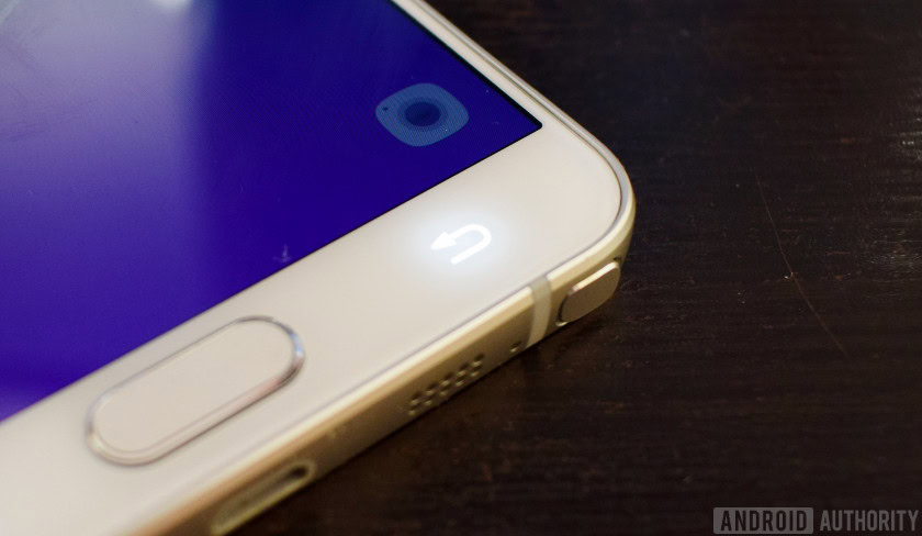
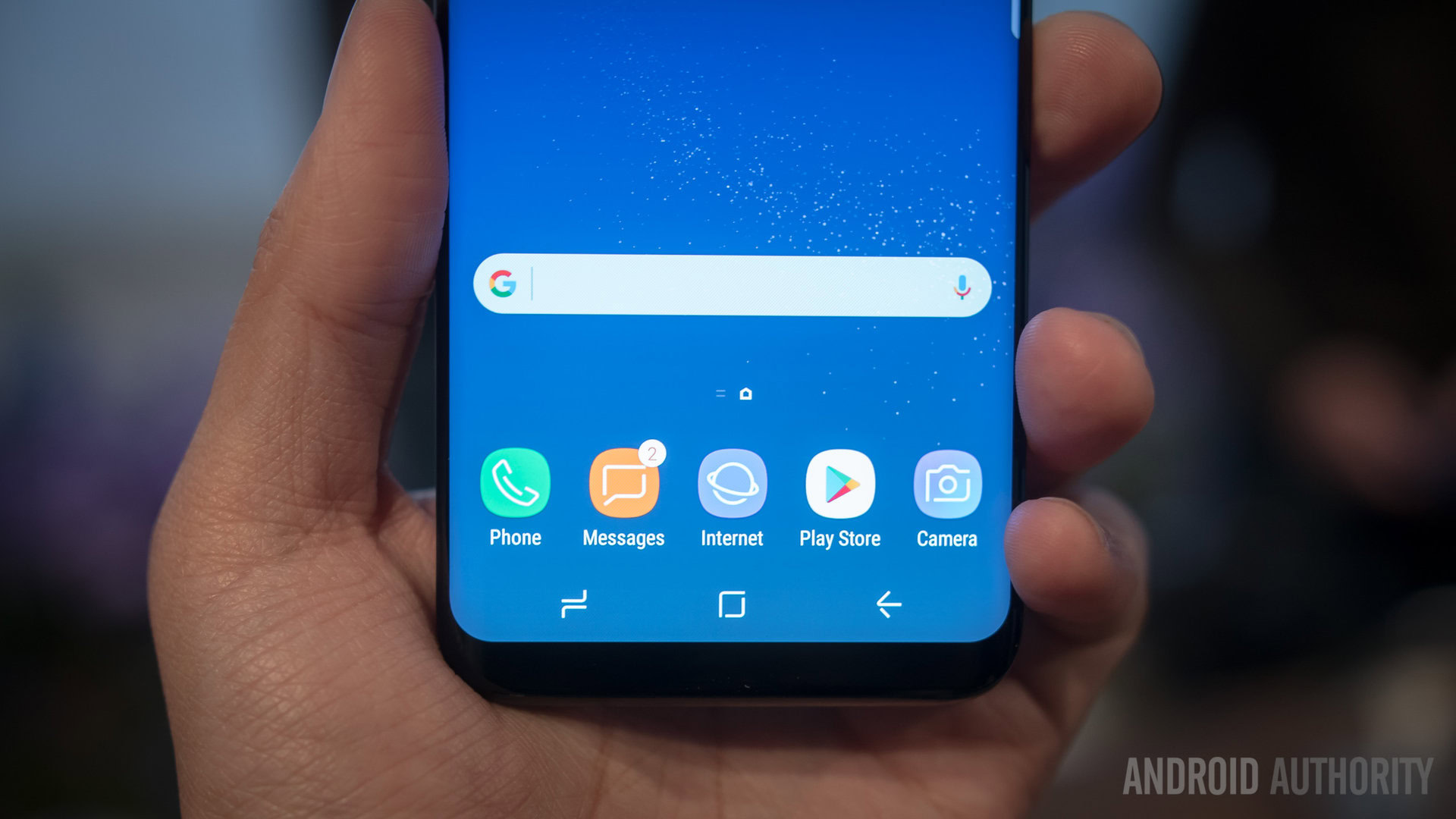
This year’s Samsung Galaxy S8 is certainly a feature rich flagship, but it’s missing one notable option for some – home and capacitive buttons are absent from the handset. Not only does this do away with one of the Galaxy S flagship’s long running signature looks, but could also be the start of a worrying precedent for fans of capacitive keys.
Like it or not, Samsung holds major influence over the designs of other manufacturers, and the company ditching physics keys could encourage more OEMs to follow suit. While there are pros and cons to capacitive buttons, it would be a shame if a large number of manufacturers dropped this hardware without giving a thought to some of the upsides that have made physical buttons such a beloved design for many.
Samsung holds major influence over the design language adopted by other manufacturers, and it would be shame if other OEMs dropped their hardware keys simply to copy the market leader.
Right off the bat, the big advantage of capacitive buttons is that it frees up screen space, maximising the amount of room for actual content rather than losing the bottom portion of the screen to some not particularly pretty navigation keys. While perhaps not as big a deal with today’s 5.5-inch displays, there’s something to be said about not having to block part of the screen with your hand.
Physical keys also avoid the hassle of having to contend with the navigation bar while watching full screen video or browsing through an image gallery. I can’t count the number of times I’ve struggle to hide software navigation keys in certain video apps, whereas physical keys offer a more consistent experience. The fact that physical keys are always accessible is also very convenient for speedy actions, allowing manufacturers to offer a quick way to launch the camera or other apps without having to unlock your phone first.
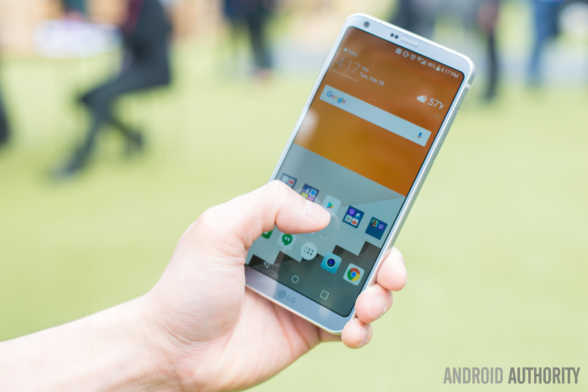
Then there’s the localized tactile feedback, which feels more convincing coming from directly under the keys rather than shaking the whole phone for a keypress. Physical and capacitive buttons, implemented well, can offer a more premium feel than generic software keys.
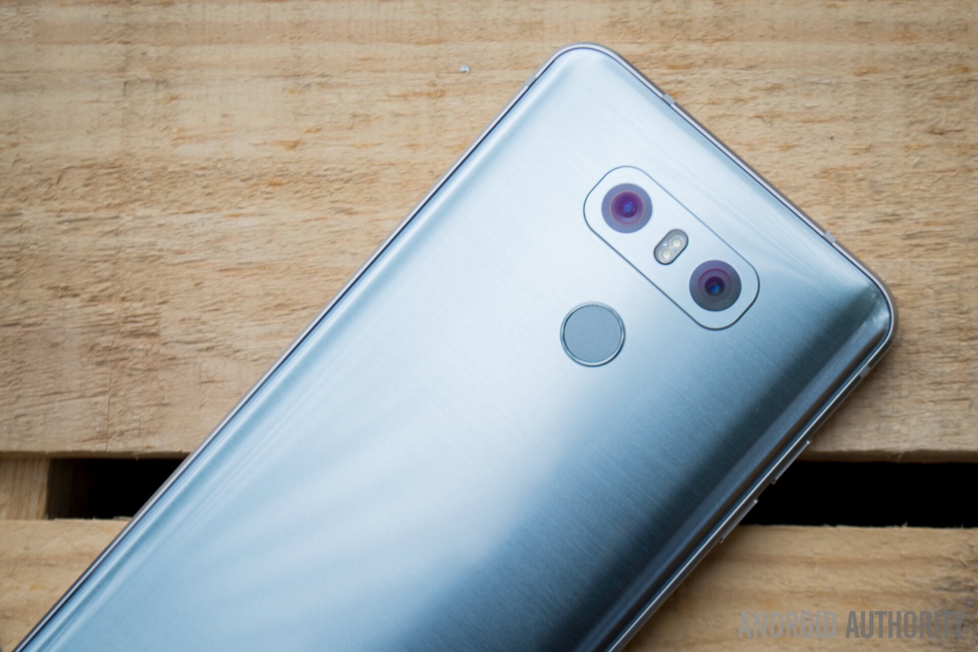
OEMs are just starting to experiment with force sense and swipe gestures embedded in fingerprint scanners and capacitive keys, but these innovations might be lost to bezeless designs.
Manufacturers can also make these keys at least as interactive as their software counterparts these days, and possibly moreso. Fingerprint scanners conveniently located in the home button is one common option, but we’ve also seen manufacturers begin to experiment with force sensing and swipe gestures within fingerprint scanner and capacitive key hardware. This opens up capacitive keys to do more than your typical software button, and all without having to drag your fingers across the screen, potentially clicking on something and therefore ruining the gesture input.
While these innovations aren’t without problems in their current iterations, it would be a disappointment to see companies ditched these ideas before they’ve had time to mature into features that many may come to love.

Of course, capacitive buttons aren’t without their trade-offs. Bezel size, as seen with the new LG G6 and Galaxy S8 design, is going to be notably larger with space dedicated to physical keys, and so these handsets simply might not look as sleek as the competition. Then there’s the question of durability. Will responsiveness of the keys fade with time or might they stop functioning if I drop the phone? It’s one more component that is unlikely to but could fail, and they’re very rarely replaceable.
Capacitive buttons are also rarely configurable and can’t be moved to added to, leaving you with just the default commands setup by the manufacturer. Software keys allows for users to reconfigure the location of the back button, change the look and style of the bar, and even add in additional dedicated command keys for extra functions. Software, by its very nature, is simply more flexible.
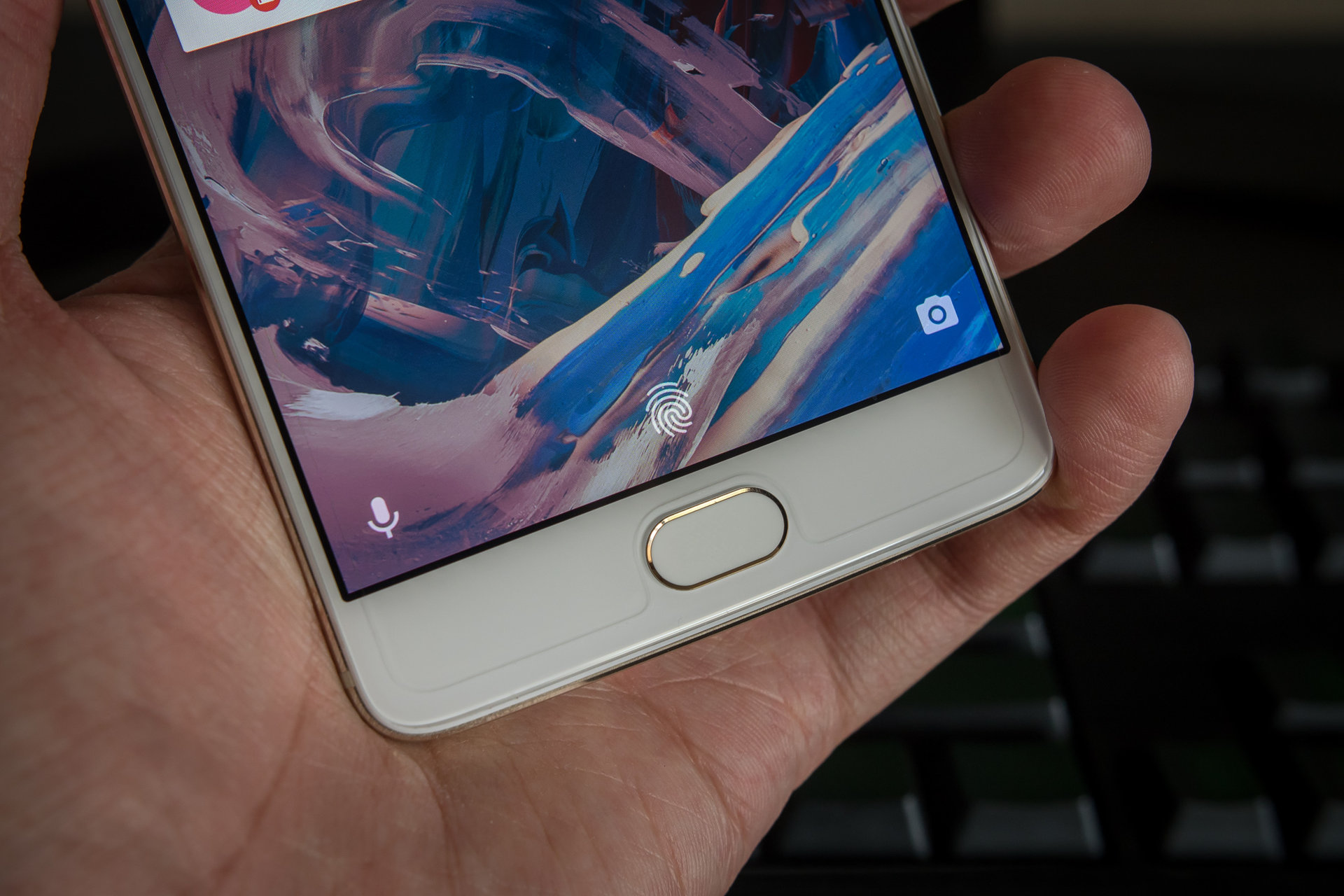
Perhaps the best option for companies going forward could be to offer consumers the option of both. OnePlus already allows its users to enable software keys upon request by rummaging through the settings menu. The company also enables users to assign secondary controls to the capacitive buttons, to better customize how they can interact with their handset.
Perhaps there’s a more elegant solution still though, such as contextual switching of controls. For example, allowing users to hide and show software buttons to access them when needed, for custom actions and the like, while still retaining the advantages of physical buttons for when using camera and video apps?
Despite some major OEMs showing an eagerness to slim down bezels in the pursuit of a sharp new look for their flagships, there are still a number of benefits to the physical key and home button setup, which some consumers will surely miss. Fortunately, other handsets released this year still offer the more traditional design, for those who want it, but only time will tell if this configuration sticks around over the coming year or so.
Do you think that we’ll see less physical key smartphones as OEMs move towards bezeless designs? Are there any upgrades to capacitive buttons that might convince customers and OEMs to stick with this tried and tested formula? Let us know your thoughts in the comments below.