Affiliate links on Android Authority may earn us a commission. Learn more.
Google looks to make Chrome OS much more touch-friendly than before
July 8, 2017

Traditional, non-touchscreen Chrome OS were very popular in the past, but partly due to the inclusion of Android app support, Google has slowly made its desktop operating system more touch-friendly over the years. That trend looks to continue with an updated look and feel that make Chrome OS more touch-friendly than before.

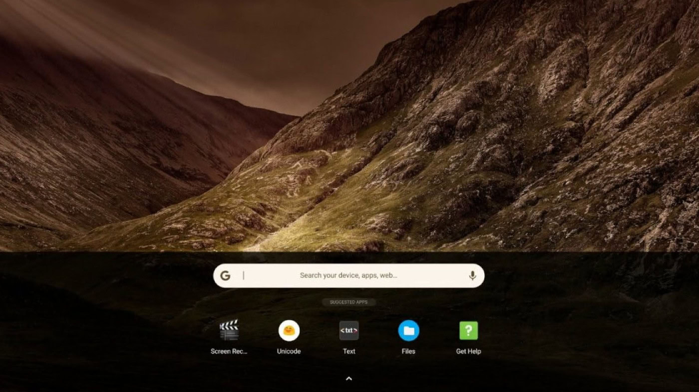
Based on the video, which was first spotted by Engadget and uploaded by Chromium evangelist François Beaufort, the redesigned desktop takes cues from Android by having the app launcher window at the bottom of the screen when you click on the Apps button. By comparison, clicking on the Apps button will pop open a window in the current version of Chrome OS.
In the redesign, clicking on the Apps button also opens a search bar, which you can drag up to open the full app drawer. Alternatively, five “suggested apps” sit right below the search bar, so there is no need to open the app drawer if the app you want is there.
The best part about the redesign is you do not have to wait to play around with it – it is live on Chrome OS’ canary channel. Even so, the software is incredibly buggy, so unless you live on the bleeding edge, it might be best to wait until Google irons out all of the kinks.
What is promising about the update, though, is that Google looks to be interested in changing Chrome OS from an operating system designed around a keyboard and mouse to one that takes your fingers into account. It also means that manufacturers could eventually release new types of Chrome OS devices instead of the laptop/touchscreen hybrids that dominate the Chrome OS market today.
Thank you for being part of our community. Read our Comment Policy before posting.