Affiliate links on Android Authority may earn us a commission. Learn more.
Circle to Search is getting an app drawer, and here's what it looks like
November 19, 2024

- A new version of the Google app has revealed a new UI for Circle to Search.
- The new UI moves features like the translate and Google Lens buttons into an app drawer button.
- This comes several weeks after Google removed the Lens button from Circle to Search.
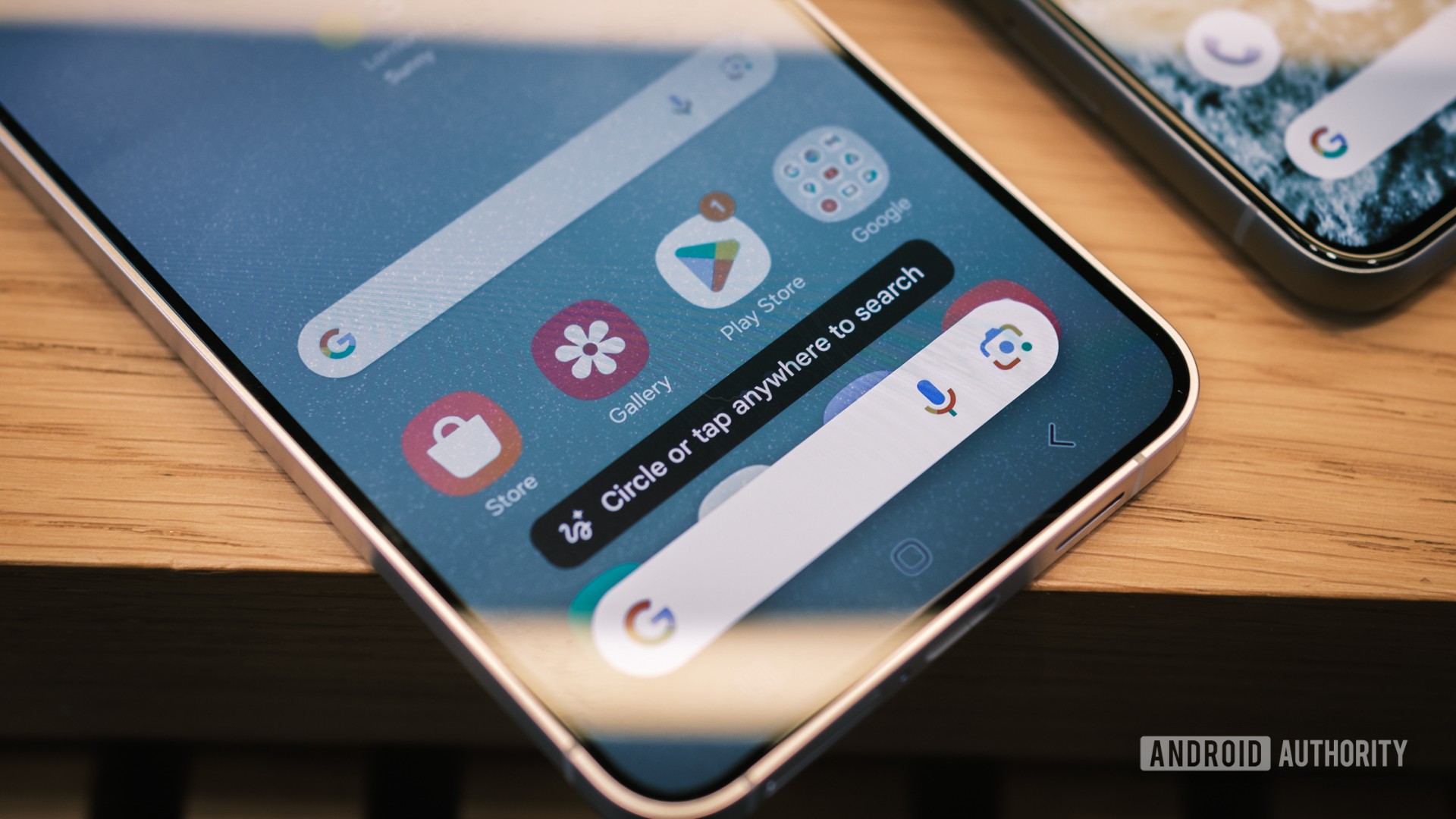
Google’s Circle to Search is a handy way to quickly search your screen and perform more actions. Google recently made the polarizing decision to remove the Lens button from the Circle to Search bar, but it looks like a more significant change could be on the way.
A recent version of the Google app (15.45.43.ve.arm64 beta) has revealed a redesigned Circle to Search UI. This is a chunkier interface compared to the current UI, with the UI elements now encased in a rounded box. However, the biggest change is that we’ve now got an app drawer in place of the translate button. Check out the video below and screenshots further down the page via Telegram user @John9498 for a better idea of what to expect.
The move to an app drawer means that some Circle to Search features, like the Google Lens shortcut and translation functionality, will require an extra tap. But an app drawer makes sense in light of the expanding number of features hosted by Circle to Search. After all, Google has been shrinking the size of the search bar since the initial launch. So an app drawer button lays the foundation for future features to be added without screen space and search bar considerations.
It’s also worth noting that the music search button remains next to the search bar. But we hope Google will eventually let users swap the music search shortcut for a translation or Lens button instead.
The news also comes after we discovered Google was working on the ability to use Circle to Search in videos. But it’s unclear whether this functionality will apply to specific platforms (e.g. YouTube) or videos across the board.
Thank you for being part of our community. Read our Comment Policy before posting.