Affiliate links on Android Authority may earn us a commission. Learn more.
Understanding color accuracy in mobile devices (part 1 of 3)
Published onJuly 14, 2018

This year a quarter of the world’s population will watch video on their smartphones, according to global market research firm eMarketer. Similar studies over the past few years have consistently shown the growing importance of mobile devices in delivering all sorts of entertainment content to viewers worldwide.
While the conventional television model isn’t exactly dead, we can’t deny the fact that more and more of us are watching our favorite movies, sitcoms, sporting events, and news broadcasts on screens that comfortably fit into our hands. And yet, while TV buyers have scoured published specs to find those products that deliver the most accurate, faithful-to-the-original images, there’s been relatively little attention paid to this when it comes to our phones, tablets, and other small screens. This is particularly true when it comes to specs and best practices related to delivering accurate color, in part because it’s a subject that’s poorly understood by most viewers.
This is the first in a three-part series of articles intended to change that.
Little attention has been paid to identifying those mobile products that deliver the most faithful-to-the-original and accurate images.
We’re going to be taking a look at just what it takes in order to deliver accurate (or at least good-looking) color to you, the viewer. To do that, though, we’ll first have to review just how color works, and how our eyes and brains deliver this perception to us. Because in the end, that’s all that color is; it’s just a perception, something created entirely within our visual systems, with no more objective physical existence or significance than the taste of a favorite dessert. After we get through the basics of the perception of color, the next two in this series will cover what a display device needs to be capable of in order to provide good color, and then how the entire content delivery chain, and specifically the notion of proper color management, work with the display device to ensure the best and most accurate representation possible.
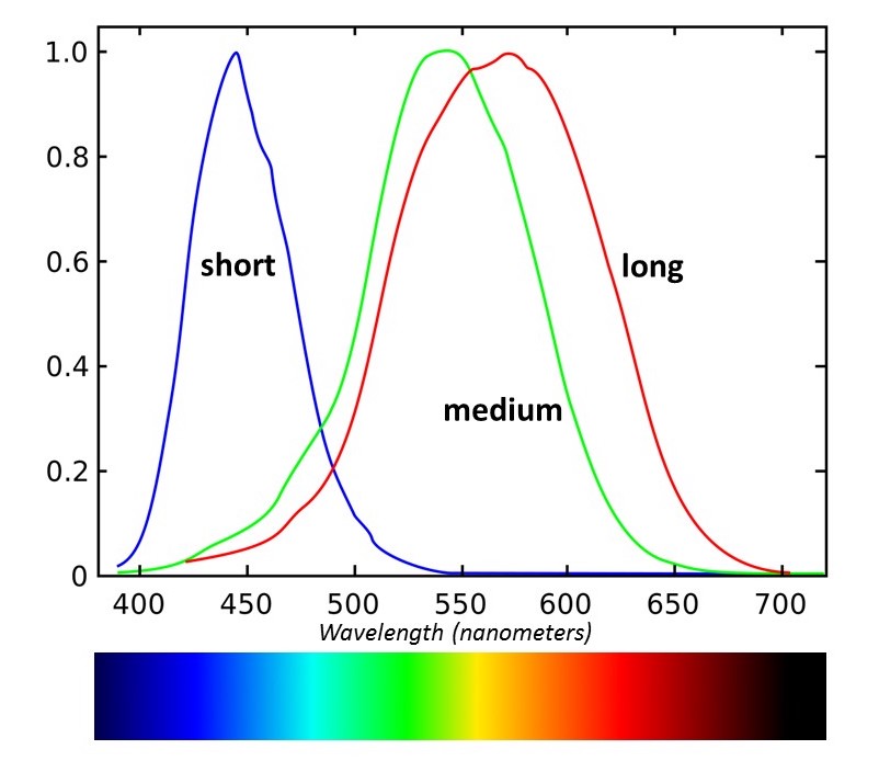
So let’s start out with the basics. As was just noted, color doesn’t really have any physical existence. Rather than saying “that apple is red,” it’s more accurate to say that “that apple looks red to me.” This is because the perception of color is something that’s created wholly within the visual system, in response to the stimulus of visible light (which itself is just that narrow slice of the EM spectrum that our eyes happen to be set up to detect; there’s nothing otherwise special about it). We are able to perceive different colors because our eyes contain three different types of receptor cells – the cone cells – each of which is sensitive to a somewhat different range of wavelengths. (A fourth type of receptor, the rod cells, have more to do with vision in low-light situations, and don’t contribute at all to color vision.)

It’s very common to think of these three types as being the “red,” “green,” and “blue” cones, and that they correspond to the three primary colors we’re used to in displays, but that’s really a misconception. The response curve of each of the three is pretty broad, and each covers more wavelengths than we’d associate with just one color. It’s better to refer to them as the long-, medium-, and short-wavelength cells. (And note that in the case of the long-wavelength cones, the ones that some would call the “red” ones, the peak sensitivity is actually in the yellow range!).
How the visual system distinguishes different colors, then, is basically by measuring the degree to which each type of cone is stimulated by the light striking it. Each has no ability to distinguish the wavelengths of light within its range; a strong deep red source, for instance, might stimulate the “long” cones to the same degree as a weaker yellow light. The two could only be distinguished by looking at the degree to which both the long- and medium-wavelength cones are being stimulated. (Note that the short-wavelength cones – the “blue” receptors – have practically no sensitivity here, so they don’t enter into the perception of these colors.) You can look at each type of cone as generating a “meter reading” determined by the total light within its range of coverage, and together it’s these three values that permit the visual system to distinguish color.
This means that any system we create to represent color numerically has to be three-dimensional – in other words, to cover the full range of colors, you’re going to have to provide three numbers. These aren’t, though, RGB values or any other simple system that just gives the relative levels of three “primary” colors. We’ll be getting to primaries in just a minute; first, though, let’s take a quick look at how color is commonly represented in a 3-D space.
Any system we create to represent color numerically has to be three-dimensional – in other words, to cover the full range of colors, you're going to have to provide three numbers.
The sensitivity curves for the three types of color receptors in the eye can be used to generate just such a 3-D space, in which any color can be described by three numbers. I won’t bore you with the details of the math, but basically you can take the distribution of a given light source and calculate the degree to which each of the three receptors (or at least the standard curves that describe how these cells work in the average person’s eyes) will be stimulated by that source. This set of numbers is called, appropriately enough, the tristimulus values for that light source, and they’re usually represented by the letters X, Y, and Z.
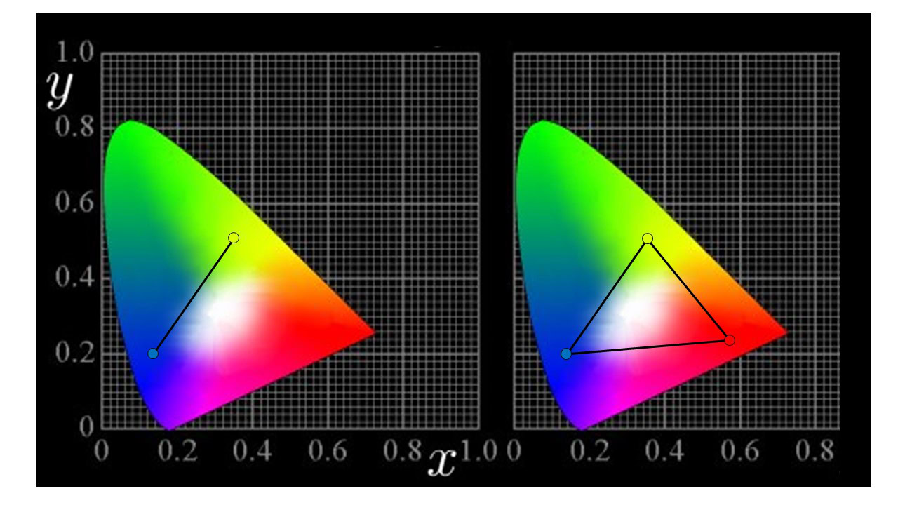
The XYZ values usually aren’t all that useful unless you’re a color scientist needing to work with color mathematically, so they’re not commonly given. Instead, these values can be used to set up systems of chromaticity coordinates, such as the one shown in the following diagram.

This is a chart of the popular “Yxy” coordinate system, or at least two dimensions of it. The chart plots colors in terms of their x and y values – so where, you may ask, is the Y? These systems are typically defined so that the third dimension is luminance, or what most people would consider “brightness” or “intensity.” (Technically, “luminance” has a specific definition separate from these, but we don’t need to worry about that here.) The luminance or Y axis is at right angles to the other two, so you can imagine it as pointing right out of the screen as you’re viewing this chart. For now, the important thing to note is that the Y value is independent of the x and the “little” y, so we can talk about color on this chart without really worrying about “brightness” so much. A lot of displays, for instance, simply list their primaries in terms of their xy coordinates.
Now that we have this chart to describe color, we can start talking about how different colors of light mix to produce the perception of other colors. Remember, all of this has been derived from how the eye perceives color and the sensitivities of the cells that get this job done for us, so using charts like this ought to be pretty useful in telling how we’re going to see various combinations of light.
For instance, pick any color — any point within this diagram. Let’s say it’s a particular shade of greenish-yellow, and mark that location on the chart. Now we pick a second color — maybe a blue — and mark that location as well. If you draw a line connecting the two, you’ve just shown all of the colors that can be made by mixing them in various proportions.
You can see what I mean in the image on the left below.

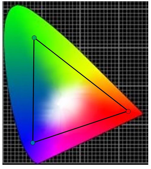
Now, let’s add a third color; this time we’ll pick a deep red. Drawing the lines between it and the other two also shows the colors you can get by mixing the red with either the yellow or the blue. You also now have a triangle – and that encloses all of the colors you can make by mixing all three colors together! This is what’s meant by the color gamut provided by any such set of colors (of course, you would refer to the colors themselves as the “primaries” of that particular system). You may be wondering just what’s up here since the colors we chose were red, blue and yellow. What happened to the primaries being red, blue, and green, at least for our screens?
There really isn't just one fixed set of colors that we should consider primaries.

While it’s true that we normally think of color displays as being “RGB” devices, the point here is that there really isn’t just one fixed set of colors that we should consider “primaries.” We use red, green, and blue for the most common additive primaries (the sort you use with light) because using shades of those colors give the best coverage in terms of the total color gamut, but notice that even the red, blue, and yellow set that we chose would be able to create a fair “full-color” gamut — you couldn’t get a really deep green out of this set, but you would be able to at least make enough green for pictures to look acceptable.
Even if we do limit ourselves to the “RGB” set, keep in mind that there are lots of possible reds, greens, and blues to choose from. Nor is there any law that says you can only have three primaries, either. As noted, three is just the minimum number needed for anything like “full color” images, but systems with four, five, or even higher numbers of primaries have been demonstrated in various attempts to get a better color gamut.
This should give us enough of an understanding of how color is produced, perceived, and measured so that we can now turn our attention to the devices that are going to be making color for us: the displays in our devices. The second part in this series will look at what’s needed there to deliver “good” color, and some of the unique challenges presented by mobile devices in terms of getting accurate color out of these screens.
Had you come across these color graphs before? Did you know how to read them?