Affiliate links on Android Authority may earn us a commission. Learn more.
How to create awesome pixel art for your games and apps
August 5, 2016
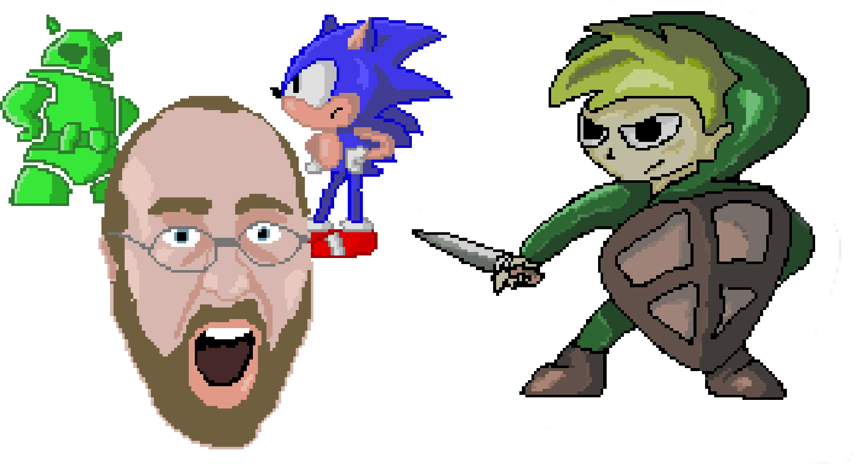
Pixel art has a certain retro appeal to it that harkens back to the 8, 16 and 32 bit console eras. Today though, it is more likely to be found in any number of indie and mobile games and is currently enjoying something of a resurgence. It’s a fantastic way to get around the technological limitations that come from being an independent developer and from mobile hardware. This way, you can make less work for yourself and shrink your file sizes – but rather than looking cheap, it will look like a deliberate stylistic choice. Add in some chiptune music and a unique color palette and you have a great aesthetic that will draw attention in the Play Store.
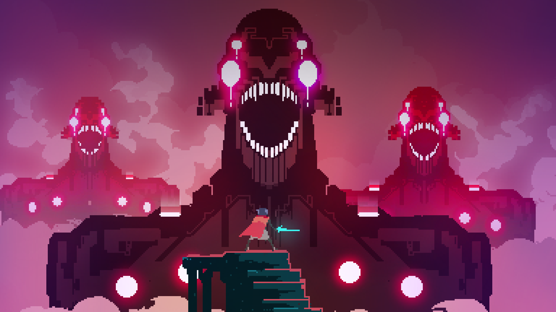
Another appeal of pixel art is how it challenges you to work within its limitations. Because the images are so small, it forces a somewhat impressionistic approach. How can you make one or two pixels instantly identifiable as a charismatic smile, or a dagger sticking out of an opponent? This is where the true art of the format lies and it’s why some of the accomplishments in games like Superbrothers: Sword & Sworcery, or the more recent Hyper Light Drifter, are so impressive.
How to get started
With all that in mind, you may decide that pixel art would be a good direction for your own project. In which case, how do you go about getting started? Fortunately, pixel art is one of those rare occasions where it really is as simple as it looks. This is art, made from pixels…
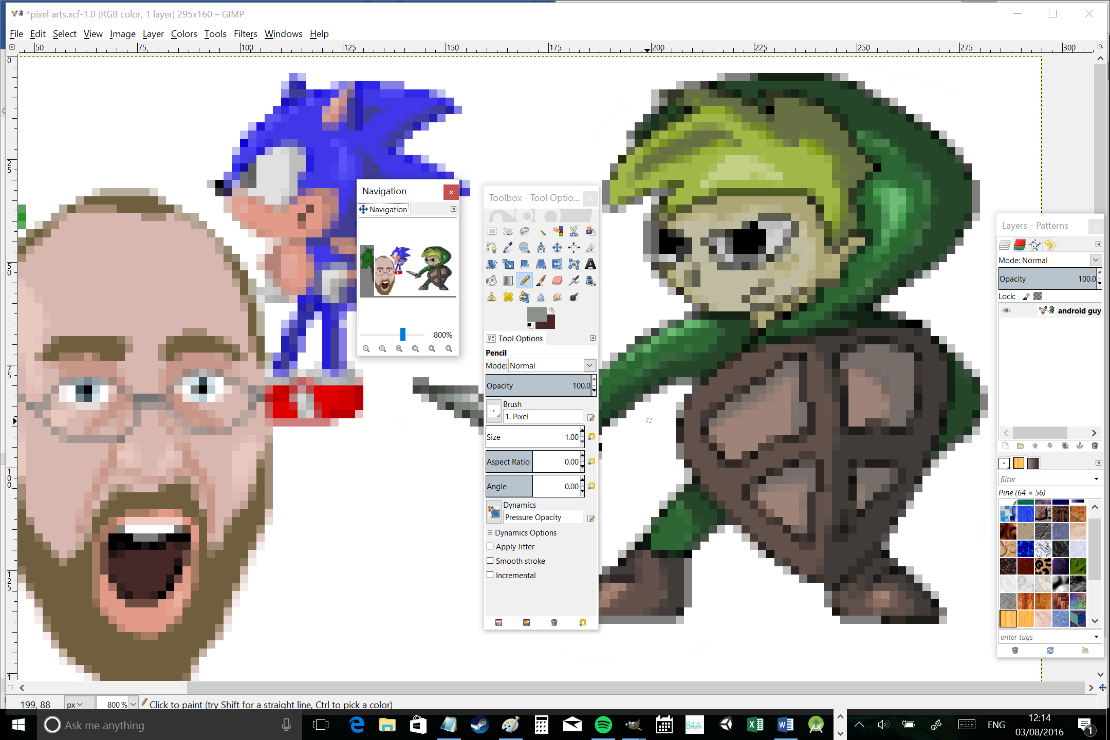
To begin, you simply need to select a drawing program of your choice. I’m using GIMP seeing as it’s free but you could just as easily use Photoshop or even MS Paint. That said, I would recommend going with something a little more complex than MS Paint, as it can come in handy having access to features like layers and transparencies (as we will see later). There are some specific pixel art programs available you can work with too but these aren’t generally necessary. Aseprite is one good option, however.
No matter your choice of software, you’re then going to select the pencil tool and make sure that it is set to draw in single pixels with 100% opacity. Now zoom in on your image to the point where you can clearly see the square pixels as you draw. It’s really that simple!
Now you can start to draw free-hand or place each pixel individually. Note that when drawing things like circles, it can pay to take some deliberation looking at the patterns of your pixels (two up, one across, three up one across, four up one across etc.) as this create a more consistent and controlled looking image. The good news is that it’s very easy to undo any mistakes you might make, so there’s no reason not to experiment.
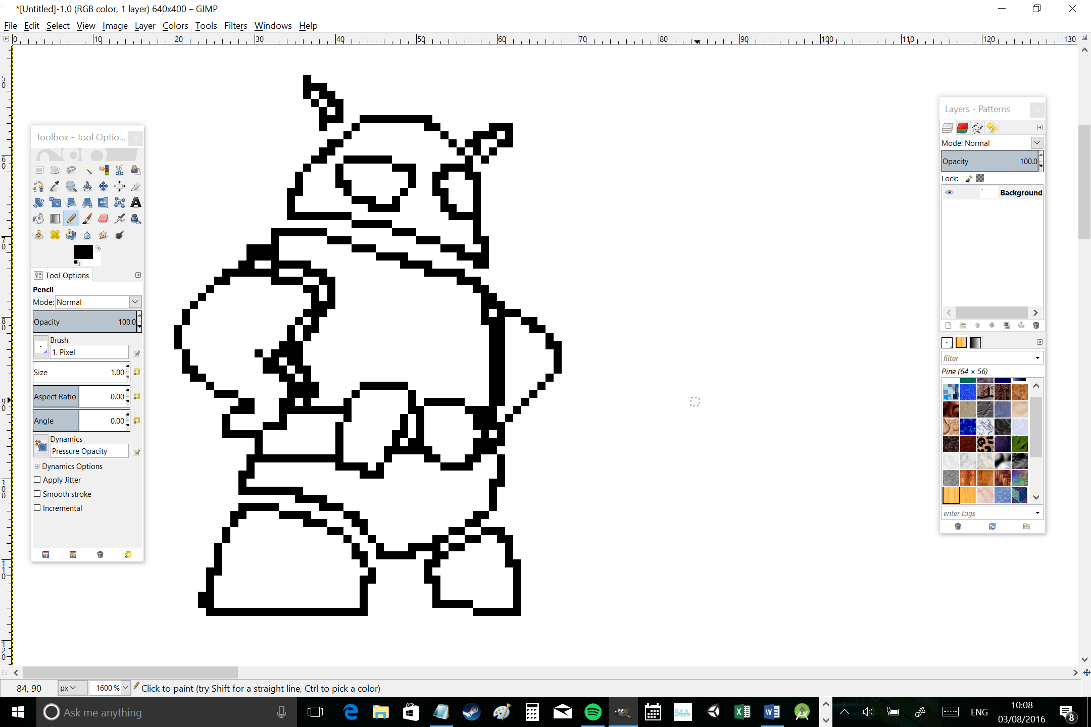
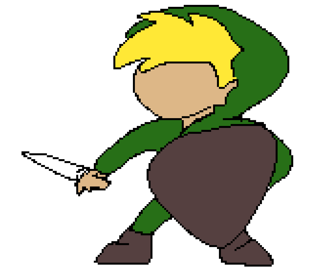
What you’ll end up with is a basic outline for whatever it is you’re trying to draw in blocky pixels. Don’t worry about adding lots of detail until later on – first just experiment with getting the shape and the proportions correct. This is the hardest part with a lot of characters in particular.
I like to use an outline for my images but a lot of people don’t bother with that and will draw in block colors. Do what works for you but note that there are pros and cons to each method; outlines make it easier to differentiate details but they can get in the way as your images get smaller and pixels start becoming scarce!
Adding detail and shading
Once you’re happy with your outline or silhouette, you can then go about adding the individual details until you have a complete picture. The more detail you add, the more impressive your characters will look. At the same time though, you need to avoid making your image look too cramped. Important is to start with an outline that’s the right size – and remember that the other objects in your game world will need to be relative too.
Now you have your details, just add whichever colors you want to use using the fill tool. This can look a little flat though to start with though, so you’ll most likely want to add some kind of lighting after that.
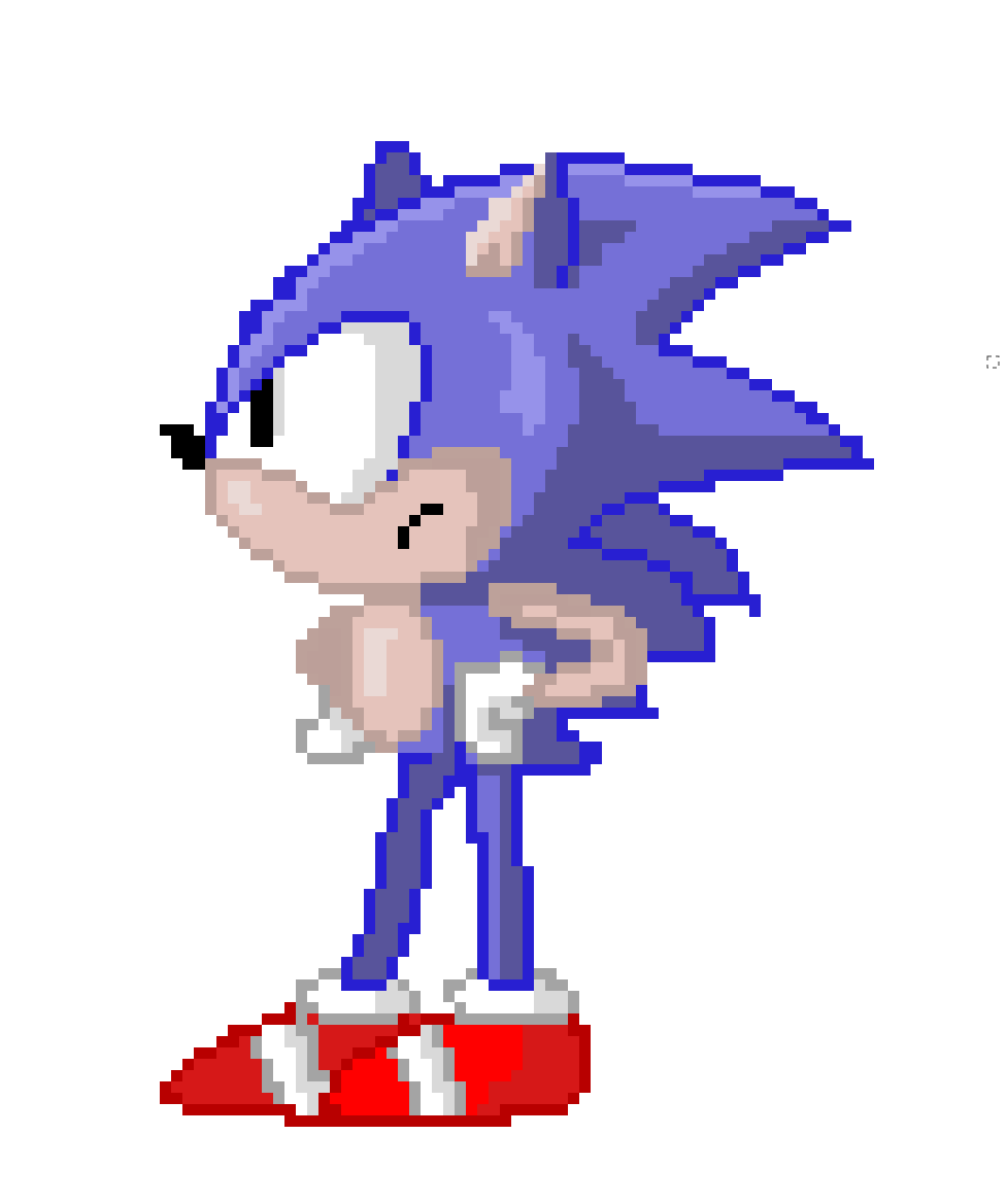
To do this, simply imagine a lighting source for your character and then select two or more additional tones to add to your color palette. You’ll need at least one for shadows and one for highlights. Make sure that all shading appears on the same side and think about the contours that would naturally be created by the shapes you’ve drawn if they were three dimensional. I use a lot of shadow on one side and then just a thin strip of light on the other to show highlights but again, the key is to experiment and see what works for your own personal style.
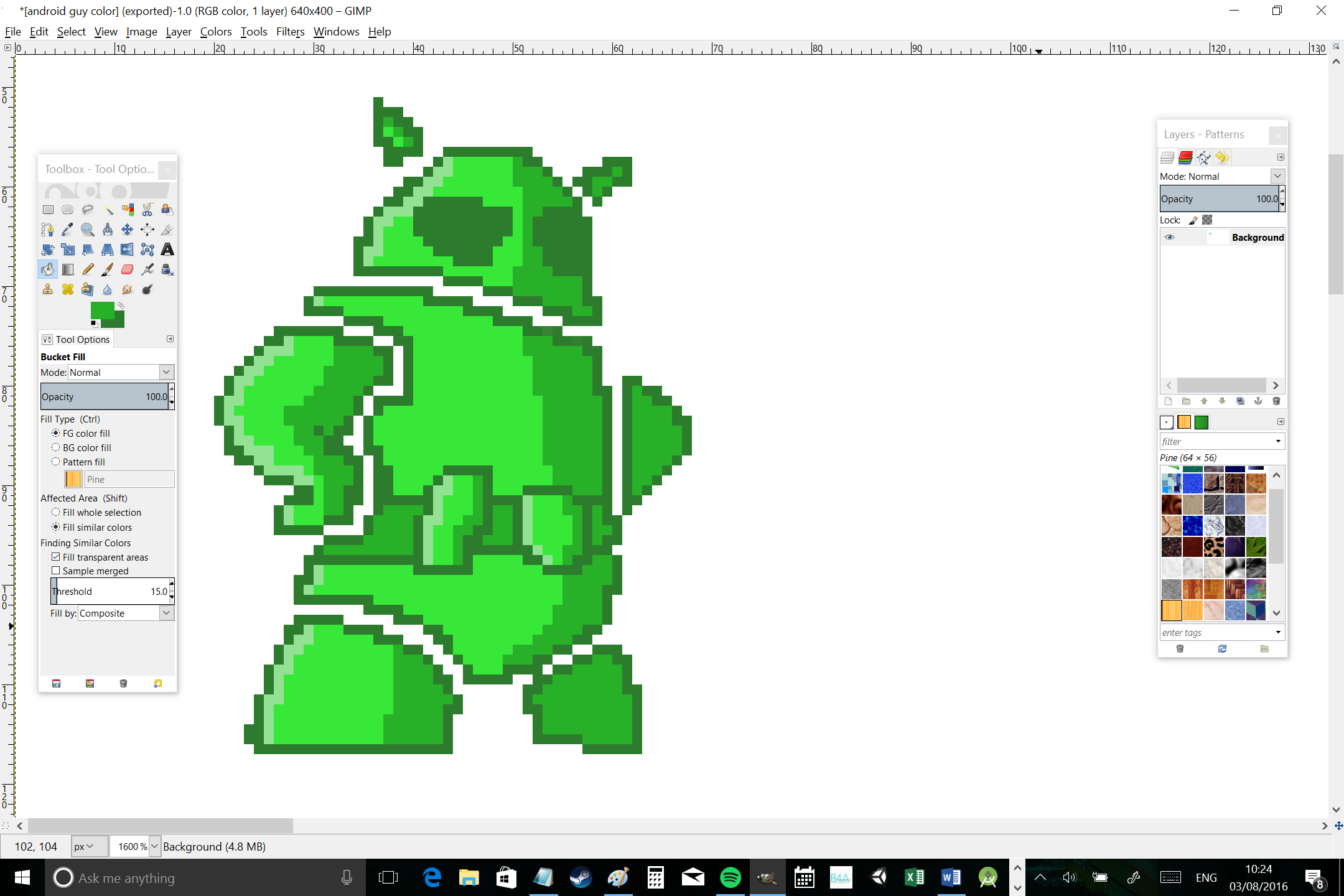
Do keep in mind that you are drawing characters and objects for games. This means you need to think carefully about your light source. If you make a very obvious shadow effect on the right hand of your sprite, this can end up looking odd in some contexts – especially if you’re flipping your sprite over when they’re walking the opposite way! Keep this in mind while creating your image and consider making your lighting more subtle or casting it from above instead.
Exporting your image
Once you’re ready to go, you can save and export your image. Of course we need to be careful at this point seeing as the picture will actually be tiny. There are also a couple of other things to remember if you’re going to be using your art in your games.
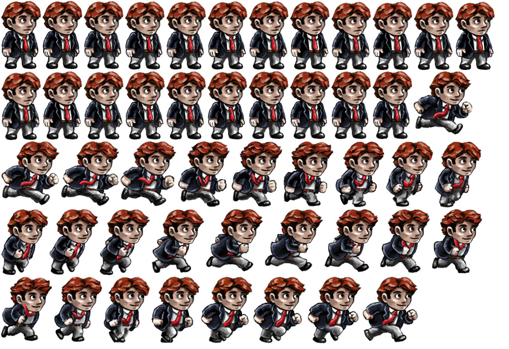
First, make sure that you autocrop your image so that there is no white space around the edges. This will be useful for your collision detection and it will also help you to avoid making your image unnecessarily large. That said, you may wish to create a ‘sprite sheet’ instead, which means you’re going to add every frame of animation to a single file. This makes the total file size smaller and keeps things easy to organize. In this case, cropping is less important as you’ll be doing it later in your chosen IDE.
You also need to make sure that the background is transparent so that you have characters moving around your game world instead of large white squares with characters drawn on them. In Gimp, you do this by selecting ‘Layer’ from the menu, then ‘Transparency’ and ‘Add Alpha Channel’. From there, you’ll be able to delete your white background leaving your image to hover over nothingness.
When you export your image, you can do so at the real file size if your aim is to use it in a game. In Unity, you can choose the ‘Pixels Per Unit’ for each individual sprite and that way, you can simply blow your image up as large as you like while also benefiting from the small file size.
Conversely though, if you hope to share your images online then you’ll want them to appear larger. So go to ‘Image’ then ’Image Size’ and increase the size. Make sure that you have turned off ‘interpolation’ or selected ‘preserve hard edges’ (depending on your software). Otherwise, the image will appear blurry.
7 pixel art tips
To finish, here are just a few tips to help you on your way to pixel art mastery…
1. Keep the big picture in mind
While you’re zoomed in and carefully editing each pixel, it can be hard to imagine what your image is going to look like once finished. This is why it’s important to keep zooming out from time to time. Or better yet, try using the navigation tool (available with most art programs) which will allow you to view a zoomed-out perspective on your canvas and also to jump to certain points.
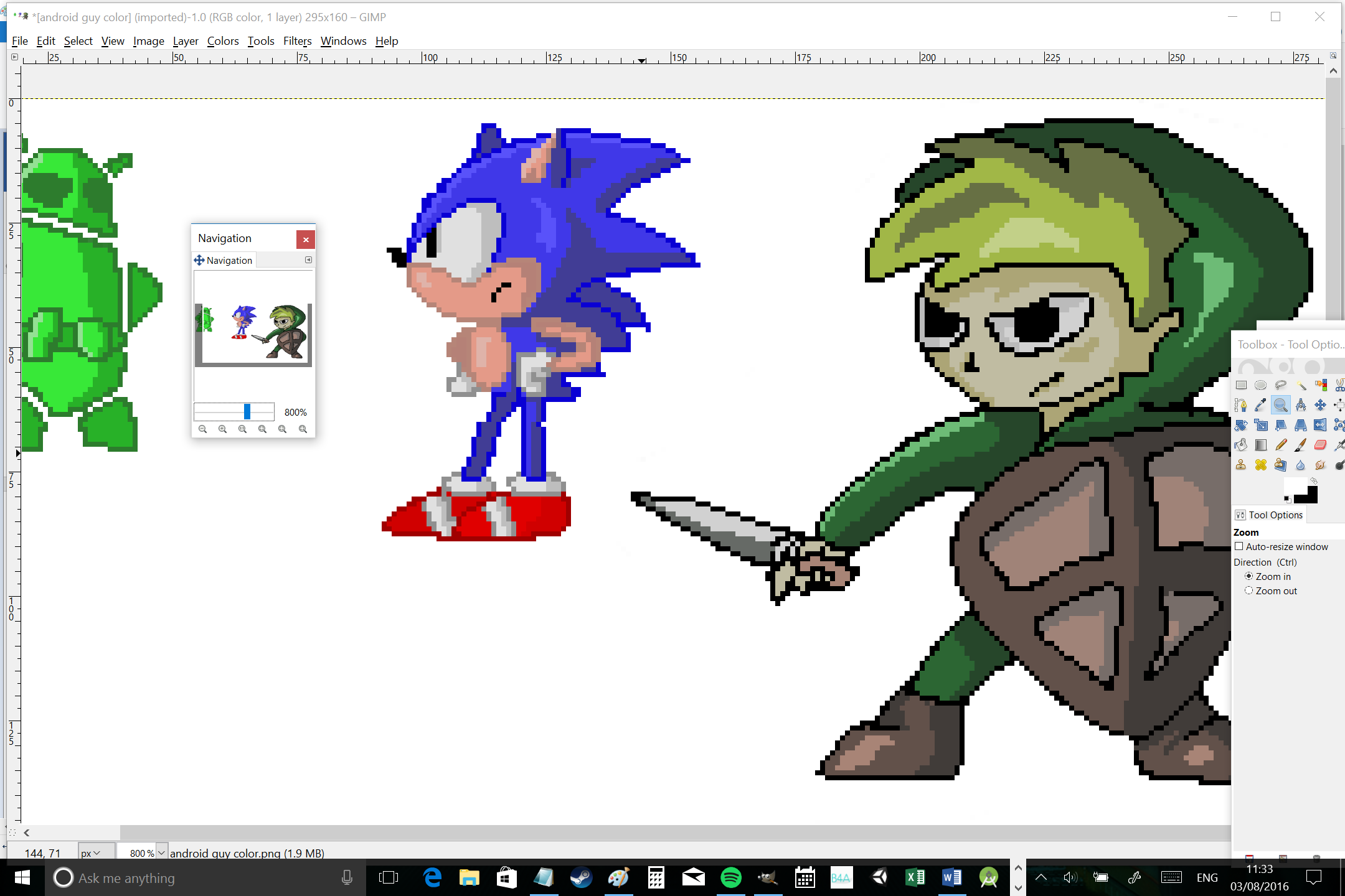
2. Use the magic wand tool
Using the magic wand or color select tools, you can select a whole region or color. This then allows you to draw onto that area alone which in turn will ensure you can draw freely without worrying about going outside of the lines. Alpha lock is another tool you can use to do this.
3. Add antialiasing
Antialiasing is a term used in computer graphics which is designed to soften the appearance of pixels, usually by reducing contrast and adding more transition colors. PC gamers will recognize this as a graphical option that can be turned on and off to improve performance.
In our case, antialiasing is an effect we can mimic in order to make our images look a little more authentic. To create the effect, simply find the points where you have a sudden contrast and then introduce those transition colors along the edges. The idea here is not to make a smooth gradient but just to make the transition appear a little less stark. I’ve added some antialiasing to Link here, so you can see the difference:
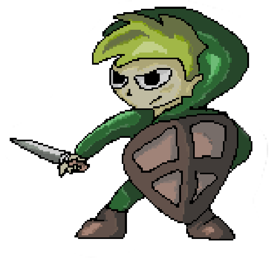
This is also where you’ll learn something else about pixel art: it requires a lot of patience!
4. Use layers
Most art programs allow you to use layers, which in turn means that you can have images appear in the background and draw on top of them without affecting that layer. You can also alter the transparency of individual layers etc.
What this allows us to do, is to take an image we want to work from, shrink it right down (maintaining the correct aspect ratio) and then trace over it with the pencil tool. This is how I made this portrait of Gary…
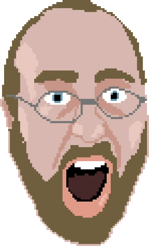
5. Try filters
While the best pixel art will be handled 99% by hand, there are some filters that can help to make life a little easier for you depending on your ambition. For example, Gimp has a blur filter called ‘pixelize’, which does exactly what it says on the tin. You can use this to add additional antialiasing to your existing image, or you can use it to ‘cheat’ and turn a regular image into something that looks a little more like pixel art. The sharpen tool can also be a handy resource.
6. Look for inspiration
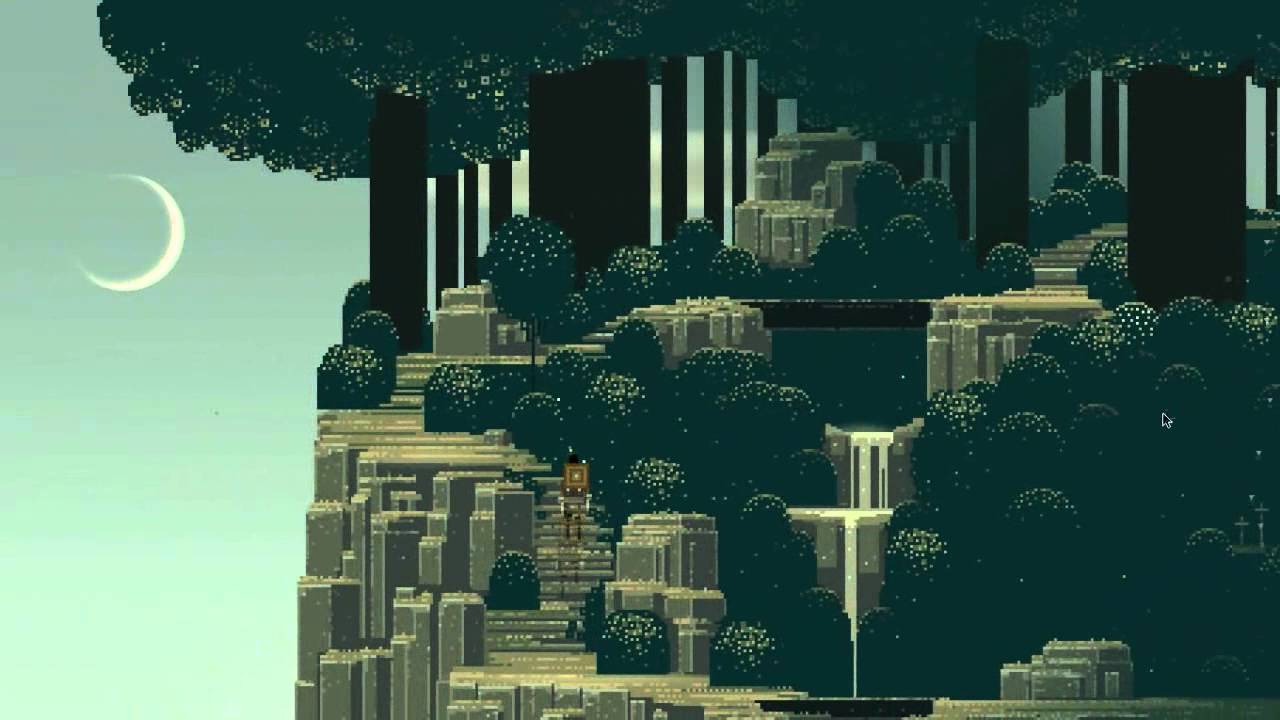
The best way to get better at pixel art, as with most things, is to keep trying. That said though, doing some research and looking for inspiration online can also help a great deal. In particular, looking at existing examples of ‘reference sprites’ can be helpful, especially if you want to quickly create elements such as chests, trees and the like. ‘The Spriter’s Resource’ is a great site for finding spritesheets from all your favorite old games. Looking at sprite sheets can also be very handy when you’re trying to animate your characters, as it gives you a reference for the biomechanics of walking, running and jumping (biomechanics refer to the way our arms and legs move as we do).
And of course there is plenty of inspiration over on Deviant Art and Pinterest, as well as in a ton of great games right in the Play Store. Some excellent examples include: Superbrothers: Sword & Sworcery, Pewdiepie: Legend of the Brofist, VVVVVV (sort of), Sonic the Hedgehog 1, 2 & CD and Terraria.
7. Be original
While pixel art regularly looks fantastic and the potential for experimentation is endless, it’s important to make sure that you work to make sure yours doesn’t look contrived. There’s a lot of pixel art around at the moment, so it’s all too easy to just create a generic pixel art look and call it a day. If you want to make your game look unique, you need to think a little outside the box and try coming up with your own style. How about combining pixel art with another style, like cyber punk for instance? Experiment, try new things and create pixel art that is somehow unique to you. Use pixel art as a medium to express yourself and bring your imagination to life – that’s what art is all about, after all!
Let us know your thoughts!
Thank you for being part of our community. Read our Comment Policy before posting.