Affiliate links on Android Authority may earn us a commission. Learn more.
Designer reimagines Google's iconic Search page with Material Design
Published onDecember 4, 2014

Android has gone through a lot of facelifts throughout the years, and mobile operating systems in general often change outfits by way of skins, fonts, icons, and animations.
Google recently introduced its Material Design, which brought forth a plethora of changes both aesthetically and in terms of functionality, but what about Google Search on its own? While we have saw small tweaks to the Google search page throughout the years (and some Material-ish web design elements as of late), nothing comes close to this concept showcasing how Google search (and the internet as a whole) could look with a coat of Material Design.
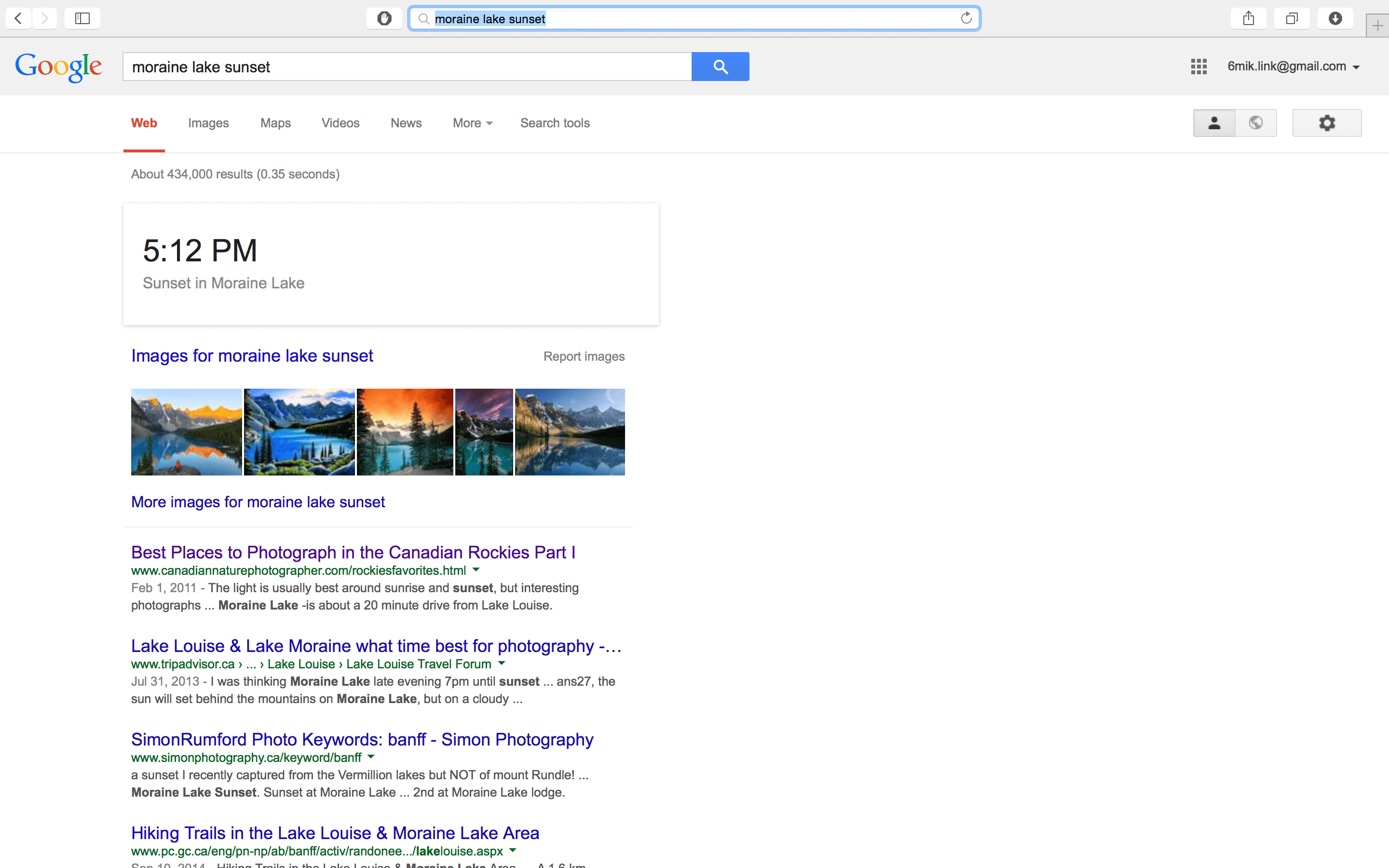
Whether you like the concept or Material Design as a whole certainly boils down to personal preference, but designer Aurélien Salomon’s vision of a Material Search is certainly a huge visual difference, transforming this…

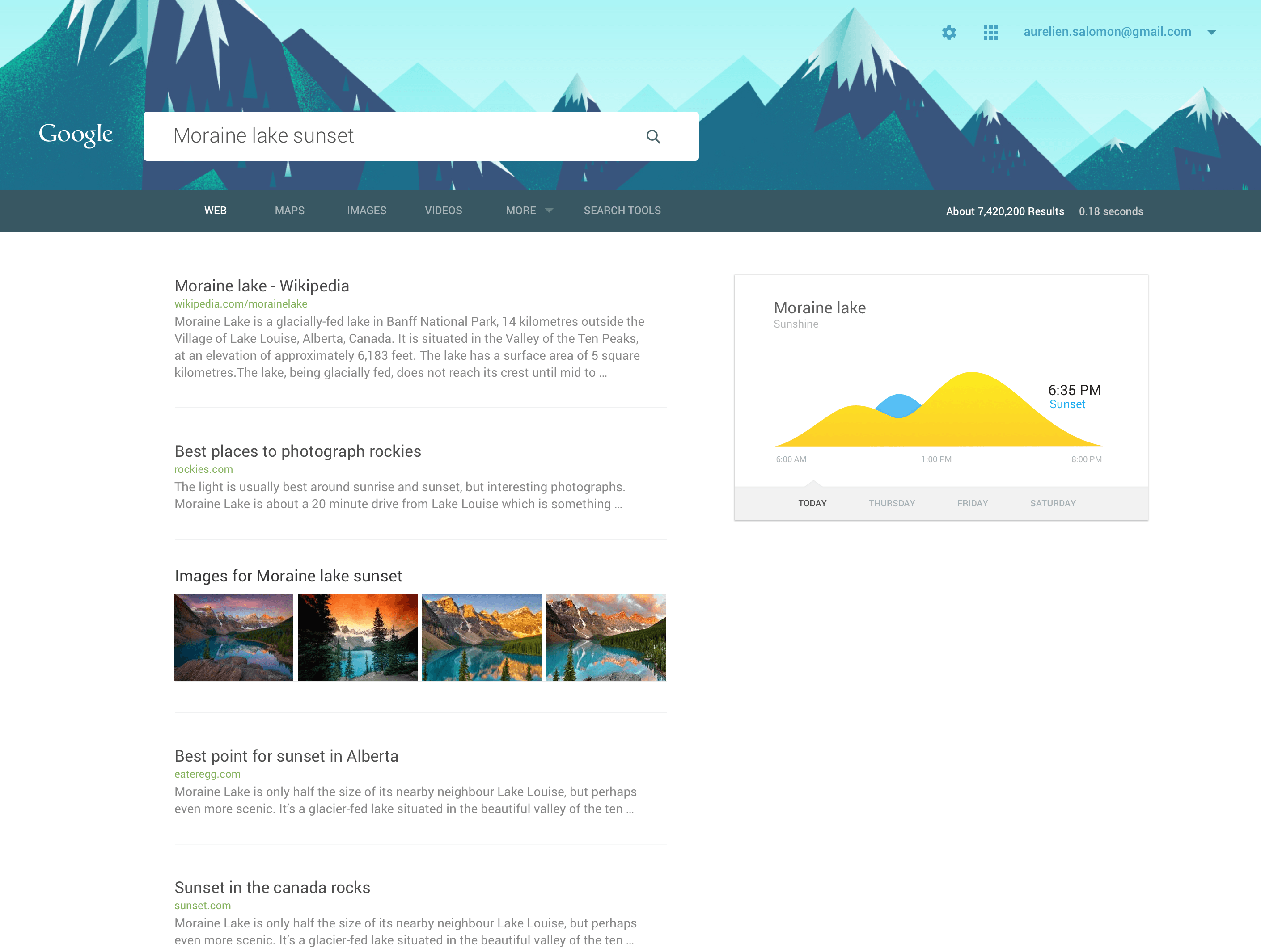
…into this:

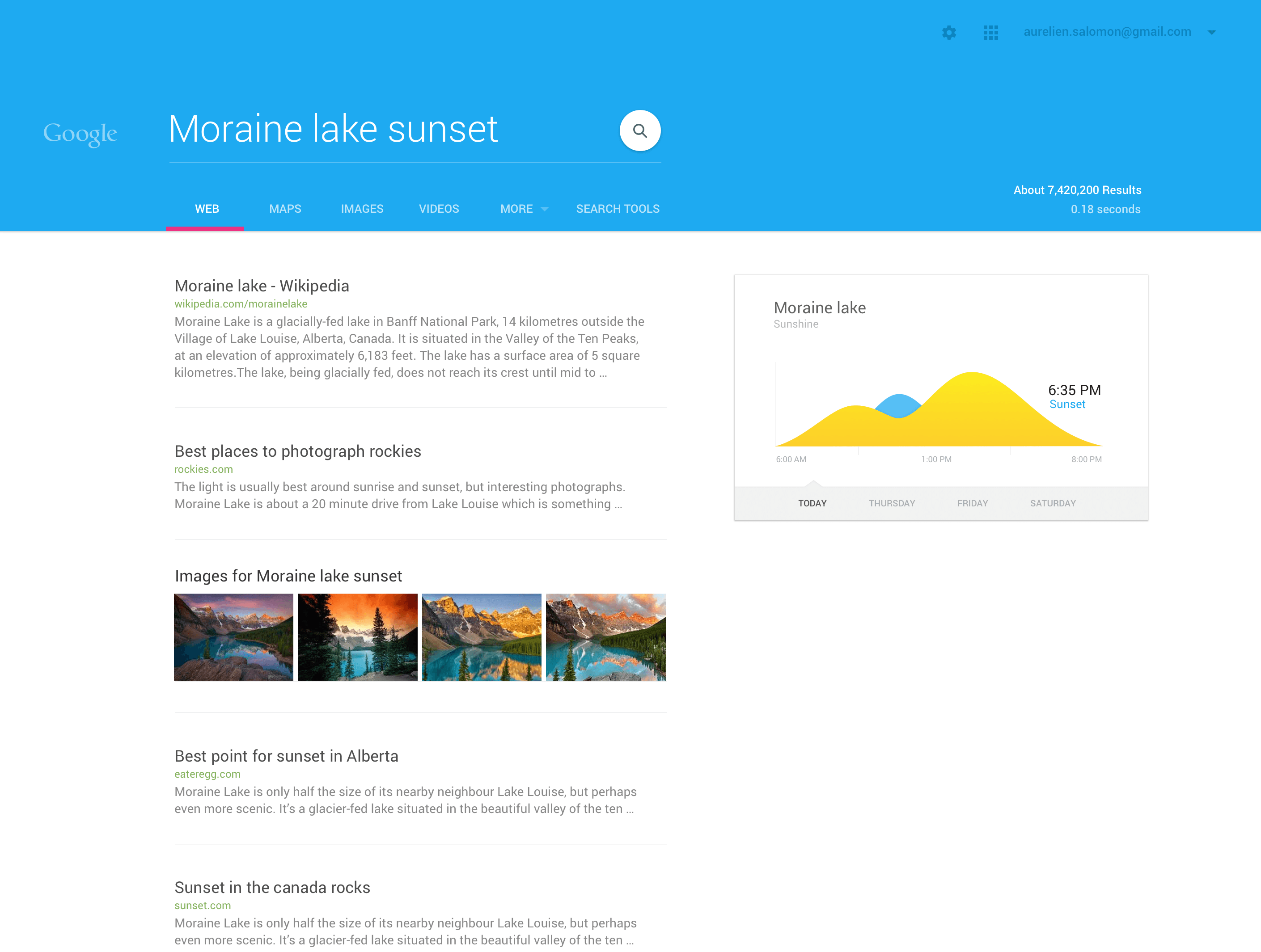
Or into this:

Again, whether you like the design or not is a matter of choice, but as a fan of the Material design, I find it rather nice. Granted, it is a substantially different Google than what the majority of the world has become accustomed to, and it’s probably something that Google isn’t considering doing.
But it also makes you wonder if Google does have plans one day to drastically switch up the UI on its core product. They have done it with so many of their other products, so why not search? You can have a look at more images of Aurélien’s concept Material internet by hitting up his Dribbble page here.
Would you like to see Material Design coming to Google’s websites and beyond?