Affiliate links on Android Authority may earn us a commission. Learn more.
Developers! Don't do these things - they're annoying!
Being able to create new experiences, tools, and utilities for Android is an incredible ability that opens many doors. You can improve your users’ daily lives (in some cases even change them!), change the way we communicate, or just provide some much-needed entertainment. Maybe you’ll even make a buck in the process!
But with great power, comes great responsibility.
It also creates opportunities for you to get up people’s noses. Your software is living on a device that will get carried with its users constantly and that contains a huge amount of personal data. Our phones sleep right next to us. Often at face height.
Cross the wrong line and your app can become an intrusive, obnoxious guest. Unfortunately, many developers don’t know where these lines are, or they forget to think about the user as they add features and polish their creations.
Developers: don’t do these things. They’re annoying.
Feature bloat
This might sound like a first-world problem: “boohoo, my app has too many features!” But it can actually be incredibly annoying. To illustrate the point I have just one word for you: ES File Explorer.
Okay, maybe two words. Or three.
But anyone who’s used this app for a while will hopefully know what I’m talking about. This file manager started out as the best file explorer (IMO) on the Play Store. It could do everything, looked smart, and felt like using a full-blown computer.
Boohoo, my app has too many features!
Then the developers started adding all kinds of great “features,” like battery saving tweaks and malware detection. They were tools completely unrelated to the core utility. I’d find my phone behaving oddly and, lo and behold, some new ‘innovation’ from ES File Explorer would be the cause. Eventually it had to go!
The moral here is to avoid feature bloat. Focus on the core functionality of your app and its core purpose.
Apart from anything else, feature bloat is contrary to how Android is designed. Google is encouraging developers to create their apps in a modular fashion, calling upon other apps, via intents, to perform different functions. If your user needs a profile photo your app should open up the gallery or the camera app, rather than try to build in your own camera solution.
This is why Google wants us – where possible – to stick to the same ‘Material Design’ aesthetic. The user should be able to seamlessly switch between apps to get a job done in the most consistent and efficient way possible.
When one app starts to take over and do too much, the experience becomes disjointed and bloated. Don’t be arrogant enough to think that your users want to use your app for every single task!
Hijacking software buttons
Every app should behave in a consistent way, which means respecting the operation of the software keys and not overriding them unless completely necessary.
Users have been trained by using hundreds of apps to know that clicking back will close a dialog, take them to the previous activity, or exit the app entirely—in that order. When a user clicks back to dismiss a menu and the app closes abruptly, it’s jarring. When they click back and nothing happens, it’s even more frustrating.
This is actually a complaint I have with Google Now (well, Google Feed). I love getting recommended stories and news, based on my browsing history. I don’t love having to re-open the app every time I want to exit one.
More often, this another case of developers getting a bit carried away. Just because you can override the back button, doesn’t mean you should.
Giving your app an unpredictable name
This complaint is a completely different pet peeve. Developers have the option to create a name or ‘label’ for their app but they also have an option to create a title for their store listing. These are not always the same.
Take Hangouts Meet for instance. In the apps drawer, it’s just called Meet. This isn’t too big a deal, Meet is my second guess once I’ve checked all the ‘H’ apps.
But when the app’s name is too drastically different from the store listing, it can take ages to find in the drawer, and even on subsequent attempts if you forget what the developer decided to call it.
Not the end of the world, but a bit of a nuisance nonetheless! It’s not great branding either.
Push notifications
You shouldn’t need me to tell you push notifications are a pain. Being a developer myself, I know exactly why they sometimes seem like a good idea. You want to remind people that your app exists increase engagement. You want those ad clicks!
Very often push notifications will have the exact opposite effect, convincing users to uninstall your app. I love the game 1010! but when I haven’t played for a few days, it will tell me ‘1010! is waiting for you!’.
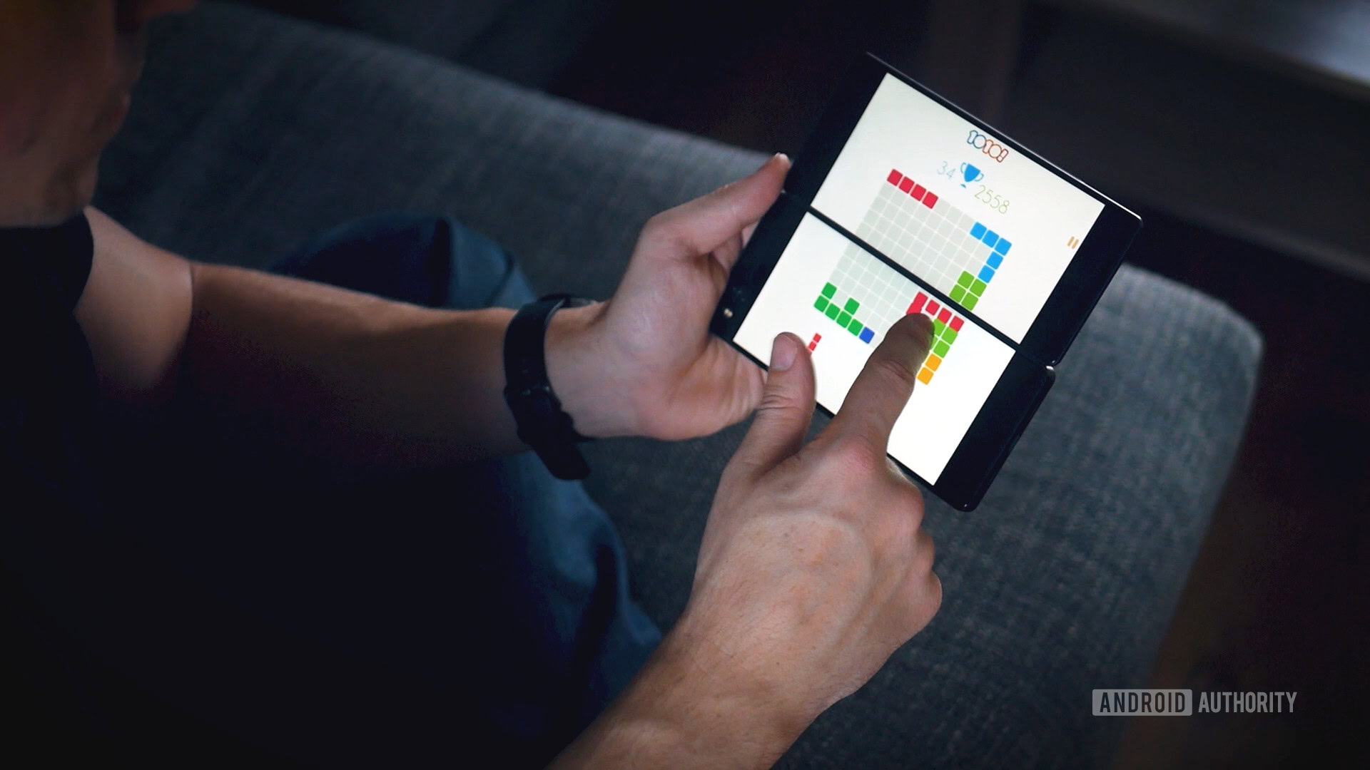
This message is completely meaningless. I know I have the app. It’s not like I’m being informed of some new feature. When I receive the notification while I’m at work or out with friends, it’s unlikely my response is going to be shut down whatever I’m doing and play the game as instructed.
If it comes after I’ve inevitably lost interest in the app, I’ll likely uninstall it as a result – rather than just leaving it on my device to potentially be rediscovered on some long journey.
You can use notifications, but just make sure you have something useful to say first—useful for the user that is, not your bottom line.
Making things too easy to click
This is a design choice that I feel a few apps are guilty of. The biggest offender is probably Facebook.
We’ve all had it where we’re scrolling through the feed, only to accidentally ‘like’ a picture of a stranger’s baby. “Hey man, love your baby!” That’s weird.
Hey man, love your baby!
I recently thumbs-downed a message a friend had written in a group chat months ago. People will start to think I’m a psycho.
Of course, you can’t control the touch-sensitivity of a user’s screen, but you can think about which actions have the most potential for damage and then ensure they are harder to enact, or at least easy to reverse.
Tons of splash screens and menus
What is the big advantage that mobile gaming has over gaming on PC or console? Simple: you can start playing instantly, anywhere. It’s one of the reasons why the Nintendo Switch has been such a big hit.
Many developers miss this point entirely and block access to the core experience of their creations by having multiple splash screens, fiddly menus and more. Again, this often comes down to sheer narcissism!
This is why I find myself playing games like 1010!, Ballz, and Downwell far more than many more interesting and in-depth games that take too long to boot up. (Though, to be fair, Downwell is pretty awesome.)
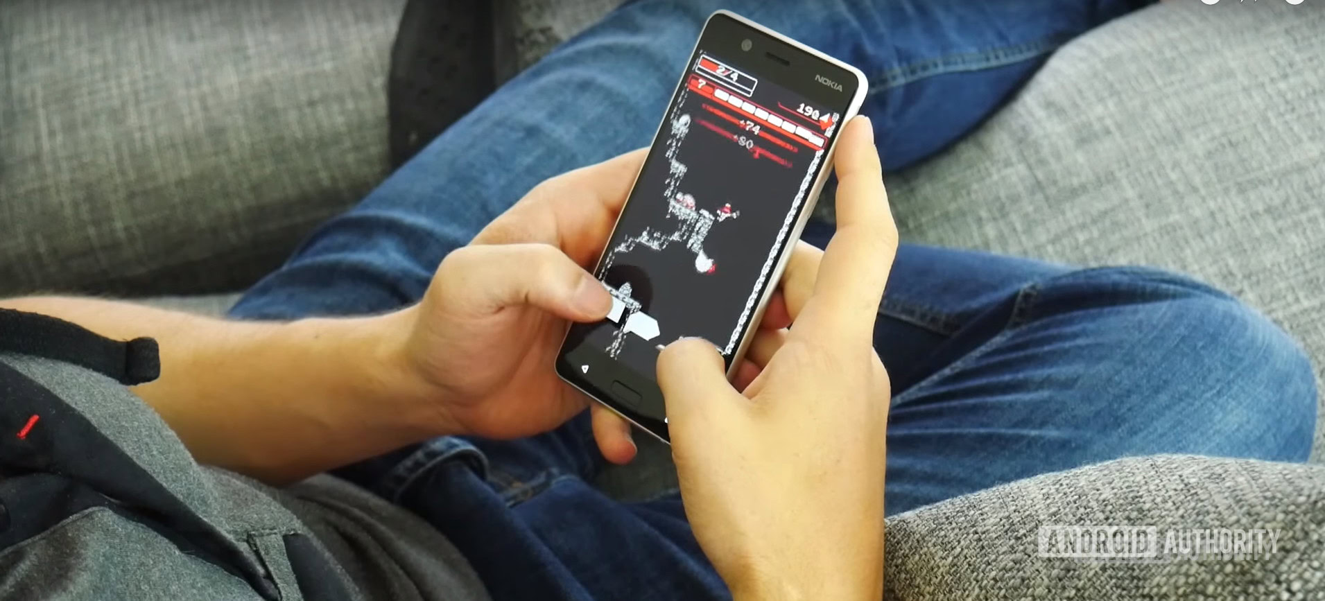
I would love to play a platformer that would ping back to life from where I picked up after a brief load screen. Wouldn’t that be better than forcing the player to go through the start menu, select a save file, read ‘fun tips’ etc. every time? Sonic the Hedgehog is one of my favorite games on Android, but having to sit through two separate title screens and menus (one for the remake and one for the original game) holds everything up.
This is actually what I believe to be the truly best feature of the Switch. Sure, it’s portable, but so is my laptop. The difference is I can start playing the Switch in seconds, because the games simply pause.
Games aren’t the only apps guilty of this. Several utilities have frustrating splash screens (which are even more disruptive when switching between tasks with intents) and labyrinthine menus which end up chipping away hours of your life. The Garmin Connect app is still a nightmare to use, despite all its cool features.
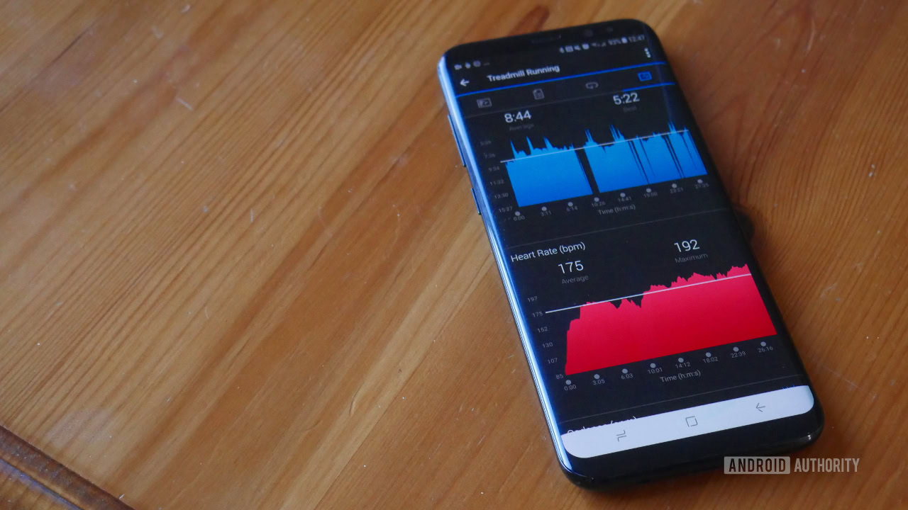
Be intuitive. Be quick. Save user preferences. Help your user get to what they want as quickly as possible.
Battery draining services
This should go without saying, but one of the greatest crimes you can commit as a developer is to introduce a background service that quietly uses up all of the user’s memory and battery. This became such a problem that Google has decided to try addressing it in Android 8. But even with restrictions in place, you still need to act responsibly.
Don’t be that guest that doesn’t get the hint that it’s time to go home.
In fact, these changes can actually force more creators to use foreground services, with notifications that can’t be dismissed—which is even more annoying!
Don’t be the guest who doesn’t get the hint it’s time to go home.
Permissions
Another one you should know but it bears mentioning: users don’t like being forced to accept all manner of strange permissions in order to use your apps. Wherever possible, look for alternative ways to perform the tasks you need to. Follow Google’s guidelines on this subject and make sure that you endeavor to always be transparent; tell your users precisely which permissions you’re using and why.

Ads
Ads are fine— to an extent. Most users recognize they are a necessary evil to keep experiences and tools free. They only become a problem when they obscure the screen or get in the way of the experience. The feeling that you might accidentally click on an ad while zooming in or out can make people reluctant to use your app. It can even create a sensation of claustrophobia.
Again, it’s a matter of ‘more is less’. Sure, more ads will get you more clicks and more money in the short term. But having more users is ultimately the goal. Flooding an app with ads will only drive them away.
Make loud noises in the middle of the night and turn on the flashlight
Don’t do this.
I can’t think of many apps that do.
Yours shouldn’t be one of them.
Conclusion
Can you think of any apps that you actually dread using? You keep it because you love the core value it offers, or because you need it, but you know it’s going to be a pain to navigate. Maybe it makes you wait around. Maybe you end up searching for ages in the app drawer. I can name a few such apps.
This is an article born of frustration, but it also comes from my experience as a developer. I get why some of these mistakes are made. I’ve made them myself. The key is to reign in the ambition and ego, and respect the user. Avoid trying to make a quick buck. Focus on doing one thing quickly and well.
There are plenty of developer missteps I’m sure I’ve missed. Let me know in the comments below what bugs you? If you’re a creator, what tips have you got?