Affiliate links on Android Authority may earn us a commission. Learn more.
Did you know: Most of the stories about Apple's logo are wrong
February 13, 2024
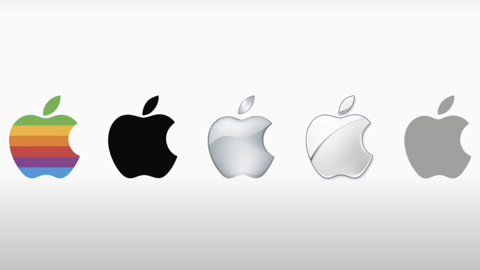
Apple is one of the most popular brands in the world, and you don’t have to be a “techie” to instantly recognize the chrome “bitten apple” logo that has become synonymous with simplicity and quality. The Apple logo has gone through a few evolutions since the company was founded in 1976 by Steve Jobs, Steve Wozniak, and Ronald Wayne (who sold his share in the company after only two weeks). But, after a significant change only a year after Apple started, there have only been a few tweaks along the way to the logo that we all know and love today.
While the Apple logo is minimalistic, the theories behind why the founders chose the symbol aren’t, particularly regarding the “bite.” From urban legends based on science and philosophy to stories pointing to civil rights considerations or, simply, Steve Jobs’ diet, there are plenty of theories surrounding Apple’s logo. However, most of the stories about Apple’s logo are wrong. Let’s dive in.
Inspired by another famous apple?
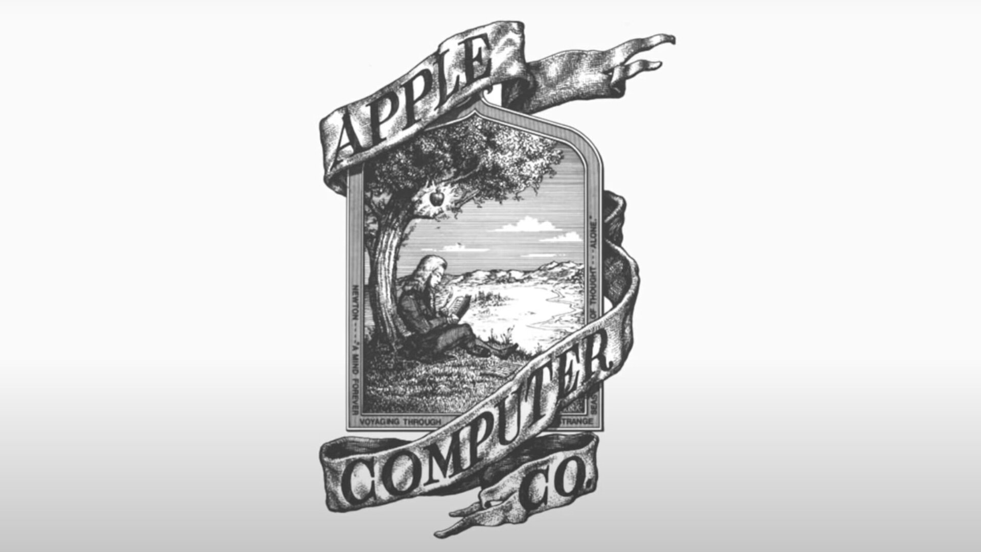
The simple fruit has a rather prominent place in history, from a biblical reference in the story of Adam and Eve to Sir Isaac Newton’s discovery of gravity. Religious and philosophical references gained traction with the assumption that the logo symbolized taking a bite from the “fruit of knowledge.” But, the latter was, in fact, the direct inspiration behind Apple’s very first company logo.
The logo depicts the scene of Newton sitting under a tree with an Apple hanging from a branch, with “Apple Computer Co.” written on a flowing scarf draped around the frame. The frame also has an extract from William Wordsworth’s poem, The Prelude: “Newton…a mind forever voyaging through strange seas of thought…Alone.”
The logo was old-school, even by 70s standards, more in line with what you might find on a storefront and not suited for what you’d find etched in a tiny size on a piece of tech. It wasn’t long before the logo was changed to the first variation of the symbol that’s famous today.
Alan Turing and civil rights
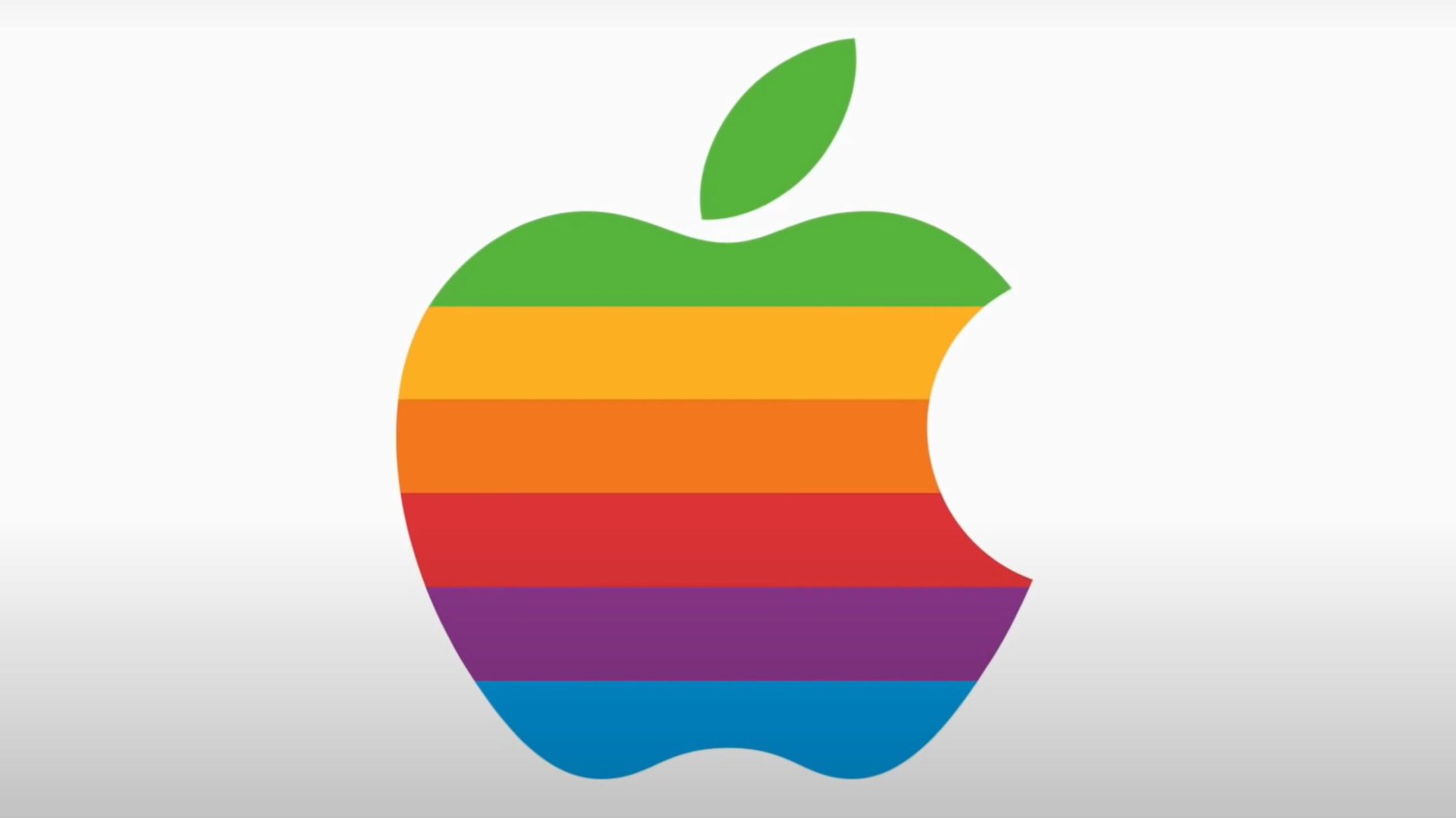
In 1977, Jobs hired Rob Janoff to design the Apple logo, the first iteration of the simple Apple symbol with a bite taken out of it. The logo was more colorful than the monochrome version we have now, with six colored stripes with green at the top to represent the stem.
Theories suggested that the rainbow colors symbolized support for the LGBTQ+ community, with the bite an homage to Alan Turing, widely considered to be the father of modern computing, who was found dead from cyanide poisoning with a half-eaten apple next to him.
However, Janoff addressed any speculation regarding the first logo, calling the Turing theory an urban legend. Instead, he said that the colors referred to the color screen capabilities of the Apple II computer. The colorful logo remained Apple’s identity for two decades until Jobs returned to the company and changed the logo to a monochromatic black in 1998.
Other stories and theories
Some suggested that Apple’s logo found its roots in Greek mythology, with the garden of Hesperides or Hera’s orchard said to grow trees producing golden apples that granted immortality. Others theorized that the logo was a playful take on the proverb, “An apple a day keeps the doctor away.” Finally, there’s speculation that Jobs and Wozniak wanted a brand name that would be listed before Atari in phone books.
Diet and scale: The real reasons behind Apple’s name and logo
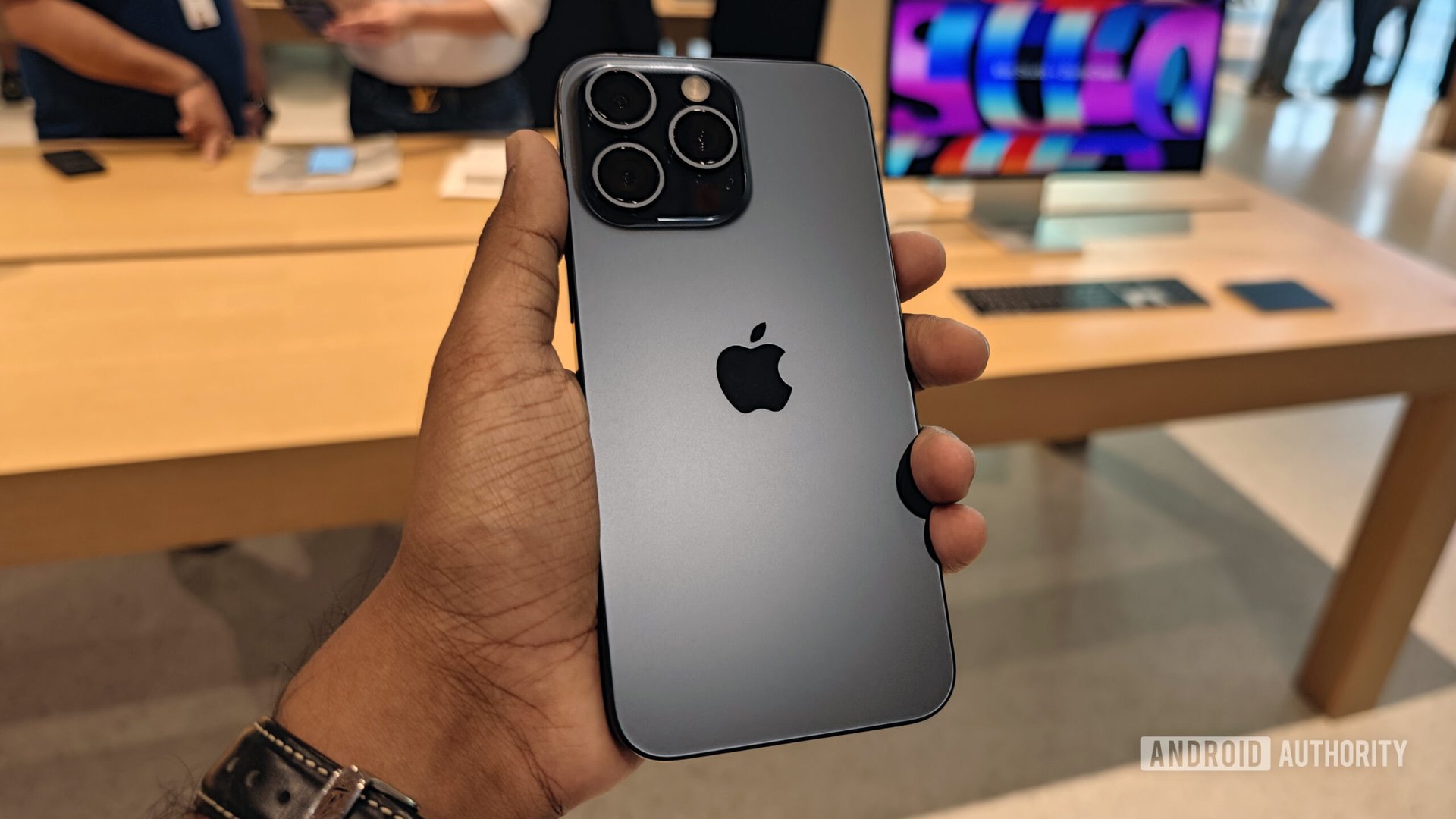
While many theories regarding Apple’s name and logo continue to float around, the real reason is far more straightforward — Steve Jobs liked apples. When asked about the Apple name and logo during a press conference in 1981, Jobs, who was also following a fruitarian diet, said the idea came to him after visiting an apple farm. He said, “I love apples and like to eat them. But the main idea behind Apple is bringing simplicity to the public, in the most sophisticated way, and that’s it, nothing else.”
As for the bite, Janoff explained that it was for scale to show that it was an Apple and not something like a cherry. He also said it was a “happy coincidence” that the word had a tech implication — the word “byte” — and only found out about it after presenting the design to Jobs. The bite also had room to fit the curve of the “a” in “apple” when the word did appear with the logo for a short while.
So the next time you look at the back of your iPhone, iPad, or Mac, you’ll know exactly how the Apple name and logo came to be, even if the real reasons aren’t nearly as fanciful as the theories surrounding it.
Thank you for being part of our community. Read our Comment Policy before posting.
