Affiliate links on Android Authority may earn us a commission. Learn more.
Diving into M: Dark and light themes, and revamped app drawer too
Published onMay 28, 2015

Now that the Google Android M preview images are out, we are all eagerly digging in and trying to figure out what all has changed, both under the hood and right at the surface. We will be bringing you a video that takes a look at Android M a bit later, but in the meantime we’ll do our best to highlight some of the changes as we encounter them.
First up, light and dark themes. It seems that developer options now contains the ability to let users manually turn on dark or light options (light is the default, of course). You can also let it change automatically, perhaps so it can adjust for different lighting conditions while driving with Android Auto (just a thought). As you can see the in screenshots, the dark theme applies just to the settings screen and, at least in this early build, doesn’t affect the app drawer’s colors, the notification shade, or any other aspect of the UI. Whether this will change, or if the dark theme will even be in the final M build, remains unseen.

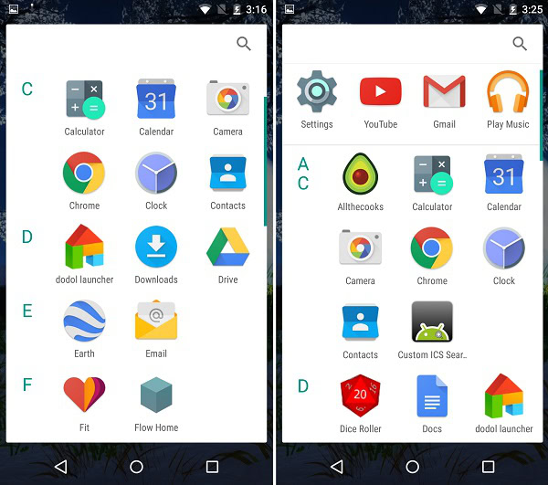
Another change that was immediately noticeable has to do with the app drawer. Android M has switched up the way that the app drawer is laid out, creating an alphatized list that makes it easier than ever to find what you’re looking for. Even better, your most used apps are all neatly tucked in and the top. For me at the time of testing this out, it was Settings, YouTube, Gmail, and Play Music that took these positions by default. That said, as I’ve used more apps (like Photos) my options have changed to reflect which ones I use the most.
That’s all we have for now, but rest assured, there’s more to come as the hours, days, and weeks progress. For those who have the dev preview installed, any other changes you’ve noticed that weren’t highlighted in Google’s announcement of M? Let us know in the comments!