Affiliate links on Android Authority may earn us a commission. Learn more.
Does the larger display on the Galaxy Watch 6 improve the experience?
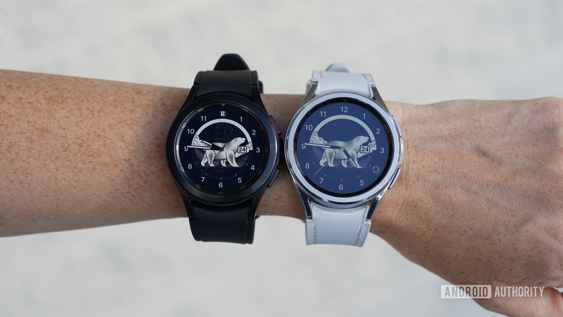
Samsung’s brand-new Galaxy Watch 6 lineup boasts bigger displays than ever. If you ask most smartwatch wearers, more screen space should mean a better user experience. If nothing else, larger graphics are easier to tap and larger text is easier to read. But how does the expansion actually translate on users’ wrists, and is the experience significantly different on a Galaxy Watch 6 versus a Galaxy Watch 5? We dug in.
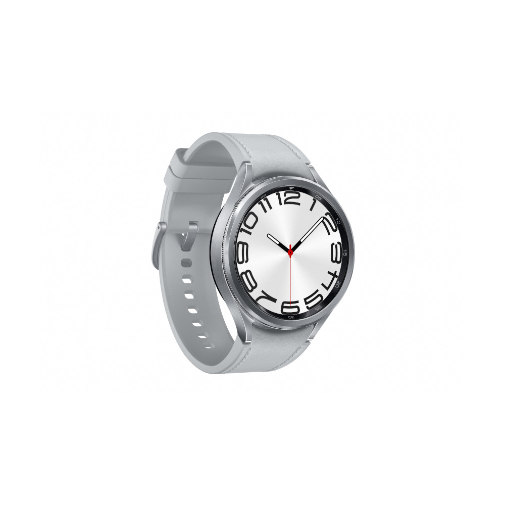
Elegant design and build materials
Ships with Wear OS 4
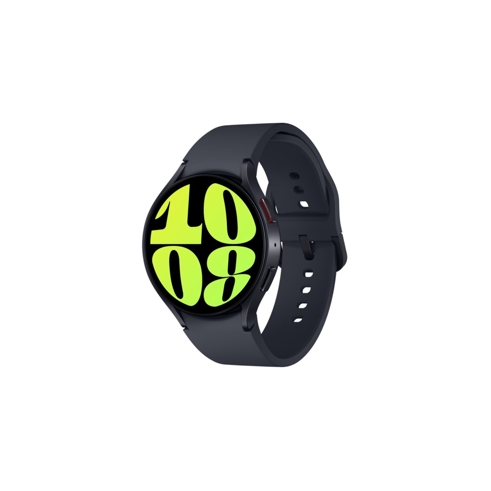
Snappy Wear OS 4 software experience
Sporty yet tasteful aesthetic
When it comes to Galaxy Watch display space, bigger is better
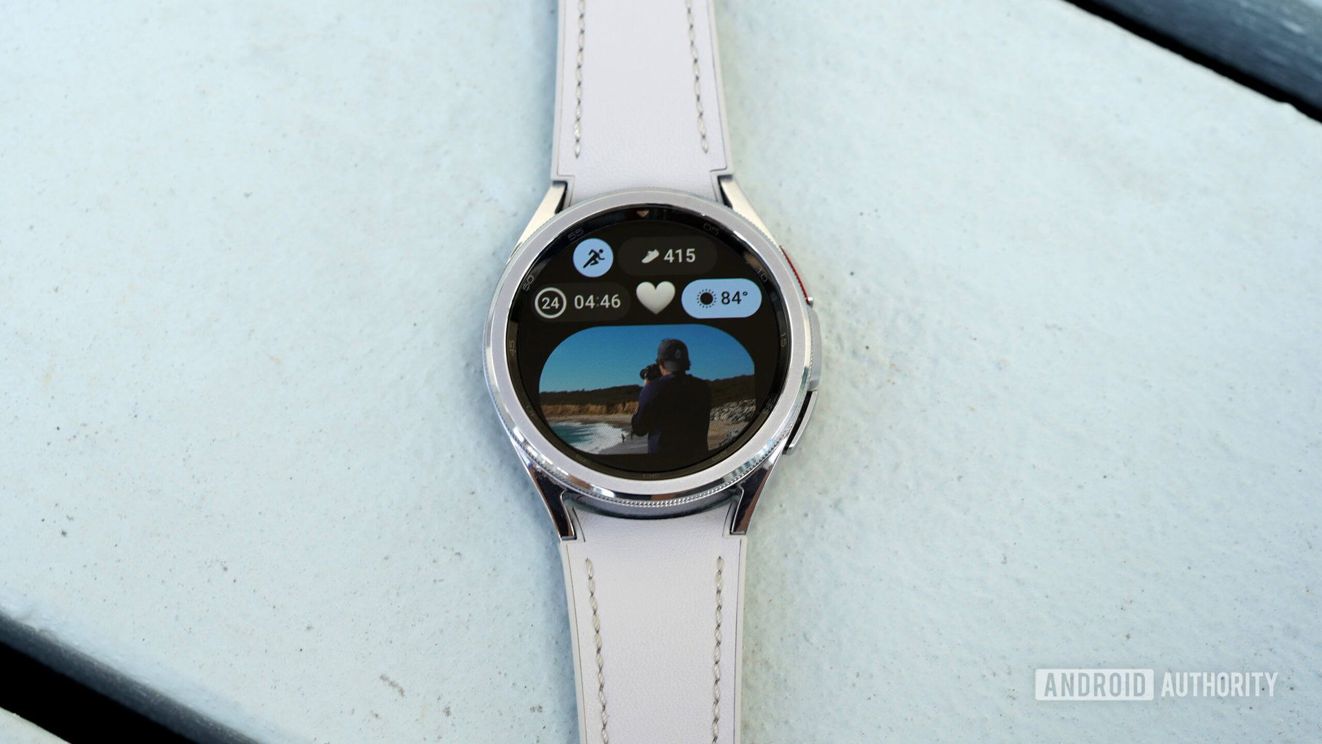
For better or worse, the Galaxy Watch 6 looks a lot like the Galaxy Watch 5. Likewise, the 6 Classic doesn’t exactly revolutionize the 4 Classic’s design. Both new Samsung smartwatches feature subtle improvements across the board and bring back the same basic looks shoppers have seen before. Samsung did, however, improve the line by boosting its display sizes.
| Samsung Galaxy Watch 5 | Samsung Galaxy Watch 6 | Samsung Galaxy Watch 4 Classic | Samsung Galaxy Watch 6 Classic | |
|---|---|---|---|---|
Display | Samsung Galaxy Watch 5 44mm: 1.4-inch Super AMOLED 450 x 450 resolution Sapphire Crystal 40mm: 1.2-inch Super AMOLED 396 x 396 resolution Sapphire Crystal | Samsung Galaxy Watch 6 44mm: 1.5-inch Super AMOLED 480 x 480 resolution Full color Always On Display Sapphire Crystal 40mm: 1.3-inch Super AMOLED 432 x 432 resolution Full color Always On Display Sapphire Crystal | Samsung Galaxy Watch 4 Classic 46mm: 1.36-inch Super AMOLED 450 x 450 resolution Corning Gorilla Glass with DX 42mm: 1.19-inch Super AMOLED 396 x 396 resolution Corning Gorilla Glass with DX | Samsung Galaxy Watch 6 Classic 47mm: 1.5-inch Super AMOLED 480 x 480 resolution Full color Always On Display Sapphire Crystal 43mm: 1.3-inch Super AMOLED 432 x 432 resolution Full color Always On Display Sapphire Crystal |
Dimensions and weight | Samsung Galaxy Watch 5 44mm: 44.4 x 43.3 x 9.8mm 33.5g 40mm: 40.4 x 39.3 x 9.8mm 28.7 g | Samsung Galaxy Watch 6 44mm: 42.8 x 44.4 x 9.0mm 33.3g 40mm: 38.8 x 40.4 x 9.0mm 28.7g | Samsung Galaxy Watch 4 Classic 46mm: 45.5 x 45.5 x 11mm 52g 42mm: 41.5 x 41.5 x 11.2mm 46.5g | Samsung Galaxy Watch 6 Classic 47mm: 46.5 x 46.5 x 10.9mm 59.0g 43mm: 42.5 x 42.5 x 10.9mm 52.0g |
Durability | Samsung Galaxy Watch 5 5ATM + IP68 MIL-STD-810H | Samsung Galaxy Watch 6 5ATM + IP68 MIL-STD-810H | Samsung Galaxy Watch 4 Classic 5ATM + IP68 MIL-STD-810H | Samsung Galaxy Watch 6 Classic 5ATM + IP68 MIL-STD-810H |
The Galaxy Watch 6 offers a display area 20% larger than that of the Galaxy Watch 5. Last year, the sporty model landed with 40mm and 44mm case sizes featuring 1.2-inch and 1.4-inch displays. This year, the Galaxy Watch 6 offers larger 1.3-inch and 1.5-inch displays in the same case sizes.
Likewise, the Galaxy Watch 6 Classic offers even larger cases and shrinks the 5’s bezel by 15%. In other words, its real estate is noticeably larger than the last device to sport a rotating bezel, the Galaxy Watch 4 Classic. The older sibling offered 42mm and 46mm cases with 1.1-inch and 1.36-inch displays respectively. The newest Classic combines an extra 1mm on each case with much thinner bezels to offer 1.3-inch and 1.5-inch displays.
Given that the displays don’t add bulk, they’re an easy upgrade to celebrate. There aren’t any obvious drawbacks beyond that you may need to purchase a new screen protector. On the flip side, the expanded margins mean larger graphics. If you often find yourself raising your arm excessively to check stats or read texts, you’ll appreciate the roomy new devices.
More screen space means larger icons, text, graphs, and watch face details.
Rather than cramming more details onto data fields, Samsung merely beefed up existing icons and menus to improve readability. This is helpful when browsing at-a-glance info on your Wear OS tiles, but it’s even more impactful on info-packed screens such as graphs, Google Maps, and more. For users who like maximum complications on their watch faces, the bigger displays also make those particulars more visible.
A new generation of Samsung Galaxy Watch Classic
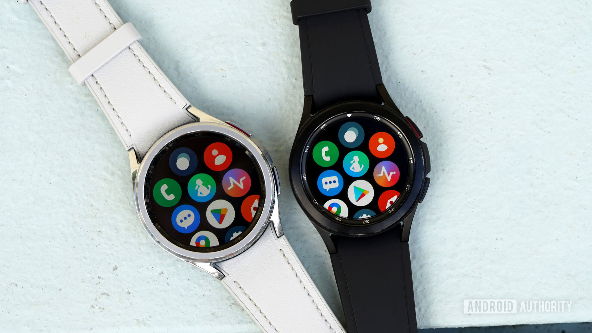
Of course, most any conversation about the Galaxy Watch 6 series inevitably makes its way to the return of the rotating bezel. As mentioned, even while bringing back this space-eating feature, Samsung still managed to maintain its promise of a larger display. With a thinner bezel, bigger screen, and beefed-up resolution, the 6 Classic delivers a truly attractive device for those interested in a traditional aesthetic.
A larger display and thinner bezel make the Galaxy Watch 6 Classic even more attractive than its predecessor.
Wear OS 4 has not yet rolled back to the Galaxy Watch 4 series so the devices don’t feature the same software. Since Samsung redesigned certain menus and tiles, a 1:1 comparison is not possible. A side-by-side look at different layouts isn’t as helpful as identical screens.
Still, it’s clear that the user experience is positively impacted by a larger display. As seen above, the watches often show the same amount of information. However, it’s easier to read and review on the Galaxy Watch 6. Likewise, shortcuts are easier to interact with, input is more consistent, and actions like selecting an app are easier. Even the thinner rotating bezel is pleasant to use. Notably, the 6 Classic is protected by Sapphire Crystal while the 4 Classic isn’t. The role of reflective lighting is misleading in analyzing each screen’s contrast in the shots above.
Whether you purchase a Galaxy Watch 6 or a Galaxy Watch 6 Classic, you’re taking home at least one user-friendly upgrade. Rather than bringing your watch up to your nose to see it or feeling like an oversized giant tapping the wrong details, you can now see clearer and aim truer.