Affiliate links on Android Authority may earn us a commission. Learn more.
What I don't like about the Galaxy S8 Plus
Published onMay 5, 2017
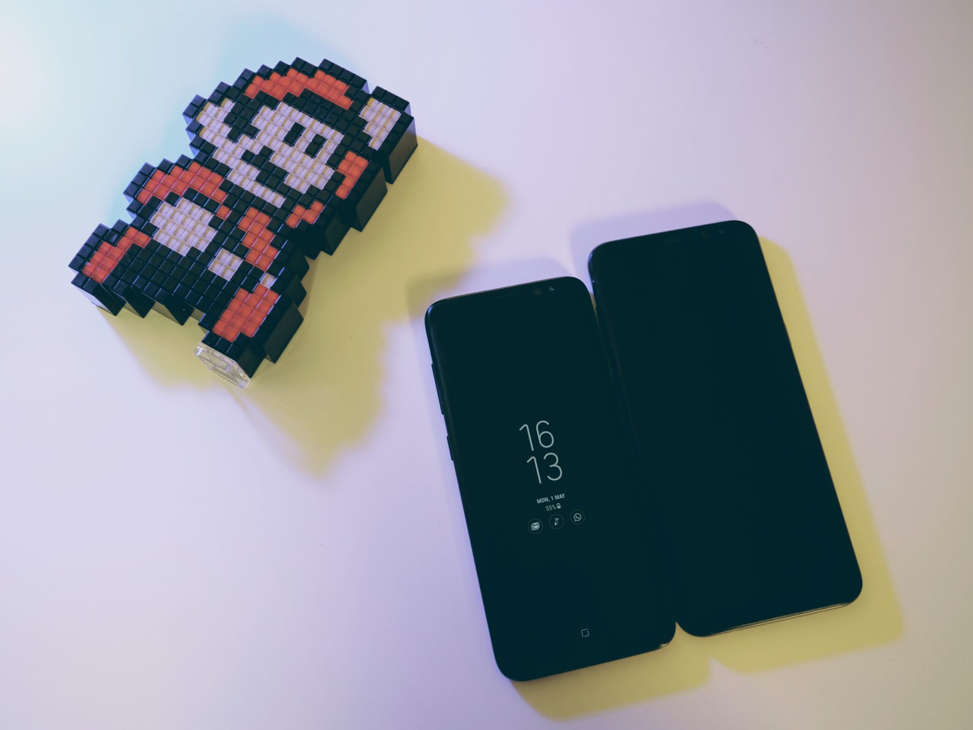
Samsung has a long history of releasing multiple variants of their devices. The Galaxy S line, in particular, has had an enormous number of variations released to consumers over each product lifecycle. The Galaxy S5 had a whopping six different versions for customers to choose from, and that doesn’t even include carrier-specific models. This produced a fair amount of confusion for customers looking to get their hands on the year’s hottest device from Samsung, though most would likely end up with the standard variant tailored to their specific carrier’s bands.
Since the days of the Galaxy S5, Samsung has consolidated their offerings a bit, though to date they continue to release an “active” variant of each device a few months after initial launch. The company seems to be more focused on making two distinct variants of their devices for different types of users, but has Samsung reached a point where the plus-sized variant is no longer necessary? I get it – there are quite a few reasons why someone would want a larger phone. While many of these arguments are absolutely viable, the 2017 design language sweeping the Android market gives me a few concerns about the future of handsets.
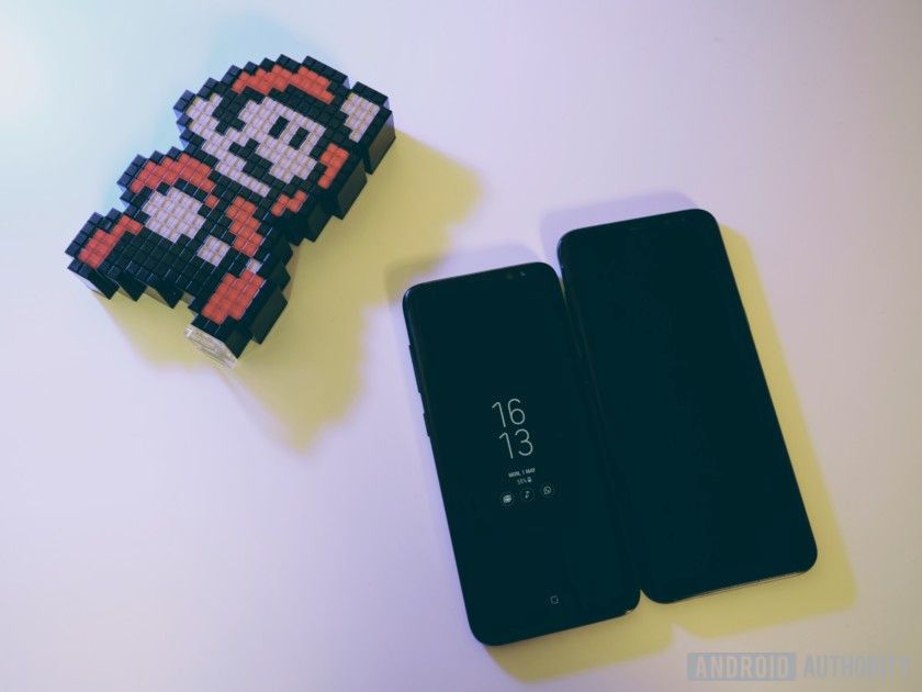
When does that much screen become too much?
Samsung’s Galaxy S8 is all about bigger screens and smaller bezels. This is literally its core feature and the defining design adaptation fueling the Unbox Your Phone marketing campaign. This is objectively a fantastic evolution of design, as it moves us towards a future where our phones are nothing more than an extremely fast piece of glass.
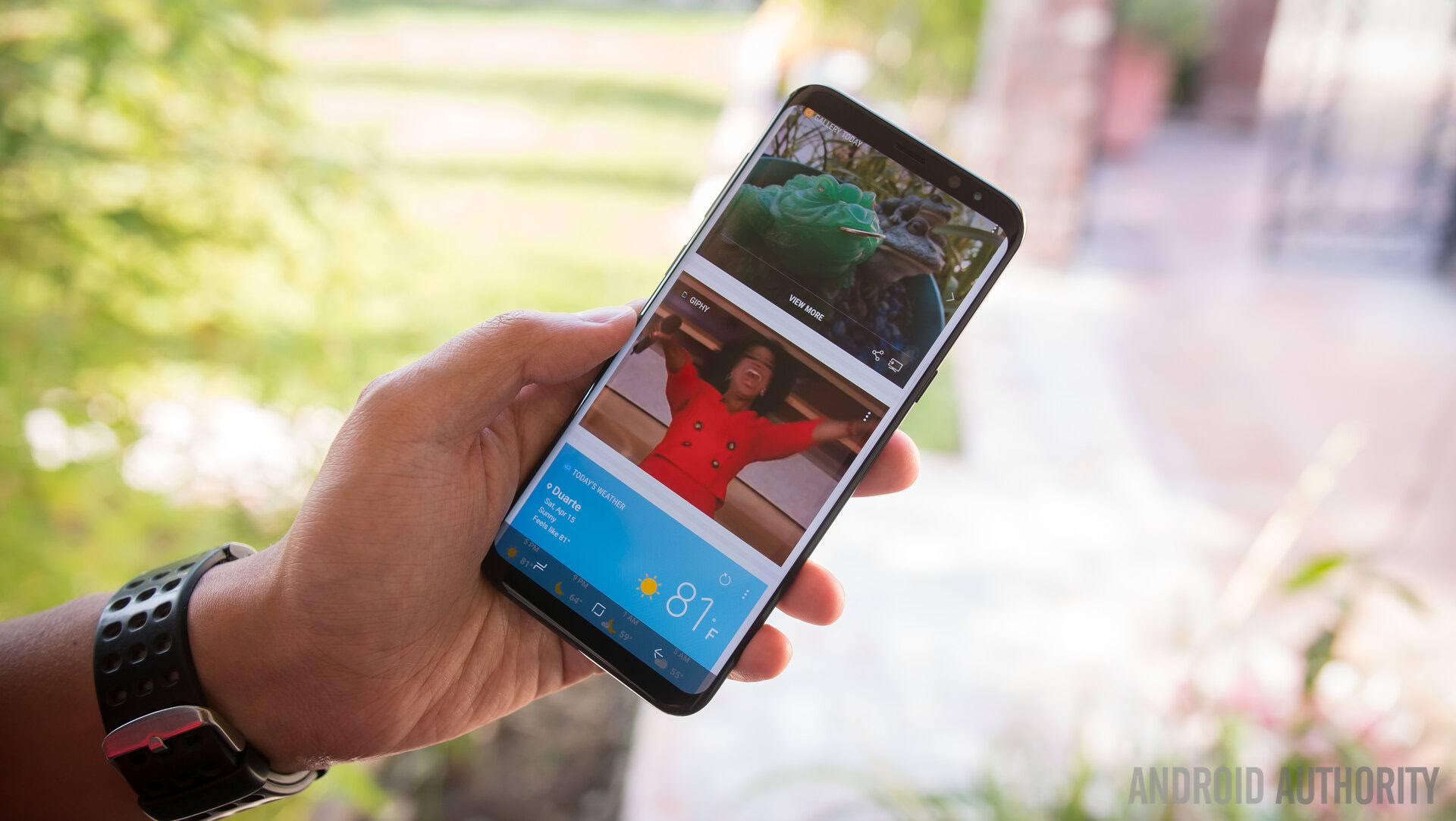
Even with a similar body size, smaller bezels birth more screen real estate, leading to additional usable space and an overall better media experience. But when does that much screen become too much? Even the standard variant of the Galaxy S8 trumps the Galaxy Note 7 when it comes to total screen real estate, so is an even larger “plus” variation really necessary in today’s landscape?
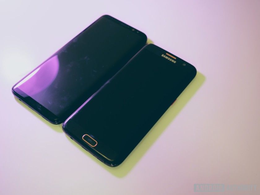
Backing up a bit, the Galaxy S7 Edge was effectively the “plus” variant of the seventh generation in the Galaxy S line, sporting what many would have called an enormous 5.5-inch display. This made sense for Samsung, as the base model of this device ran with a display size of 5.1 inches, feeling a bit small for some customers more accustomed to Note-style devices, and who also wanted the extra functionality the edge variant offered over the baseline.

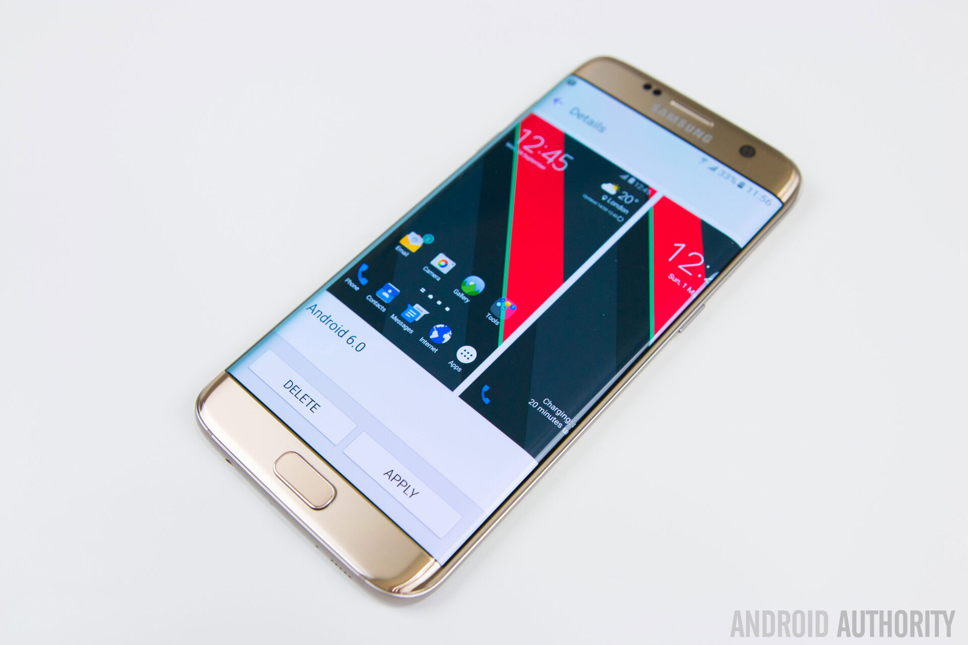
The shape of these screens absolutely makes a difference in overall size
With the design evolution the Galaxy S8 has brought to the table, the standard model Galaxy device has had its screen size increased to 5.8 inches, while the Plus grew to a massive 6.2 inches diagonally. For reference, the Nexus 6 was once known as one of the most oversized devices of all time, with a screen size of 5.96 inches. Who’s the whale now, Google? That being said, the shape of these screens absolutely makes a difference in overall size. The 18.5:9 aspect ratio on both the Galaxy S8 and S8 Plus makes the devices a lot taller than they are wide, and when held in the hand they are still much easier to handle.
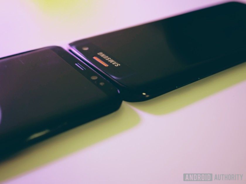
While the overall screen to body ratio of the Galaxy S8 and S8 Plus is far more optimized than it was in previous devices, the whole point of this new design language is to give more usable pixels to something that is still manageable to use with one hand. One could easily make the argument that the Galaxy S8 Plus is just slightly bigger than something like the Pixel XL, but the curved, glass-encrusted body of the phone makes it far too easy to slip out of the hand, and the small bezels – in relation to the overall screen – make it much more difficult to reach the top of the device with your thumb alone. While I can reach the top of the standard Galaxy S8 with relative ease, it is nearly impossible for me to do so on the Plus variant.
I can reach the top of the Galaxy S8 with ease, it's nearly impossible for me to do so on the Plus variant
A case could theoretically help to hold the phone in a more robust fashion, but the entire point of the Galaxy S8 is to let the screen fill as much of the device as physically possible. The Unbox Your Phone motto that ships with the Galaxy S8 and S8 Plus asks the user to let the screen take over, and using a case to aid in grip is counterproductive to the whole idea of this device. Samsung tried to remedy both of these issues by producing an official case which only covers the bezels of the device, but the end result came out worse than any of us could have imagined.
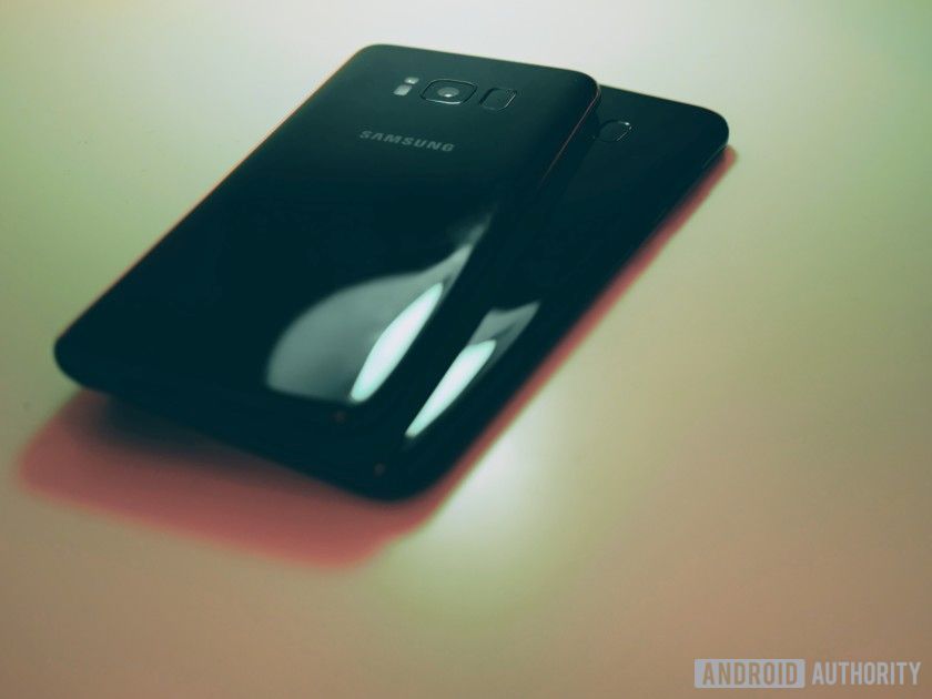
The handling of this phone feeds into my other primary gripe with the device: the fingerprint sensor
The handling of this phone feeds into my other primary gripe with the device: the fingerprint sensor. Yes, the sensors on the S8 and S8 Plus are exactly the same, but the effort required to actually activate them is a whole different ball game. A fingerprint sensor on a device should be as effortless to use as possible, and both the Galaxy S8 and S8 Plus sensors are guilty of awkward placement and bad design. Why would a manufacturer stick the fingerprint sensor directly next to the camera? Especially on the S8 Plus, my finger lands directly on the camera sensor almost every time I pull it out of my pocket, leading to a consistently smudgy image when I need it most.
The shape of the sensor is also odd. I understand Samsung’s devotion to consistency and reflection in this phone, but making the sensor ovular just to match the shape of the flash seems counter productive. Phones like the Pixel have implemented biometric security in a much more natural way, and the larger circular sensor on that device is much better suited for blind unlocking directly following removing it from your pocket. The amount of frustrations I have with this component is bar none, and I’ve been using pin unlock ever since.
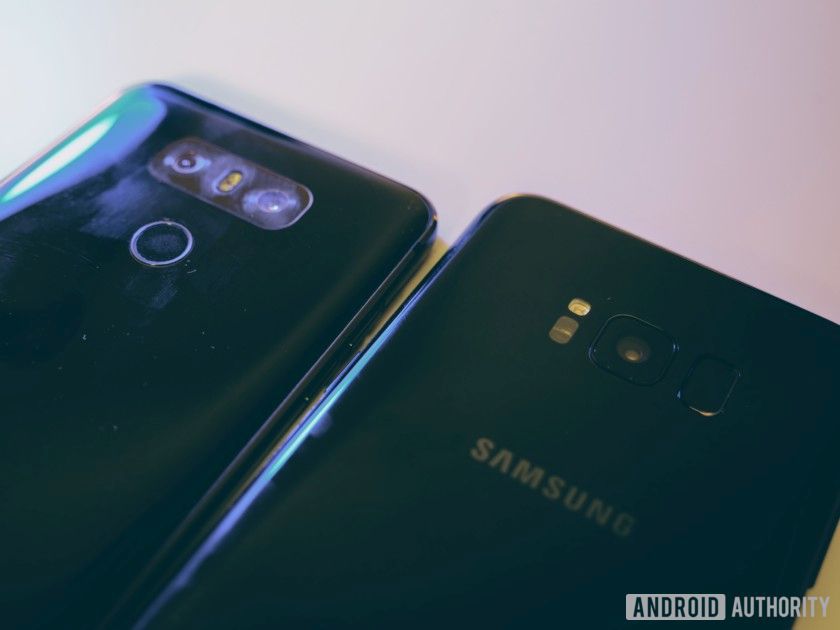
While I do find myself more partial to LG’s newest device, the LG G6, the Samsung Galaxy S8 and S8 Plus are still marvelous pieces of innovation. The premium feel of the devices is unsurpassed by almost anyone else in the industry, a wholly different story from the plastic Galaxys of years past. I wouldn’t blame you for getting either of these devices, as they represent some of the best engineering minds on the planet. If you really want the bigger battery and use your phone with two hands already, go ahead and get the S8 Plus. From a content perspective, there is almost no device that can beat it, and there is no doubt you’ll be blown away by just how immersive these screens can be. If you’re like me and value using your device with one hand as often as possible, the standard variant is likely the way forward.
What’s your opinion on these devices? Is the extra .4 inches of screen and objectively longer battery life worth the extra $120 price tag? Let us know your thoughts in the comments below.