Affiliate links on Android Authority may earn us a commission. Learn more.
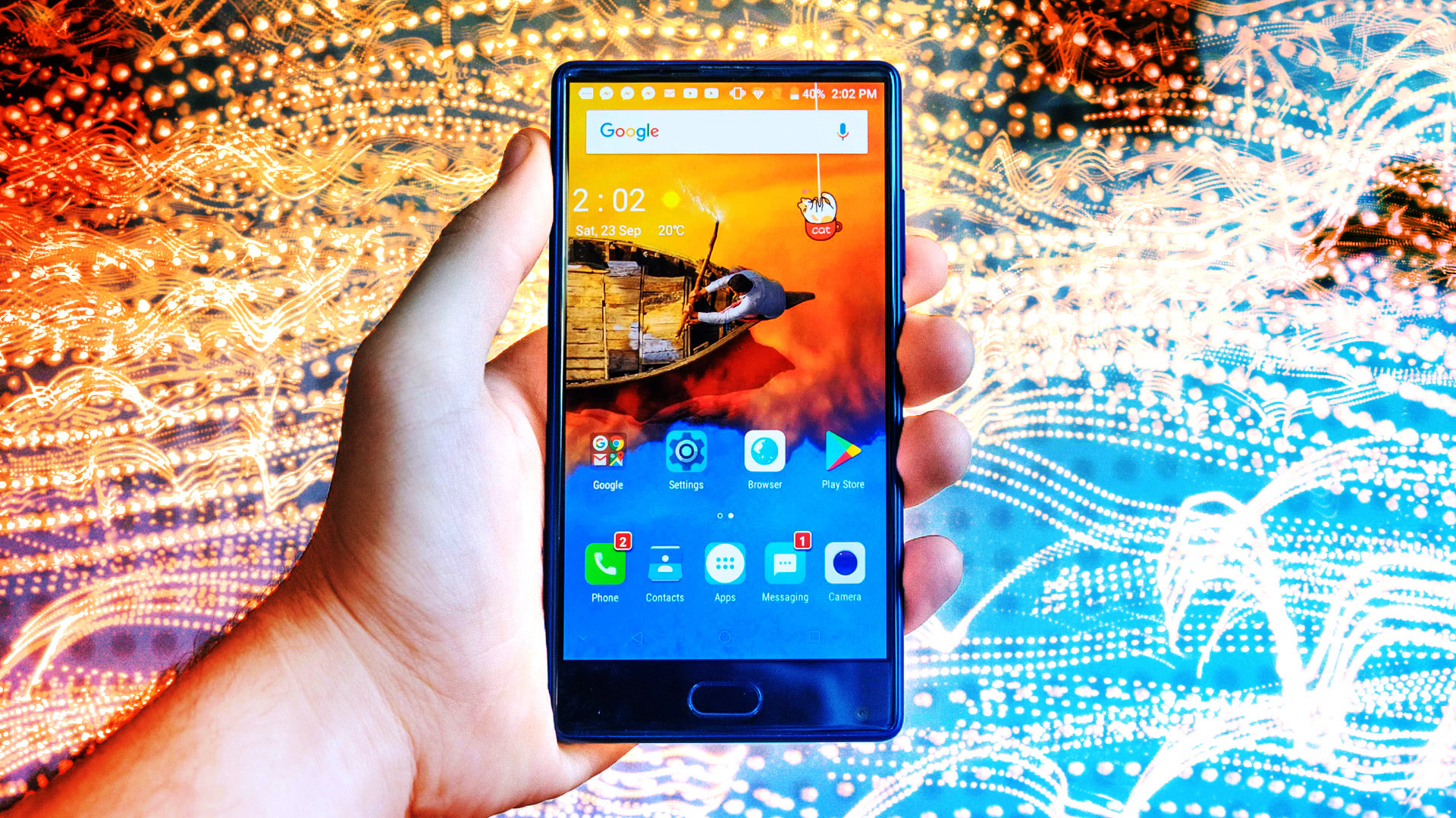
DOOGEE Mix review - the $200 bezel-less smartphone
Published onSeptember 28, 2017
Doogee Mix
What we like
What we don't like
Our scores
Doogee Mix
2017 has been a year full of new designs. Ever since the Mi Mix burst onto the scene at the end of 2016, manufacturers have been rushing to create a unique experience capable of tempting buyers from their current device and into a new, futuristic phone. Almost all of these devices are flagships. We’ve seen the Samsung Galaxy S8 and Note 8, the LG V30, and even the iPhone X radically shift their design language to fit into the new, bezel-less form factor of the future.
But what if you don’t have a lot to spend?
DOOGEE is attempting to fill the bezel-less void for the average consumer who doesn’t have as much money to blow on their phone, but who still wants something they can show off to their friends. While its specs aren’t on par with most flagships currently on the market, some of them actually come pretty close. And all for $200.
Design
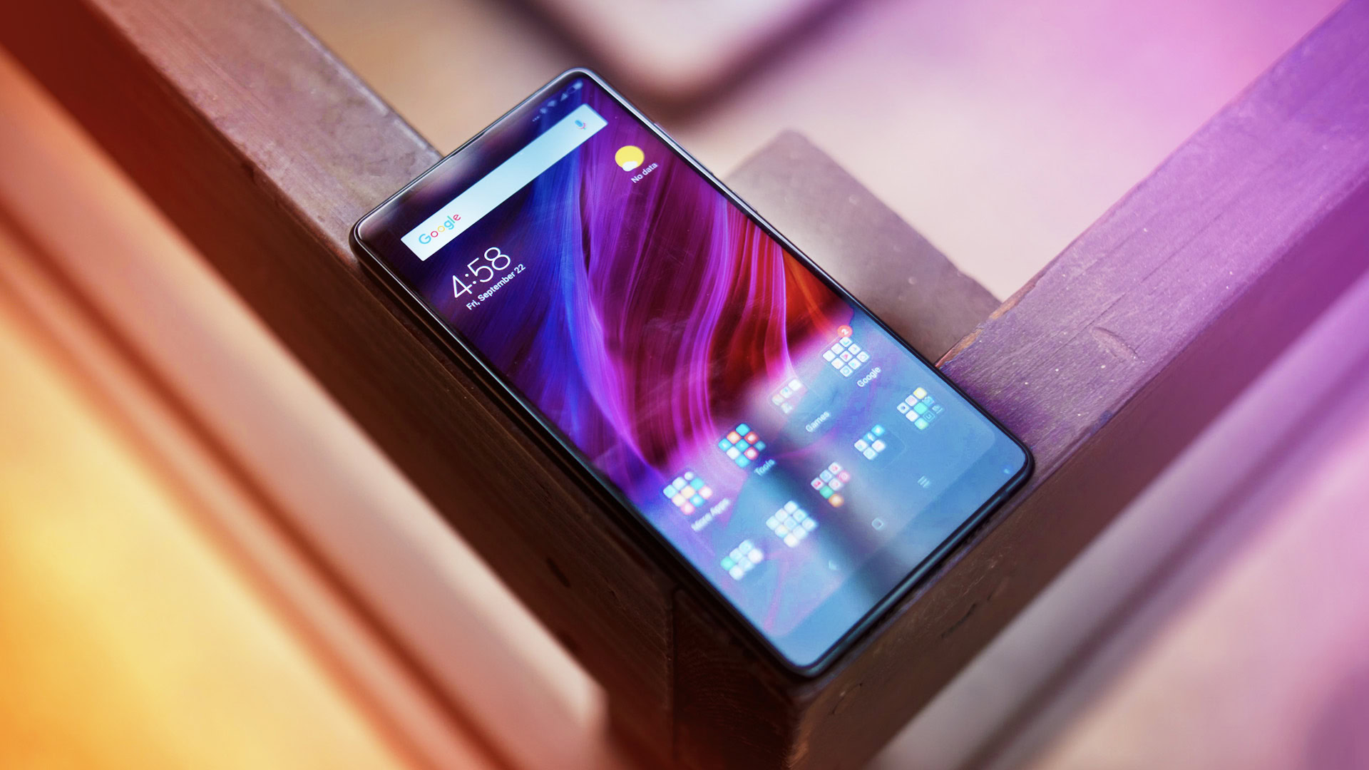
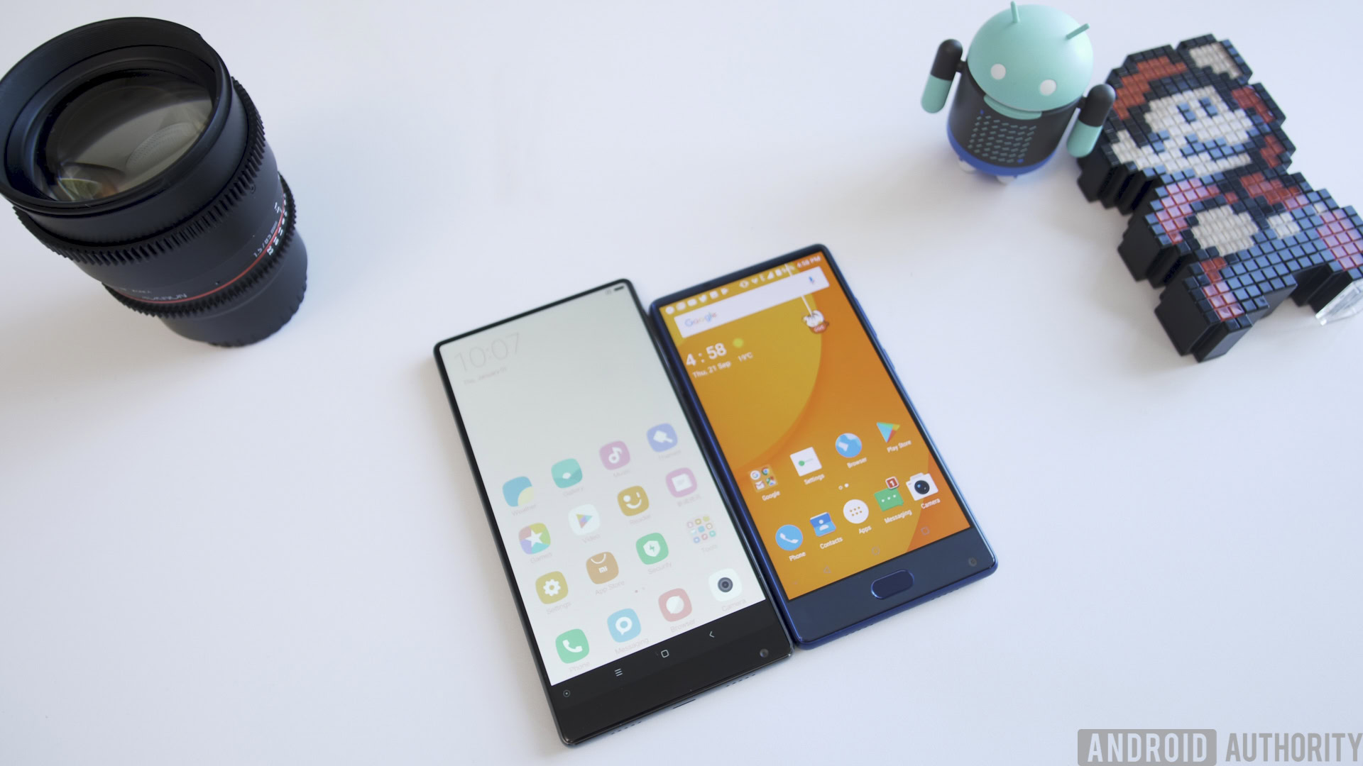
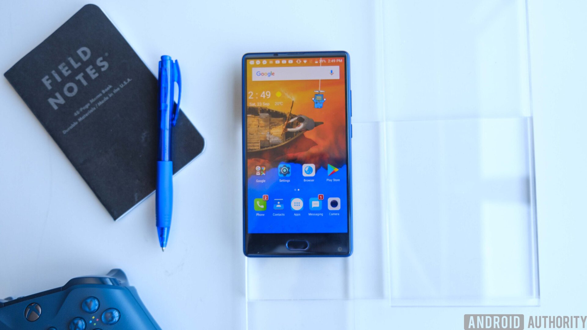
The DOOGEE Mix looks strikingly similar to another phone we’ve reviewed, the Xiaomi Mi Mix, and it honestly doesn’t seem like DOOGEE is attempting to hide it. The front facing camera is placed in the bottom-right corner, just like Xiaomi’s option. Because of this, you actually have to flip the phone upside down to use it in selfie mode. It’s a little awkward at first, but you’ll get used to it once you realize it’s there to make room for the nearly edge-to-edge display.
There is a very small bezel on the top of the device which houses the earpiece and proximity sensor, but it’s barely noticeable. It really feels like the phone’s only bezel is its relatively large chin.
Even though this is a $200 budget device, the company is still offering a very nice chassis. It uses an all-metal unibody design and feels quite nice in your hands. You may need to use a case or carry a cloth with you, though, because this thing is one of the biggest fingerprint magnets I’ve ever seen. I’ve been using the thin black case that DOOGEE includes in the box, which is a soft rubberized material, and I quite like it.
The milling work on the phone seems oddly messy though. It’s not something one usually notices, but in the case of the Mix, there are scratches around the port. The port itself doesn’t even appear to be centered on the device’s Z-axis.
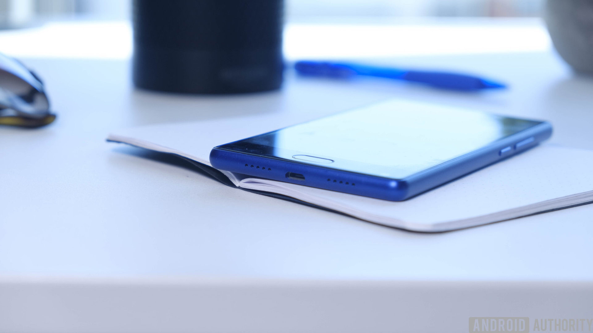
The headphone jack sits at the top of the device on the leftmost side. It’s milling, too, seems a little dirty. The jack is set a little too far back into the phone and even slopes down a little bit with the curve of its edge. Fortunately, it works just as well as any other 3.5mm headphone jack. And to be honest, we’re just glad DOOGEE left it in the device instead of removing it.
Near the micro-USB port you’ll find two bottom-firing speakers, and we’re happy to see that they both work, unlike the Pixel which only uses one of the two grills to output sound. They’re not the best speakers in the world and the bass is certainly lacking, but they get the job done.
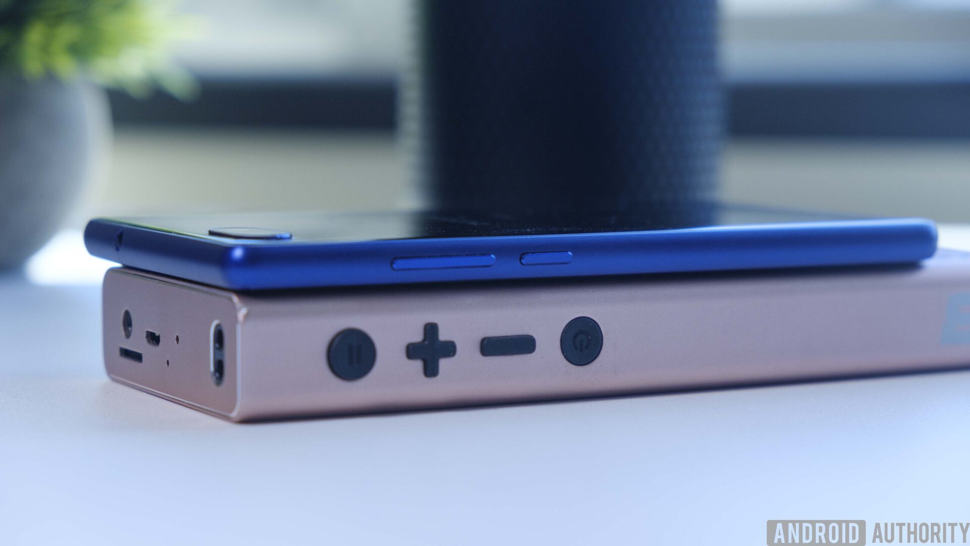
The right side houses the volume rockers and power button, and they are both quite tactile and clicky. The dual SIM/micro-SD port mirrors the volume rockers on the other side of the device, and it creates a nice sense of consistency through the phone. The dual SIM/storage tray is another feature that many manufacturers are not utilizing, and it adds quite a bit of value to a phone that otherwise seems like a cheaper carbon copy of a major player. SD cards have become extremely affordable, and the ability to store data on an external device is very useful for those with big music libraries and other forms of media.
Below the screen there’s a fingerprint reader/home button. While the phone is on, it works as the back button, as there are no hardware-implemented back or multitasking buttons in the chin. The lack of physical navigation buttons seems like a missed opportunity though. Given the Mix costs $200, this was likely a way for DOOGEE to save on costs but still make more than one use for the fingerprint reader, which I appreciate.
The reader can be used to wake the phone, but only if you use it within about a minute of turning off the display
Unfortunately, this fingerprint reader is pretty bad. It doesn’t recognize my finger about half of the time, and I find myself using the pin code to access the device more than I would on other phones. The reader can be used to wake the phone, but only if you use it within about a minute of turning off the display. If you pass this threshold, it goes to sleep, and you’ll need to use the power button to wake it up again.
In this way it functions more as a navigation button than an actual fingerprint reader, though it is nice to have the functionality in case you’re using something like Android Pay or want to log into an account using biometrics.
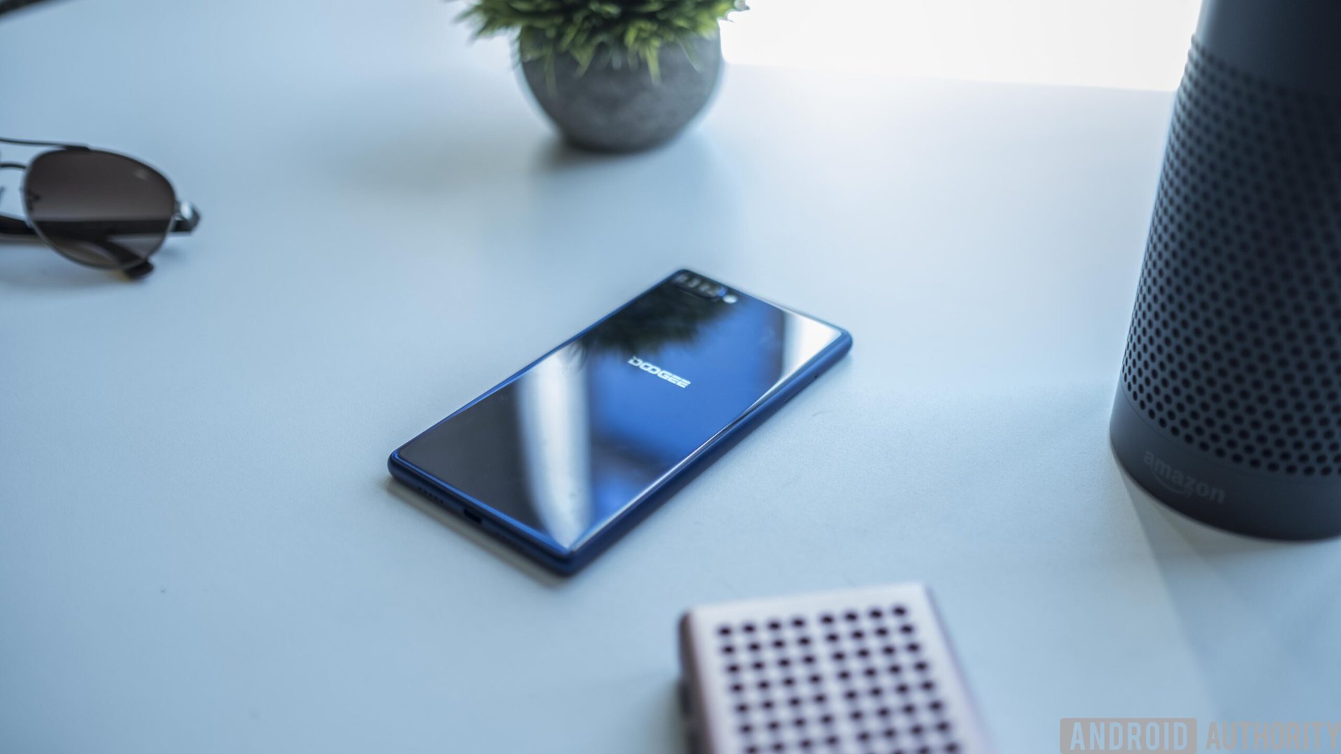
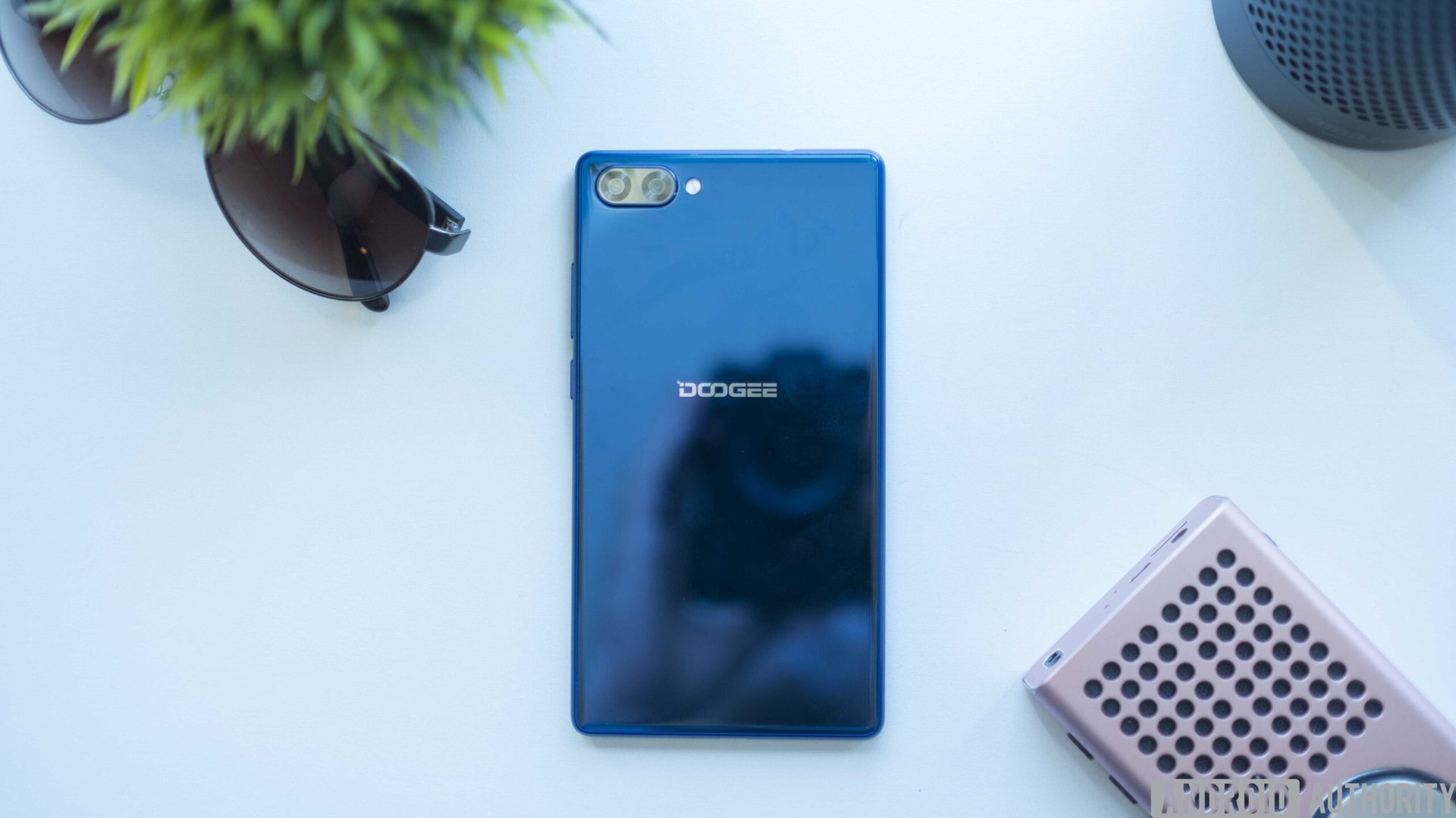
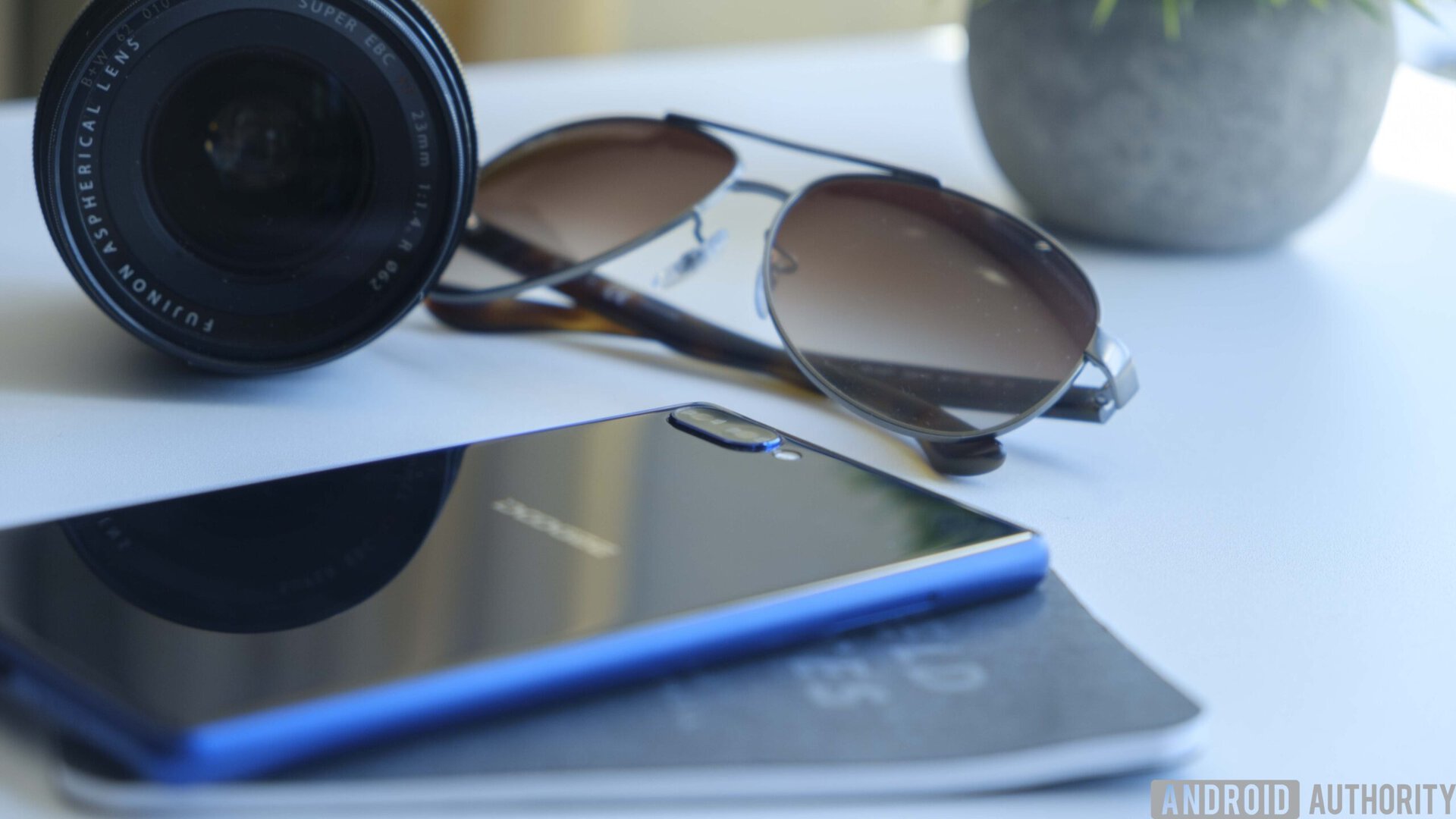
The back is basically a colored mirror with a DOOGEE logo in the center, with dual cameras and a flash at the top. Again, this is a way for DOOGEE to try to make a competitive device that has all the trendy features. There is no wide-angle lens on this device, but one of these cameras is 1x while the second is 2x. I actually prefer this, and it’s really nice being able to quickly punch in without losing any quality.
Don’t miss: Galaxy Note 8 vs LG V30 camera features
Display
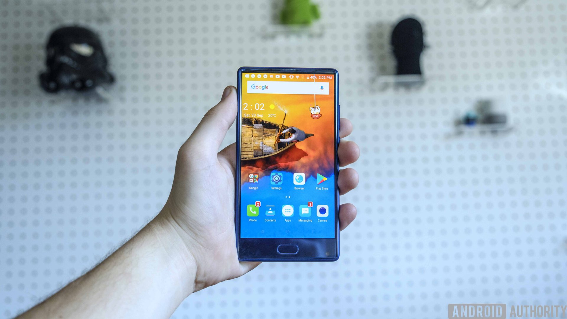
It seems like we’ve spent the last few years debating whether or not you need a 1440p screen. While most manufacturers still haven’t made the leap to 4K, 2K seems to be the standard on flagships these days. Some manufacturers like OnePlus have fought this idea, claiming that 1080p is perfectly acceptable for most users’ needs.
Well, the DOOGEE Mix isn’t a 2K panel. It’s not even a 1080p panel. It’s 720p. Am I disappointed?
Surprisingly not.
The screen on the DOOGEE Mix was made by Samsung, and delivers some nice colors with its AMOLED tech, though it’s a bit washed out. It’s not a screen that can handle visually demanding things like virtual reality, but it gets along well enough for everyday tasks. In a $200 phone, you really have to think about how much you value the difference in resolution. Almost every application you use on this phone is going to look “good enough,” though I did notice some more obvious quality drops in things like Facebook chat heads. Still, a lower resolution screen also means better battery life.
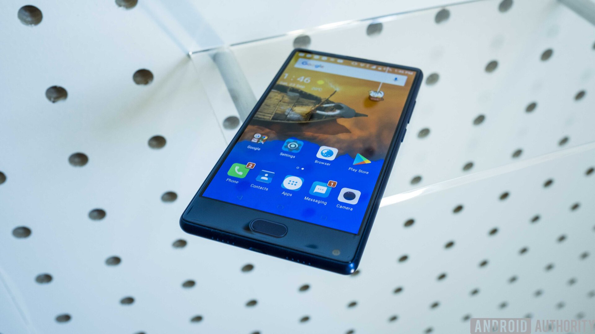
294 ppi isn’t great, but you could do worse. The biggest thing I saw this low pixel density affecting was photo and video quality. Both look a lot more “grainy” than if you were using a higher-end option, and it left me wanting a better screen, especially after using a Pixel XL for the last year or so.
For the average consumer that cares more about their product working vs little caveats like screen resolution, it’s really not half bad.
Yes, it looks strikingly similar to the Mi Mix
Speaking of the display, it’s really the key hardware feature that makes this phone stand out. Yes, it looks strikingly similar to the Mi Mix. Judging by the name, it’s clear DOOGEE isn’t trying to hide it, but I don’t think they really care either.
The Mi Mix retails at over $500 for the baseline model, and more budget-conscious users are going to turn their head if they can get a very similarly-styled device for way less than half the price. Yes, it is 720p, but the Mi Mix is only 1080p. If you care about your display, you’ll probably be willing to spend a bit more on a different phone.
Performance
Even with a Helio processor, this thing can really kick. When comparing it to the Pixel XL on the PCMark benchmark, the DOOGEE Mix performed admirably, with a score of 4713 compared to the 5425 the Pixel XL received. While a score differential of 700 may seem pretty big, I was honestly expecting worse.
In terms of real-world usability, I found most apps run just fine. I played a few games like Super Mario Run, and didn’t notice any hiccups throughout my time with the Mix. The main thing I noticed that really bugged me was the lag that happens when you hit the home button. Often when you return to your home page the phone will show a message that reads “loading launcher”, which will then take a couple seconds to actually populate the screen.
I don’t know if this is due to their launcher being bloated, but that’s what I’d guess. The news tab that you swipe onto is constantly updating to keep up to date, and that likely causes some lag when you jump out of your apps.
I think DOOGEE is hyper-aware of their bad RAM management as well, since when you use the multitasking button the phone will tell you how much usable RAM you’ll get back if you kill all your tasks. This is pretty nice, but I would prefer they just worked to optimize app management in the back-end instead.
For your everyday tasks, this phone runs perfectly fine, and the Helio P25 Octa-Core processor does a pretty good job of running individual tasks. Just don’t get your hopes up.
Hardware
Accessories
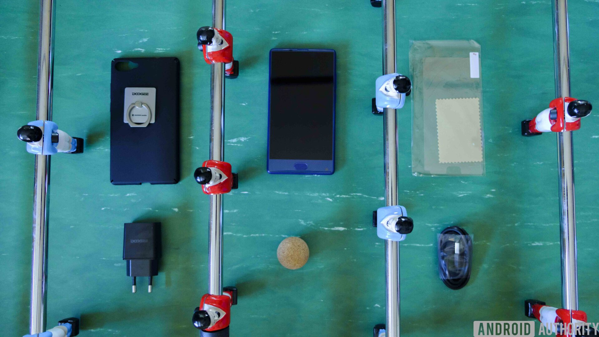
In the box you’ll find the regular charging brick and cable, product booklet, and limited warranty card. Additionally, DOOGEE has included a soft touch case for the phone, screen protector, and even a ring holder that sticks to the back of your device. These are extremely popular in markets like China, and it’s cool to see a company throwing one in for free. The packaging that the ring comes with is more than a little odd, but we’ll take what we can get. It is free, after all.
FM Radio
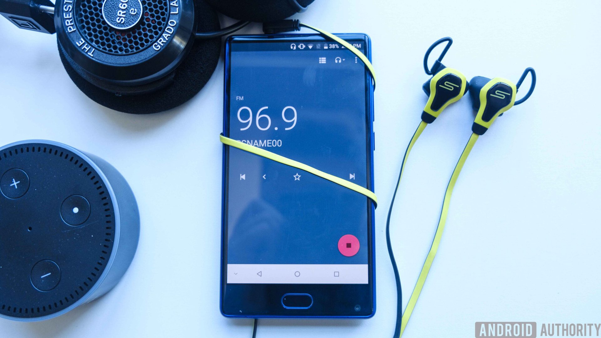
FM Radio! This phone has an FM radio! I might be biased, but I’ve severely missed the days of using some wired headphones in my HTCThunderbolt to listen to one of the oldest media sources on the planet. Sure, Spotify is going to give you better quality, but especially on a phone like this that doesn’t support many bands in a lot of countries, it’s nice to be able to tap into some good old fashioned local music.
On-Screen Buttons
This phone gives you the option of using on-screen buttons or pulling them away. Since there is no way to enable the multitasking mode without it, you’ll have to enable on-screen buttons to use this function. Again, I think there was a missed opportunity in not adding capacative hardware buttons, but it was probably due to cost management.
Network bands
If you live in the United States, you probably don’t want to purchase this phone. This device works with one band on T-Mobile, and that’s it. No AT&T, no Verizon, no Sprint. And since it’s just one band (3G at that), your service is going to be both unreliable and extremely spotty.
If you’re in somewhere like the UK, it may be worth a look. This device uses multiple 4G bands on FDD-LTE, so you’ll get good speeds if you live somewhere that works with these.
Battery life
DOOGEE seems really focused on battery life, and it shows. The 720p AMOLED panel is already great for getting more juice out of this device, and combining that with its 3,380 mAh battery gets you a lot more useable time than many other devices on the market. I used Wi-Fi a lot of the time because there is only one network band in this thing that works in the US, so that would’ve helped as well. Your mileage will undoubtedly vary.
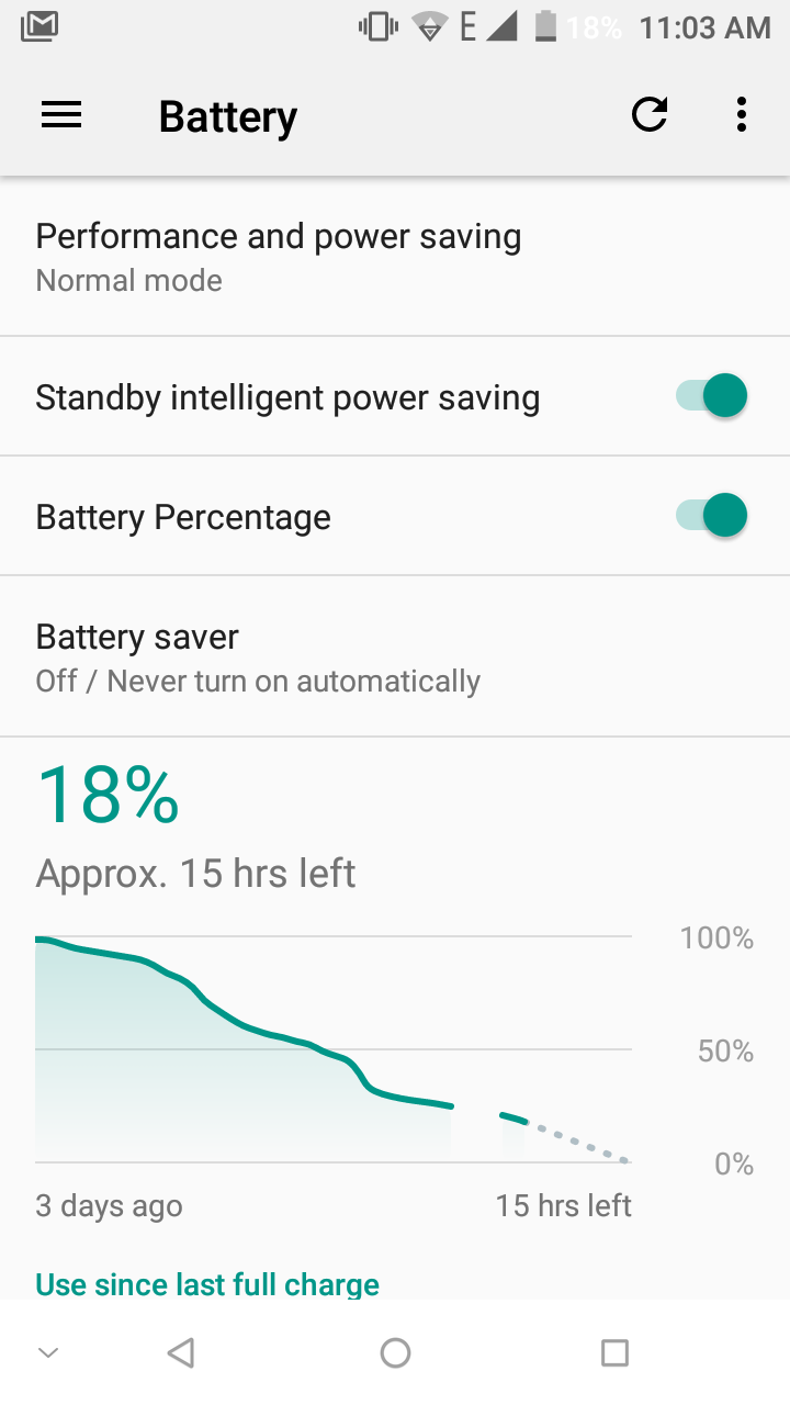
Using the phone at half brightness got me a couple of days of power, even with the terrible service I had on T-Mobile. I am a bit frustrated that I wasn’t able to get the screen-on time values, but the phone said I hadn’t charged it in over two days, which is pretty great.
Software
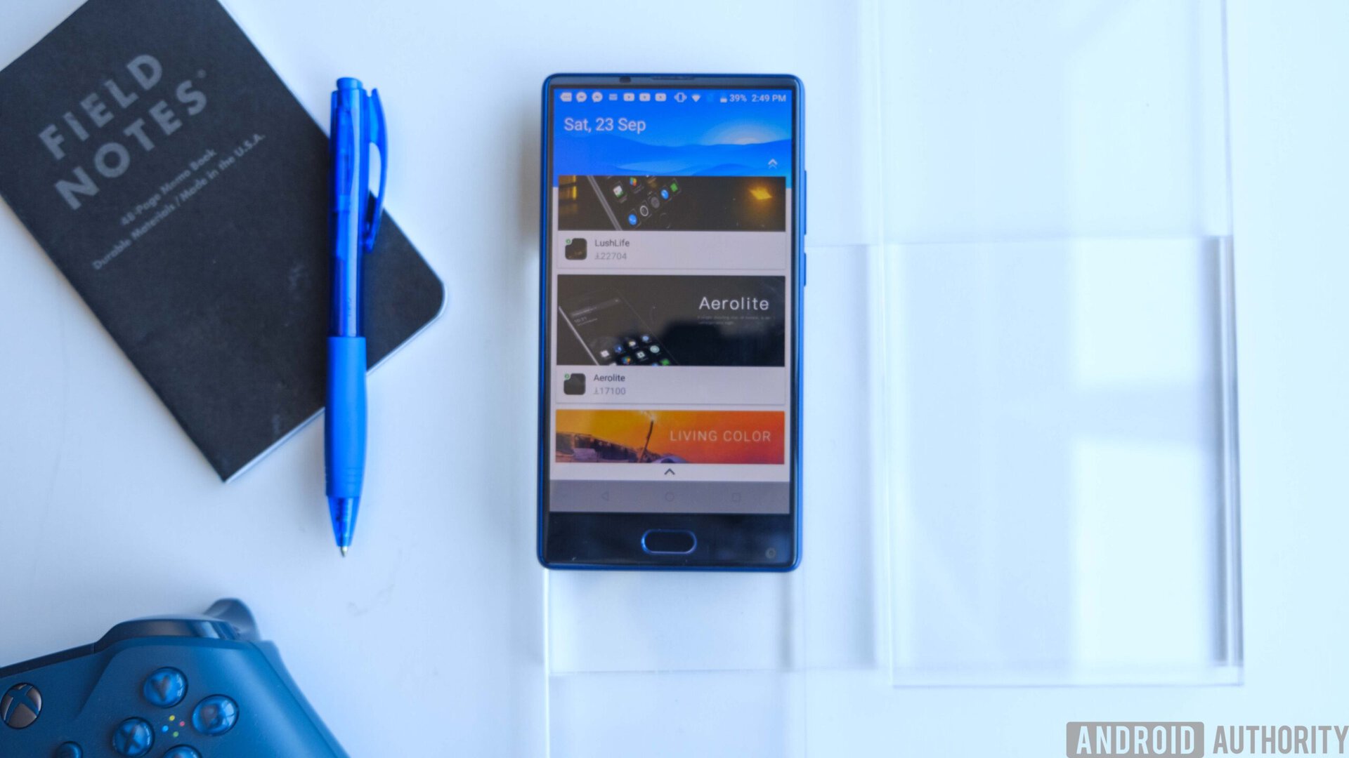
DOOGEE uses a custom launcher called DOOGEEOS, which is really not all that different from stock Android. It’s based on Android 7.0 Nougat, and actually runs pretty well considering this is using a lower-end Helio P25 processor.
On the home screen there’s a cat/robot constantly hanging down from a string, which is clearly trying to play to a different audience than the US. The cat/robot design choice is a bit annoying, but it takes you to what is essentially a theme store. You may hate this feature, but I actually found it kind of nice. There are a wide variety of themes available, and they will change your wallpaper and icons to match a specific look.
A weird thing about these themes is that they download as apps initially, and then get applied to your phone. It seems like DOOGEE is using this as a way to get around the Google Play Store.
If you swipe to the left of the home screen you’ll find a news section with five different categories: Local, World, Business, Entertainment, and Sports. This feels a lot like Flipboard, but it’s got a number of pretty invasive ads in it, so DOOGEE is obviously just trying to make an extra buck through their operating system. Nevertheless, it’s still nice to have a news curation platform built into your phone right out of the box.
Besides this caveat, the operating system has everything you would expect out of Android Nougat. There are a few other extra features like a modified screenshot manager, which allows you to select which portion of the screenshot you actually want. You can also paint on top of it and even do a freehand crop, so you won’t have to go through a separate app to show people what they need to see.
Camera
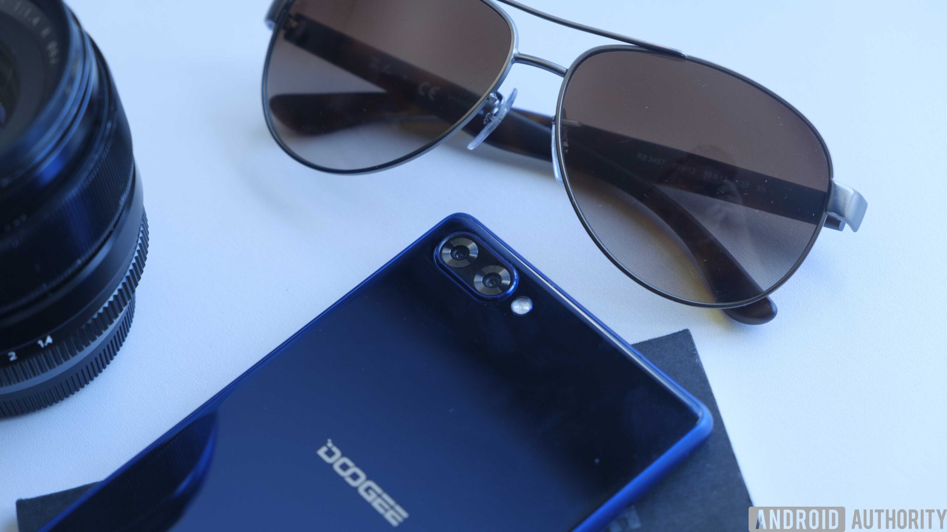
If you want to be a trendy smartphone manufacturer these days, you have to include dual cameras. While some companies like LG have gone and added additional functionality like wide-angle to their secondary shooter, DOOGEE has stuck with a 1x and 2x lens. I appreciate this and actually prefer it, since the UI gives you the option to immediately jump to the 2x camera to get your shot.
The main camera is 16 MP and the secondary one is 8 MP, but you won’t see a whole lot of difference between the two. Overall I’m just really glad to have the ability to do a 2x zoom on the fly, and you’ll find a similar feature in a few other phones.
Since there are two cameras, you’ll be able to emulate depth of field like you can on the OnePlus 5 and other dual-shooter options. The way DOOGEE does it is pretty terrible though, as you have to hold the phone absolutely still to get anything close to a good image. If you’re one of those people who likes to stabilize your phone camera this might work a little bit better, but I personally would recommend a dedicated alternative camera if this is the phone you’re going to be rocking.
If you swipe out from the left you’ll find a number of different live filters for the camera, which are cool but don’t seem all that useful. You’ve also got a “face beauty”, “blur”, and “mono” mode, so you can have a bit of fun, even if you aren’t getting the best images out of the cameras.
Still, the pictures produced aren’t half bad. You get a decent amount of quality out of those 16 and 8 MP shooters and they look a lot better off-device than on it. So if you’re taking photos and aren’t particularly happy with how your images are coming out, don’t worry too much, because they’ll probably look a lot better on your computer.

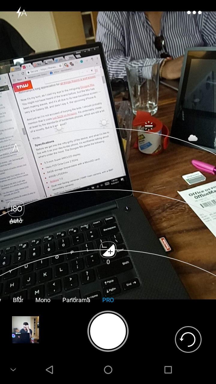
You get a decent amount of quality out of those 16 and 8 MP shooters..
There is a 5 MP selfie camera in the bottom right of the phone, which forces you to turn the device upside down to get a natural view. This camera is pretty bad, and produces extremely soft images. I wasn’t expecting much, but I was hoping these photos would be just a little bit sharper.
One of the coolest things about this camera software is the “Pro” mode. This allows you to adjust individual elements like exposure, aperture, ISO, and white balance. It’s almost funny that this is included though. The cameras aren’t terrible, but who are you trying to impress if you’re using pro mode on a budget phone? The auto worked fine for most of the shots, and if I was that worried about getting a good image, I’d be shooting in RAW with something else. It’s still fun to use though, so take this as you will.
Check out this photo gallery to see how well the three cameras did in different situations.
Specifications
| DOOGEE Mix | |
|---|---|
Display | 5.5-inch HD 1280 x 720 resolution 294 ppi Samsung Super AMOLED |
Processor | Octa-core (max 2.5GHz) Helio P25, 16 nm process |
RAM | 4/6 GB LPDDR4X |
Storage | 64 GB/128 GB |
MicroSD | Yes |
Cameras | Rear: 16 MP sensor, f/2.0 Samsung ISOCELL, Additional fake lens which does not work Front: 5MP F/2.2 |
Battery | 3,380 mAh |
Wireless charging | No |
Water resistance | No |
Connectivity | Wi-Fi 802.11 a/b/g/n Bluetooth 4.0 NFC Micro USB 3.5mm Headphone jack Location (GPS, AGPS, Glonass, BeiDou) Network bands 2G: GSM 850/900/1800/1900MHz 3G: WCDMA 900/2100MHz 4G: FDD-LTE Band 1/3/7/8/20(B1:2100, B3:1800, B7:2600, B8:900, B20:800MHz) |
SIM | Dual nano SIM |
Software | DoogeeOS based on Android 7.0 Nougat |
Dimensions and weight | 144 x 76.2 x 7.95 mm 193 g |
Design | All metal unibody |
Gallery
Final thoughts
I think the biggest thing you have to keep in mind when you look at this phone is the price. Yes, it uses an old charging standard, the milling isn’t perfect, and the UI is a little bloated. But for $200, this is a very solid device.
You’re getting great battery, a flashy design, dual cameras, and some nice extras in the box, and outside of some newer specs and caveats, I can’t see anyone with their expectations in check being truly unhappy with this thing.
DOOGEE has removed a few newer features to make room for a lower price and great battery life, and it’s hard to fault them for that. If you want to pick a phone up as a backup, this is a great option, otherwise, you’ll probably still enjoy this as a daily driver, even if it doesn’t have all those shiny bells and whistles.