Affiliate links on Android Authority may earn us a commission. Learn more.
Feedly redesign introduces a cleaner and more straightforward design with bottom tabs
Published onNovember 14, 2018

- Feedly has pushed a much-awaited redesign to its app’s beta channel.
- The new design introduces bottom tabs for quick access to the app’s various categories.
- If you don’t like the redesign, there is now a “Feedly Classic” app that you can download.
Following this morning’s news that Pocket Casts has released a redesign for its mobile apps, Feedly has pushed out a major visual overhaul to its app on the beta track. While Feedly isn’t introducing any new features, the fresh design makes it much easier to switch between the app’s different categories.
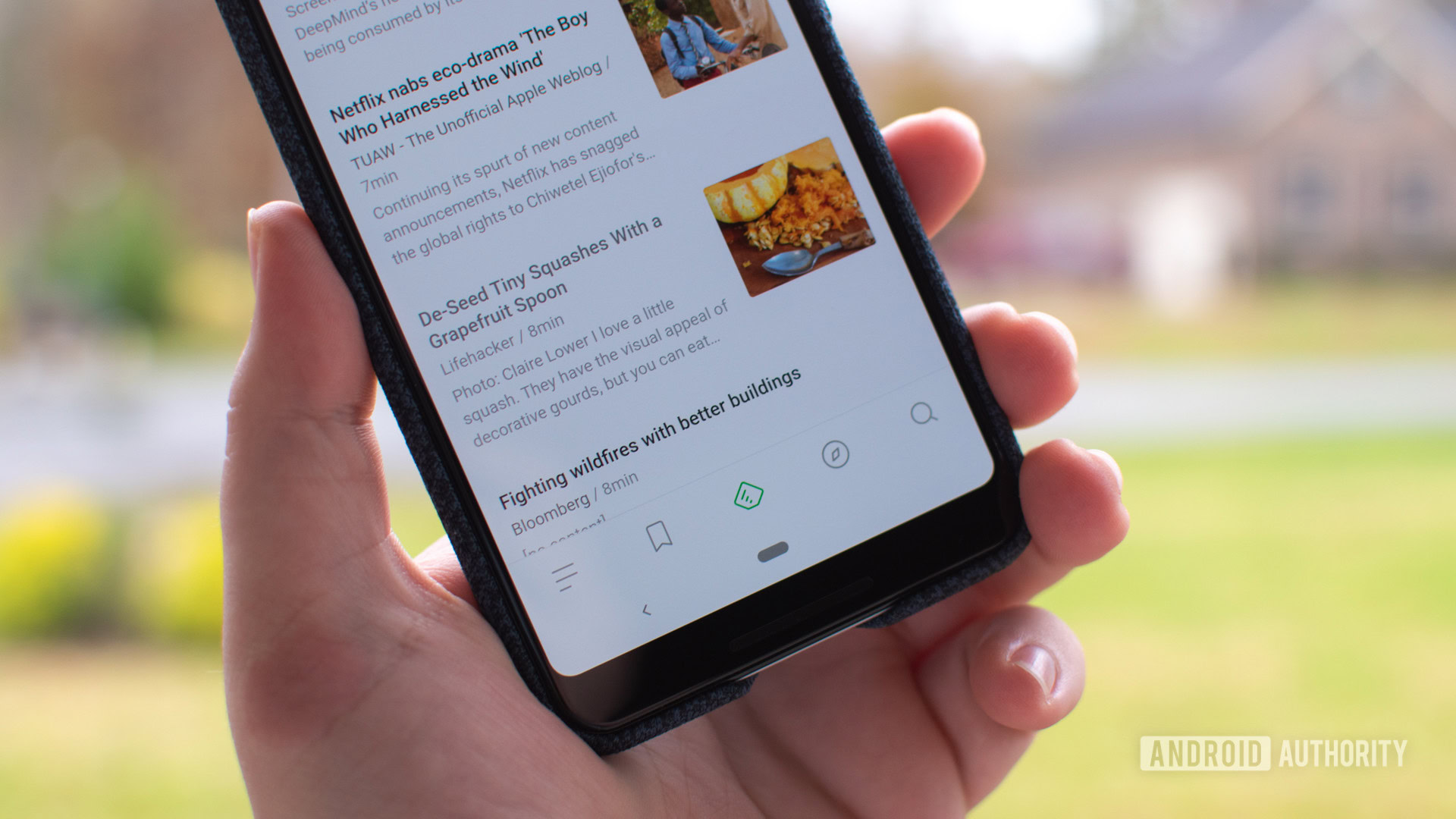
First, instead of sticking everything into the overflow menu, Feedly has added button tabs. You can now quickly jump between the news feed, read later, discovery, and search sections without necessarily having to swipe inward from the left side.
As you can see from the screenshots below, the overflow menu remains the home of your news sources and settings menu. The only thing that was removed from this redesign was the gray color that accented the top of the interface.
And lastly, yes, Feedly retains its dark/Night Mode so that you can read the news in the evening without blinding yourself.
One of my favorite parts about the new design is a new progress indicator located in the top left corner of the app. As you can see, the further you scroll down your Feedly list, the more the indicator fills up. And if you tap on the icon, you are greeted with a Digital Wellbeing-like popup that lets you know how long you’ve been in the app, how many articles you’ve scrolled past, and how many stories you’ve read.
But if you aren’t a fan of the redesign, don’t worry, you can download Feedly Classic. While it isn’t clear if Feedly will update this app going forward, it does allow those who wish to retain the old design to keep it and not leave the service completely.

To sign up for Feedly’s beta, you can head on over to the app’s Play Store listing using the button below. From there, there should be an option to sign up for the beta. After a short enrollment process, you should see the update for the redesign.