Affiliate links on Android Authority may earn us a commission. Learn more.
The pros and cons of fingerprint scanner gestures
Published onMarch 1, 2017

Fingerprint scanner gestures are nothing new. The HUAWEI Mate S introduced us to fingerprint scanner functionality way back in 2015, Meizu phones have used them for a while too and more recently the Google Pixel lets you drag the notification shade down with a swipe. Even the original YotaPhone had swipe-based gestures for navigating its rear e-ink screen.
Now, at MWC 2017, the new HUAWEI P10 and P10 Plus and Moto G5 and G5 Plus use their front-mounted fingerprint scanner as a replacement to on-screen navigation buttons. In some ways this is really cool, but there’s more than a few problems with the idea and its implementation in both products. So many problems that I can’t see this being anything more than a passing fad unless a much better solution is created. Here’s why.
I enabled fingerprint scanner gestures on my P10 with a little trepidation: looking forward to enjoying more screen real estate but fully expecting a period of weirdness as I gradually became accustomed to using swipe gestures on the home button.
Using the finger scanner to navigate the interface is surprisingly intuitive.
But I was pleasantly surprised to find that this teething period lasted for all of about ten minutes, because using the finger scanner to navigate the interface is surprisingly intuitive (admittedly, I already use them on the Pixel).
How it works
On the P10, you can unlock your phone with the scanner as normal, but then once your phone is unlocked you can tap it to go back, hold it to go home, swipe left or right to bring up your recent apps list and swipe up on the bezel beside the home button to launch Google Now.
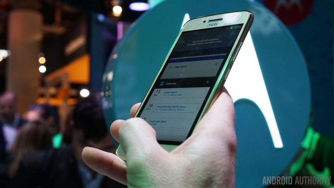
On the Moto G5 and G5 Plus the setup is a little different – with an arguably better layout in my opinion – where you swipe left to go back, tap to return home and swipe right for your recent apps overview. As you might expect, a long press on the home button brings up Google Now.
But the particular layout isn’t so difficult to pick up on either device. In my brief time so far with both devices, I’ve acclimatized very quickly to whichever setup is on the phone. Fortunately, it’s entirely optional so you can always just stick with on-screen buttons if you find it’s not for you and both phones default to on-screen buttons.
It’s kind of good… but also bad
So is this something we might see more of? I’d say yes. In some ways, but certainly not all, it’s a pretty elegant solution to the age-old problem of capacitive vs on-screen buttons (or both). Most fans of capacitive soft keys justifiably argue for the additional screen space they afford, and scanner-based gestures certainly fit the same mold.
Using finger scanner gestures means you're essentially always in immersive mode.
Using finger scanner gestures means you’re essentially always in immersive mode, with no swipe or tap required to call the nav buttons up on screen. So if a phone is already going to have a front-facing scanner then why not let it handle navigation as well? A few reasons, actually.
One of the biggest problems I can see so far I’ve already mentioned: both HUAWEI and Moto have chosen their own unique layout for gestures. If you think Samsung using a different orientation of back and recents is confusing just think how much worse it will get when there’s a few other gesture possibilities and no visual clues as to what they do.

While a “standard” might eventually be found that make its way across multiple device ranges, there’s very little chance it will ever be even vaguely universal. The only way that would even come close to being a possibility would be if Google mandated a “preferred” layout.
There's very little chance a universal gesture 'standard' will ever appear.
But even then there’d be breakaway factions that insist on doing it differently. The ability to customize gestures would help, but that would make things even more confusing across the smartphone spectrum.
Of course, if you only ever plan on sticking with a single manufacturer rather than chopping and changing, you’re in better shape, but you’ll still suffer the limited functionality gestures afford.
Limited functionality
Just think about the navigation shortcuts we enjoy on Android. Google Assistant for example. Google Now has always been brought up with a long press of the home button. While this is still possible on the G5 series, where a long press on the home button will call up Assistant, on the P10 you have to swipe up from the bezel beside the home button onto the screen itself to call up Google Now. This is weird but workable.
Navigation gestures mean bad things for all the other shortcuts the back, home and recents buttons allow.
But there’s also all the other shortcuts the back, home and recents buttons allow. How will we enter Nougat’s split-screen mode without a recent apps button? Or quickly switch between our two most recent apps? If moving all these functions onto the bezel beside the fingerprint scanner is the answer, how is that any better than just sticking with capacitive keys?

No bezels mo’ problems
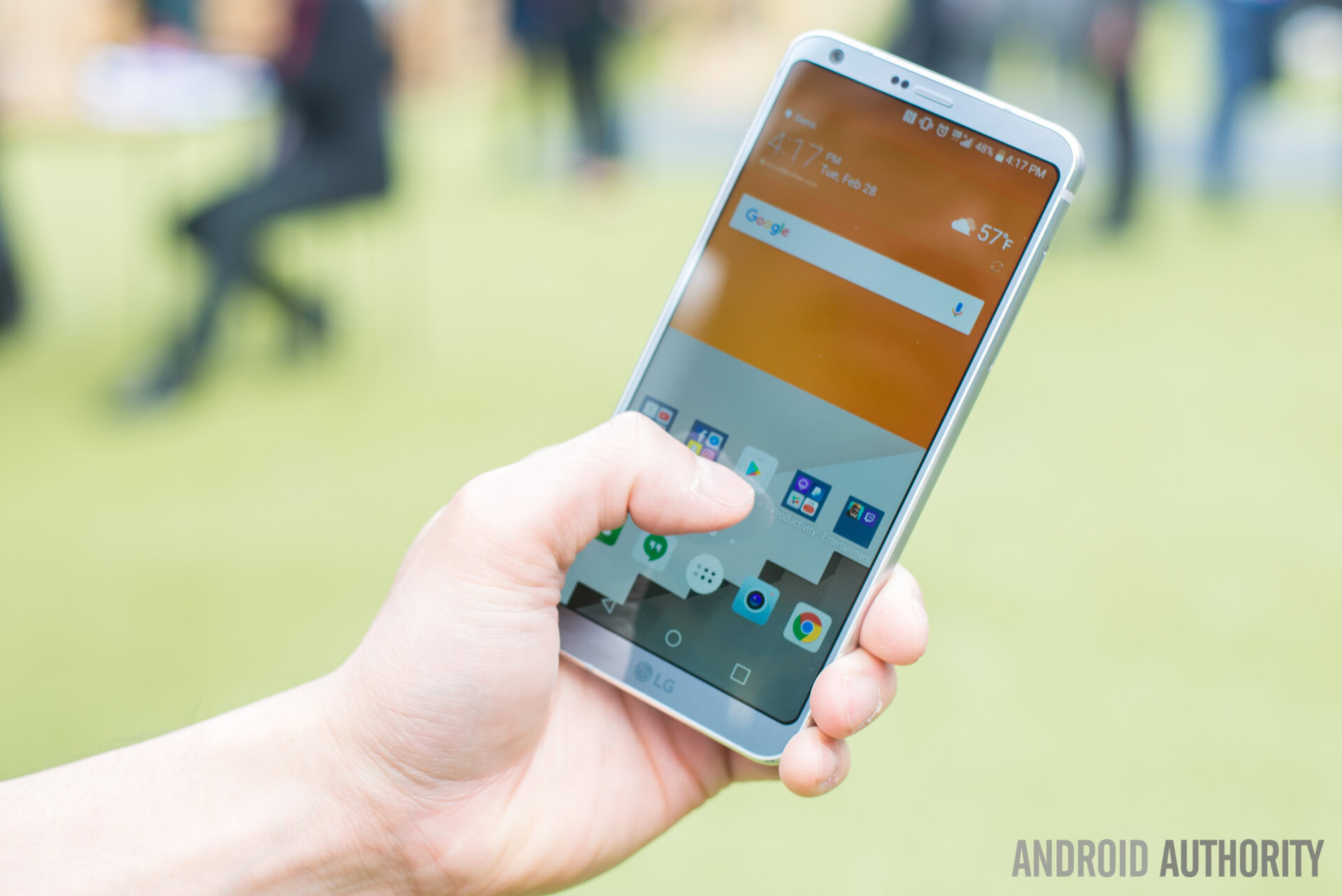
Then there’s the seeming trend toward rear-mounted finger scanners. While many OEMs continue to make phones with front-facing scanners and a lot of folks prefer it that way, there are some pretty big names doing it on the back: LG, Samsung and Google. The “problem” with that is that it’s a lot weirder to navigate using a rear-mounted finger scanner than a front-facing one.
Plus there’s the move to near bezel-less devices, which is increasingly looking like the next big smartphone design trend. If front-facing scanners and navigation gestures become a thing, then we’re going to continue needing large(ish) bottom bezels in which to house the fingerprint scanner module.
Navigation gestures are a limited alternative made worse by a lack of visual clues as to what they do.
Blind gestures
Of course, the same kind of gestures could simply be moved on-screen, but we’d then need to have a “gesture area” at the bottom of the display. Again, this doesn’t seem like it would be a much better solution than the on-screen buttons we have now.
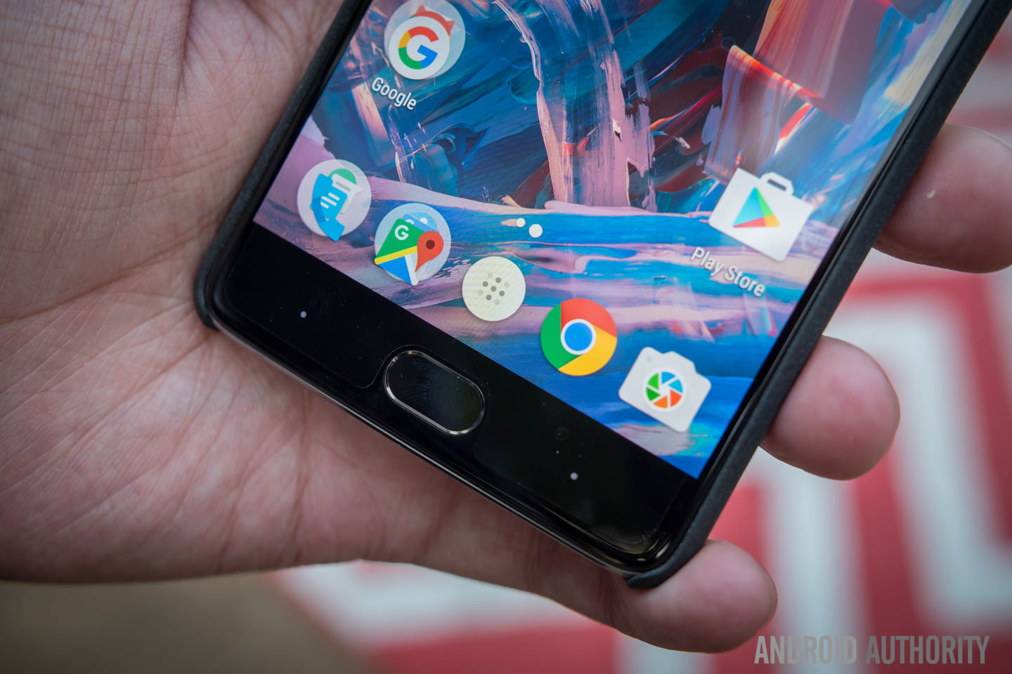
Then there’s the problem of an absence of visual hints as to what each gesture does. If you think OnePlus’ use of nondescript dots or lines on the capacitive keys is confusing enough, think how much worse it will be when you have left and right swipe gestures, up and down swipes, taps and long presses to contend with. All without a visible reminder as to what they do.

Fun, but not very functional
One person with one phone might figure it out quickly enough, as I did with both the P10 and G5. But if you’re the type that swaps between phones regularly, has a work and personal phone or even just regularly borrows friends’ phones to look at something, you’re going to experience a lot more problems than navigation gestures are probably worth.
Every time you pick up a new phone you’ll have to fumble your way through the gestures until they become second nature. This is going to be such a pain for most people that they simply won’t bother to repeatedly adapt. So it’s a good thing that both HUAWEI and Moto have included gestures as an option. I suspect after the novelty wears off almost everyone will revert back to on-screen buttons.
I suspect after the novelty wears off almost everyone will revert back to on-screen buttons.
Android is all about options though. Having an option for finger scanner gestures is by no means a bad thing. If it’s your cup of tea then more power to you. After all, I’m sure there are plenty of people that don’t use long press or double tap shortcuts on Android’s current buttons.
If developers can start adding other cool gestures and users can customize them to their liking, this could still be pretty cool. I actually like fingerprint scanner gestures – I just prefer the kind of functionality found on rear-mounted scanners like the Pixel. As fun as front-facing scanner gestures are, I just don’t see them as a viable replacement for the current three-button layout.