Affiliate links on Android Authority may earn us a commission. Learn more.
Form factors: which design language do you prefer?
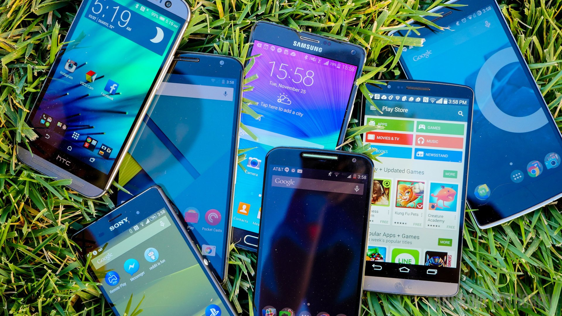
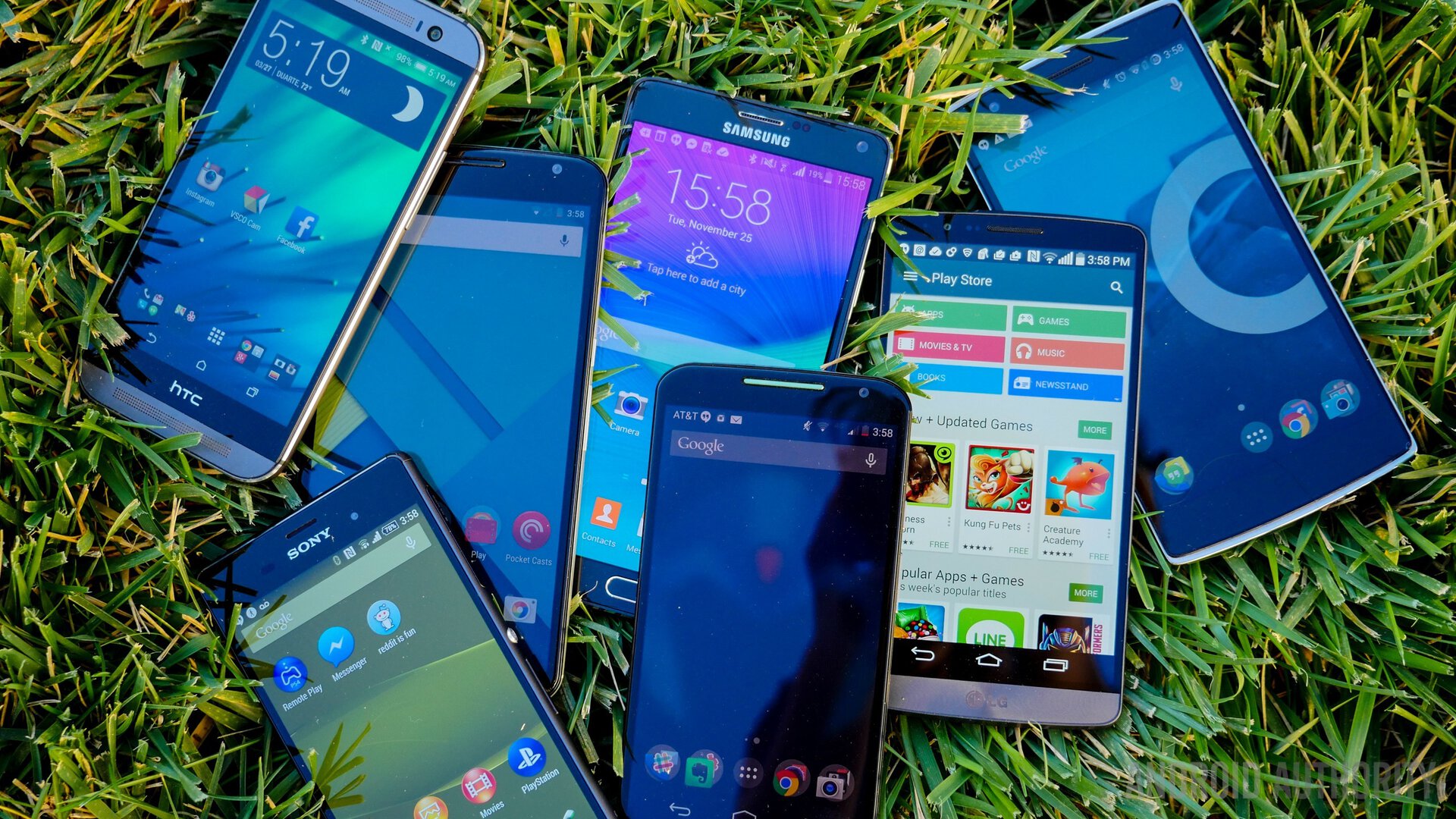
A short while ago, I wrote a small story about tablets. Despite my love for them, I will be the first to admit that affection is not spread equally. Some devices are not created as equal as others, though ironically (for the purposes of this piece), this has less to do with specs and more to do with design choices.
In this feature, we will take a look a the major form factors of devices and analyze the benefits of each, as well as the demerits. At the end, we’d like to ask you, the reader, to let us know your own personal preferences with a short survey.
Traditional smartphone design (with on-screen buttons, side volume rocker and power button)
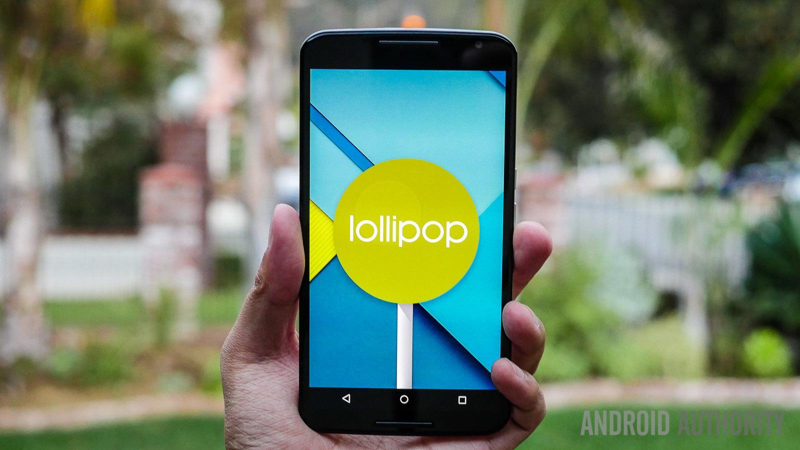
The best place to start the party is with Google’s core Android design, and generally speaking, that means Nexus devices. For the sake of this feature, this means on-screen navigation buttons. While Lollipop has ushered in a new, Playstation-esque geometry, the functionality is still relatively unchanged. You have a back button, a home button, and a quick access button. This form factor uses more traditional smartphone button placement, with power and volume keys located along the sides or top of the device.
Pros: In terms of hardware, having on-screen navigation frees up OEMs from needing to add any mechanical or capacitive features to their devices. While the power and volume buttons will always be present, the “Samsung effect” isn’t needed.
Cons: The one main problem with on-screen navigation is, and will seemingly always be, the reduced screen real estate. The buttons take up space, and nothing else is able to use it. As a result, a device like the HTC One M9 seems to have an even smaller screen due to the unusable space. Granted the buttons can be hidden, but when using the device in earnest (as opposed to a video or game) the problem is always black and white. Literally.
Special Mention: LG (and these days, some additional OEMs as well) has been allowing users to customize the navigational buttons for some time now. One option in particular that fans of phablets might like is the ability to add a notification shade drop down button thus alleviating the need to contort your hand to reach the top of the screen, or hold the device with both hands. Even on lower models that lack the customization, LG still lets users opt to swap the order of the core three AOSP buttons. LG also allows you an option to manually set the navigation buttons to hide and require a gesture to call them up on higher end devices.
Samsung’s physical and capacitive combo
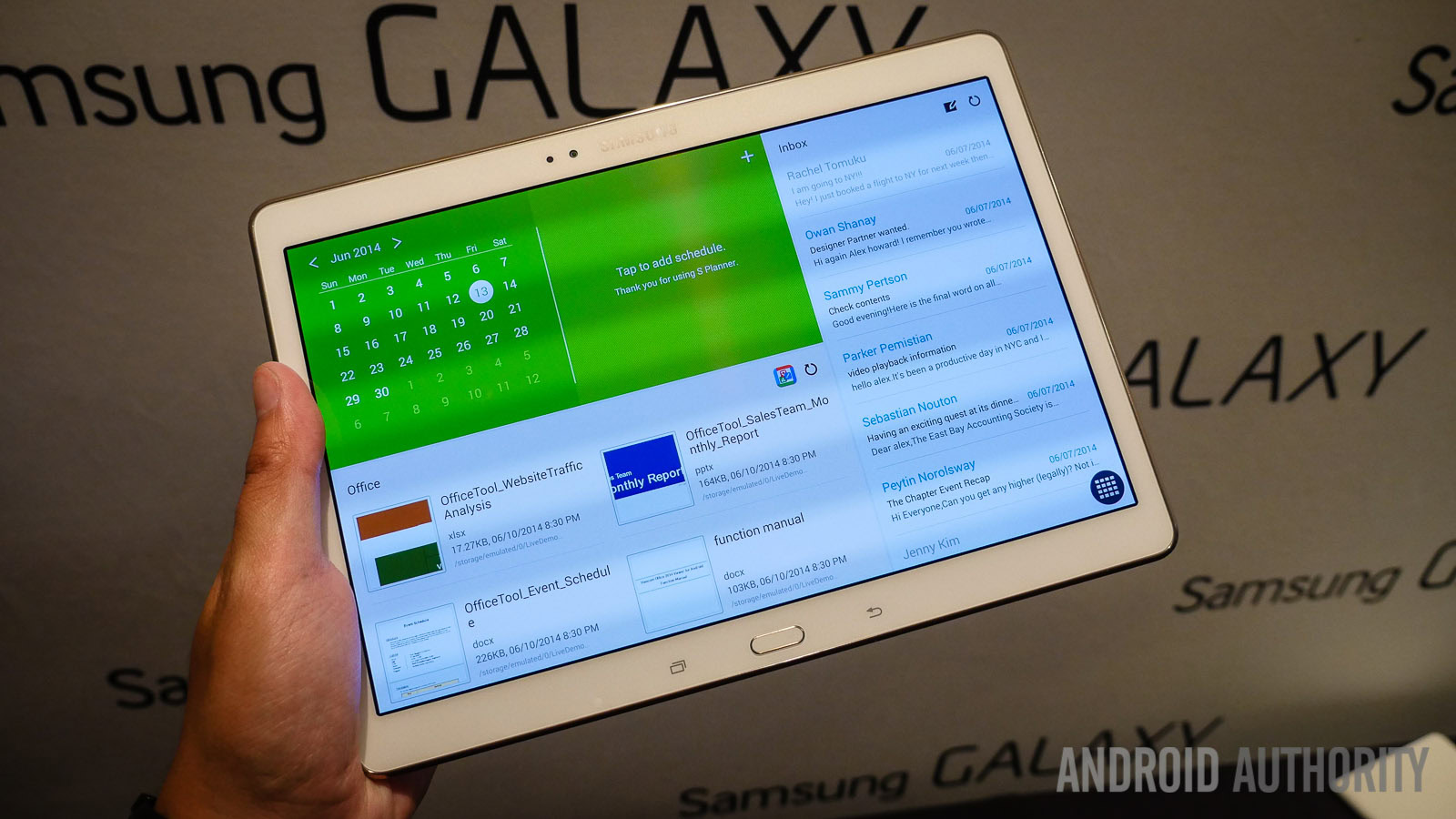
Arguably a large part of why some feel Samsung’s fruits to be rotten, the Galaxy series has always employed a clickable, mechanical home button. Unlike Apple however, it also flanked it with two capacitive buttons which have changed functionality (and design) over the years.
Pros: Samsung’s products offer a lot of benefits to those who want maximized screen real estate, physical buttons, and these days, fingerprint sensors. The basic layout hasn’t changed (though the Menu Button was changed to a Recent App button last year) since the original Galaxy S.
Cons: Arguably the biggest problem with Samsung’s design choices are accidental button input. Especially with some of the lower end Galaxy Tab products, the “hit zone” can be quite large and thus create a totally jarring experience. Even in more premium products like the Galaxy Tab S 10.5, the buttons are so irritating that I literally can’t use the device in portrait mode because one of the capacitive keys will always get hit. More recently, Samsung has suffered some user outrage for removing the ability to set the time out lighting for the capacitive keys on the S6.
LG’s back mounted buttons
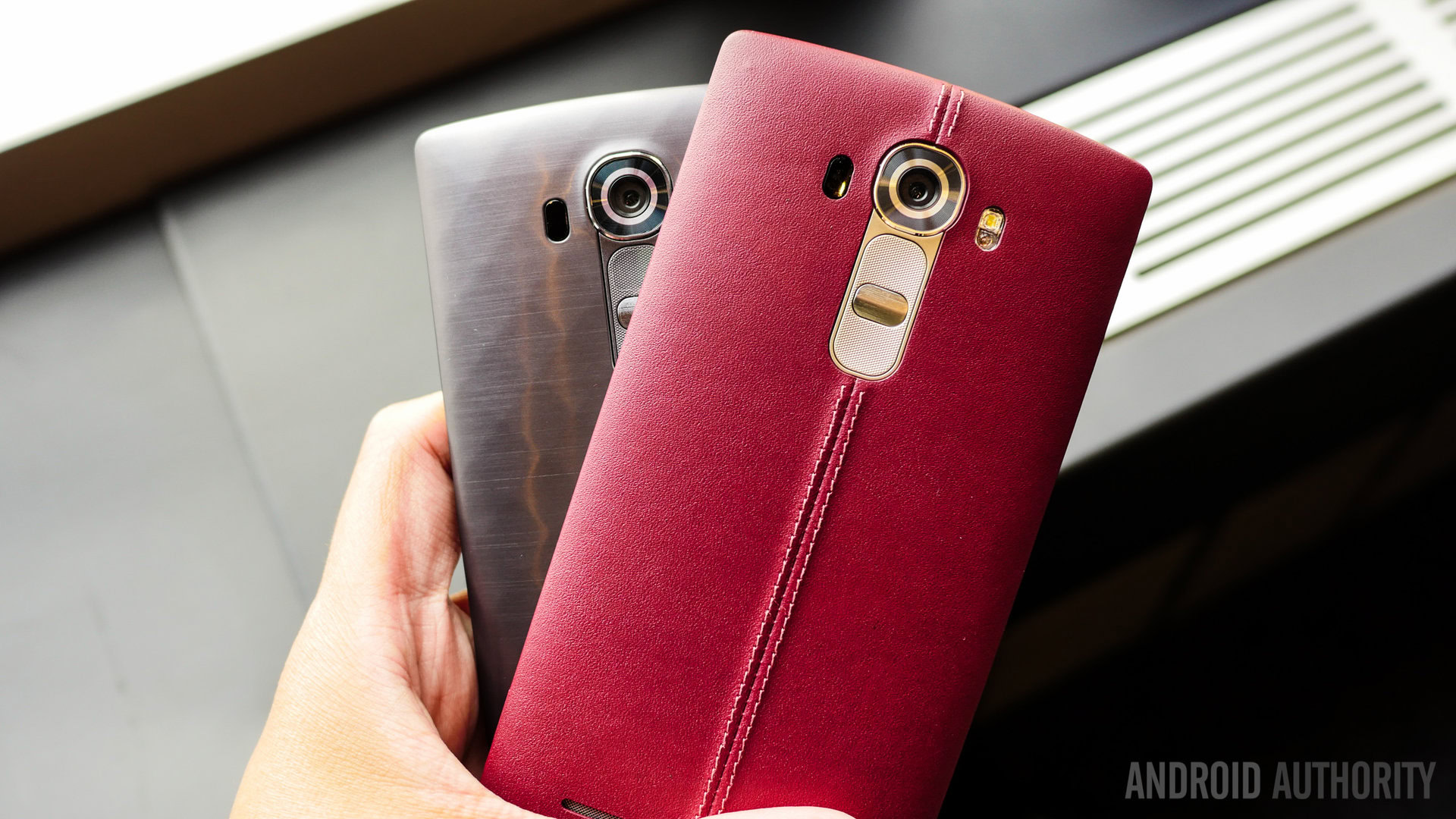
Starting with the LG G2, Korea’s other major conglomerate shook up the world by making a mainstay of the mullet: business up front, and a party in the back. The decision to move power and volume keys to the back of the device doesn’t directly affect Android interaction (namely because LG opts for on-screen buttons) but it did pave way for things like tap-to-wake and to this day is a love it or hate it affair.
Pros: LG’s approach solves the problem of accidental button presses a la Samsung. For all those who hold a device in landscape orientation and accidentally hit the power or volume keys in the process, having buttons on the back is a great feature.
Cons: While a smartphone is arguably acceptable, when tablets such as the Motorola Xoom opt for buttons on the back, the end result was an exercise in frustration more times than not. Even LG has opted not to use rear mounted buttons for its tablets.
The hybrids

Type 1: The Multi-Form
ASUS is one company that has been actively pushing hybrid devices for some time now. The Padfone for example, is a smartphone that has an optional tablet dock that basically converts the smartphone display and mirrors it on a tablet “frame” all while charging the battery of the smaller unit.
Pros: This is an great choice for people who only want to use one main device.
Cons: While buying the set is arguably cheaper than buying a top-tier phone and tablet, with this you’re really only getting a phone yet paying through the roof. The problem lies in the fact that the “frame” is absolutely useless by itself and thus if you forget your phone at work, you can’t use the tablet. Likewise, the tablet has no internal storage or specs to speak of, and thus you’d better be satisfied with the specs of the Padfone smartphone.
Type 2: The Foldable
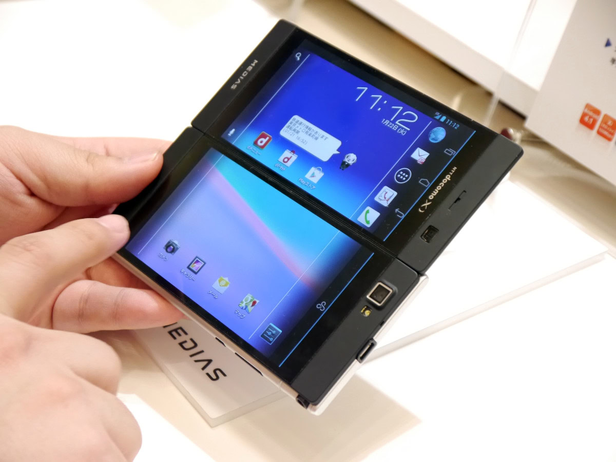
While the most recent example of a foldable device was the Japan-only NEC Medias W released some years ago, other examples include the Kyocera Echo and the Sony Tablet P. These devices all used two separate panels that worked in tandem to create one larger image. In the case of the Medias W, you could opt to use just one screen as the device folded in half “reverse book-wise” though with the Sony Tablet P it could only be used with the screens together.
Pros: The ultimate in compact-yet-expandable size factor. These devices were all quite small yet when using both screens, created a much larger experience. Samsung is rumored to be making a product that would possibly feature two truly bendable displays.
Cons: Basically everything. My own experiences with the Medias W and the Tablet P were met with endless irritation as key apps weren’t compatible (in particular, YouTube with the Tablet P), problems with the gap separating the two screens and dragging/dropping elements, battery life, software issues…until someone can actually get this right, it’s safe to say there’s a reason we haven’t seen any new foldable device in the past couple of years.
Wrap up
So now that you’ve gone through the three (arguably four) main types of hardware design language choices, please feel free to take our survey below and let us know which you prefer. Drop a comment as well and let us know just why you made your choice, or what form factor you’d really want to see in the future.