Affiliate links on Android Authority may earn us a commission. Learn more.
Galaxy Note Edge follow-up: is it worth it?
Published onDecember 23, 2014
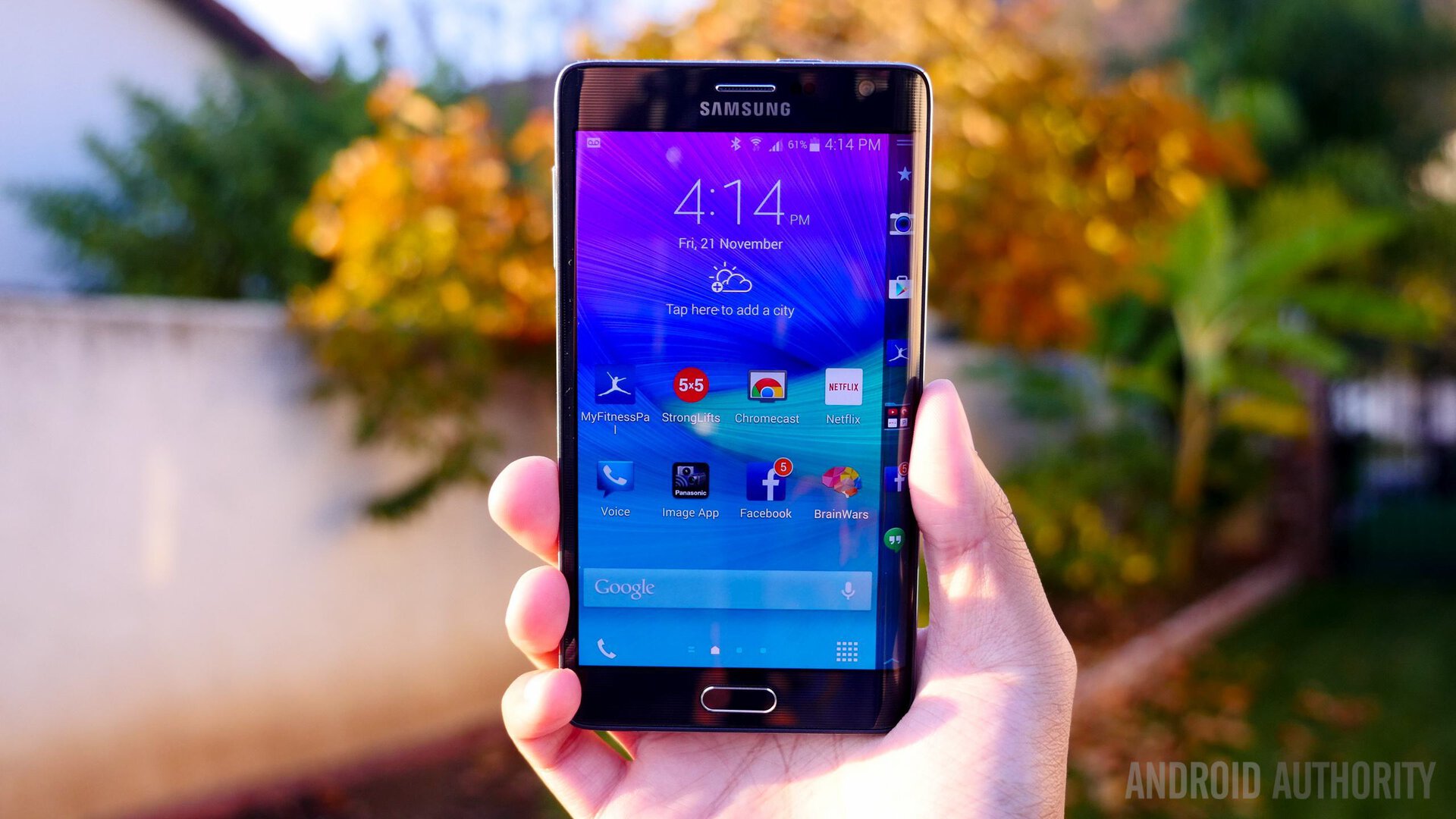
Having posted my initial impressions of the Galaxy Note Edge roughly two months ago now, I thought it might be a good time to post a follow-up, having obviously spent much more time using the phabulous phablet in the interim. I also want to use this as an opportunity to address some of the criticism of the device, which I feel is unfair.
On the Edge of something big
Despite its unconventional design, the extra Edge is actually quite useful, and I can not stress this enough. All of the negative comments I’ve seen across the internet, including many of those posted on our own comprehensive review, seem to question the usefulness of the second screen, a feeling that may begin to dissipate after roughly an hour of use, and should be gone entirely after a few days. The more I used the phone, the more comfortable and logical the Edge display felt, and in turn it was that much harder going back to a traditional phone — as I have to readjust my newly ingrained habits to deal with the lack of an “App Ribbon” on the side.
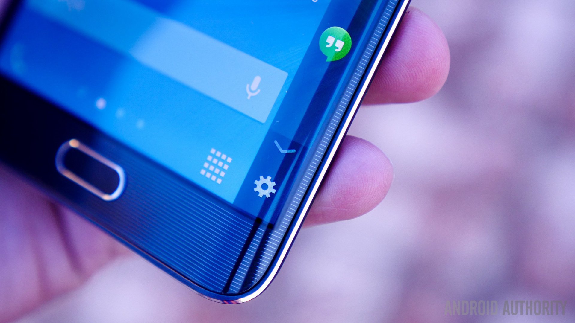
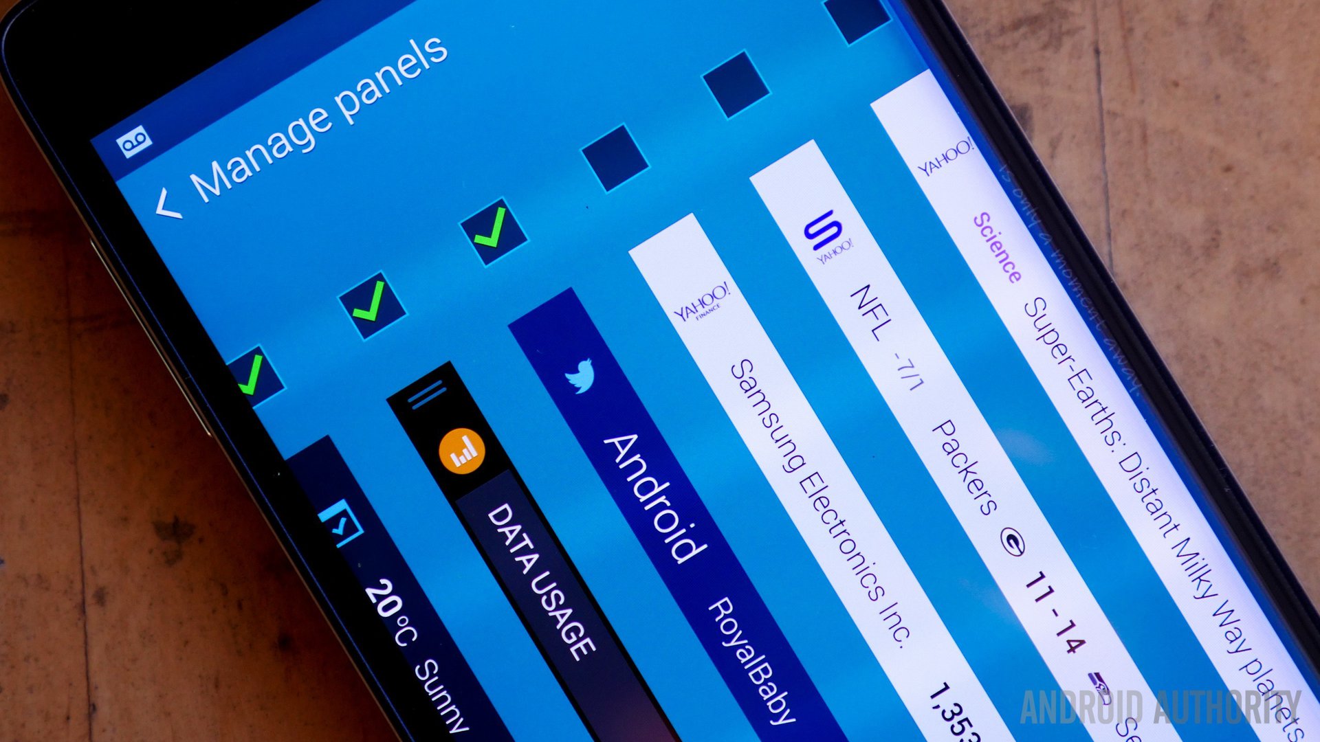
I love the fact that you can have so much accessibility on just one thin strip of space: swipe down from the top and utilities appear. Swipe up from the bottom and the Edge display setting shortcut appears. I love the fact that you can add any app on the phone to the App Ribbon and customize the order as well. It is the logical progression of the Multi-Tasking panel found on the Note 4 and Galaxy S5, but is completely unobtrusive.
As Samsung has mapped all notifications to initially appear along the Edge upon arrival, this has proven to be quite a nice feature as well, as the area is much larger to see, and reduces clutter.
There is also a lot of talk about using the phone for southpaws. I am left-handed, and had no trouble holding or using the device. Given the size, when typing on the device, I hold it with two hands. Even one handed use isn’t a problem, in fact I might argue that it’s actually easier to use for left handed people, at least based on my own habits. I will hold the device in my left hand, and use my left thumb to operate it. The tapered edge of the Edge display actually conforms better to the grip, because the frame is much thinner and therefore easier to wrap your fingertips around. In contrast, I would think right handed people would have more trouble, because if they replicate this grip in their right hand, the Edge display would dig into their palm and presumably cause discomfort.
For what it’s worth, I will be the first person to admit that, as a lefty, my habits don’t seem to conform to those of other lefties, and thus for all I know, I’m “holding it wrong”. It is possible that I opt for two-handed operation when a normal lefty would place the device in their right hand, type with their left, and hence the aforementioned palm-digging dilemma. Still, as far as my use goes, there are no problems at all operating the phone.
I could go on talking about the phone forever, but every other positive aspect is something that holds true of all Note devices, and therefor it’s time to move onto the problematic areas:
Some of the Note Edge’s biggest downsides
The Galaxy Note Edge is by no means a perfect device. While everyone will have their own opinion as to what does, and doesn’t work, there are four main areas that I found particularly troublesome.
1. The Edge Panel: As mentioned in the initial impressions, the sweet strip of space on the side can create some annoyances. There have been more than a few times where it reappeared while typing, covering up the keyboard. Additionally, there were many instances when I specifically set or left the active Edge panel on the App Ribbon, only for it to somehow revert to another panel. This became increasingly annoying as I had to cycle through the displays to find the one I wanted. Given how heavily skinned the Japanese variants are however, I am not unwilling to assume this could be a unique glitch for the models here/on my carrier. Finally, there are often problems with manually selected background images not filling the entire screen width due to the unique size.
2. Battery Life: while the Edge doesn’t need to be charged twice a day, it is a far cry from the LG G Flex, which I had selected as my phone of the year in part because of the battery life. I typically use my phone to send endless amounts of chat based messages and use the Internet. No movies on YouTube, no games. Even so, the thing didn’t last as long as I had hoped. After a month or so, the on-time was much less than in the beginning, to the point where the battery would be dangerously low by the evening. Play this out over half a year or more, and suffice to say I don’t see the situation getting any better. I understand that background processes can drain battery, but again the G Flex managed to last far longer doing far more, without any problems whatsoever. Then again maybe complaining about the battery here isn’t quite fair given the screen resolution and technology involved.
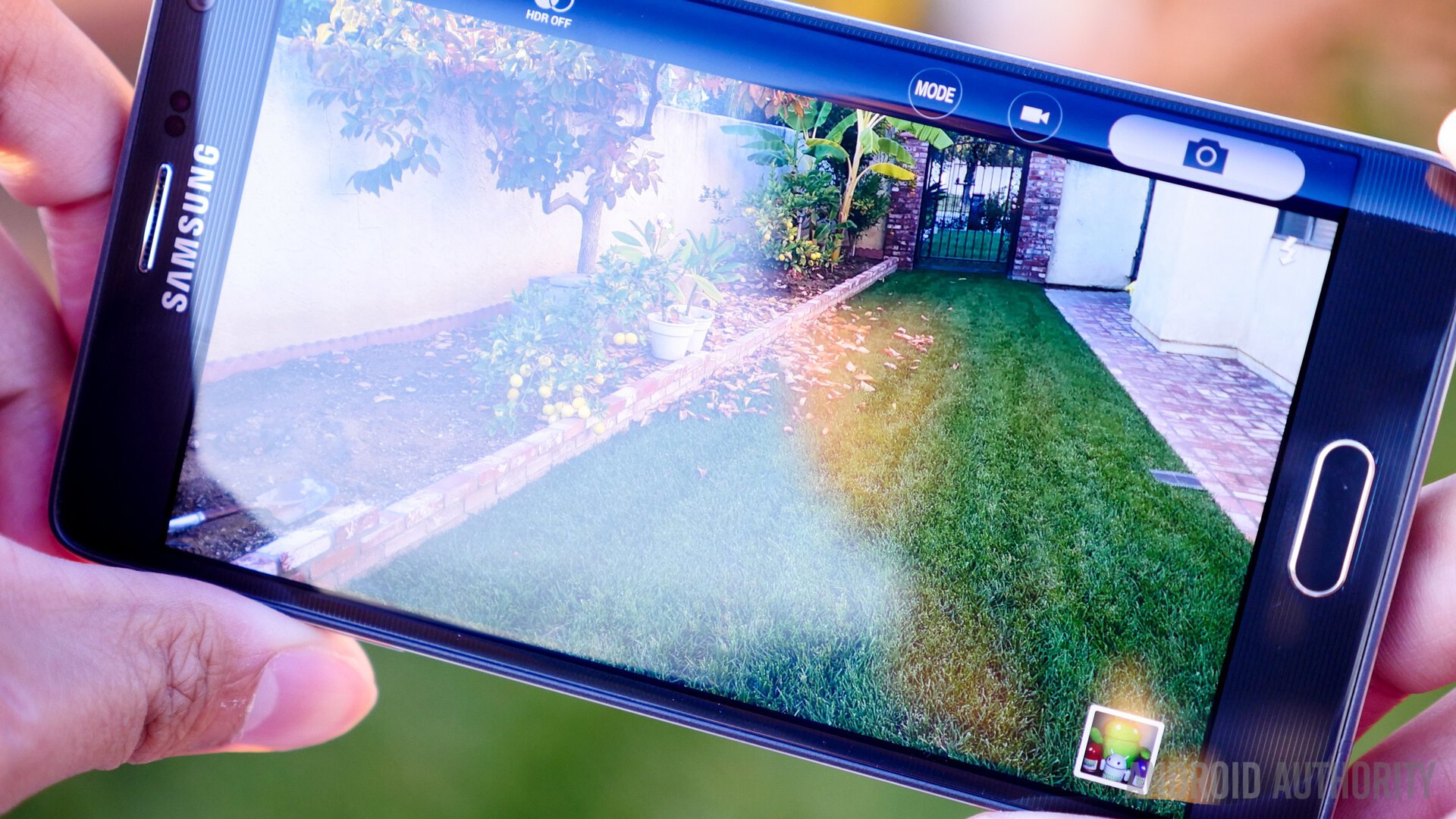
3. The Camera: Rather than say the camera itself, the problem is specifically the way in which Samsung has implemented the capture button. Instead of being located along the bottom of the screen, as is always the case with TouchWiz, it is digitally grafted onto the Edge Display. This makes it incredibly troublesome to take horizontal pictures, as the button is always exactly where your hand isn’t. Depending on the way you hold the device, it’s actually extremely easy to get your finger in the frame just as you attempt to reach for the shutter.
I really cannot stress how bad this is, to the extent where I literally don’t want to use it, at least with the stock camera application. Obviously Samsung had the right idea in trying to reduce the clutter on the main screen, but ultimately it’s a horrible attempt, in my opinion at least. Just looking at the picture above, it’s easy to see how taking a photo would be difficult for those (like myself) who use traditionally use our thumbs to press the virtual shutter.
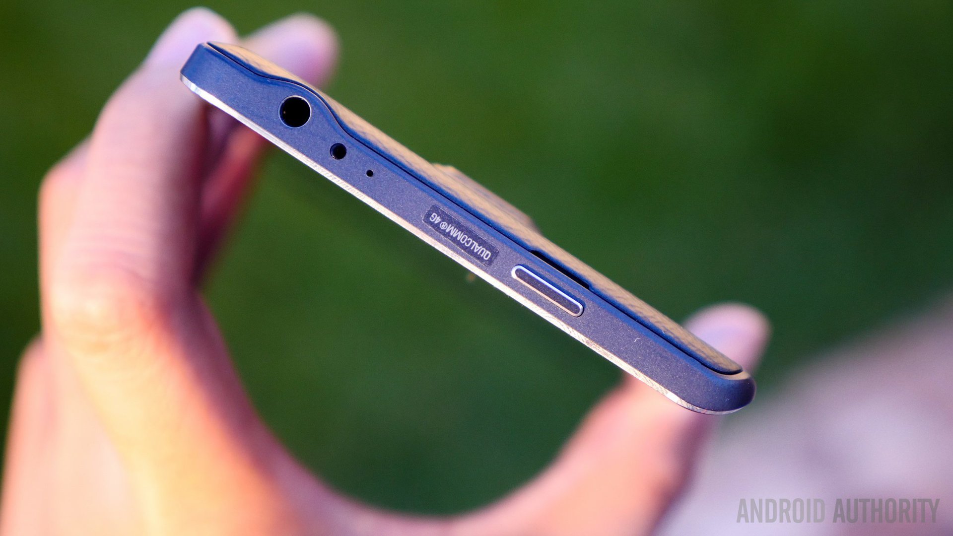
4. The frame: Ironically for all the hate Samsung receives and the positive reaction in finally switching to metal, it’s funny that the frame itself is partially a problem. For all those who love to keep their devices in pristine condition, the chamfered edge of the frame is just made for madness. The first Edge presented at the time of purchase had scratching on the frame, upon which the store employee noticed and ask if he should bring another. The replacement also had a scratch on the frame, though much smaller. Noticing a pattern here (especially after dealing with a Galaxy Alpha that had a damaged frame), it was agreed that the second one was acceptable.
After the first week of use, however, the chamfered edge already had several scratches, some of them quite visible. After a month, more had appeared. It’s worth pointing out that the Flip Case leaves the Edge display exposed, but had I put the thing inside a TPU case, an infinite number of particles would become trapped between the frame and likely would have caused the same kind of damage.
5. The Price: Honestly speaking I don’t see a problem with the price, but then again my purchasing habits aren’t necessarily in-line with the general public, and therefore I recognize there are a large number of people who are put off by the extra money needed to obtain the Edge. Still, breakthroughs come at a high cost, which is largely why they aren’t mass-marketed or commercialized.
Why the Edge is superior to the Note 4
For the life of me, I can’t understand why people like the Galaxy Note 4. It is everything the Galaxy Note Edge is not, which is to say it is ugly, garish, and awkward to hold. I’ve used two now (first White, then Gold) and not even the pallet swap could prove my initial impressions wrong.
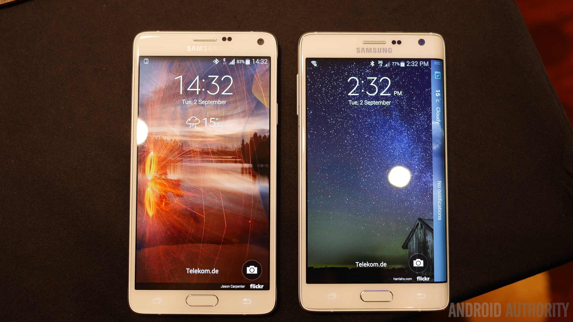
The Note Edge, on the other hand, is slightly smaller, feels lighter (perhaps because it’s wider and thus spread out) and just plain looks better. I can’t stand the metal aspects of the Note 4: everything that worked beautifully on the Alpha simply looks horrible when super-sized. The Edge has much more simplified hardware accents (the volume rocker is, for example, flat) and lacks the tacky striped, dual-silver adorning the frame. The single band of silver and color work much more effectively from at least my visual standpoint.
Looks aside, the key factor is functionality, and that’s where the Edge wins hands down. The Galaxy Note 4 is, to put it one way, little more than a modified Note 3 in a new frame. The Note Edge, however, is not just an evolution of the Note series in and of itself, but actually feels like a leap forward in terms of productivity, handling, and user-interface. I for one, am hoping Samsung opts to make this concept into a full-blown product line in the near future, because quite simply, it would be a downright shame for this concept to be a one-off.
Obviously not everyone s going to agree with my opinion, and not everyone will feel that way about the Note 4. What’s your take? And for those most critical of the Edge, have you actually spent any real time trying it out? Tell us what you think in the comments.