Affiliate links on Android Authority may earn us a commission. Learn more.
Samsung Galaxy S3 vs Sony Xperia V
Published onFebruary 14, 2013
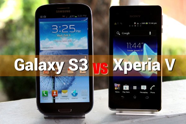
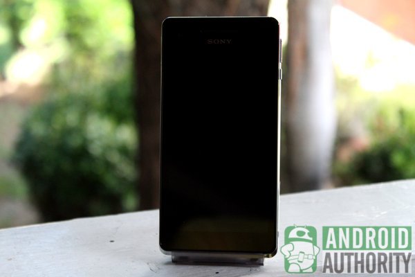
We’ve seen a lot of new letters in the Xperia alphabet lately. We previously reviewed some of them, such as the Sony Xperia J, Xperia T, and the Xperia TX. Recently, the Sony Xperia V LT25i came along to join the group. The Xperia V does more than improve Sony’s alphabet letter count. This exciting edition is Sony’s 4G LTE-capable, dust-proof, and water-resistant phone.
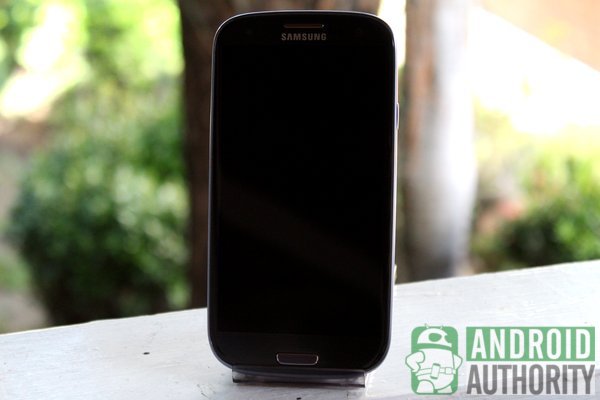
Meanwhile, the Samsung Galaxy S3 GT-I9300 continues to sit in the clouds as one of the most popular Android smartphones, reaching 20 million in global sales just a hundred days after initial release. Its current sales have topped 40 million despite the ongoing patent wars.
Does the Galaxy S3 need to worry about the Xperia V’s appearance into the scene? Is the Sony phone amazing enough — in word and in deed — to cause the Galaxy S3 to squirm in its seat of honor? Let’s find out in this comparison review. You can also skip to our comparison video at the end of this article.
(NOTE: In this comparison, the pebble blue model of the international variant of the Samsung Galaxy S3 GT-I9300 is compared with the Sony Xperia V LT25i.)
Physical Build and Design
Dimensions and Weight
| Galaxy S3 | Xperia V | |
| Length | 136.6 mm (5.38 in) | 129 mm (5.08 in) |
| Width | 70.6 mm (2.78 in) | 65 mm (2.56 in) |
| Thickness | 8.6 mm (0.34 in) | 10.7 mm (0.42 in) |
| Weight | 133 g (4.69 oz) | 120 g (4.23 oz) |
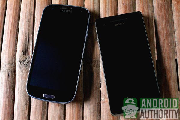
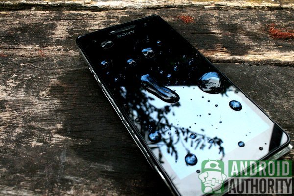
The Galaxy S3 and the Xperia V are portable phones. However, I find the Xperia V more portable because of its smaller design and lighter weight. The Xperia V’s whole screen is more accessible to my thumb than the Galaxy S3’s. In addition, the Xperia V has a sturdier build with an Ingress Protection code of IP55 and IP57, which means that dust can’t easily enter its internal parts. The phone is also resistant to low-pressure water sprays and can survive immersion under 1 meter of fresh water for up to half an hour.
Front
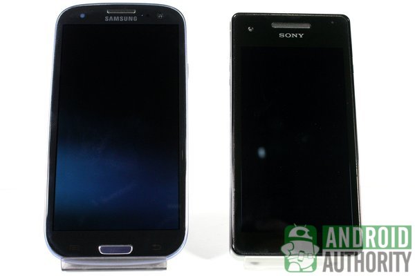
Both phones sport different faces: a polished pebble-like front on the Galaxy S3 and a minimalistic industrial design on the Xperia V.
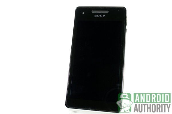
True to its minimalist roots, the Xperia V’s front is all glossy black. Its silver frame protrudes a bit at the bottom side of the phone, giving the Xperia V a narrow chin. There are no physical buttons here; navigation is done through onscreen buttons.
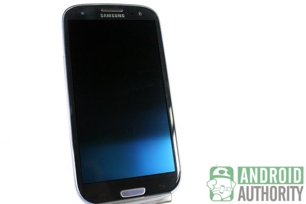
In contrast, the Galaxy S3 has a glossy blue chassis with a brushed metal design. Unlike the Xperia V, this phone uses a physical Home button flanked by the Menu and Back capacitive buttons. The front screen is accented by a blue frame.
All front elements on the Xperia V and Galaxy S3 are found on the top bezel: front camera, earphone piece, logo, light sensors, and notification light.
Sides
The sides of the Galaxy S3 stay consistent with its all-blue design. The sides are protected by a blue plastic frame meeting the phone’s polycarbonate blue-black back cover. The sides are curved and smooth, making the Galaxy S3 comfortable to hold.
In contrast, you’ll find three layers on the Xperia V: a black frame around the touch panel, a silver frame that protects the phone’s body, and the white back cover. I’m not too fond of the silver frame because it lacks a premium feel and the metallic coating looks like something that will peel off in time.
Both phones have the same standard buttons and ports, although these are situated differently on each phone.
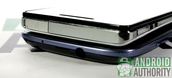
On the top side is the headphone jack.
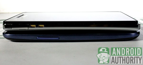
The Galaxy S3 has its Volume keys on the left side. The same side on the Xperia V has its Micro USB port and dock pogo pins.
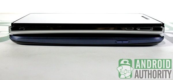
The Power button sits alone on the Galaxy S3’s right side; the Xperia V’s own right side is a bit busier with the Volume keys and the Power button.
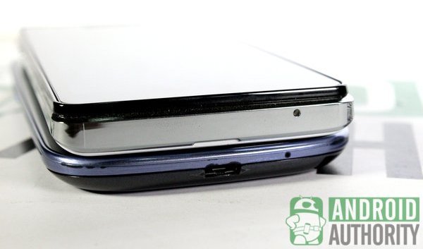
The Galaxy S3’s bottom side has its Micro USB port and microphone hole, while the Xperia V’s own bottom side only has the mic hole.
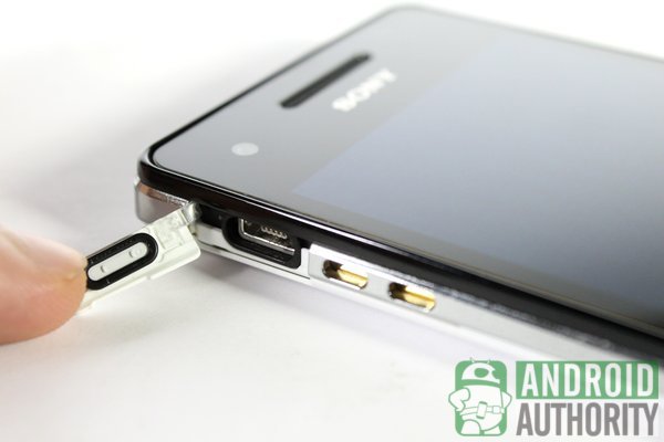
The Xperia V’s ports are covered by a flap, protecting the phone from dust and water. Added protection is a good thing, but you have to pay the price of having to open those flaps before plugging in your Micro USB cable or headphones. And, if those flaps break, you lose the dust and water-resistant protection of your phone. On the Galaxy S3, the ports are readily accessible not only to you but also to dust and liquids.
Back
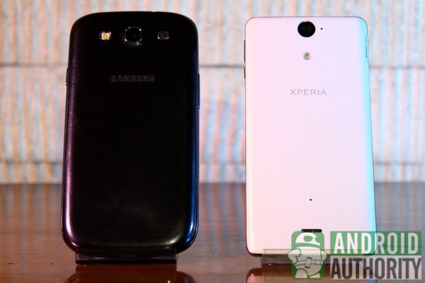
The Galaxy S3 has a polycarbonate blue-black back cover with brushed metal design while the Xperia V has a white pearl-like back. Both covers have one thing in common — they are removable. The batteries on both phones are also removable. This means that you can use third-party back covers and replace the batteries on both phones.

Sony deserves some credit for the Xperia V’s removable back, considering that this is a dust and water-resistant phone. When you remove the back cover, you’ll find rubber edging designed to prevent liquid or dust from reaching the battery, microSD card, and SIM compartments.
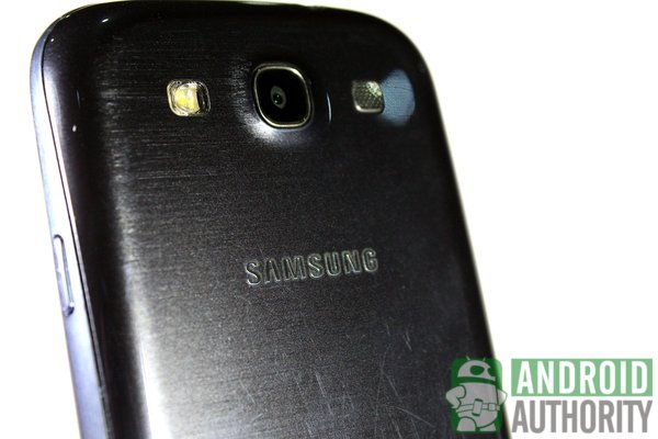
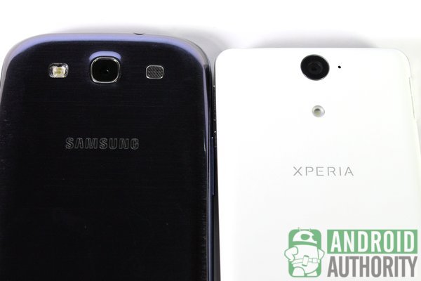
You’ll see the same elements on both phone’s backs, although they are arranged differently. The Galaxy S3 has the camera flash, rear camera, and the speaker grille aligned horizontally on the top portion of its back cover.
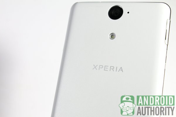
In contrast, all these elements are arranged vertically on the Xperia V. From top to bottom, you can find the rear camera and a small hole for the microphone, the LED flash, the Xperia logo in silver, the tiny hole for the water sensor that Sony uses to measure if the limit for safe operation has been exceeded, and the speaker grille.
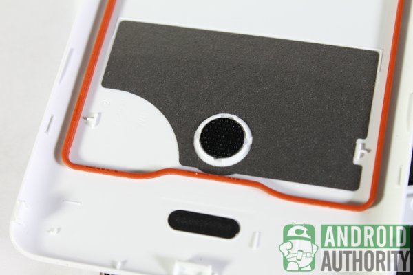
The Xperia V’s back also curves slightly towards the center, which makes the phone feel like it is hugging my hand. The Galaxy S3’s back, in contrast, is flat and smooth.
Screen and Display
- Galaxy S3
- 4.8-inch HD Super AMOLED
- 720×1280 HD resolution
- 306 ppi
- Corning Gorilla Glass 2
- Xperia V
- 4.3-inch TFT LCD
- 720×1280 HD resolution
- 342 ppi
- Scratch-resistant glass
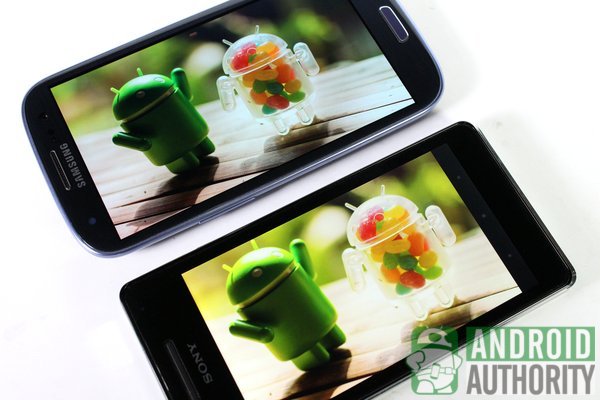
The Galaxy S3’s screen is half an inch wider than the Xperia V’s but both phones have the same screen resolution. The Xperia V, however, has a higher pixel density. On paper, the Xperia V’s display is sharper and more vivid than the Galaxy S3’s, in real life, I could hardly tell which one is sharper.
The HD Super AMOLED screen on the Galaxy S3 produces vibrant and saturated images. Some may find the display too saturated, but I find the Galaxy S3’s screen okay. In contrast, the Xperia V uses a TFT LCD capacitive touchscreen with Sony’s BRAVIA Engine. This screen produces bright and vibrant images, but they were not as saturated as those on the Galaxy S3. You can disable the BRAVIA Engine, but doing so will render subdued and realistic colors.
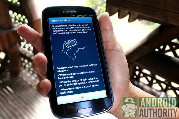
Samsung also squeezed some of its display features into the Galaxy S3. For example, you’ll find Smart Stay, an eye detector that keeps the screen on while you’re looking at your phone. There’s Smart Rotation, which scans your face and adjusts the screen’s orientation accordingly. These features use the Galaxy S3’s front camera and need adequate lighting to function.
Processing Power
| Galaxy S3 | Xperia V | |
| Chipset | Samsung Exynos 4412 | Qualcomm Snapdragon MSM8960 |
| CPU | quad-core 1.4 GHz Cortex-A9 | dual-core 1.5 GHz Krait |
| GPU | Mali-400MP | Adreno 225 |
| RAM | 1 GB | 1 GB |
| Internal Memory | 16, 32, 64 GB | 8 GB |
| External Memory | up to 64 GB | up to 32 GB |
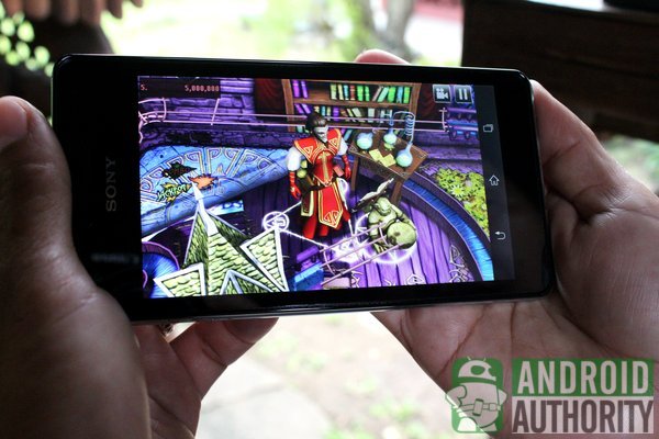
Some people think that quad-core processors are always faster than dual-core processors. One shouldn’t judge a processor by its numbers; optimization should instead be the basis for performance. Even a well-optimized dual-core processor can match a fast quad-core device. One concrete example is the Nexus 10.
A quad-core processor powers the Galaxy S3 and a dual-core processor on the Xperia V. Although both phones differ in the number of cores, the Galaxy S3 and Xperia V performed equally well when we browsed the Web, launched apps, and played HD games. Although I noticed some jitter while scrolling through the Xperia V’s homescreen and App Drawer, it didn’t bother me at all.
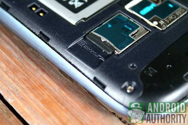
For storage, though, the Xperia V is quite limited with only 8 GB of internal storage, but it does have a slot for a microSD card for up to 32 GB additional space. In contrast, the Galaxy S3 has more storage capacity options and can take up to 64 GB of additional space via microSD expansion.
Benchmarks
We did some standard benchmark tests on both phones and got these results:
| Galaxy S3 | Xperia V | |
| Quadrant | 5461 | 5661 |
| AnTuTu | 15689 | 11075 |
| CF-Bench | 13224 | 9580 |
| Vellamo Mobile Benchmark HTML5 | 1417 | 2047 |
| Vellamo Mobile Benchmark Metal | 557 | 608 |
| Geekbench 2 | 1489 | 1631 |
| Linpack for Android Single Thread (in MFLOPS) | 54.937 | 150.509 |
| Linpack for Android Multi-thread (in MFLOPS) | 460.838 | 286.361 |
| GLBenchmark 2.5 Egypt HD C24Z16 Offscreen (in fps) | 15 | 12 |
| Nenamark 1 (in fps) | 60.0 | 60.1 |
| Nenamark 2 (in fps) | 58.8 | 60.0 |
| An3DBench | 7663 | 7362 |
| SunSpider 0.9.1 JavaScript (in ms; lower is better) | 2036.8 | 1165.6 |
| BrowserMark 2.0 | 1881 | 3092 |
| Google V8 Benchmark Suite | 1744 | 1467 |
The benchmark tests yielded varying results, although the Galaxy S3 bested the Sony phone in most tests. This means that even if the Xperia V has dual-core processing power, it can still outperform the quad-core phone in some areas.
Battery Life
Both phones use a Li-ion battery with different capacities: 2,100 mAh on the Galaxy S3 and a 1,700 mAh battery on the Xperia V. In theory, the Galaxy S3 should last longer than the Xperia V.
I did an informal battery test to compare the battery life. The test involved enabling battery hungry features such as Wi-Fi, Bluetooth, GPS, and maximum screen brightness. I also kept the screen on and turned on all sync options. Then, I played a hi-def YouTube video for an hour and then browsed the Internet for another hour.
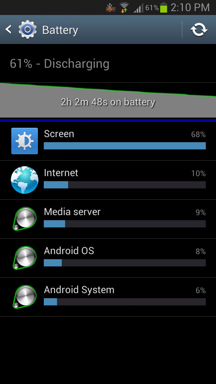
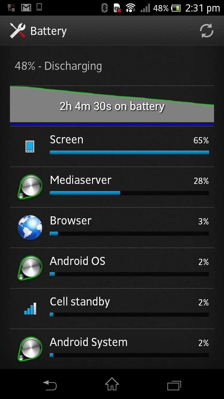
From a full charge, the Galaxy S3’s battery went down to 61% while the Xperia V’s went down to 48%. You can clearly determine which phone would black out if I went with the test for 2 more hours.
Connectivity
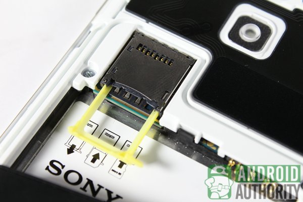
Each phone requires a Micro-SIM card for mobile network connectivity. The SIM trays are underneath the back covers. The Xperia V’s SIM tray, though, is curiously beneath the microSD card slot; you’ll need to pull out the caddy with a fingernail.
Both phones can connect to the Web via 2G, 3G, or Wi-Fi connections. The Xperia V, however, can also connect to 4G LTE, supporting the following LTE bands:
- LTE 850 MHz (B5)
- LTE 1800 MHz (B3)
- LTE 2100 MHz (B1)
- LTE 2600 MHz (B7)
Other variants of the Xperia V support other LTE bands, which means owners of the handset can enjoy flexible 4G LTE compatibility. The international Galaxy S3 doesn’t support 4G connection, however some of its variants do (e.g., the GT-I9305).
The Galaxy S3 and Xperia V have the same connectivity features as those on most high-end smartphones, such as:
- Bluetooth
- Wi-Fi Direct
- NFC
- DLNA
- Syncing screen to an HDTV
- Standard Micro USB port for transferring files
Camera
Both phones’ Camera apps are flexible and easy to use. I particularly like how these Camera apps let you scale down images or videos to be captured. Both Camera apps have essential features for photoholics such as:
- 5 white balance presets
- Selection of photo effects
- Different ISO values
- Exposure values
- Geotagging
- Image stabilization
In addition to those essential features, each Camera app has unique features to make it better than the other. On the Galaxy S3, for example, you’ll find these:
- Burst Shot — captures multiple pictures with one tap of the Shutter button
- Best Photo — selects the perfect photo from a series of Burst Shot images
- Best Face — lets you select a set of pre-captured images
- Share Shot — shoot images and share them instantly via Wi-Fi Direct
- Voice enabled controls — control the camera using your voice
Meanwhile, the Xperia V has the following camera features:
- Quick launch — set a predefined action when launching the camera from the lockscreen
- Focus mode — select a method on how to focus when taking pictures
- Smile Shutter — smile to activate shutter; choose between small, average, or big smiles
The Galaxy S3 has an 8-megapixel camera with a CMOS sensor. The Xperia V, in contrast, has a 13-megapixel camera, coupled with a Sony Exmor-R sensor. But, then again, higher-megapixel cameras don’t necessarily produce better images. Megapixels never indicate photo quality. Rather, image quality highly depends on the camera’s sensors.
Let’s compare some photos captured by the Galaxy S3 and the Xperia V.
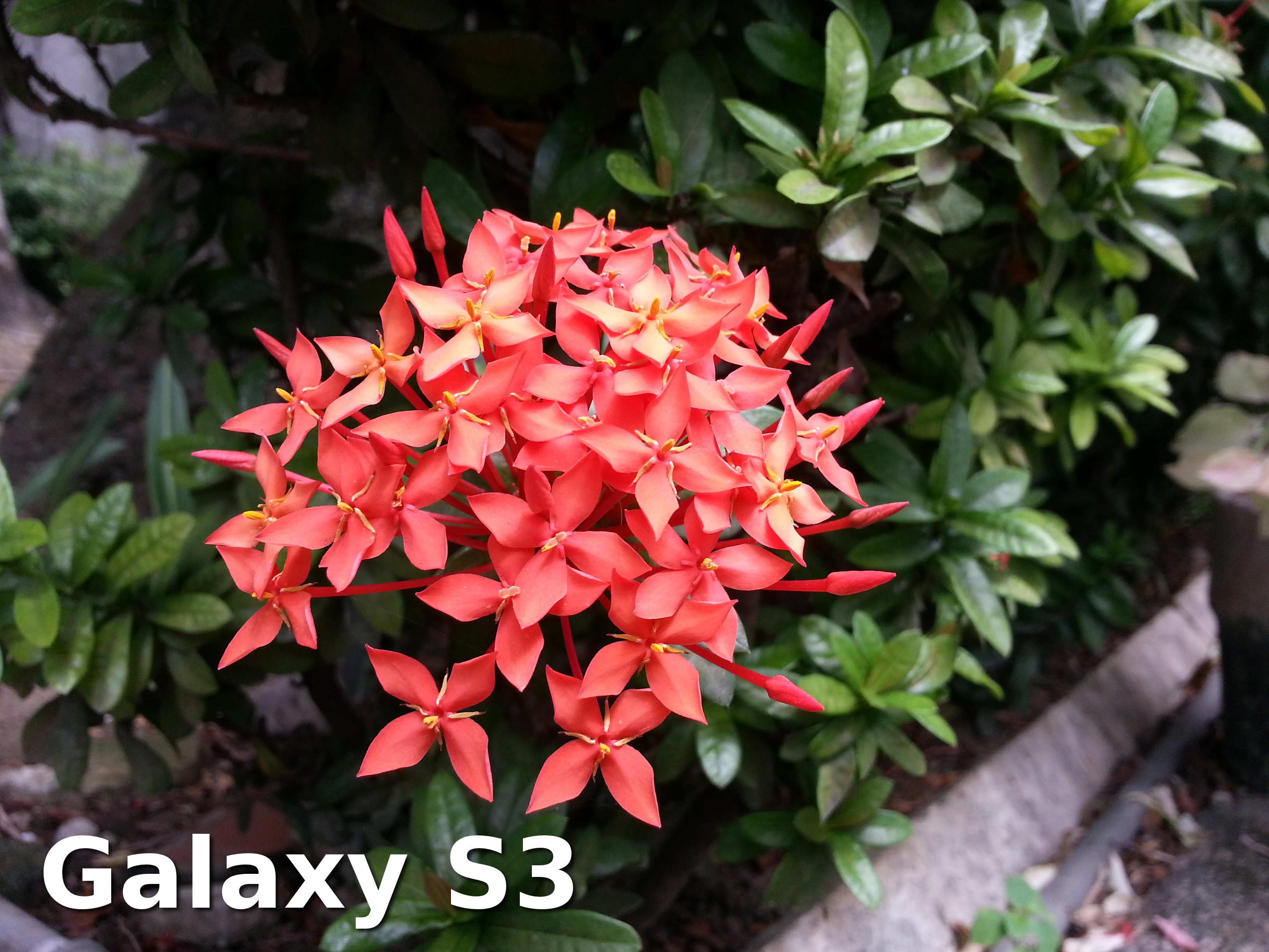
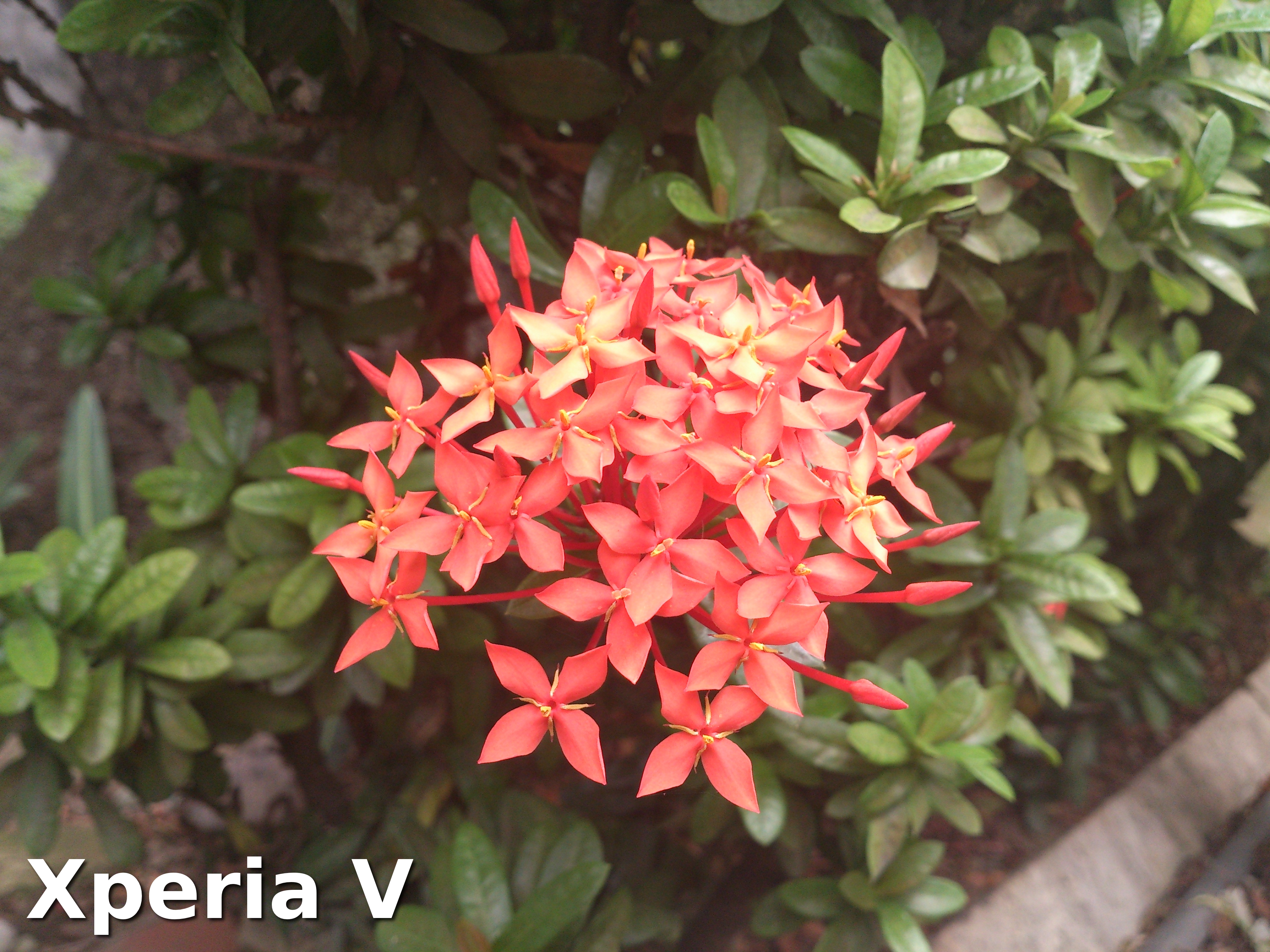
In the shots above, I prefer the image from the Galaxy S3. The image is sharper and more vibrant than the image captured by the Xperia V.
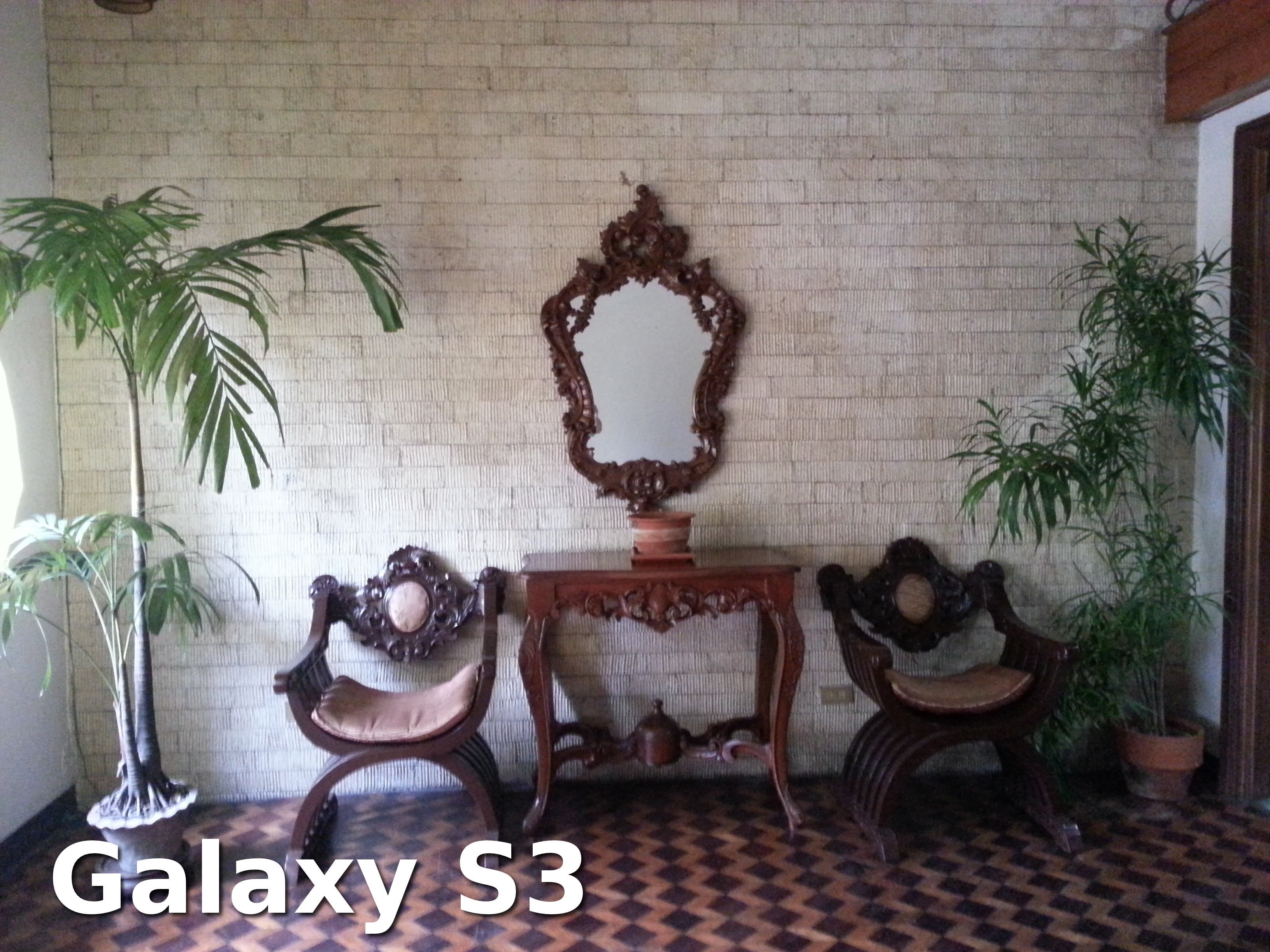
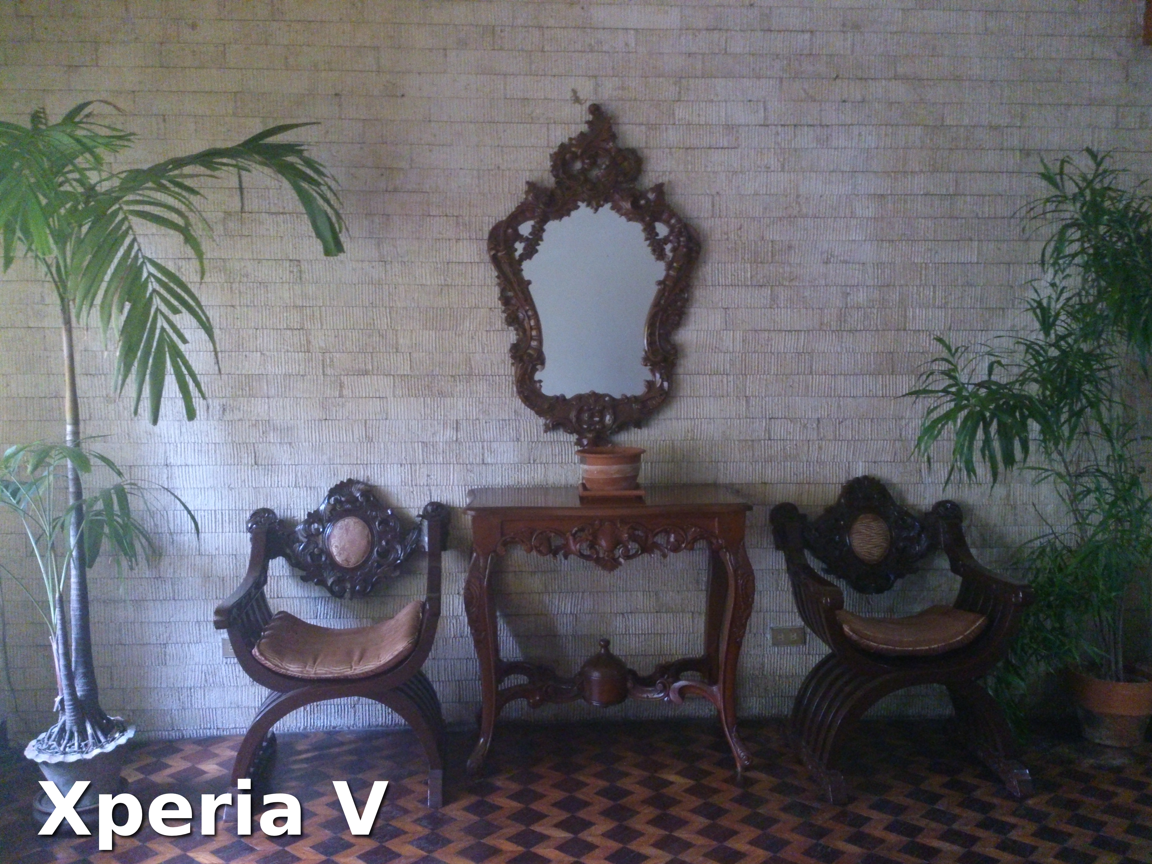
For indoor shots like those above, the Xperia V’s photo’s colors were more subdued than the Galaxy S3’s image.
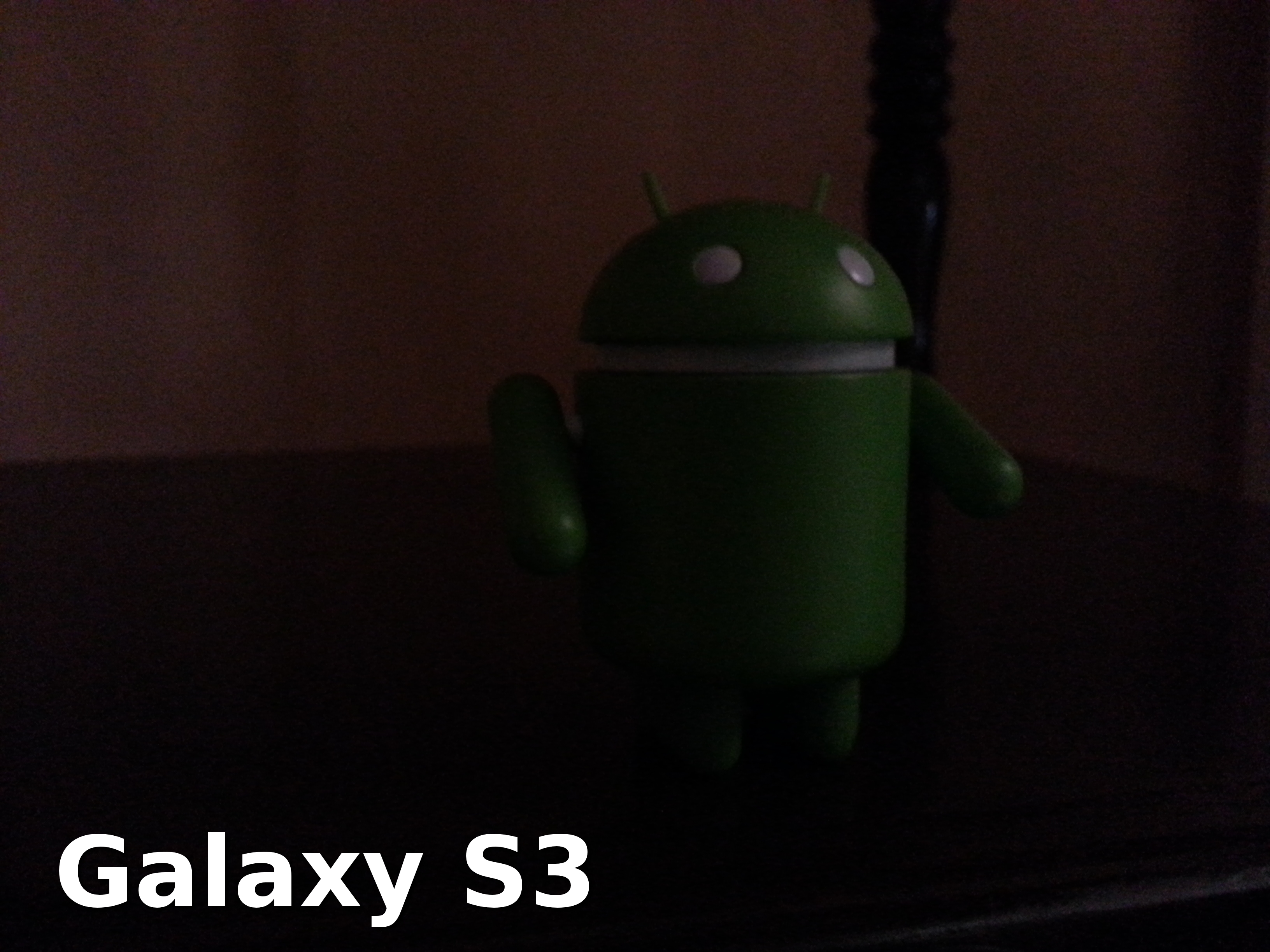
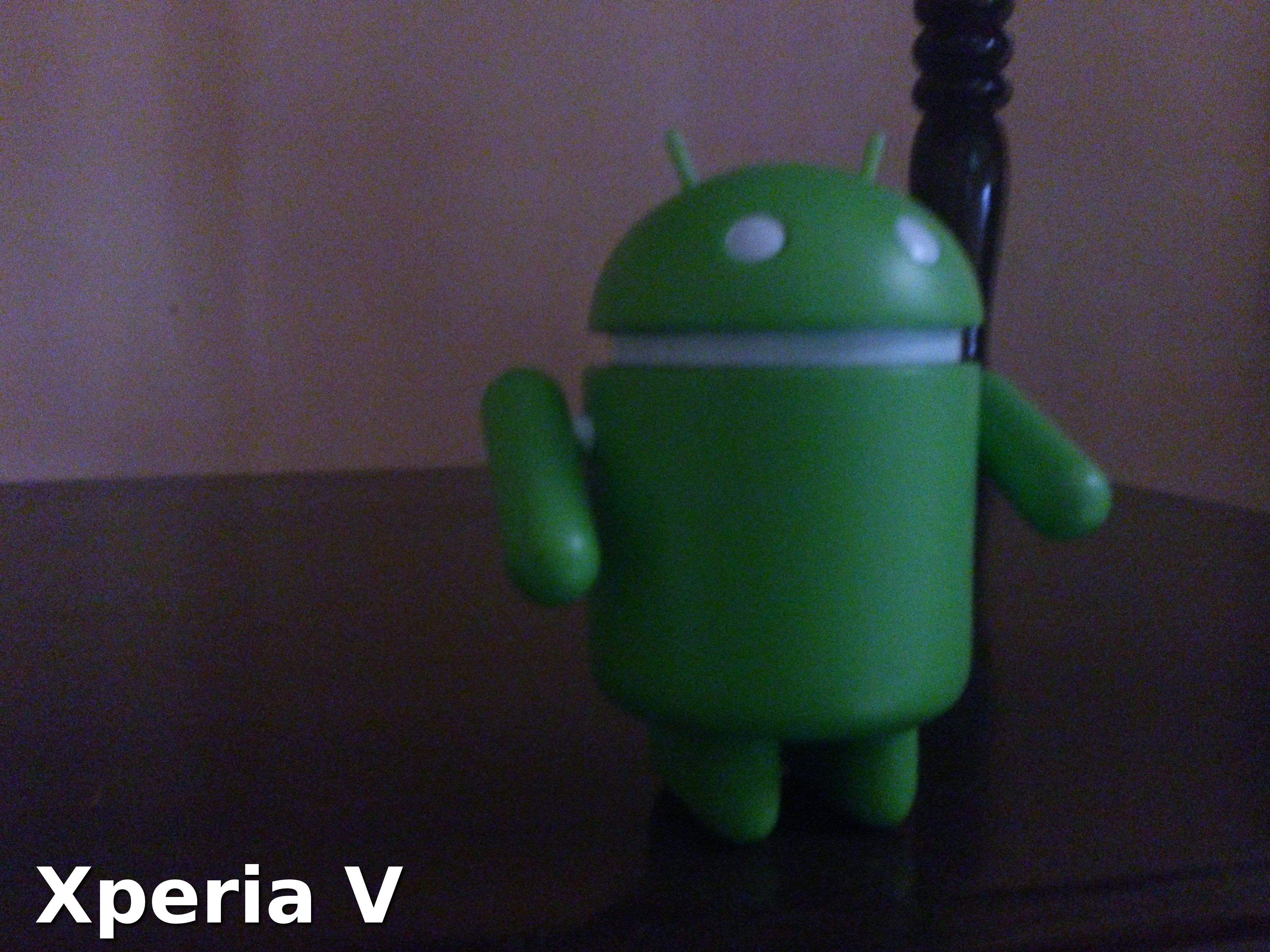
In low-light settings, the Xperia V produced a brighter yet noisier image.
Camera performance on both phones were actually fast in bright settings. In low-light conditions, though, it took time for both cameras to focus and capture an image.
For video chatting and vanity shots, the Galaxy S3 has a 1.9-megapixel front camera while the Xperia V has a VGA front camera. Let’s see how these two front cameras fared.
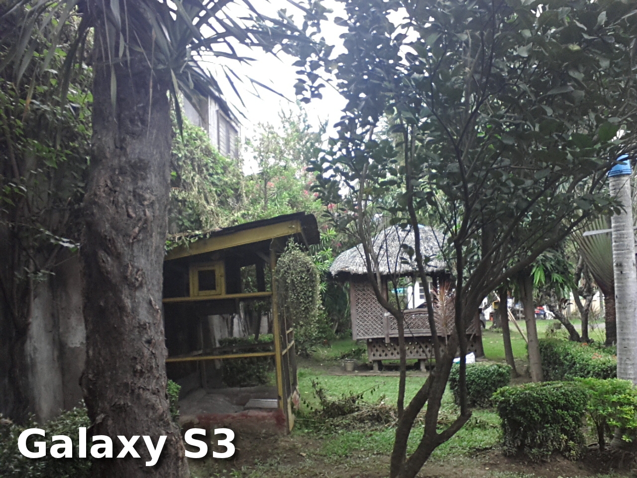
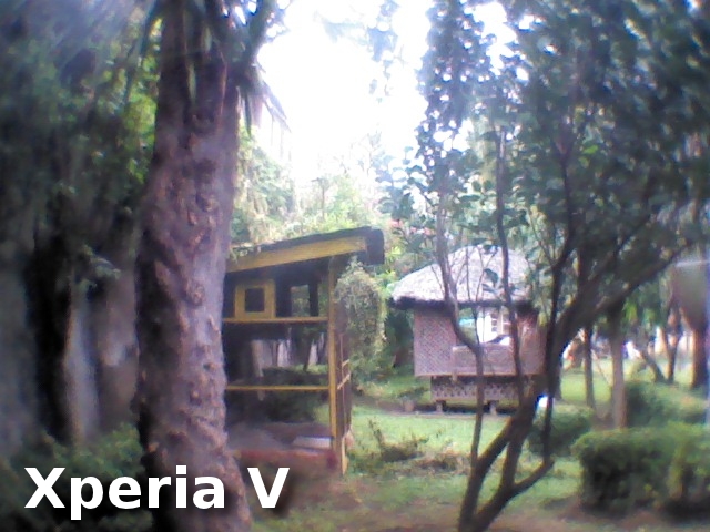
The Galaxy S3 produced an acceptable image while the Xperia V’s was a bit blurry and fuzzy, and the colors weren’t accurate.
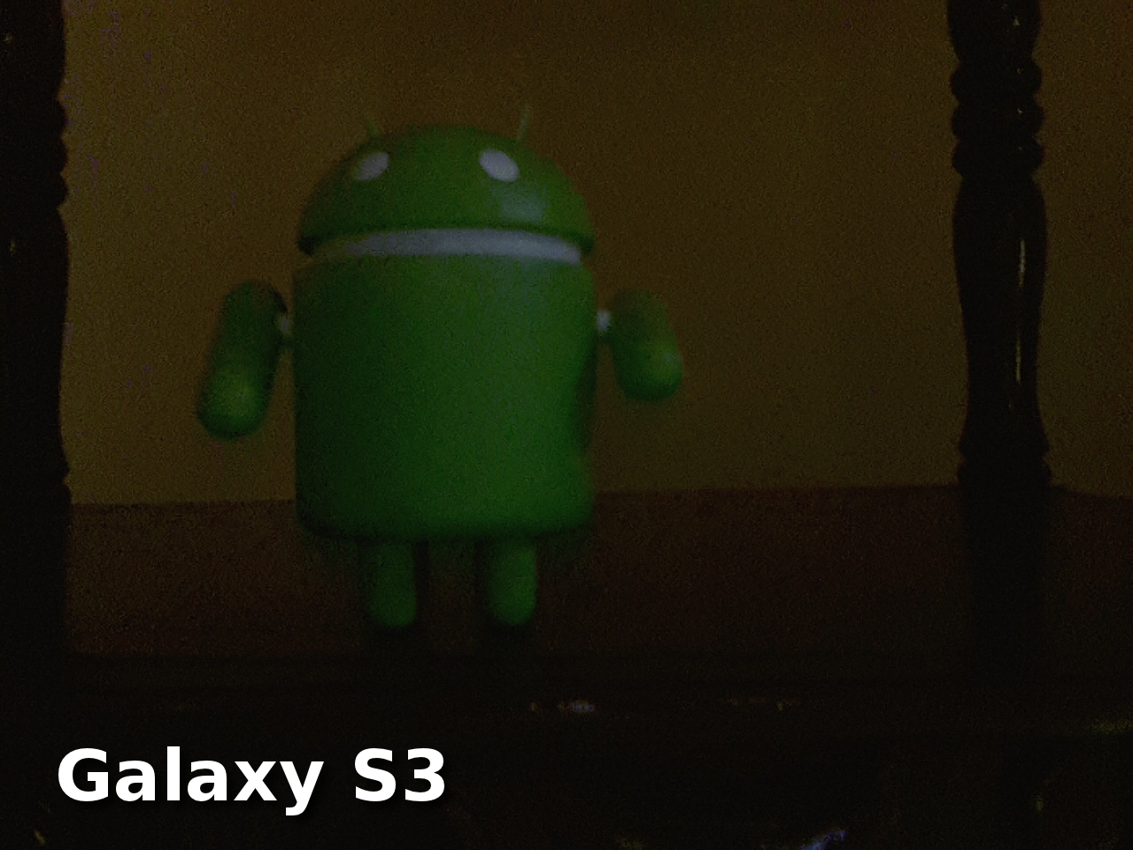
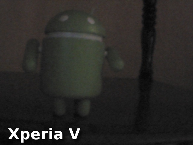
In low-light settings, the Galaxy S3 still produced an acceptable shot while the Xperia V’s own shot was very subdued and noisy.
Both phones can record 1080p Full HD videos. The Xperia V’s autofocus, however, is rather slow. The Xperia’s camcorder produced blurry videos when I moved from one spot to another.
Media Playback

You can watch videos through the Galaxy S3’s Video Player app and the Xperia V’s Movies app. Both video players are simple and can play 1080p Full HD videos without breaking a sweat. I also like the unique interface of both video player apps.
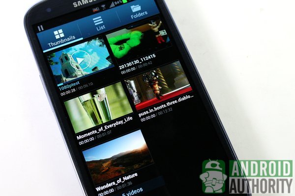
The Video Player app on the Galaxy S3 displays video thumbnails on a grid. The thumbnails are not static; they play previews of the videos. The Galaxy S3’s video player also allows you to take snapshots of the video you’re watching or, with the help of the Pop-up Play feature, to multitask while watching your video.
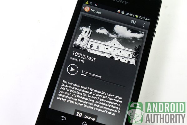
Meanwhile, the Movies app on the Xperia V displays a preview of the video that you last watched, as well as the time remaining. Viewing a video will display an image thumbnail and a brief description about the video (if available) from Gracenote. It actually feels like I’m in the cinema when watching videos through this app.
You can also find simple video players in each phone’s photo album/gallery app.
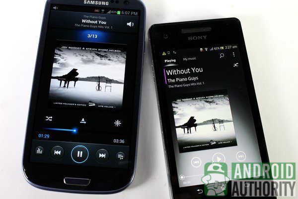
For music playback, the Galaxy S3 comes with the Music Player app while the Xperia V has the WALKMAN app. Both apps group your music according to songs, playlist, artist, albums, and more. They both have 5-band equalizers and equalizer presets to refine audio quality.
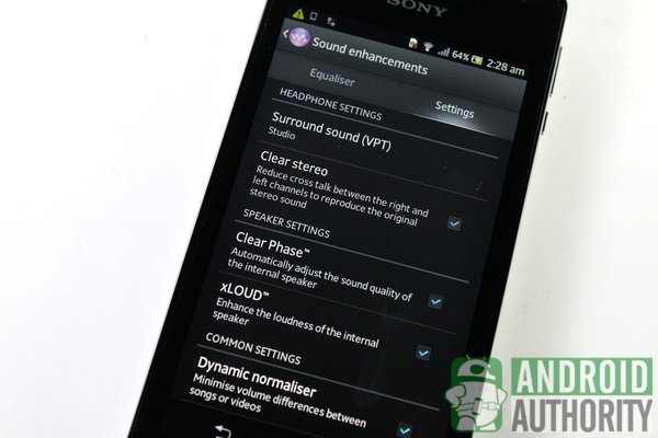
The Xperia V, however, has even more features that enhance your music experience:
- ClearAudio+ — instantly enhances your music
- Surround sound (VPT) — uses surround sound types for listening via headphones
- Clear stereo — reduces crosstalk between headphone channels to reproduce original stereo sounds
- Clear Phase — adjusts sound quality of internal speaker
- xLOUD — increases sound intensity from loudspeaker
- Dynamic normaliser — uniforms volume levels between songs or videos
- Visualizer — displays a visual visualizer on the screen
The sound quality of both phones’ loudspeakers is good. The Xperia V’s sound output, however, is louder compared to the Galaxy S3’s, but distortion was also more evident. I recommend using headphones for listening to music on both phones.
Software
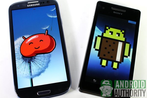
When it was first released, the Galaxy S3 ran on Android 4.0 Ice Cream Sandwich. It then received its Android 4.1.2 Jelly Bean update that brought additional goodies.
Meanwhile, the Xperia V is still running Android 4.0.4 Ice Cream Sandwich, but Sony is currently pushing the Android 4.1.2 update for this phone in select countries. Each phone runs on Android, with its respective custom OEM skin giving it a unique look, as well as a set of unique features: the Touchwiz Nature UX on the Galaxy S3 and Timescape UI on the Xperia V. Let’s take a glimpse at the look and feel of both phones’ interfaces.
Lockscreen
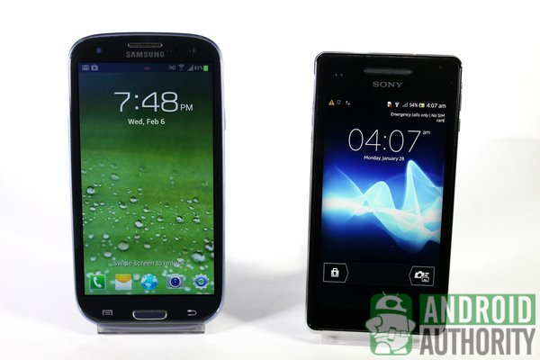
Right from the Galaxy S3’s lockscreen, you instantly get a taste of the nature-inspired TouchWiz UI. Tapping the lockscreen shows you ripple effects. To unlock the phone, just swipe anywhere. For easy access, you can place several app shortcuts here and you can launch the app by dragging its shortcut across the screen. The notification menu can be accessed even when the phone is locked.
The Xperia V’s lockscreen is a lot simpler. You get a slider with buttons for unlocking the phone and for Quick Launch. Just drag the lock icon towards the unlock icon to unlock the phone. Drag the Quick launch icon to the opposite side of the slider to perform the predefined Quick Launch Camera action. You can also swipe the Digital Clock widget leftwards to reveal the music player on the lockscreen. The notification menu is inaccessible from the lockscreen.
Homescreen
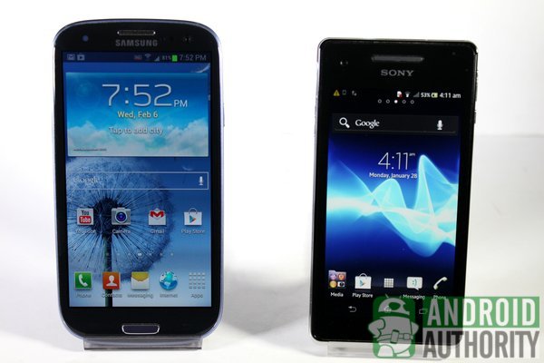
On the homescreens of both phones, you can group your favorite contacts, place widgets, or decorate the screen with the background of your choice. Homescreen layout is similar on both phones: status bar at the top edge of the screen and App Dock bar below.
The App Dock contains 4 app shortcuts and one button for the App Drawer. The location of the App Drawer button, however, differs on both phones: it’s in the middle of the Xperia V’s App Dock while the Galaxy S3 has it on the rightmost side.
The Xperia V gives you only 5 homescreen pages to play with, but the Galaxy S3 gives you two more (for a total of 7). You also get a cool flipping animation when you navigate through the Galaxy S3’s homescreens.
Multitasking
Android is quite flexible at multitasking, and custom OEM skins often add to the basic functions that barebones Android provides.
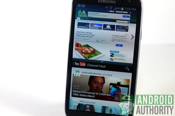
On the Galaxy S3, you have the following:
- Recent Apps menu — long tap Home button to open menu; swipe left/right to remove apps or tap to switch between apps; contains toggle buttons for task manager, Google Now, and delete all recent apps
- Multi Window — open two apps simultaneously by splitting the screen; long tap Back key to open Multi Window bar
- Pop-up Play — plays and overlays video on a floating mini video player
- Page buddy — a special home screen page appears when connecting earphones, while docked, or when the phone is set to roaming
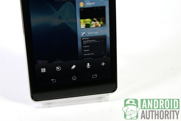
Meanwhile, the Xperia V has the following:
- Recent Apps menu — tap Recent App virtual button to open menu; swipe left/right to remove apps or tap to switch between apps
- Small Apps — overlays a small app or widgets on the screen; calculator, timer, note, and voice recorder small apps installed by default
- Smart Connect — instantly performs predefined actions when connecting earphones or charging the phone
Notifications
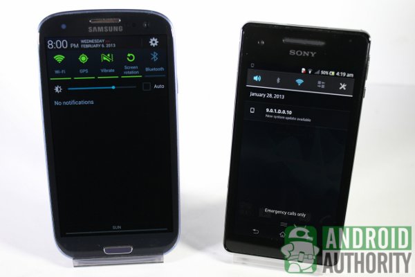
The Notification Shade is a common heritage on every Android phone, but it can vary in design and in how notifications are managed.
The Galaxy S3 has taken on the style of the Jelly Bean Notification Shade with some TouchWiz UI modifications. This notification menu has toggle buttons for most accessed Settings options. You can change the order and choices of toggle buttons on the Settings menu. A brightness slider is also present here. Notifications are grouped according to app. You can expand a notification to view more details by swiping the notification downwards with two fingers; swipe upwards to collapse. Some notifications are actionable, allowing you to perform actions right on the menu. To remove notifications, either swipe left or right or tap the Clear button to remove all notifications.
Things are much simpler on the Xperia V. The Notification Shade has toggle buttons for sounds, Bluetooth, Wi-Fi, mobile data connection, and a shortcut for the Settings menu. You cannot change or add toggle buttons. Notifications are also grouped according to app, but you cannot expand or collapse notifications. Notifications are also not actionable. Gestures for dismissing notifications are similar to those for the Galaxy S3.
App Drawer
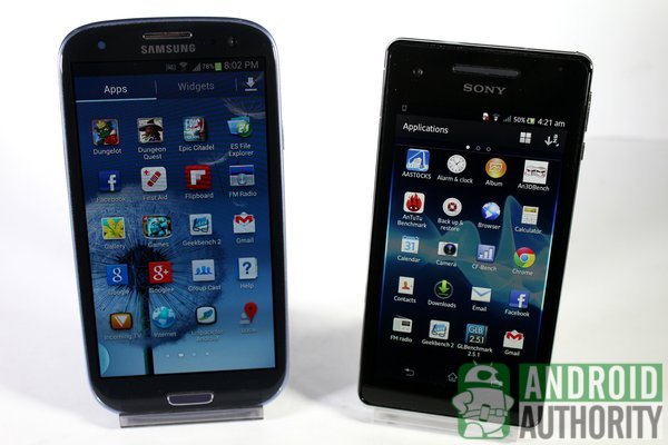
Your apps in the Galaxy S3 and Xperia V are stored inside the App Drawer. By default, your apps are arranged on a 5×4 grid. You can also customize the look and arrangement of apps in the App Drawer.
The only major difference between the two App Drawers is that the Xperia V doesn’t have a dedicated tab for Widgets inside the App Drawer. You also cannot hide apps or display downloaded apps; the Galaxy S3 is capable of those.
Widgets
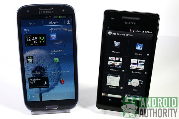
On the Galaxy S3, you can find widgets inside the App Drawer. Hold down on a widget and drop it on any empty spot on the homescreen.
On the Xperia V, there is no Widgets tab inside the App drawer. Instead, access the list of widgets by tapping on an empty spot on the homescreen and then tapping the plus button at the upper-right corner. You’ll be shown a list of widgets and app shortcuts.
Personalization
Both the Galaxy S3 and Xperia V inherit the personalization features of stock Android, plus a few extras thrown in.
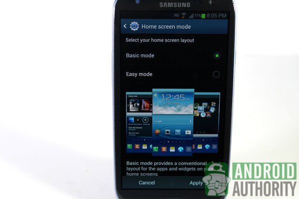
The Galaxy S3 has the following features:
- Two homescreen modes
- Changing the font style
- 4 screen modes
- Motion gestures
- Changing or rearranging toggle buttons on the Notification Shade
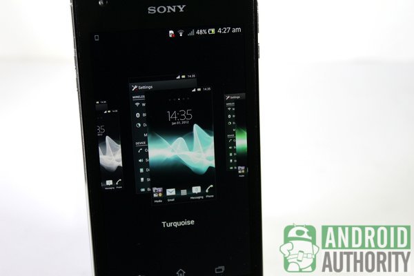
Meanwhile, the Xperia V has the following:
- Applying themes
- Customizing keyboard layout and adding additional keys
- Enhancing photos and videos with Mobile BRAVIA Engine 2
- Changing keyboard layout and skins
Keyboard
Both keyboards have the essential core features such as multilingual support, word prediction, auto correction, voice-to-text, and gesture typing.
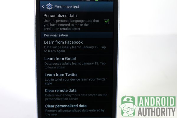
Although having similar features, the Galaxy S3’s keyboard is definitely smarter than the Xperia V’s because of advanced Text Prediction. This feature studies the way you type. You can even log-in to your Facebook, Twitter, and Gmail accounts and let the app study your word use. With smarter prediction, tap- or swipe-typing becomes quicker on the Galaxy S3.
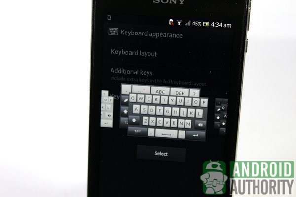
Meanwhile, the Xperia’s keyboard focuses more on style and suiting the taste of the user. The keyboard has the Personalization wizard that helps you through a series of steps for customizing the keyboard. You can set which buttons to add on the keyboard, select a keyboard layout, and select keyboard skins.
Search
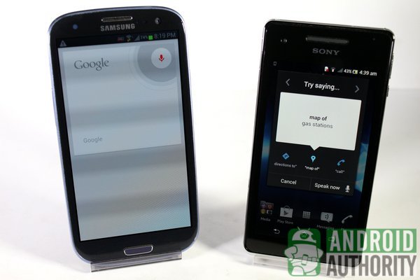
Since the Galaxy S3 runs Jelly Bean, this phone uses Google Now as its default search app. This search app is now smarter because it automatically flashes reminders or alerts. Results are displayed on flashcards. You can also use Google’s voice search to search for terms, launch an app, call a contact, set reminders, and more. You also get a voice-activated assistant called S Voice.
Meanwhile, the Xperia V uses Google Search as its default search app but it’s not as smart as Google Now. You can also use voice commands such as that for getting directions, calling contacts, and doing a web search. The Xperia V doesn’t have a voice-activated assistant.
Security
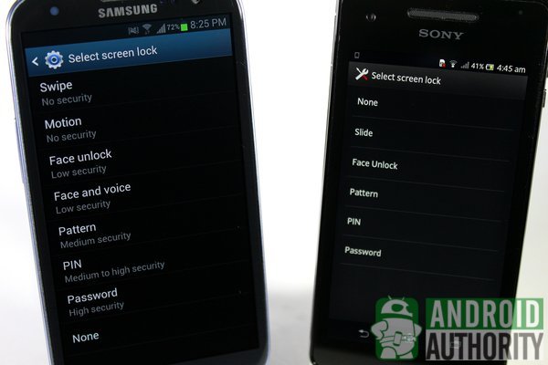
The Galaxy S3 and the Xperia V have inherited the same security features of Android 4.0 Ice Cream Sandwich. Samsung, however, has added a few more security measures of its own, such as:
- Motion unlock
- Face and Voice unlock
- remote controls via SamsungDive
Updating Process
Updating the Galaxy S3 can be done in two ways: via Samsung Kies or over-the-air. I updated my Galaxy S3 from Android 4.0 Ice Cream Sandwich to Android 4.1 Jelly Bean easily over-the air.
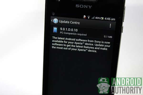
Meanwhile, the Xperia V prompts you when an update becomes available, but to be able to install system updates, you need to connect the phone to a computer on which the Windows-exclusive PC Companion software must be installed. And, I find this rather frustrating, especially since I use a Linux machine for work.
Pricing and Availability
The Samsung Galaxy S3 comes in 16-, 32-, and 64-gigabyte models variants in select countries for about US$550, US$680, and US$800 respectively. Meanwhile, the Xperia V is available through some mobile carriers at an estimated price range of about US$500 to US$600.
Video Review
Check out our comparison video for the Galaxy S3 and Xperia V.
Conclusion
Both the Samsung Galaxy S3 and Xperia V are excellent and well-crafted phones. Both have distinct designs that can certainly compete with the hottest smartphones on the market. I was impressed by the hardware and performance on both phones. Each phone, however, has unique features that are worth pointing out.
With media consumption in mind, I like the Xperia V for its WALKMAN and Movies app. The music player contains tons of features that let me tune and personalize my phone according to my music taste and preference. I particularly like the cinema-like theme on its video player. More importantly, you get 4G LTE capability, plus protection from dust and water, all in a small and portable phone.
Owing to its quad-core processor, the Galaxy S3 is perfect for multitasking. This beast is perfect for power users and mobile gamers. It is also ideal for those who frequently need multitasking features. I also like the smoothness and features of Jelly Bean, plus the convenience of Google Now and the voice assistant S Voice.
At the end of the day, you will need to choose which phone provides the best balance of performance and features suited to your intended use for it. Which phone is best for you? Is it the popular and powerful Samsung Galaxy S3 GT-I9300? Or the water-resistant and LTE-capable Xperia V LT25i? Tell us by voting in the polls and leaving a comment below.
(with contributions from Elmer Montejo and Carl Parker)
[poll id=”211″]