Affiliate links on Android Authority may earn us a commission. Learn more.
Galaxy S8 features unique home button and customizable navigation bar
Published onMarch 29, 2017

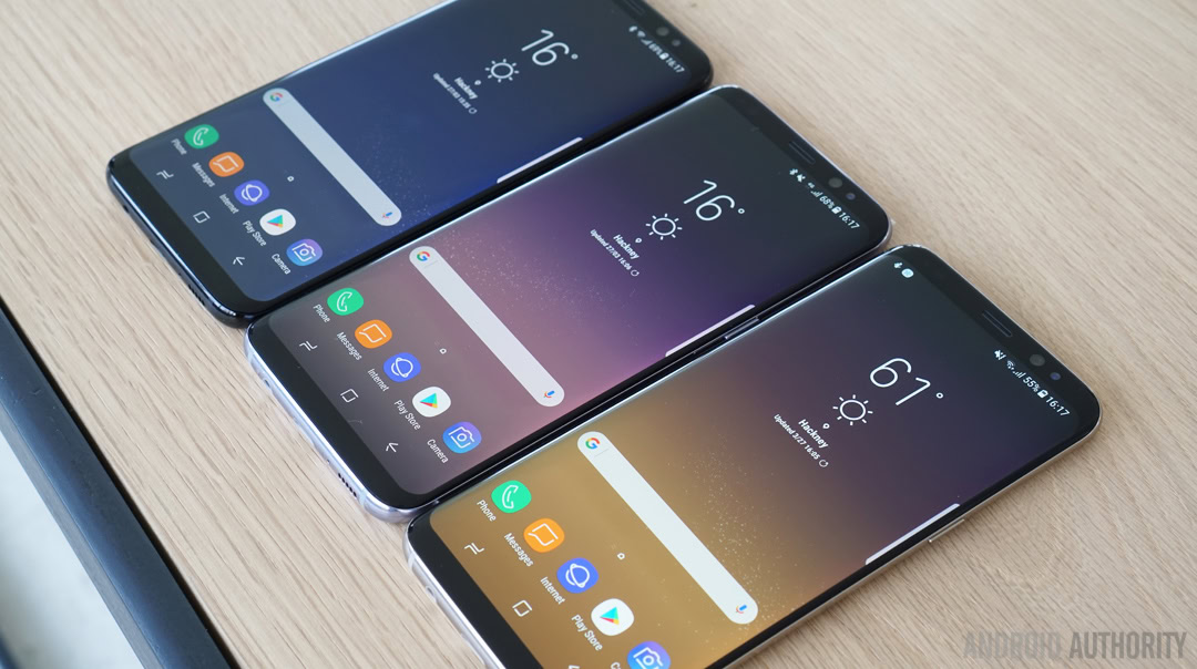
The all-new Galaxy S8 and Galaxy S8 Plus have a pressure-sensitive always-on home button as well as a customizable navigation bar.

One of the biggest changes that’s coming with the Galaxy S8 and Galaxy S8 Plus is the absence of a physical home button. It’s long been a trademark for Samsung, an iconic component of the Galaxy S series. However, in order to make room for the gargantuan Infinity Display, Samsung apparently decided to kill off the physical home button entirely this year. Well, kind of.
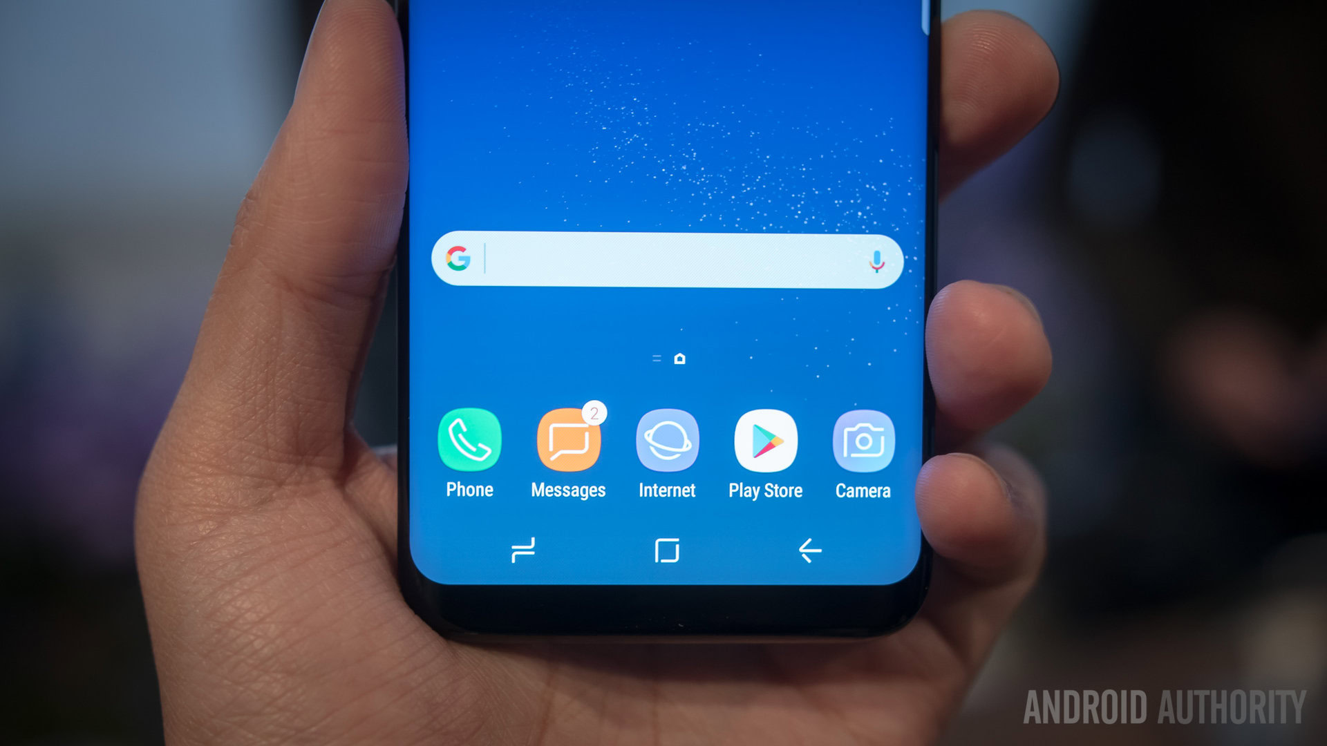
As briefly mentioned in the official unveiling, the Galaxy S8 and Galaxy S8 Plus will have a pressure-sensitive home button. Indeed, the idea is similar to Apple’s 3D Touch or Force Touch except it’s contained to one specific area of the phone: the home button. And this home button is active at all times. Whether the screen is on or off, whether the home key is visible or invisible, as long as the device is powered on, you can always hard-press the home button area to wake up the phone, return to the home-screen, etc.
Whether the screen is on or off, whether the home key is visible or invisible, as long as the device is powered on, you can always hard-press the home button area to wake up the phone, return to the home-screen, etc.
Although I imagine some might be sad to see the physical home button gone – and its convenience – Samsung’s unique approach could alleviate some of that transition pain. While Samsung does not officially offer a double-tap-to-wake feature, you could still hard-press that part of the screen to access your phone even when your phone is lying flat on a table. The key is also somewhat customizable: in Settings, you can even set the amount of pressure needed for the hard-press.
Speaking of customization, it turns out the navigation bar and the keys inside it can also be altered slightly. Found under the same settings menu, you can change the color of the on-screen navigation bar, and you can even rearrange the keys so that instead of the usual Samsung Recents-Home-Back layout, you can have Google’s Back-Home-Recents layout. I’m personally used to the former, having spent my life using Samsung phones, but if you’re coming from a device with a more stock Android layout, then this could be extremely useful in your transitioning.
You can even rearrange the keys so that instead of the usual Samsung Recents-Home-Back layout, you can have Google’s Back-Home-Recents layout.
At any rate, with the new bezel-less design trend, it seems even Samsung is starting to move on from physical buttons. Though some convenience may have to be sacrificed as a result, the move does allow for a more elegant and subdued look.
What are your thoughts on Samsung’s decision to remove a physical home button? Sad to see it go or happy it’s finally gone? Let us know!