Affiliate links on Android Authority may earn us a commission. Learn more.
The importance of gamma
Published onNovember 29, 2017

Gamma is probably the worst-understood specification in displays and imaging. Most people have heard of it, at least in the context of something called “gamma correction.” But what that actually is and why it’s a good thing are pretty hazy.
Gamma is an important factor in getting displayed images to “look right,” and has a major effect on color accuracy and determining the number of bits per pixel needed to make images look smooth and natural. It’s a big deal and certainly worth spending some time on.
Gamma
Simply put, gamma (technically: “tone response”) has to do with how a given display device translates input signal levels into the intensity of output light. Contrary to what you might expect, this relationship isn’t linear.
If you run the clock back a few decades, to the time when pretty much the only displays around used cathode-ray tubes (CRTs), the gamma curve came with the technology. Due to the way the electron gun works in a CRT, the relationship between the input signal level (v) and the intensity of light (I) at the screen follows a power-law curve, meaning one of the form:
I = Kvx
That’s the only math you’ll get from me, I swear.
The “x” here is the power to which the input signal is raised before being scaled by a gain factor (K) to determine the light intensity. It became standard for this “power” number to be represented by the Greek letter gamma (γ), and that name quickly became used to refer to the response curve itself. As long as this gamma number is greater than 1 (in a CRT, it is in theory exactly 2.5), the curve is going to look something like this:
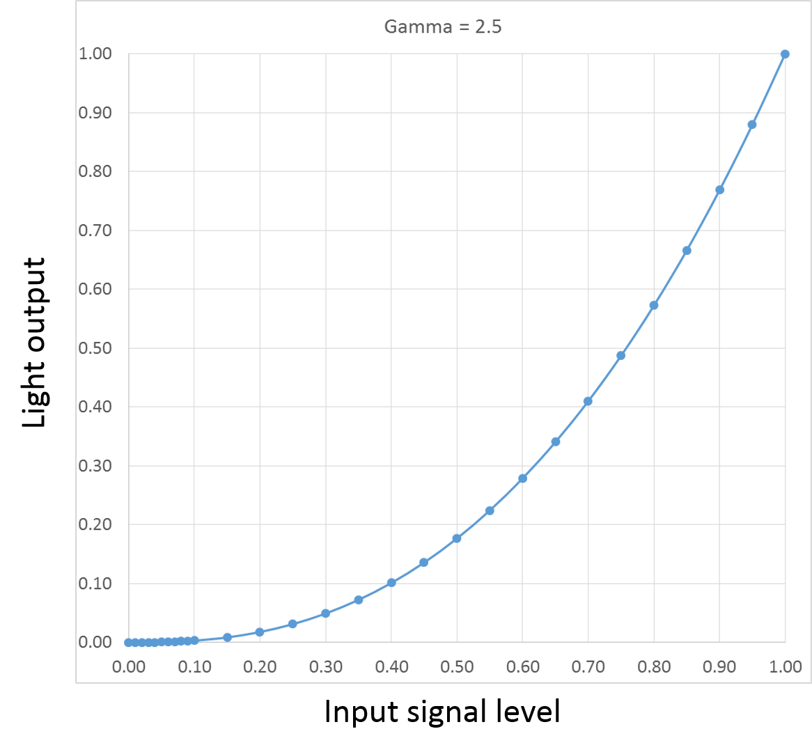
What this means is that as the input signal gradually increases, the light emitted by the screen increases only very slowly at first, then more and more rapidly toward the high end of the signal range. You’d think this would be a bad thing, but the human eye actually responds to light in almost exactly the inverse manner:
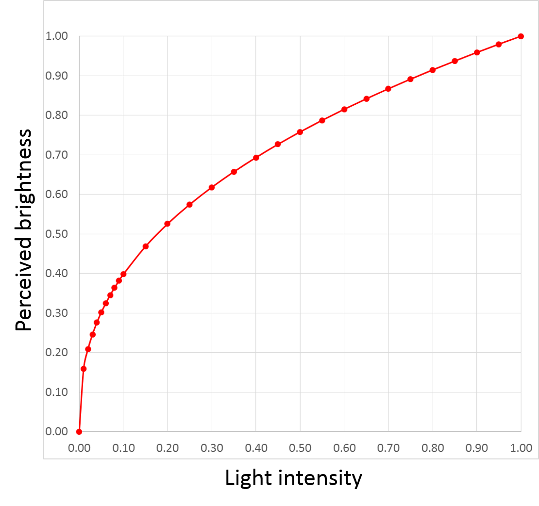
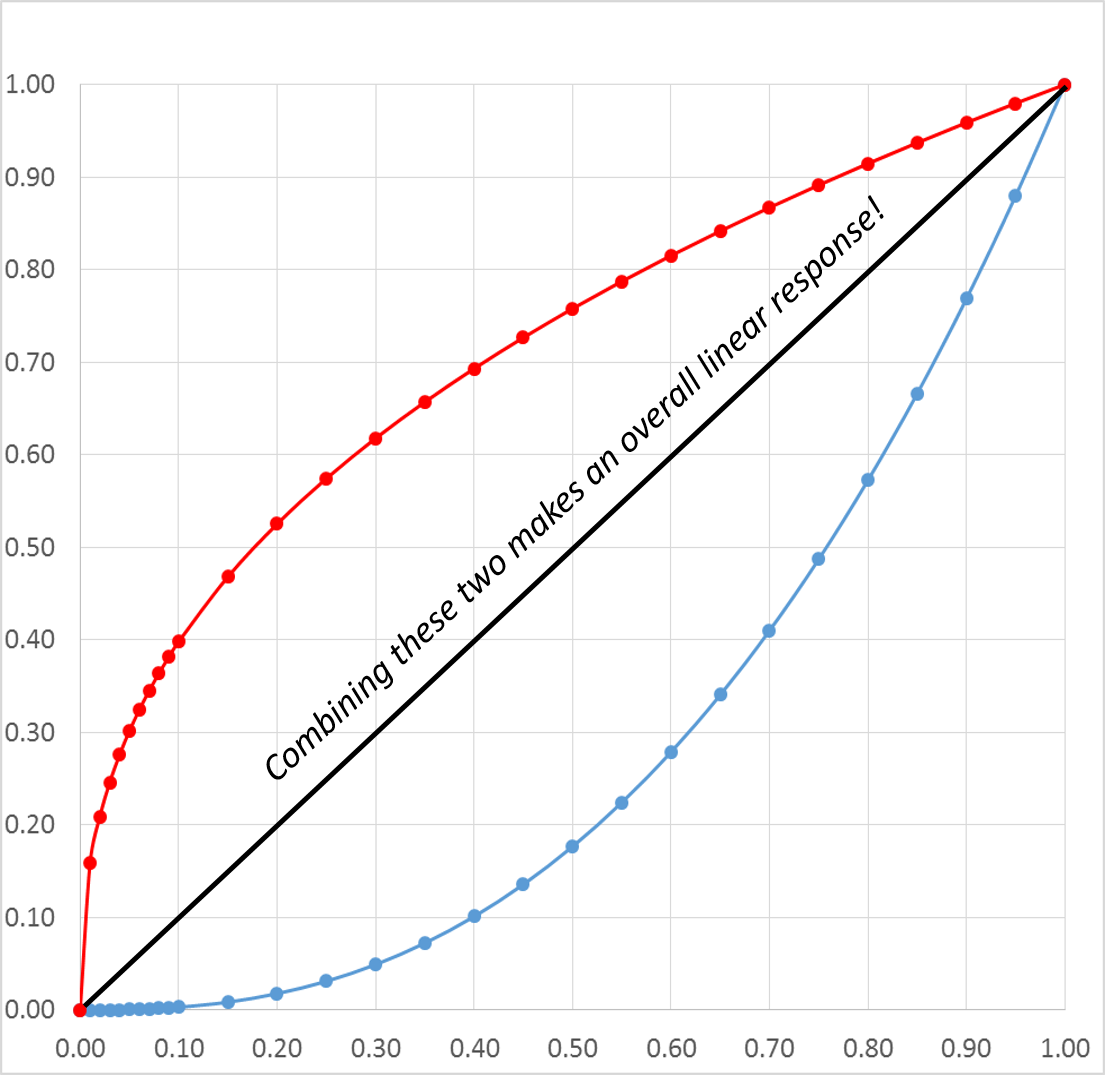
In other words, we’re very sensitive to changes in light level at the lower end of the range (whatever range of brightnesses the eye is adapted to at the moment), but relatively insensitive to changes at the high end. The two curves— that of a human eye and a CRT— effectively cancel each other out, making linear changes to input signal level actually look linear:
Gamma Correction
Gamma is a good thing because it makes things look right, right? Not so fast, young Padawan. If you want scenes to look right when shot by a camera (as opposed to just being made up by a computer), light coming out of the screen needs to vary just like it would in person. That means the camera has to behave like an eye, with its own response curve that’s the inverse of what’s expected in a display. This is what “gamma correction” means. Thus, the camera’s own response curve typically looks like this:
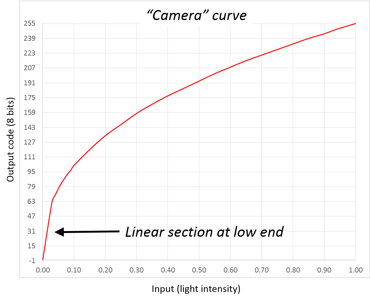
The overall system response to the input (the light of the original scene) is now linear, making things look natural on the screen.

The “camera curve” can’t be exactly the inverse of the display’s curve or there would be a serious problem at the low end, where (near the zero light level) the slope of the curve would be very steep. Problems with noise in the system would inevitably arise. The standards that define these curves generally insert a linear portion at the low end. The result is still close enough to the inverse of the display curve that it works very well, while enabling a much more practical design.
However, even with the linear section at the “bottom” end of the curve, one effect of this is the concentration of codes used to convey the “brightness” (luminance) information in the lower portion of the luminance range. Due to the way the eye works, this is a good thing. Since we’re more sensitive to changes in low light, having as small a step size as possible between adjacent levels in this range is important. If the encoding were done in a straightforward linear manner, we’d need a lot more bits to encode the full range from black to white without seeing visible steps or “banding” in the result.
By most estimates, a perceptually-smooth linear encoding would require about 14 bits per sample. But this non-linear, inverse-gamma form creates very visually-acceptable images with just 8-9 bits of grayscale or per color.
Note that in the case shown in the chart above— an 8-bit system assuming a display gamma of 2.5— over half the available 8-bit codes are used covering just the bottom 20 percent of the range of light intensities between black and white.
Over 50% of the available codes in an 8-bit system are used just to cover the bottom 20 percent of the range of light intensity
This is all further complicated by the fact that we’re no longer in a world where the CRT is the dominant display technology. LCDs, OLEDs, and the other modern display types don’t work anything remotely like the CRT did, and don’t naturally provide this nice power-law sort of response curve. An LCD pixel follows a sort of S-curve from the black state to the white state as you apply an increasing voltage. Something like this (which doesn’t represent any particular product, it’s just a sketch I’ve put together):
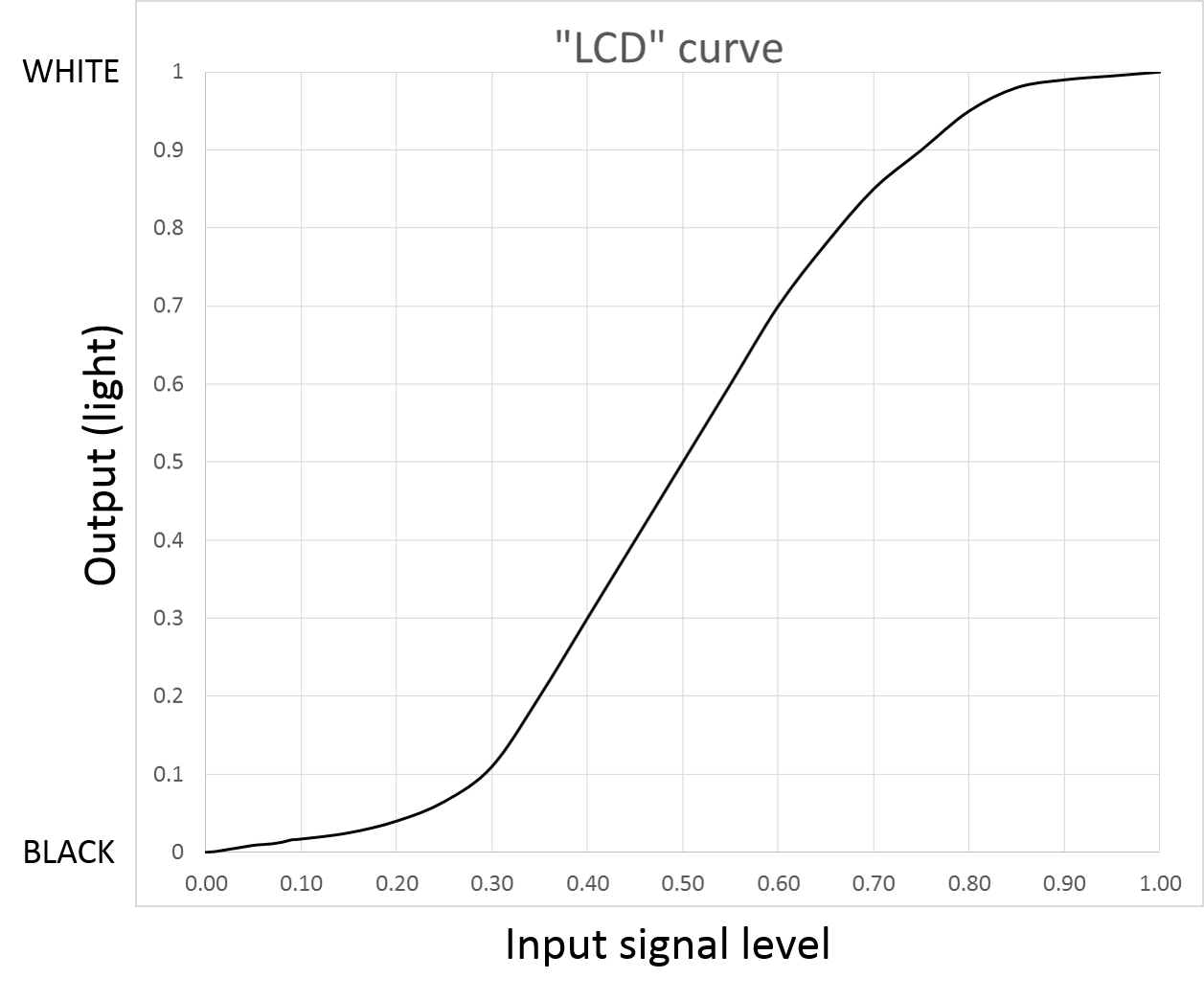
The exact curve doesn’t really matter much; the point is that it looks nothing at all like the very desirable “CRT-like” response. To address this, every LCD module includes artificial correction of its natural response, so that it looks more CRT-like. This is generally done within the column drivers, which are basically just a bunch of D/A converters that change the incoming video data into drive levels for the LCD pixels.
Since this is an artificial correction, there's always the possibility of it being done wrong, in which case displayed images just won't look right
Since this is an artificial correction, there’s always the possibility of it being done wrong. If the response curve doesn’t match what was specified by a given standard (or at least come pretty close), displayed images just won’t look right. If the effective gamma value is too low— making the curve straighter than it was supposed to be (at least as compared with the curve assumed when the image was produced)— low-end areas (shadows and the like) will look light and washed out, and the overall image will look faded and flat. Overshoot the intended gamma, and the shadow details are lost as the low-light levels move toward black, making the image look too dark and “contrasty.”
Worse yet, the “native” response isn’t the same across the three color subpixels (RGB). This means correction should be applied uniquely to each color. Mismatches in the response curve across the primaries leads to color error. In fact, response curve error is one of the primary causes of color accuracy problems in LCDs. If the effective gamma value is a little lower for the red channel than for the green and blue, grays in the midrange may take on a noticeable pinkish hue due to the red being relatively over-emphasized. This kind of error affects colors other than gray tones just as much, if not more.
Wrap-up
Gamma isn’t a spec that you often see published for displays, especially in the mobile markets. But it has a huge impact on the appearance of screens of any size. As image quality and color accuracy become more important, expect to see more attention paid to this rarely-considered item.