Affiliate links on Android Authority may earn us a commission. Learn more.
I'm in love with the Garmin Connect app redesign and its tailored experience
Published onJanuary 9, 2024
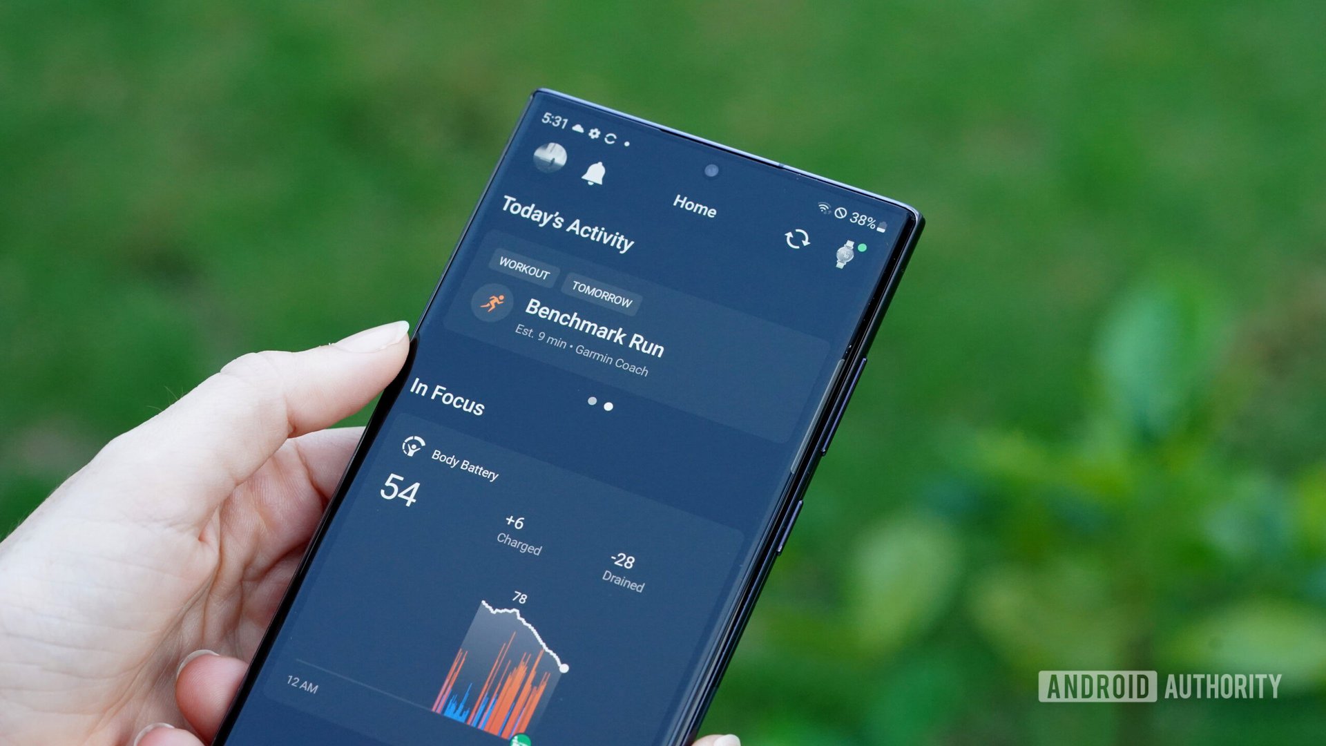
Garmin often sees success at CES, but at CES 2024, the company didn’t just unveil two new fitness trackers, it also announced a major upgrade to the Garmin Connect platform. I’ve been lucky enough to gain beta access to the redesigned app and website, and after testing it out, I’m thrilled to say it’s a major win.
Garmin Connect: New features and focus
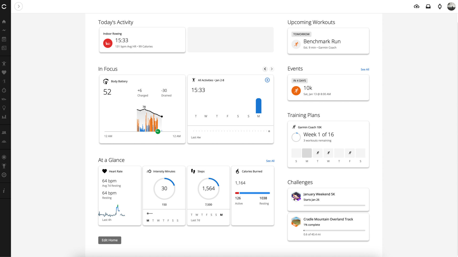
Garmin Connect’s new look makes the platform’s focus very clear: the user. Immediately upon updating to the redesigned experience, the app asked me to identify my goals and priorities, rank my interest in specific data, and prepare for a personalized Home screen. The result is a fantastically simplified landing tab that still offers the best of Garmin’s intricate training tools in a more digestible manner.
This change affects not only the companion app but also the website version of Garmin Connect. Wherever you prefer to interact with the stats tracked by your smartwatch or tracker, you’ll find the brand-new organization outlined below.
In Focus
With the option to include up to five categories, the new In Focus section highlights your high-priority health and fitness metrics, whether you’re someone who lives for their step count or plans around their Body Battery. I love the ability to quickly check in on my sleep score, steps, Training Readiness, and Activity Trends as soon as I open the app. As always, you can tap on each focus category to review deeper insights.
At a Glance
As the title implies, this section keeps even more stats front and center for quick review. Based on your selections during setup, Garmin will identify the stats most important to your goals. You can tap each to see more details or tap See All to access even more categories. Users can also select up to eight additional stats, including the whole gamut of Garmin’s tool kit. I find this second tier of data the perfect spot for information I don’t always need but want often enough that I don’t want to dig. For me, that includes things like women’s health details, activity stats, and stress.
Events
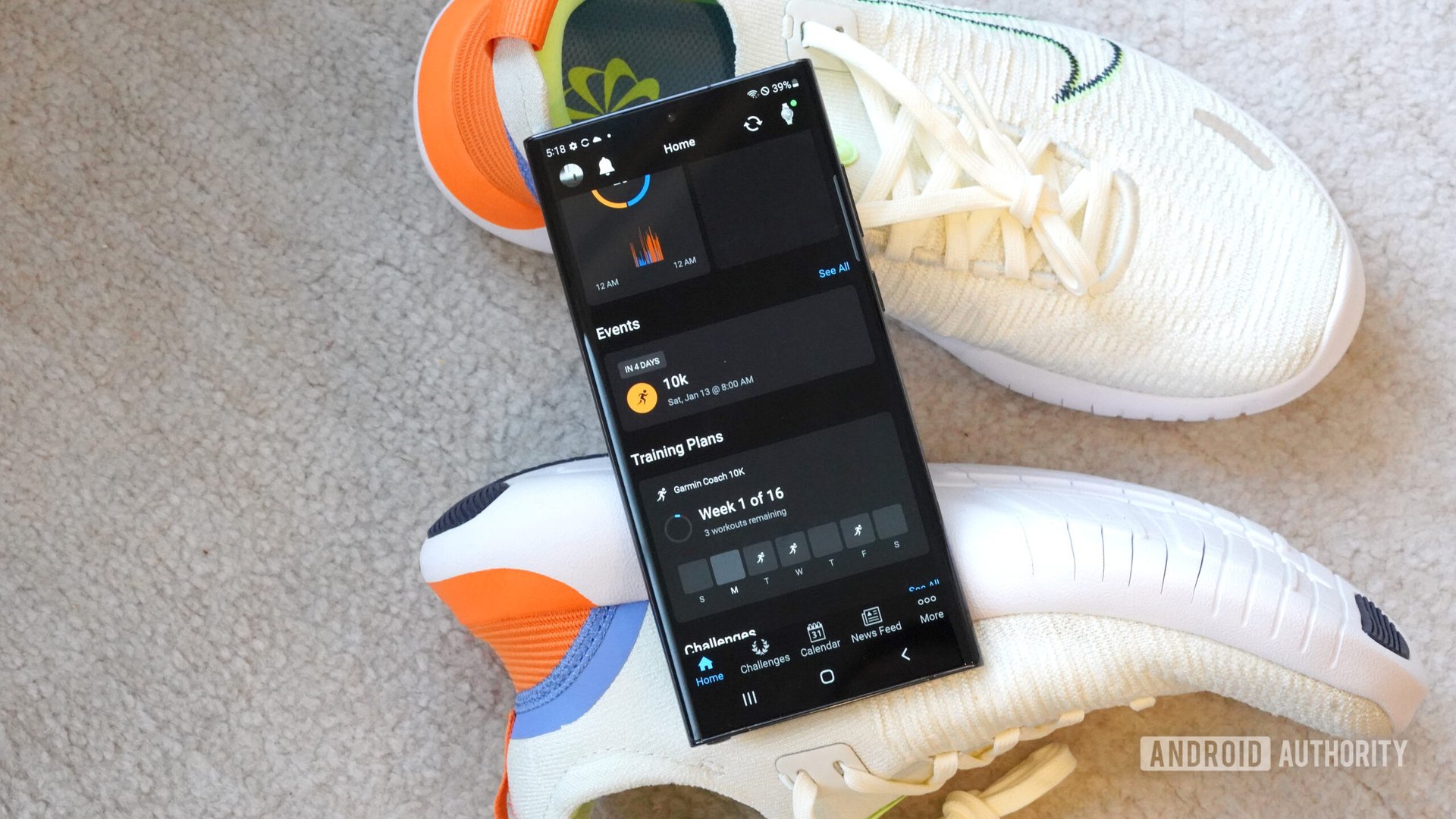
Ever sign up for an event in a flurry of motivation and misguided energy, only to forget until it’s entirely too close to race day to perform admirably? Enter the Events section highlighting upcoming races and competitions, offering prep information, countdowns, and even the ability to prioritize one event over another. Like the rest of the Home tab, this section is highly customizable and can be disabled entirely if events aren’t your thing.
Training Plans
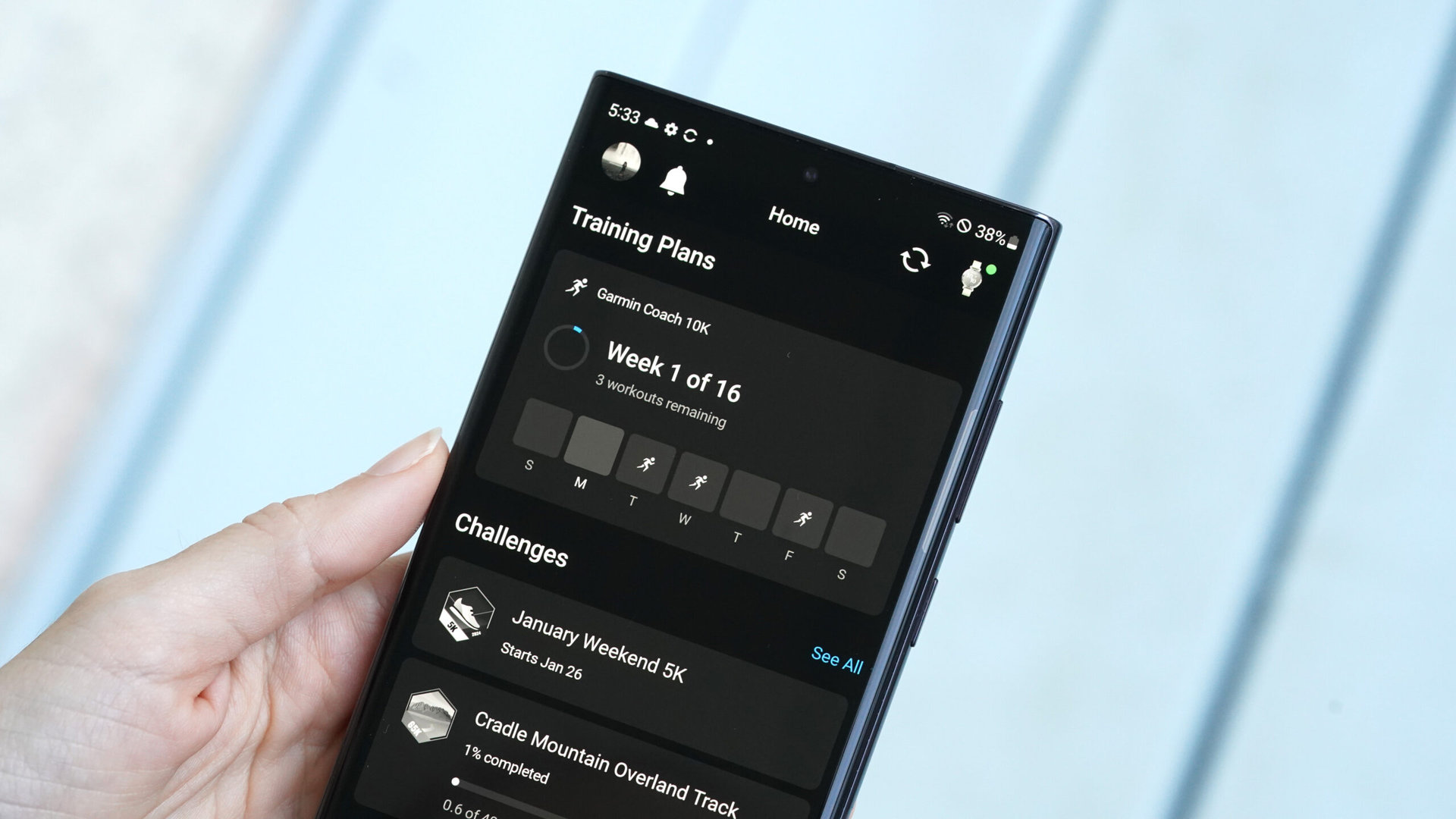
There’s no better training companion than Garmin. Under this header, users can start a Garmin Coach training plan and then check in on their progress and scheduled workouts. I’m nothing if not motivated by schedules and deadlines, and Garmin’s free programs continue to impress, especially in a landscape teeming with subscription fees.
Challenges
Garmin making space for users to check in on their challenges is a delight. You can still tap over to the Challenges tab to more closely manage your rankings and status, but now you’ll find the basic details right below the rest of your go-to stats. You can tap a listed challenge to see more information or tap See All to open the Challenges tab. I’ve never been a Boy Scout, but I’m all about badges, and I love Garmin’s Expeditions.
The Garmin Connect app Home tab’s abundant customization
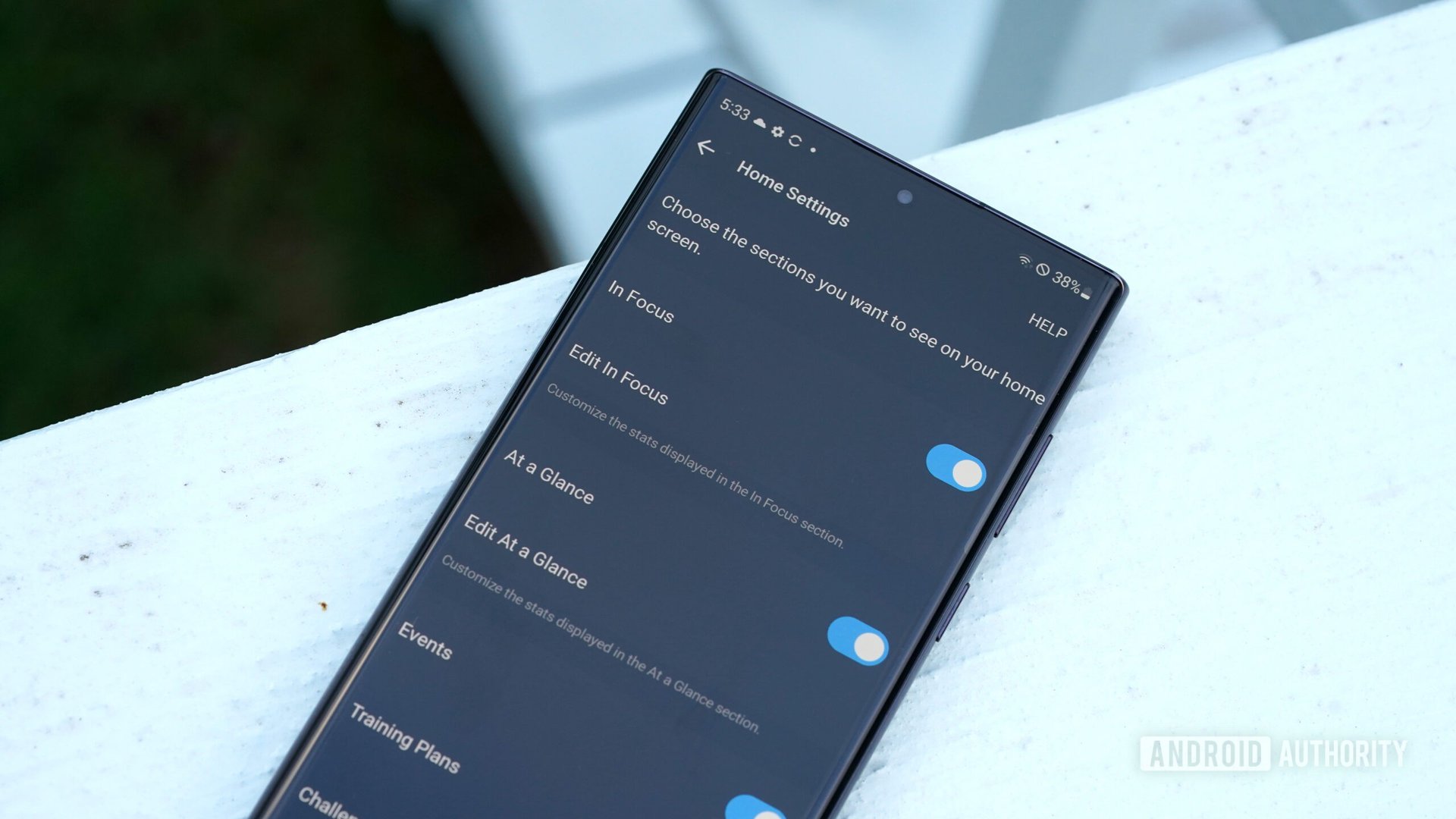
Naturally, goals change and priorities shift. To this end, the new landing page is highly customizable. I chose to enable all categories during this Garmin Connect hands-on, but Garmin makes it easy to toggle off those that don’t apply to your fitness journey. If you don’t want to participate in challenges or you aren’t one to schedule events, no problem. Scroll all the way down to the bottom and tap Edit Home.
The update’s impact on Garmin’s stable
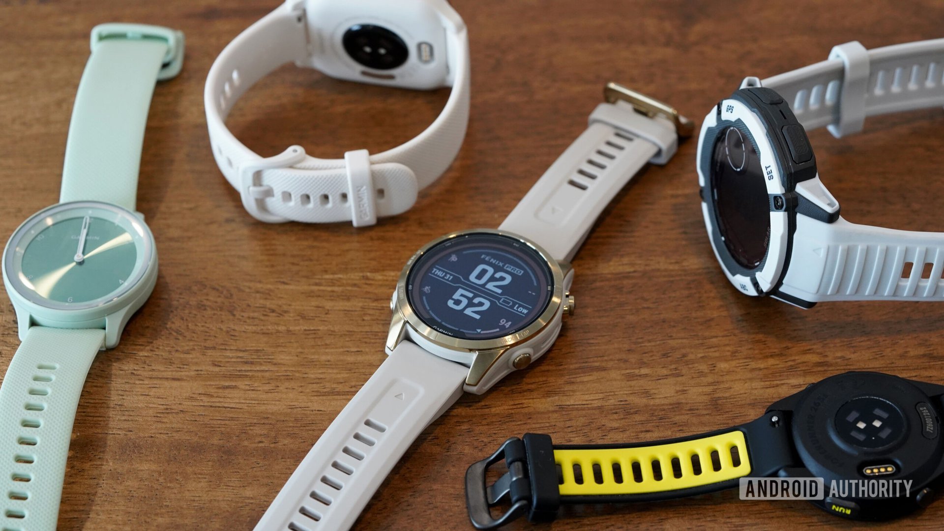
I don’t think it’s unreasonable to say that the updated app experience could expand the scale of Garmin’s user base. In the past, I and other reviewers for Android Authority have regarded Garmin’s companion app as loaded with stats and details, making it a great resource for athletes and data junkies. However, we’ve also called it potentially overwhelming for some; with so much information to wade through, newcomers might feel they’re drowning in data.
After delving into the new experience, it’s clear to me that the update makes the companion app significantly more approachable. At-a-glance stats personalized to my specific interests mean I don’t have to spend time tediously scrolling. Highlighted challenges keep me focused and accountable. Sure, I can still whip up Garmin’s infamous overflow menu when I’m itching for a treasure hunt, but the Home tab highlights everything I need daily.
Equally important, the app doesn’t seem to be missing anything. In 2023, Fitbit users were highly disappointed by the company’s app design, which oversimplified tools and removed valued features. Garmin is a shining example of simplification without sacrifice.
When can you update your Garmin Connect app?

Garmin announced the Garmin Connect app’s redesign at CES on January 8th, alongside a second-generation Garmin Lily and a new female-focused heart rate monitor, the HRM-Fit. A beta version of the app is available to select customers now. The experience is expected to be available to everyone later this year.