Affiliate links on Android Authority may earn us a commission. Learn more.
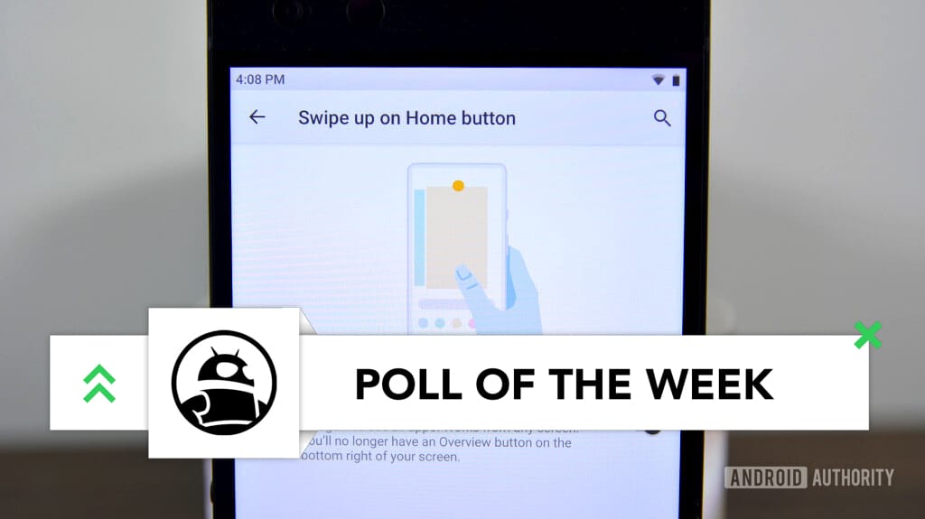
Gesture navigation or traditional software buttons? (Poll of the Week)
Published onApril 8, 2019

Apple wasn’t the first phone maker to implement gesture navigation on its phones, but one could argue that the company kicked off the sweeping trend back in 2017. Now, you’ll be hard-pressed to find a recent smartphone that doesn’t implement any kind of gesture navigation. In the months following the iPhone X unveiling, we saw Samsung, Huawei, OnePlus, and even Google implement their own versions of navigation gestures.

Google’s navigation gestures are wonky right now, but it looks like they’ll be resolved in Android Q. OnePlus’ echo the iPhone’s gestures, while Motorola’s gestures are — in my opinion — the best out there. In many cases, you swipe up from the home button to get to your app drawer and swipe right to switch between recent apps.
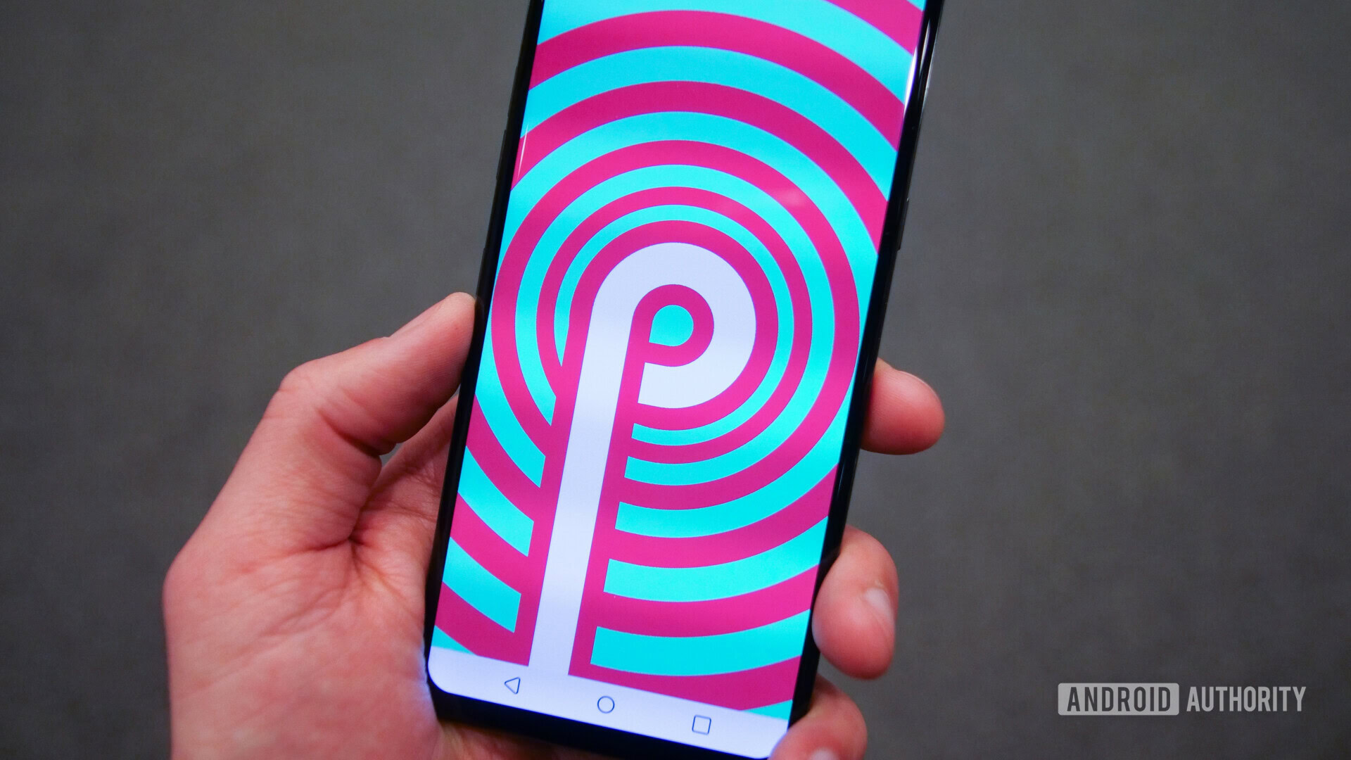
It wasn’t always this way. Google first implemented the “traditional” three-button navigation layout in the Galaxy Nexus. The idea was simple — you get back, home, and recent apps buttons — no need to swipe around the interface to get where you need to go.
We want to know which one you like better: navigation gestures or the “traditional” three-button navigation layout. If you prefer navigation gestures, which OEMs implementation do you prefer? Sound off in the comments!