Affiliate links on Android Authority may earn us a commission. Learn more.
Google apps could soon get a simplified account switcher UI (APK teardown)
August 27, 2024

- Google is working on a redesigned account switcher for its apps.
- The company has been adding new strings of code related to the design update to several apps over the last few weeks.
- Strings spotted in the latest Google Keep update suggest that the new account switcher may resemble the web UI.
The account switcher in Google apps might soon get a redesign. We’ve spotted new strings of code in several apps pointing toward the UI update over the last few weeks, and we finally have enough evidence to reveal what the new account switcher UI may look like upon release.
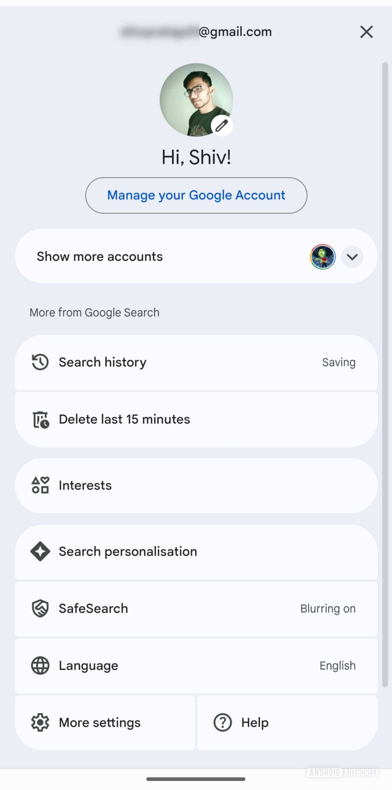
Based on the code spotted in the latest Google Keep update, we believe that the redesigned account switcher UI in Google apps may resemble the web version. Currently, the app version shows your primary account, followed by a “Manage your Google Account” button, other connected accounts, an “Add another account” button, and the option to manage accounts on your device.

As you can see in the screenshot above, the web version has a cleaner look. It shows the profile picture of your primary account, a greeting, and the “Manage your Google Account” button at the top, followed by a collapsable “Show more accounts” menu that includes other connected accounts, the “Add another account” button, and the option to sign out. The following strings of code spotted in the latest Google Keep release suggest that Google may take a similar approach for the account switcher UI in Google apps.
<string name="og_bento_greeting_hi_message_with_name">Hi, %1$s!</string>
<string name="og_bento_greeting_hi_message_without_name">Hi there!</string>
<string name="og_bento_header_title_when_account_menu_is_collapsed">Show more accounts</string>
<string name="og_bento_header_title_when_account_menu_is_expanded">Hide more accounts</string>
<string name="og_bento_short_greeting_hi_message">Hi!</string>
<string name="og_bento_switch_account">Switch account</string>
The strings highlight that the new UI will also have a greeting and a collapsable menu that will list secondary accounts. Unlike the web version, the account switcher on mobile may also get a new Switch account button.
The new account switcher UI is still in development, so we were not able to manually enable it in the current Google Keep release. We’ll keep an eye on future Google app updates and let you know as soon as the redesign rolls out.
Thank you for being part of our community. Read our Comment Policy before posting.