Affiliate links on Android Authority may earn us a commission. Learn more.
If you want people to use your navigation gestures, Google, make them better
Published onOctober 9, 2019
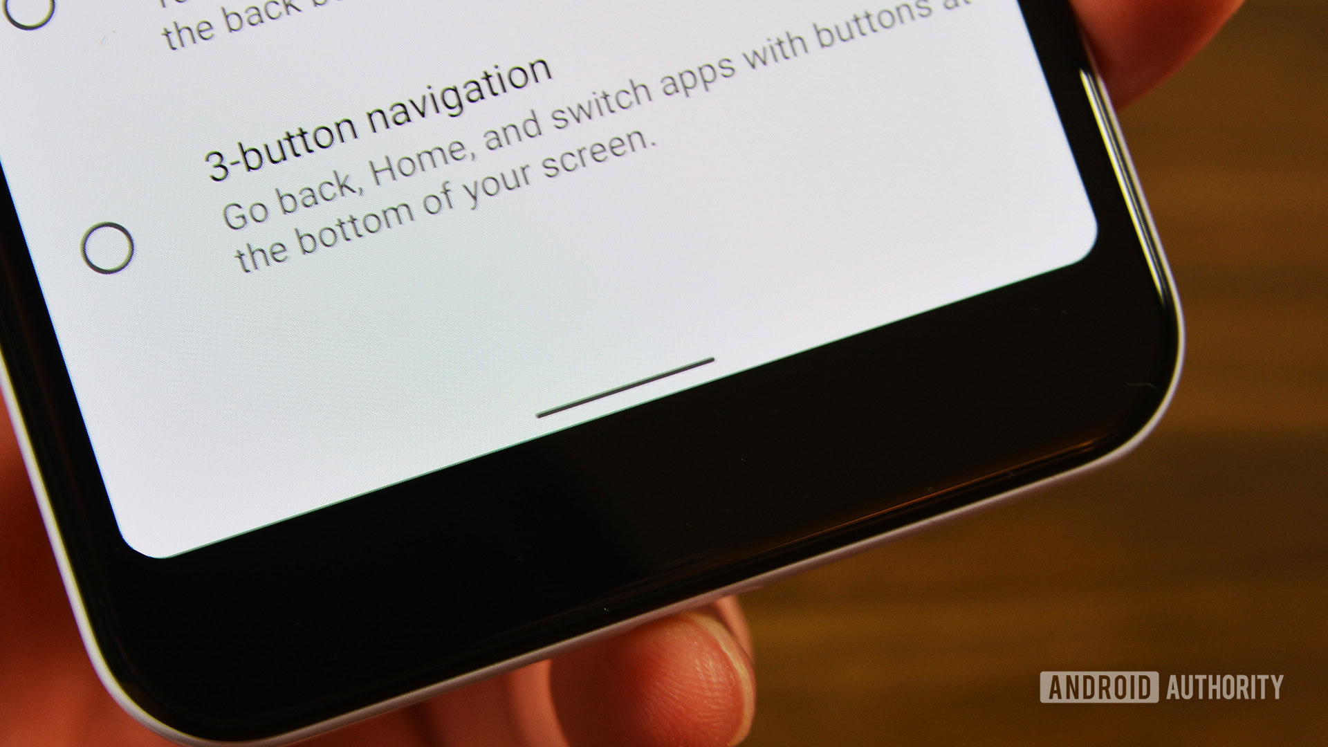
Earlier this week, we found out that Google has a new plan when it comes to Android 10 navigation gestures. That plan is to force OEMs to bury their own navigation gestures deep in Android settings and keep Google’s options front-and-center.
This means users will only have two apparent options for navigation when they first boot up a new smartphone: the traditional three-button system we’ve known for years and the new system with a slim horizontal line at the bottom of the display that relies completely on swiping gestures.
According to the latest Google Mobile Services (GMS) agreement, any third-party gestures cannot be presented as an easily-found option within Android’s navigation settings. Instead, these other systems need to be hidden away under some other heading, such as “Advanced.” Additionally, OEMs can’t prompt users to switch to a third-party system via something such as a pop-up notification.
In other words, Google is telling OEMs that they need to make it as tricky as possible for a user to switch to their custom Android 10 navigation gestures. The likely explanation for this is to keep Android from further fragmentation, but it doesn’t come off that way to me. Instead, it seems as if Google is either unaware or in denial of the fact that its navigation system isn’t as good as others from Android OEMs and, instead of making them better, just shutting the door on those other systems.
This is a bad look.
Android 10 navigation gestures: How they work
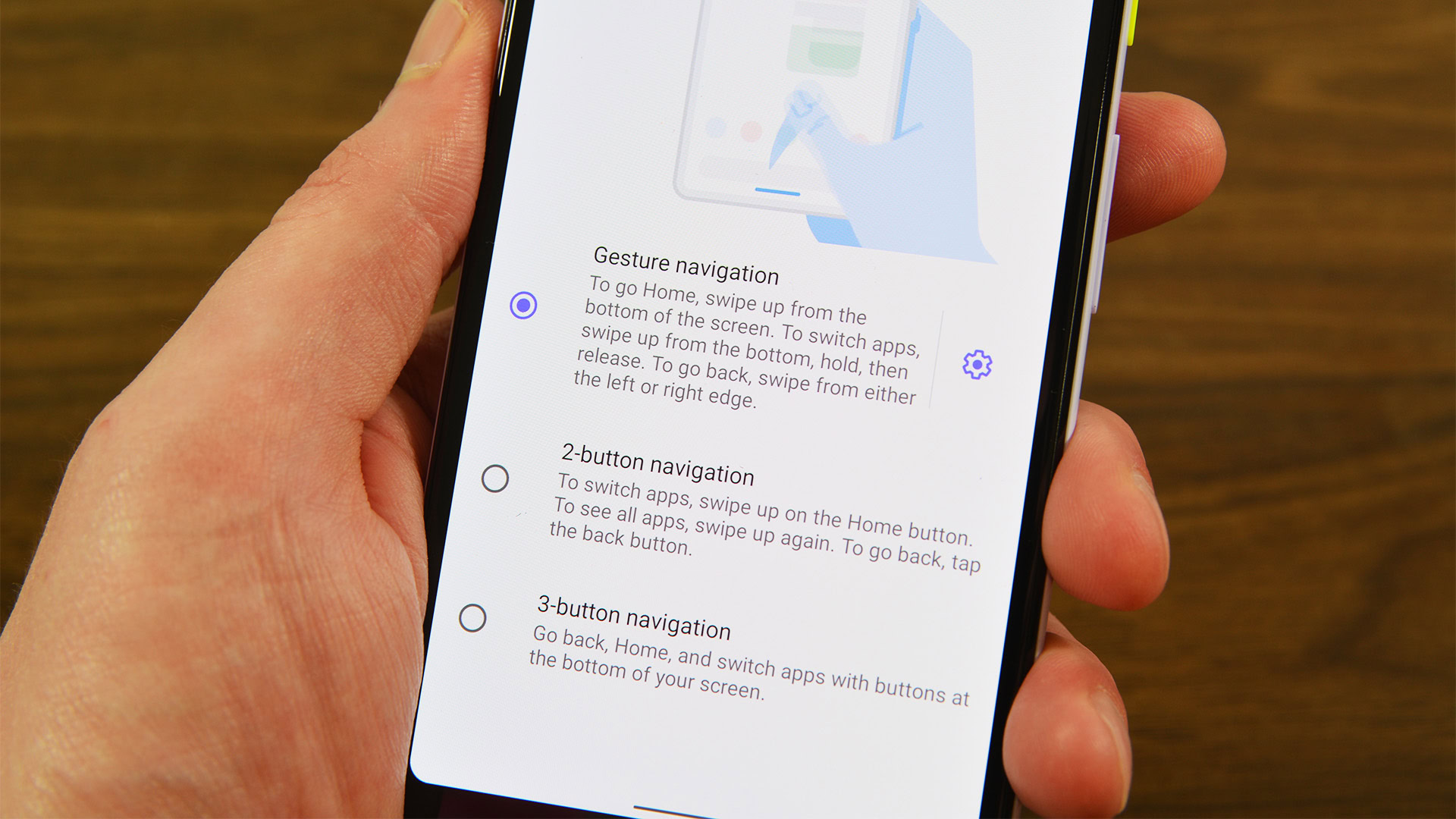
Since very few people are running on the latest version of Android at the moment, some might not be aware of how Android 10 navigation gestures work. Let’s go over them now so you can get a handle on why Google’s move is a bit heavy-handed.
Ok, here we go: you know how iOS gesture navigation works? That’s how Android 10 gestures work.
OK, OK, it’s not quite that simple. But it’s undeniable that Google’s latest attempt at gesture navigation controls not only functions incredibly similarly to iOS but even looks like iOS. Check out the image below to see what I mean:
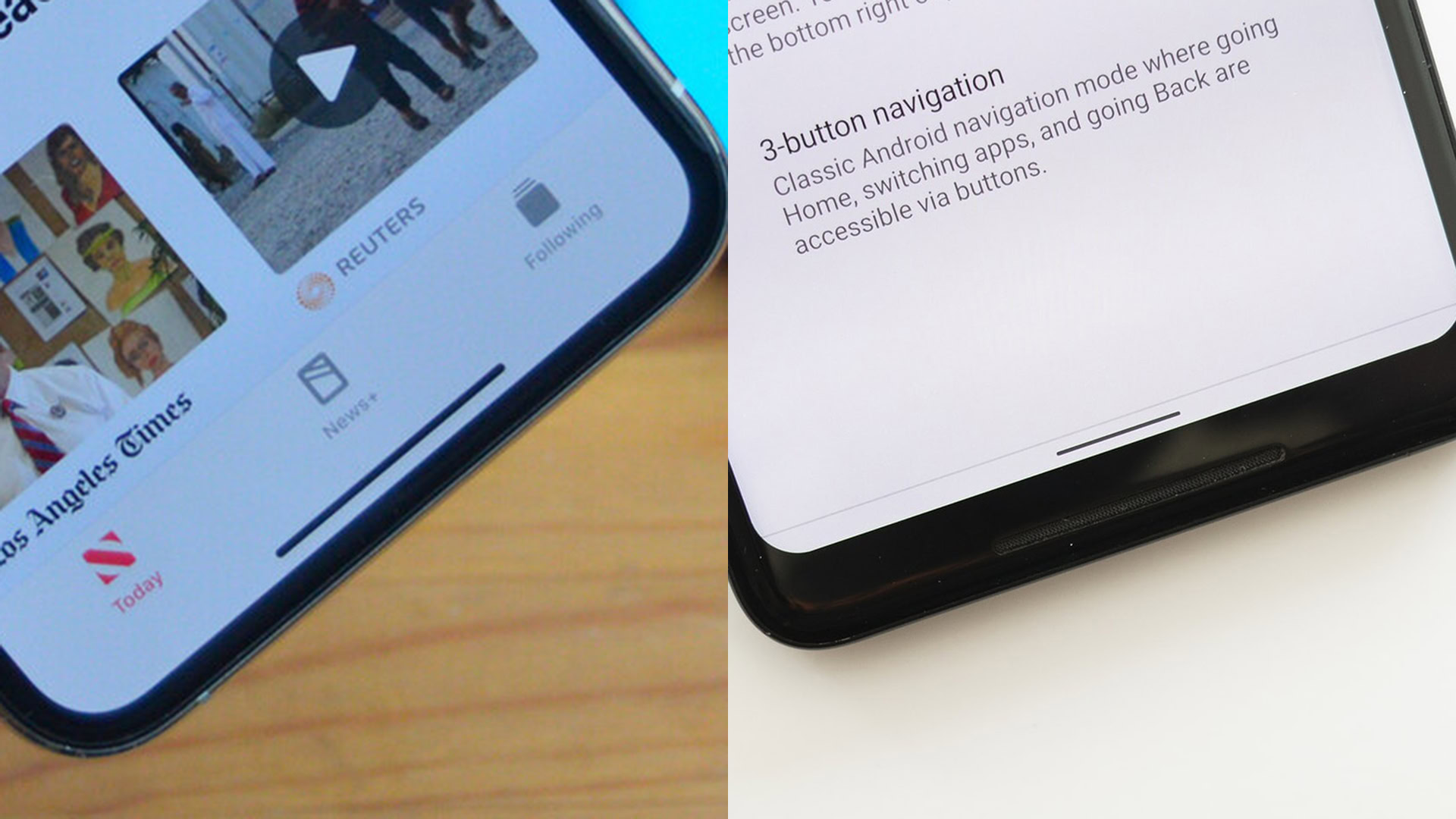
In case it’s unclear, that’s an iPhone on the left and a Google Pixel device running Android 10 on the right.
Whether you’re using an iPhone 11 Pro Max or an Android device with gesture navigation, you’ll do the same things to achieve the same ends. A swipe up on the horizontal line will take you to your home screen. Swiping up and then holding your finger will open up the recently used apps, which appear as a series of vertically aligned cards you can then swipe away. Swipe to the left or right on the horizontal line and you can quickly swipe through your open apps one-by-one. These similarities continue with pretty much every iOS gesture having an Android counterpart.
Now, we could argue all day about whether or not Android and iOS getting more and more similar, in general, is a good or bad thing. However, in the specific case of navigation gestures, it’s my opinion that Google blatantly copying Apple’s approach is a bad move for a few reasons.
Android 10 navigation gestures: Why they aren’t great
On the surface, there’s nothing patently wrong with the Android 10 navigation gestures. They are pretty much the same as Apple’s and those gestures seem to be well-received among Apple users, so why wouldn’t they also work for Android?
I think that’s a cop-out, though. That conclusion is basically Google saying, “We couldn’t think of anything better for Android, so these Apple ones will do.” That’s not the Android I know and love. Android should be different from Apple in more ways than it’s the same because that’s the beauty of having the choice between the two systems.
Additionally, there already are gesture navigation systems that are distinctly different from those on iOS that Google could have adopted instead. The OnePlus gesture navigation system is adored by most people who give them a shot and they don’t require a horizontal line at the bottom of the display. You simply swipe up from the bottom of the display in different areas for going to the home screen, going back, opening the recent apps list, etc.
With Android 10's gestures, Google appears to have said 'We can't come up with anything good on our own, so these iOS ones will do.' That's lame.C. Scott Brown
Samsung has a very similar gesture navigation system of its own that users seem to dig, though they’re not perfect. Google’s new policy of burying these and other systems will likely prevent at least a portion of users from even knowing these gesture options exist, which is a real shame.
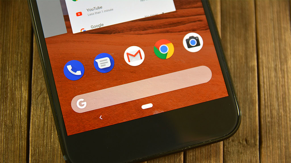
Even Google’s Android 9 Pie gesture system — based on the “pill” icon as shown in the image above — at least was a bit different from Apple’s. I don’t think the pill system got too much love (which is likely why Google seems to have abandoned it after just one year) but it seems kind of crazy that the company moved on to an Apple clone so quickly.
The bottom line (see what I did there?) is that the current Android 10 navigation gestures don’t need to be the way they are. Google could have gone in multiple directions but ultimately appears to be choosing to just stick with being an Apple clone and heavily pushing users to adopt them whether they want to or not.
Android isn’t a walled garden, so don’t make it one
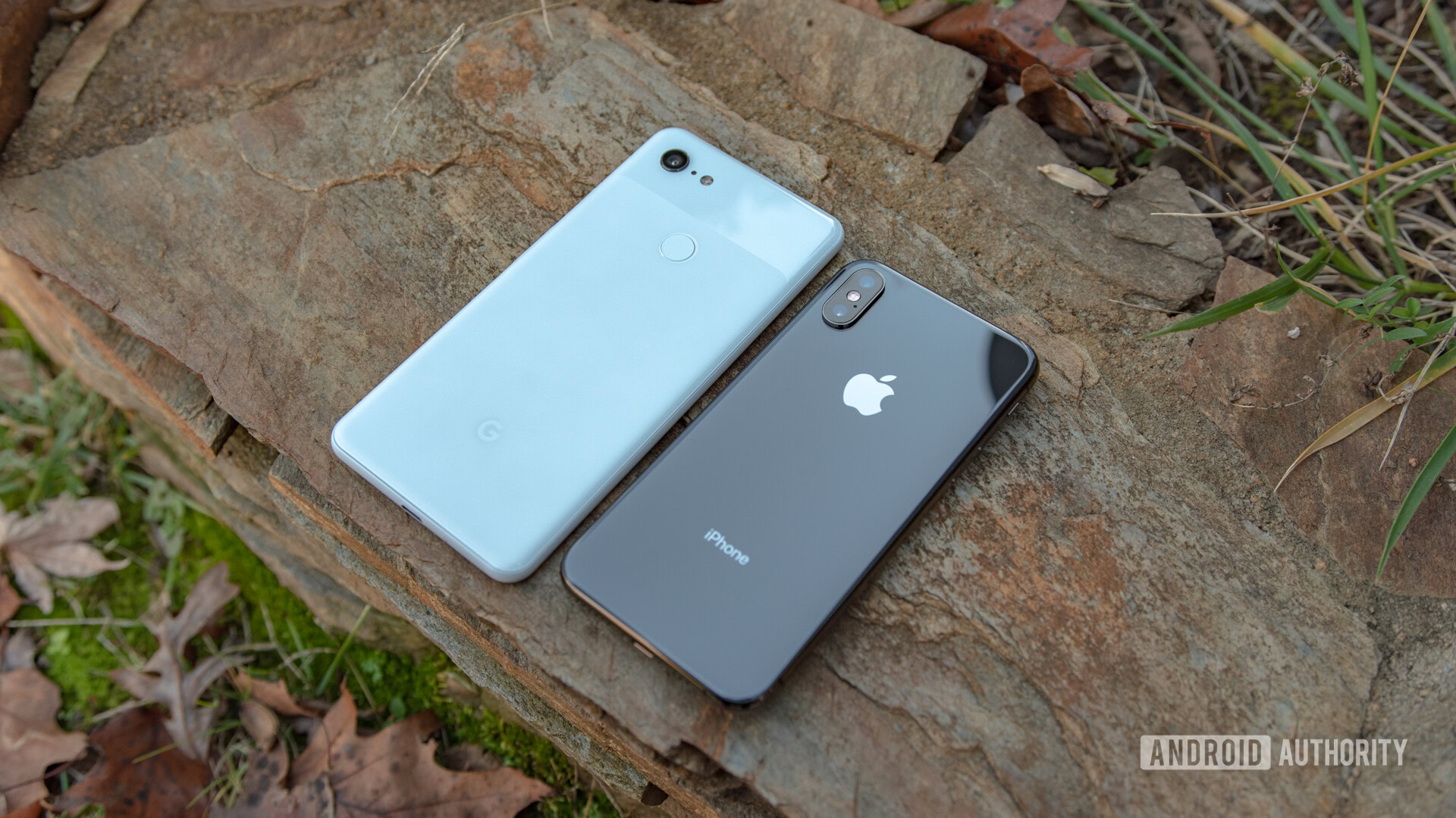
Even if Google created its own original gestures that were beloved by everyone, the very fact that the company is pushing to hide third-party gestures away from the spotlight is a move that seems anti-Android. Since the beginning, Android has been all about the user being able to do whatever the user wants, and this seems like doing the opposite of that.
Meanwhile, Apple’s ethos when it comes to smartphones has always been the so-called “walled garden” approach: give the user a beautiful and easy-to-learn experience, but one in which they have little control. Google “hiding” away third-party navigation gestures seems much more Apple than Android.
I’ll be the first to admit that Android has some serious fragmentation issues. But the solution to that problem when it comes to navigation gestures shouldn’t be, “just do what Apple did and make it tricky for users to change that.” It just seems like a bad move to me.