Affiliate links on Android Authority may earn us a commission. Learn more.
Google Assistant's responses look much better than before
Published onApril 5, 2019

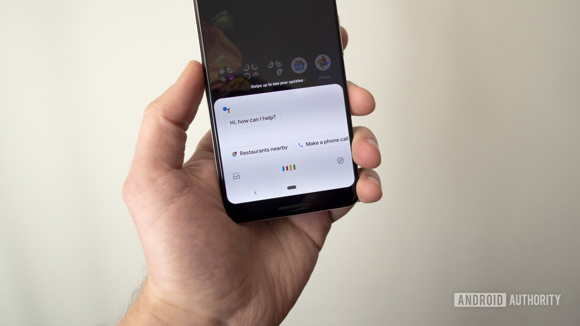
Visual responses in Google Assistant aren’t new, but we can always use more of them. That’s why Google today updated its virtual assistant with more responses that are appealing to the eyes.
Thanks to the tweaks, Assistant now issues the same response as the mobile browser does when looking up events near you, for example. Other examples include mortgage calculators, color pickers, a tip calculator, a bubble level, a metronome, and richer information for stocks.
Also, Assistant now shows the standard Google Search layout instead of the horizontal layout of boxes when you get a list of websites as a response. Showing the standard Search layout has the effect of also showing you Search ads within Assistant, the first time we’ve seen ads in Assistant.

In a statement sent to TechCrunch, Google said that advertisers can’t target Assistant users and doesn’t get additional information from them. There’s still concern that we’ll see more ads throughout Assistant, but only time will tell.
Google Assistant’s new features are now rolling out to Android phones in the U.S. There’s no word yet on availability in other regions or on the Assistant app for iOS.
NEXT: John Legend’s voice finally makes its way to Google Assistant