Affiliate links on Android Authority may earn us a commission. Learn more.
Google Calculator gets a Material Theme redesign
September 17, 2018

Since showing off its new Material Theme at I/O 2018, Google has slowly been rolling out the refreshed design to its various apps and services. After making the new look available in Chrome, Android Messages, and more, Google has redesigned its Calculator app (via Android Police).
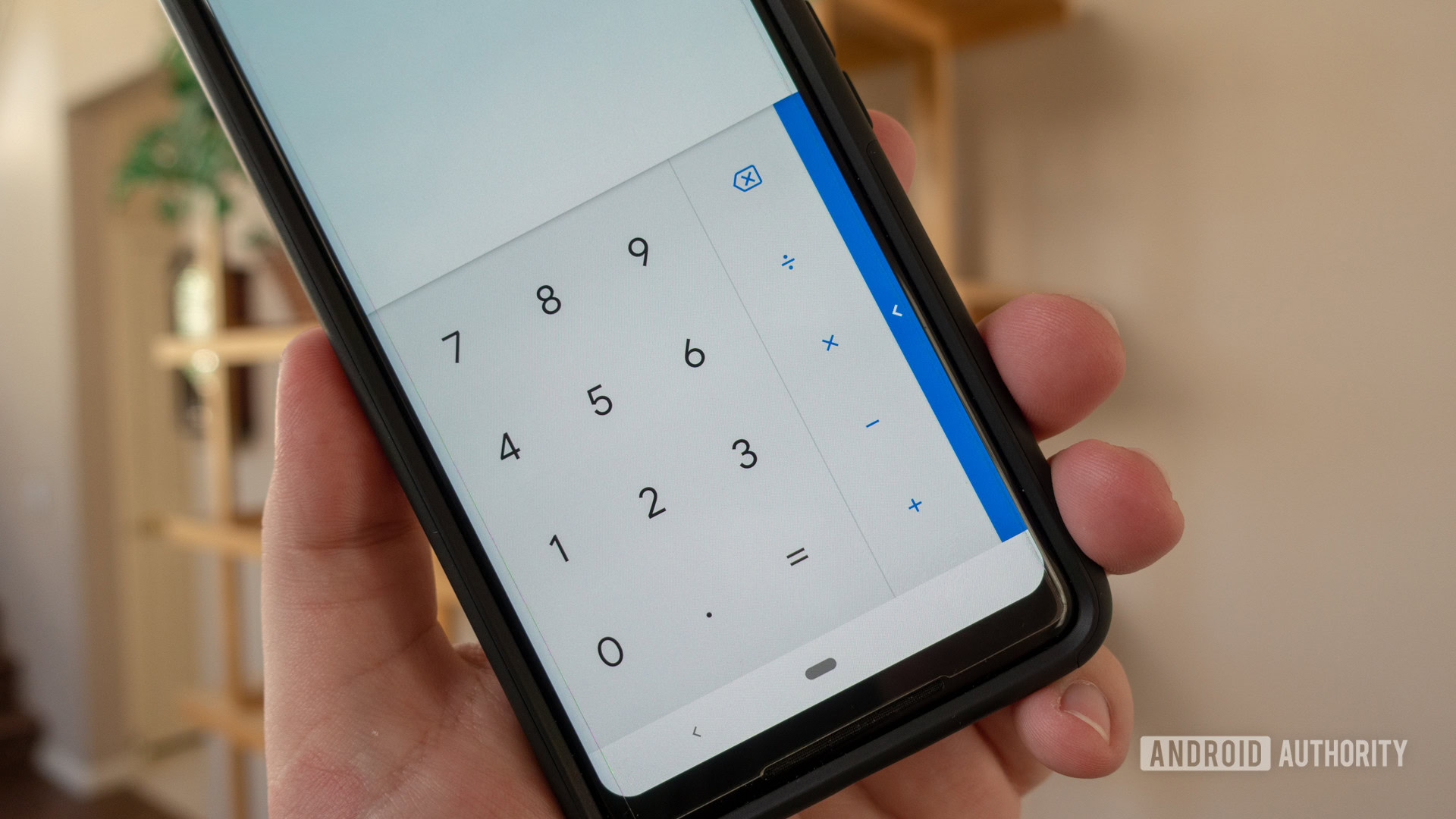
As you can see from the screenshots below, the Google Calculator app is getting a pretty striking cosmetic refresh. Gone is the dark number pad and pull-over shadow. In their place, Google has gone with a light gray background and a more transparent window.
New design
New design
The company also changed the hue of the blue color found in the overflow menu and made the switch to Google’s Product Sans font. Both changes make the graphics and symbols used bolder and help them stand out from other elements in the app.
There are also a bunch of other little changes. Some of these include the phone’s navigation bar which now becomes white while using the app and the switch in position of the “0” and “.” characters.

The Material Theme is rolling out right now so there’s a chance that you might have the update available in the Play Store. If not, it should make its way to you sometime over the next week or so. Also, if you don’t have Google’s Calculator app installed on your Android device already, you can download it using the button below.
What do you think about the Material Theme redesign? Are you a fan of the Google Calculator’s new look? Let us know in the comment section below.
Thank you for being part of our community. Read our Comment Policy before posting.