Affiliate links on Android Authority may earn us a commission. Learn more.
Get the new Material Theme in Chrome right now
Published onAugust 21, 2018

- Google has been working on a Material Theme redesign for Chrome on Android and the desktop.
- The redesign will go live with Chrome 69 in September.
- Users can enable the Material Theme right now by enabling a Chrome flag.
We first got word back in April that Google was working on a refreshed design for Chrome on Android and desktop. Google further showed off the Material Theme at the I/O 2018 developer conference. At long last, Google announced that it will be rolling out the redesign in September and can be manually enabled right now (via 9to5Google).
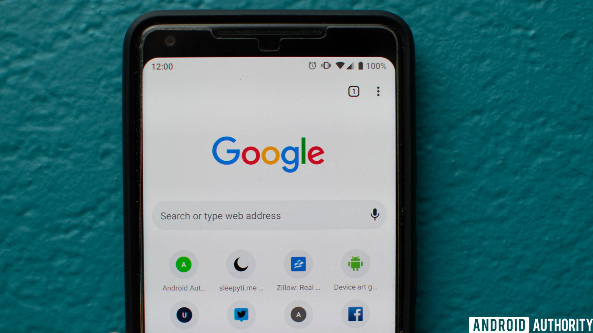
The overhaul on mobile is primarily just cosmetic, bringing the Chrome web browser more in line with Google’s Material Theme. This means a lot of white space and rounded corners. These changes can be seen everywhere including on the “New tab” page and the pill-shaped search bar found above each webpage.
One significant change that doesn’t appear to be live at the moment is a new horizontal tab overview. With this change, tabs will be laid out similar to Android Pie’s updated app switcher instead of stacked cards.
Below are some comparison shots between the current Chrome design and the Material Theme on mobile:
New design
New design
The Material Theme introduces a good number of changes to Chrome on the desktop. Of course, the rounded design and white layout also make their way to this version of Chrome and are incredibly evident in the new pill-shaped search bar and minimal tabs.
There are a good number of changes that you might love or hate. For one, the “New tab” button is now placed on the left side of any opened tabs. While the icon is much larger and more accessible, its placement on the left side of the browser seems counterintuitive and out of place.
Google has also moved the user’s avatar for the logged-in account down from the top corner so that it now sits next to any installed extensions.
You can see these changes in the comparison photos below:
New design
New design
So if you want to try out the new Material Theme before it officially rolls out, all you have to do is enable a Chrome flag. On Android, either copy and paste the following URL or type it into the Chrome search bar. The “Chrome Modern Design” item should be highlighted. Change the drop-down to “Enabled” and then relaunch the browser.
chrome://flags/#enable-chrome-modern-design
The steps are pretty much identical on a desktop (Windows, MacOS, Linux). Grab the flag URL below and paste it into Chrome’s address bar. After locating “UI Layout for the browser’s top chrome,” select “Refresh,” and relaunch the browser. When it comes back, you should have the new Material Theme.

chrome://flags/#top-chrome-md
If you don’t like the Material Theme changes, don’t worry, you can easily switch back to the old design following the steps. Unfortunately, though, Google will be officially rolling out these changes with Chrome 69. This should go live on September 4 on Windows, MacOS, and Linux. The update to Android will happen several days later.